2) How effective is the combination of your main product and ancillary texts?


   I felt that the combination of my main product and ancillary tasks went together
   quite well.


Colour Scheme

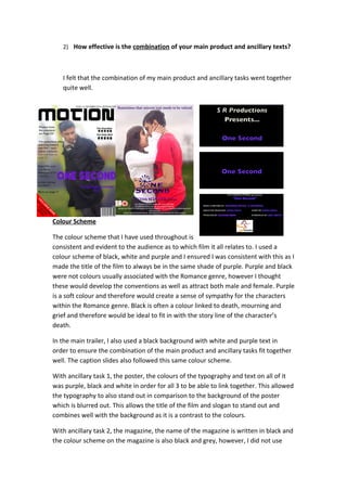
The colour scheme that I have used throughout is
consistent and evident to the audience as to which film it all relates to. I used a
colour scheme of black, white and purple and I ensured I was consistent with this as I
made the title of the film to always be in the same shade of purple. Purple and black
were not colours usually associated with the Romance genre, however I thought
these would develop the conventions as well as attract both male and female. Purple
is a soft colour and therefore would create a sense of sympathy for the characters
within the Romance genre. Black is often a colour linked to death, mourning and
grief and therefore would be ideal to fit in with the story line of the character’s
death.

In the main trailer, I also used a black background with white and purple text in
order to ensure the combination of the main product and ancillary tasks fit together
well. The caption slides also followed this same colour scheme.

With ancillary task 1, the poster, the colours of the typography and text on all of it
was purple, black and white in order for all 3 to be able to link together. This allowed
the typography to also stand out in comparison to the background of the poster
which is blurred out. This allows the title of the film and slogan to stand out and
combines well with the background as it is a contrast to the colours.

With ancillary task 2, the magazine, the name of the magazine is written in black and
the colour scheme on the magazine is also black and grey, however, I did not use
purple for anything other than the title of the film as the magazine is simply
featuring the film and therefore the colour scheme cannot be followed. As there is
no purple for anything other than the title of the film, the title stands out and
therefore appeals to the target audience. The simplicity of the title allows it to be
read from a distance and also attracts the audience to want to know more about it
because of its simplicity in comparison to other Romance films.

Characters

The characters shown in the magazine are consistent as it needs to be easily
recognisable by the audience. As characters used are the same throughout, it allows
the character to be linked to the film and allows the combination of the three to be
effective.

In the trailer, the characters of Sarah and Rick are seen as a loved up couple and this
is then followed in to the poster in order to ensure that the characters are linked
back to the trailer, as well as the Romance genre represented. The character of Rick
is used in all three media products as he is the main character and therefore I felt
that the audience needed something to which they could relate and link the film to.
It is made clear through the close ups and shots of him in the film, as well as the
images on the poster and magazine.

In the first ancillary task, the poster, the couple are both shown as this will attract
the audience more, especially those who have an interest in the Romance genre,
however in the second ancillary task, the magazine, I only used Rick as I felt he was
the main character and this would therefore attract potential consumers to want to
watch the film. This would also allow me to link to the conventions of the magazine
as there is usually only the main character on the front page.

Title
The title for my trailer is ‘One Second’ and it is consistent throughout the main task
and the ancillary tasks to ensure the audience can associate and link them all
together. The font that I used for the title is similar throughout as I have used a very
basic font to link it to the simplicity of life, and therefore the story line. The font
slightly varies throughout the three, however this is to ensure variation is included
but I have maintained the colour scheme and outlining. I wanted to ensure a
Romance feel is given to it and I wanted the audience to be able to relate to it and
therefore I made it basic.
In the trailer, the title is shown at the beginning and the end of it to ensure that the
audience remember the name and it is on a black background to ensure that it
stands out. The difference between them is simply the fact that the poster has a
slogan which allows it to attract the target audience.

Other factors
All three media products use similar ways to make the combination more effective.
One way is the intimacy between the characters. The trailer consistently shows the
closeness between the two characters which is also shown in ancillary task 1. The
effect of this is that it allows the audience to understand that it is a Romance genre
as well as understand the relationship between the two characters. The emotion is
another factor which is portrayed in all 3 as it is clear to see the passion in ancillary
task 1 and the trailer, and the sorrow in the trailer also and the magazine.


Throughout all three products, I ensure that the illness is not revealed as this is
allows the audience to be eager to watch the rest of the film by leaving them on a
cliff hanger. I chose to do this in order to leave suspense for the audience as the
trailer simply demonstrates the character faint and an ambulance, however nothing
more is revealed in neither the poster nor the magazine.

Eq2

  • 1.
    2) How effectiveis the combination of your main product and ancillary texts? I felt that the combination of my main product and ancillary tasks went together quite well. Colour Scheme The colour scheme that I have used throughout is consistent and evident to the audience as to which film it all relates to. I used a colour scheme of black, white and purple and I ensured I was consistent with this as I made the title of the film to always be in the same shade of purple. Purple and black were not colours usually associated with the Romance genre, however I thought these would develop the conventions as well as attract both male and female. Purple is a soft colour and therefore would create a sense of sympathy for the characters within the Romance genre. Black is often a colour linked to death, mourning and grief and therefore would be ideal to fit in with the story line of the character’s death. In the main trailer, I also used a black background with white and purple text in order to ensure the combination of the main product and ancillary tasks fit together well. The caption slides also followed this same colour scheme. With ancillary task 1, the poster, the colours of the typography and text on all of it was purple, black and white in order for all 3 to be able to link together. This allowed the typography to also stand out in comparison to the background of the poster which is blurred out. This allows the title of the film and slogan to stand out and combines well with the background as it is a contrast to the colours. With ancillary task 2, the magazine, the name of the magazine is written in black and the colour scheme on the magazine is also black and grey, however, I did not use
  • 2.
    purple for anythingother than the title of the film as the magazine is simply featuring the film and therefore the colour scheme cannot be followed. As there is no purple for anything other than the title of the film, the title stands out and therefore appeals to the target audience. The simplicity of the title allows it to be read from a distance and also attracts the audience to want to know more about it because of its simplicity in comparison to other Romance films. Characters The characters shown in the magazine are consistent as it needs to be easily recognisable by the audience. As characters used are the same throughout, it allows the character to be linked to the film and allows the combination of the three to be effective. In the trailer, the characters of Sarah and Rick are seen as a loved up couple and this is then followed in to the poster in order to ensure that the characters are linked back to the trailer, as well as the Romance genre represented. The character of Rick is used in all three media products as he is the main character and therefore I felt that the audience needed something to which they could relate and link the film to. It is made clear through the close ups and shots of him in the film, as well as the images on the poster and magazine. In the first ancillary task, the poster, the couple are both shown as this will attract the audience more, especially those who have an interest in the Romance genre, however in the second ancillary task, the magazine, I only used Rick as I felt he was the main character and this would therefore attract potential consumers to want to watch the film. This would also allow me to link to the conventions of the magazine as there is usually only the main character on the front page. Title The title for my trailer is ‘One Second’ and it is consistent throughout the main task and the ancillary tasks to ensure the audience can associate and link them all together. The font that I used for the title is similar throughout as I have used a very basic font to link it to the simplicity of life, and therefore the story line. The font slightly varies throughout the three, however this is to ensure variation is included but I have maintained the colour scheme and outlining. I wanted to ensure a Romance feel is given to it and I wanted the audience to be able to relate to it and therefore I made it basic. In the trailer, the title is shown at the beginning and the end of it to ensure that the audience remember the name and it is on a black background to ensure that it stands out. The difference between them is simply the fact that the poster has a slogan which allows it to attract the target audience. Other factors
  • 3.
    All three mediaproducts use similar ways to make the combination more effective. One way is the intimacy between the characters. The trailer consistently shows the closeness between the two characters which is also shown in ancillary task 1. The effect of this is that it allows the audience to understand that it is a Romance genre as well as understand the relationship between the two characters. The emotion is another factor which is portrayed in all 3 as it is clear to see the passion in ancillary task 1 and the trailer, and the sorrow in the trailer also and the magazine. Throughout all three products, I ensure that the illness is not revealed as this is allows the audience to be eager to watch the rest of the film by leaving them on a cliff hanger. I chose to do this in order to leave suspense for the audience as the trailer simply demonstrates the character faint and an ambulance, however nothing more is revealed in neither the poster nor the magazine.