Download to read offline
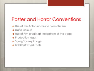
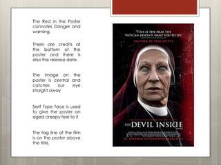
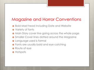
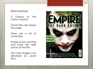
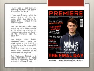

The document discusses conventions used in horror film posters and magazines. It notes that posters typically use the film's actors' names to promote it, dark colors, credits and logos at the bottom, and a scary central image. Horror magazine conventions include a bold masthead with date and website, varied fonts, a main cover story line across the page, smaller additional lines, and an eye-catching central image that conveys the dark nature of featured films without disrupting other elements. The document also analyzes the effects of dark color schemes, low-key lighting, and fast-paced editing in horror film trailers.


