Download to read offline

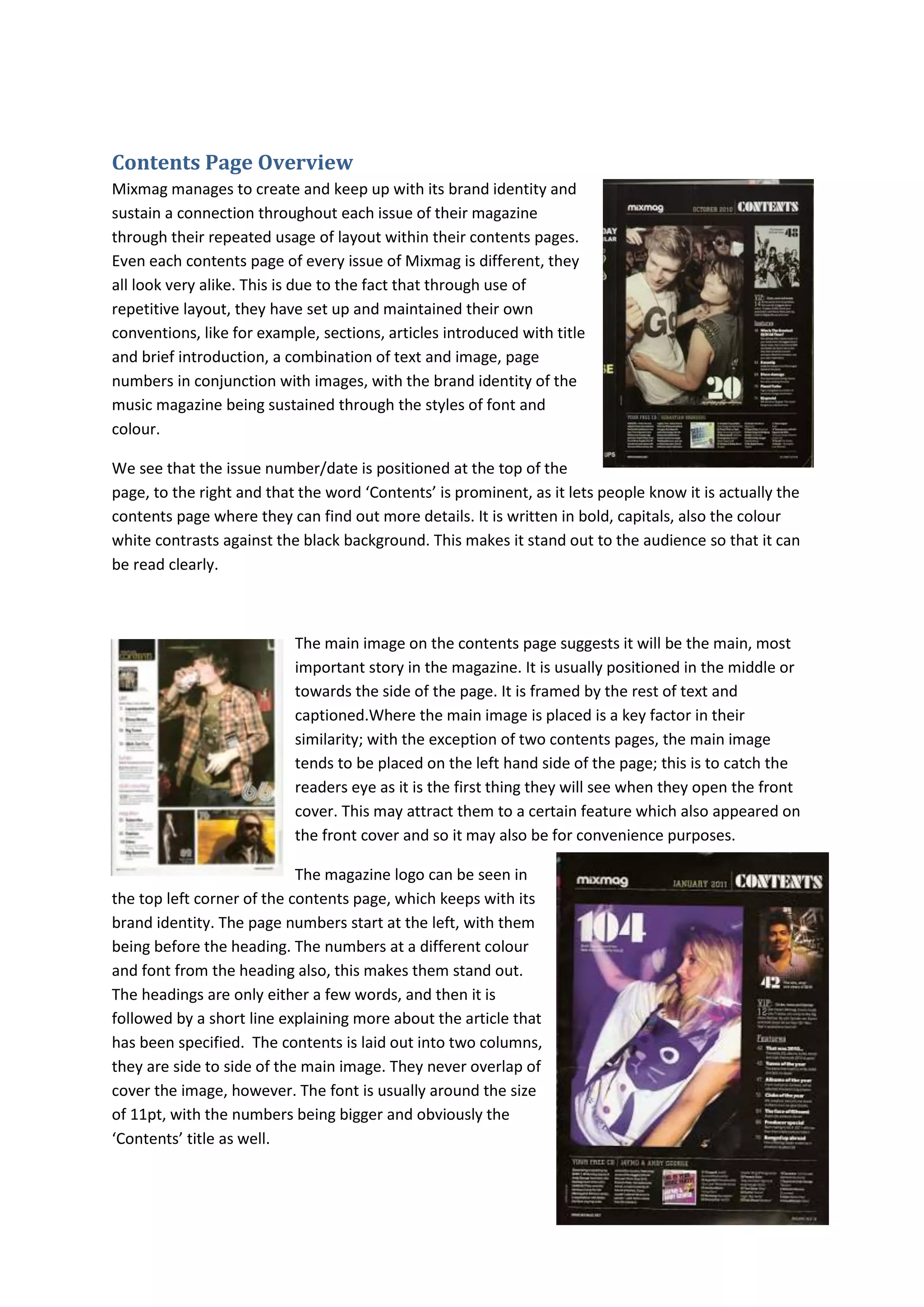

Mixmag magazine maintains consistency across issues in their contents pages through repetitive layout conventions. These include sections and articles introduced with titles and brief introductions, a combination of text and images, page numbers paired with images, and consistent fonts and colors. The issue number is prominently displayed at the top right, while the word "Contents" stands out in bold and white text on a black background. A large main image is usually framed on the left side to catch readers' attention. Headings are only a few words followed by short explanations, and the contents are laid out in two columns on either side of the central image, without overlapping it.


