1. Contents Analysis
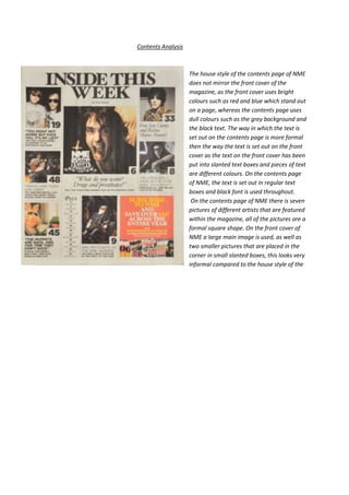
The house style of the contents page of NME
does not mirror the front cover of the
magazine, as the front cover uses bright
colours such as red and blue which stand out
on a page, whereas the contents page uses
dull colours such as the grey background and
the black text. The way in which the text is
set out on the contents page is more formal
then the way the text is set out on the front
cover as the text on the front cover has been
put into slanted text boxes and pieces of text
are different colours. On the contents page
of NME, the text is set out in regular text
boxes and black font is used throughout.
On the contents page of NME there is seven
pictures of different artists that are featured
within the magazine, all of the pictures are a
formal square shape. On the front cover of
NME a large main image is used, as well as
two smaller pictures that are placed in the
corner in small slanted boxes, this looks very
informal compared to the house style of the
2. contents page.
The contents page I have chosen uses different serif texts to show the different articles inside, this
draws the reader’s attention as serif texts are eye catching and decorative and therefore look
attractive. The text is lay out in separate text boxes which are placed in different sections of the page,
this draws the reader’s attention as the text is easy to read and does not look like there is an
overwhelming amount of text to read.
Page numbers are placed next to the relevant pictures and text in order for the reader to be able to
navigate the magazine, and know which article is on which page. In each section of the contents
page there is a small picture, a piece of text and a page number which correspond to one another.
The NME contents page ensures that the reader will buy the magazine again as in the terminal area
of the page there is an advertisement to subscribe to the magazine. The advertisement says that the
reader can ‘save over £46 across the entire year’ this will attract the reader as the chance to save
that amount of money is a very positive factor that a magazine can offer. The advertisement uses
bright colours as the text is yellow and the background is red, these colours are used to attract the
reader’s attention to the advertisement.
The house style of the contents page of
Mixmag does not mirror the front cover of
the magazine as the contents page uses the
colour black for the background and the
image used also uses dull colours, whereas
the front cover uses bright and positive
colours. Although, a similarity between the
house style of the front cover and contents
page of Mixmag is the colour yellow, which
is used for sections of text on both pages.
The way in which the text is set out is
different on the contents page and the front
cover as on the contents page the text is set
out in very formal columns whereas on the
front cover of the magazine the text is set
out in irregular, informal, text boxes.
On the contents page of Mixmag one
main image is used of a woman model, this
is the same as the front cover of Mixmag as
only one image is used on this page also, and
the picture is of a woman model. The image
used on the contents page uses dark colours
for the models hair and makeup making the
page, whereas the model on the front cover of the magazine is wearing a brightly coloured bikini and
the background is light and positive. The dark colours on the contents page, make the magazine
3. appear edgier and therefore attracts a wider audience.
Sans Serif text is used for most of the contents page, this links in with the formal layout of the
contents page and also the formal colours and picture used. This is the opposite of the front cover as
most of the text used on the front cover is serif font.
Page numbers are placed next to the names of different articles in the magazine so that they are
easy to locate. The Mixmag contents page ensures that the reader will continue to buy Mixmag as
there is an advertisement for a ‘free CD’; this is appealing to the reader as they get a free gift when
they buy the magazine.
Comparing
both NME and Mixmag’s contents page’s use dark, bland colours that give a formal effect to the
page. The pictures used on both contents pages are formal as well, as they use dark lighting and dark
clothing for the models/ artists who the pictures are of. The text on each contents page is also formal
as the colours used for the text are black and white. In comparison, the text used on the contents
page of NME is mainly serif, whilst the text used on Mixmag is mainly San Serif. Therefore the house
style of the contents page of NME is more informal than that of Mixmag.