
Recommended
More Related Content
What's hot
What's hot (17)
Viewers also liked
Viewers also liked (6)
Similar to Contetns research 2
Similar to Contetns research 2 (20)
More from HARLEENDHILLON98
More from HARLEENDHILLON98 (6)
Recently uploaded
Recently uploaded (20)
Contetns research 2
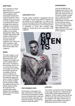
- 1. MASTHEAD: The masthead is a large letter which is a V representing the masthead of the magazine which was placed onto the front cover of the article. This is a feature which is common to all vibe magazine which is positioned at the top of the page which gives the magazine and consistent look. This “v” also acts as a logo for the company as it allows it to be clearly distinguished. Many of the contents pages within Vibe contain a monochrome theme as it has been included within this magazine, the V which has been included is a dark grey colour so it conforms to the house style of this magazine. CONTENTS TITLE: The title saying “Contents” is displayed at the top of the page in a bold, sans serif font. However it is not placed on one straight line, it is split up into three and contrasts with the title making it stand out from the crowd.Doing this is a commonthing which is presented in many vibe contents page magazine, conforming to the house style of the magazine. SUBHEADINGS: Such as the title the sub headings which were on the page they are portrayed in a bold style. However they are of more of a joined up style which makes the contents page look much more sophisticated. The font used for this particular picture links to the colour scheme and Kanye’s clothes which again makes all of the aspects into the house style of the magazine. IMAGE: The main image is a mid- shot of the rapper Kanye West who has an arm covering his shoulder with a heart shaped object in their hands. The heard is the only thing which is not in a monochrome colour on the page, the use of the red image may give the connotations that the woman is trying to win over his heart. The image dominates the page as it cover a range of hotspots. As he is looking straight into the camera it makes the audience feel like he is looking directly at them. He is placed on the contents page clearly displays the connotations that he is the main feature of this article. PHOTOGRAPHY INFO: At the bottom of the page in the right corner there is a few lines of text which give photography details such as the artists name, when and where the photos were taken and who took the photo. This gives the audience extra information. CONTENT: The content is positioned under the heading on the page, this gives an in depth into the content which will be displayed within the magazine. The font colour is grey which ties into the house style and colour scheme of the magazine. The page numbers are in a bolder fonts so the audience were able to differentiate these from the content.
- 2. IMAGE: There is a range of images which are placed on the contents page, the main image can be clearly distinguished as it is the largest of them all. It is positioned at the top, this gives the impression that this is also the main article which is on the page. The image being quite large means that it attracts the audience to the article as it hits many of the hotspots which are on the page. SUB IMAGE: There is one sub image which is placed on the page, this is used to support the content which is placed at the bottom of the page. The sub image is a much smaller image which gives the connotation that it is not the main part of the magazine. The small sub image allows the user to quickly skin he contents page. LAYOUT: The contents page is separated into three sections; the main section which is indicated by the large image which is placed onto within this sections. The second section which is included within the contents page is the features which is extended across the left side of the page. This states the different articles which will be featured within the magazine, before each description the page number is placed in a red font corresponding to the title which is placed at the top. The third section of the layout of the contents page is the review sections which states all of the articles which are going to be reviewed. DATE/NUMBER: The date and issue number are placed at the top of the page, they give the reader extra information such as whether the issue which they are reading is the latest issue. The date states when the issue was published. PAGE NUMBERS: The page numbers are placed onto the page which informs the audience of what page this article is going to be. The page numbers are of a different colour to the other features placed on the contents page which make them much more apparent to the audience. When referring to the image the page numbers and headings are placed above this in a white box where the opacity has been lowered. COLOUR SCHEME: There has been a limited colour scheme which has been placed onto the page. The main colour which has been featured on the page is grey, this is used throughout the page as the background for some of the aspects. The next colour which is features in the page is a red, this is used for the headings and the page numbers. The use of the colour red makes it stand out from the grey background. The third colour which is featured is black, this colour is primarily featured for the backgrounds which have been used for the headings.
- 3. MASTHEAD: The masthead is a large letter which is a V representing the masthead of the magazine which was placed onto the front cover of the article. This is a feature which is common to all vibe magazine which is positioned at the top of the page which gives the magazine and consistent look. This “v” also acts as a logo for the company as it allows it to be clearly distinguished. Many of the contents pages within Vibe contain a monochrome theme as it has been included within this magazine, the V which has been included, is an outline against the grey gradient background and has been outlined using white text. CONTENTS TITLE: The title saying “Contents” is displayed at the top of the page in a bold, sans serif font. However it is not placed on one straight line, it is split up into three and contrasts with the title making it stand out from the crowd.Doing this is a commonthing which is presented in many vibe contents page magazine, conforming to the house style of the magazine. SUBHEADINGS: Such as the title the sub headings which were on the page they are portrayed in a bold style. However they are of more of a joined up style which makes the contents page look much more sophisticated. The font used for this particular picture links to the colour scheme and the artists clothes which again makes all of the aspects into the house style of the magazine. The black font also makes them easy to read against the grey gradient background. CONTENT: The content is positioned under the heading on the page, this gives an in depth into the content which will be displayed within the magazine. The font colour is grey which ties into the house style and colour scheme of the magazine. The page numbers are in a bolder fonts so the audience were able to differentiate these from the content. The use of a different font for this content allows it to be clearly distinguished from the rest of the aspects on the page. PHOTOGRAPHY INFO: At the bottom of the page in the right corner there is a few lines of text which give photography details such as the artists name, when and where the photos were taken and who took the photo. This gives the audience extra information. IMAGE: The main image is placed in the centre of the page, the model is looking directly at the camera making. She is dressed in off grey clothes which link into the colour scheme included in the page but ensure that she does blend in with the background of the page. She is dressed in quite provocative clothing which ties into the genre of the magazine being a hip/hop music magazine. The use of the heels also give the impression of a very provocative picture.