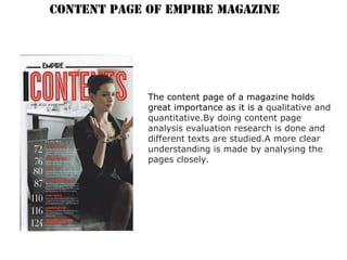
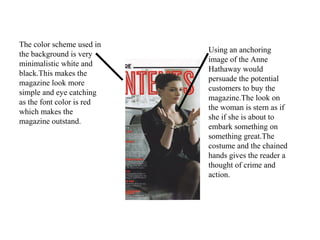
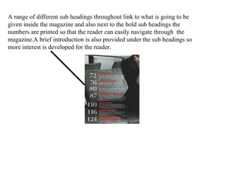
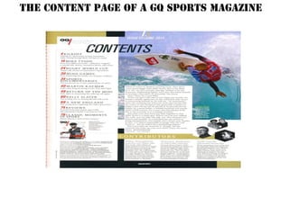
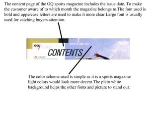
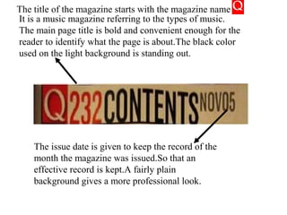
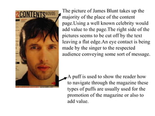
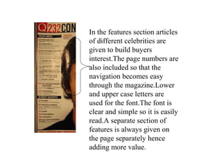
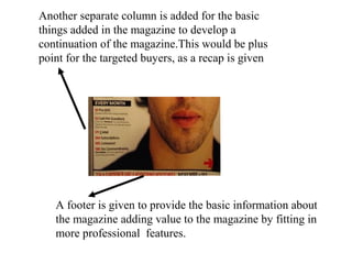
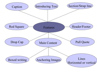
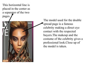
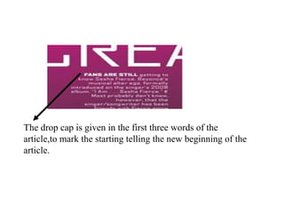
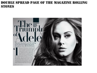
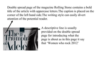
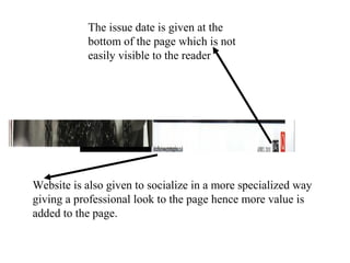
Content Page Analysis
Features
Page Title
Anchoring Images Letter from the editor
Magazine Credits
Puff
Header/Footer
Content SectionPromotion
CONTENT PAGE OF EMPIRE MAGAZINE
The content page of a magazine holds
great importance as it is a qualitative and
quantitative.By doing content page
analysis evaluation research is done and
different texts are studied.A more clear
understanding is made by analysing the
pages closely.
The title is ‘Contents’ it is clear and easy to see as it is red and
bold and also it is the largest text on the whole page.The red on
the top of the black and white background follows on the
theme from the front cover of the magazine.
The date is
provided on the
content page it
is a common
convention,basi
cally to know
when the
magazine came
or to which
month it
belongs to.
The name of the
magazine is also
given on the
content page to
make a
continuation flow
meaning dose not
breaks the readers
interest hence
creating brand
loyalty.
The color scheme used in
the background is very
minimalistic white and
black.This makes the
magazine look more
simple and eye catching
as the font color is red
which makes the
magazine outstand.
Using an anchoring
image of the Anne
Hathaway would
persuade the potential
customers to buy the
magazine.The look on
the woman is stern as if
she if she is about to
embark something on
something great.The
costume and the chained
hands gives the reader a
thought of crime and
action.
A range of different sub headings throughout link to what is going to be
given inside the magazine and also next to the bold sub headings the
numbers are printed so that the reader can easily navigate through the
magazine.A brief introduction is also provided under the sub headings so
more interest is developed for the reader.
The content page of a GQ sports magazine
The content page of the GQ sports magazine includes the issue date. To make
the customer aware of to which month the magazine belongs to.The font used is
bold and uppercase letters are used to make it more clear.Large font is usually
used for catching buyers attention.
The color scheme used is simple as it is a sports magazine
light colors would look more decent.The plain white
background helps the other fonts and picture to stand out.
This content page is
not much complicated
as it divided in two
sections,it is not
cluttered but easy to
read,page numbers are
also added and
understandable whilst
being attractive at the
same time.It has a
simple title with a
basic listing down of
subheadings on the
left hand
side.Different names
of famous sportsmen
and the famous news
of world records
which would become
eye catching for the
interested people in
sports.
Another example of the same
magazine is given by giving a
highlight of the same magazine
cover with a well known sports
men.
A letter from the editor is given to build more
interest for the readers as they are keen to
know what the editor is conveying.
The contributors play a vital
role by giving their opinion
and what their interests
are.More value is added to
the magazine as famous
notes are written by well
known people.
The picture of the sports man is
given while practicing a sport.It is
also a way of promoting the sport
or the particular game he is
playing.A 3d effect is also given by
the splash of the water hitting the
boat.
The content page of Q magazine
The title of the magazine starts with the magazine name
It is a music magazine referring to the types of music.
The main page title is bold and convenient enough for the
reader to identify what the page is about.The black color
used on the light background is standing out.
The issue date is given to keep the record of the
month the magazine was issued.So that an
effective record is kept.A fairly plain
background gives a more professional look.
The picture of James Blunt takes up the
majority of the place of the content
page.Using a well known celebrity would
add value to the page.The right side of the
pictures seems to be cut off by the text
leaving a flat edge.An eye contact is being
made by the singer to the respected
audience conveying some sort of message.
A puff is used to show the reader how
to navigate through the magazine these
types of puffs are usually used for the
promotion of the magazine or also to
add value.
In the features section articles
of different celebrities are
given to build buyers
interest.The page numbers are
also included so that the
navigation becomes easy
through the magazine.Lower
and upper case letters are
used for the font.The font is
clear and simple so it is easily
read.A separate section of
features is always given on
the page separately hence
adding more value.
Another separate column is added for the basic
things added in the magazine to develop a
continuation of the magazine.This would be plus
point for the targeted buyers, as a recap is given
A footer is given to provide the basic information about
the magazine adding value to the magazine by fitting in
more professional features.
DOUBLE SPREAD PAGE
ANALYSIS
Features
Caption
Red Square
Drop Cap Main Content
Section/Strap line
Header/Footer
Lines
Horizontal or vertical
Introducing Text
Pull Quote
Boxed writing Anchoring Images
Double spread page of Fiercely Creative
magazine
The title of the article is the largest text on the whole
page.The font is bold and white color is used for the
caption whereas the background is purple and gray which
makes a great color combination.Uppercase letters are used
for the caption.
A catchy line is given on the page to
divert customers to buy the
magazine.Uppercase letters are used so it
becomes easy for the buyers to read and
also to persuade to buy the magazine.
A descriptive line is given to entice the
buyer and to know what content is
available in the magazine.As in this page
the line is written by Gail Mitchell a well
known person would force the fans of the
celebrity to buy the magazine.Again
upper case letters are used so it becomes
easy to catch customers attention.
Different color tones are used,from the
top the page has light colors and as it
comes to the bottom of the page the
tone becomes darker.Using 2 shades of
purple would give a more effective
look.
This horizontal line is
placed in the center as
a separator of the two
pages.
The model used for the double
spread page is a famous
celebrity making a direct eye
contact with the respected
buyers.The makeup and the
costume of the celebrity gives a
professional look.Close up of
the model is taken.
The drop cap is given in the first three words of the
article,to mark the starting telling the new beginning of the
article.
Double spread page of the magazine Rolling
Stones
Double spread page of the magazine Rolling Stone contains a bold
title of the article with uppercase letters.The caption is placed on the
corner of the left hand side.The writing style can easily divert
attention of the potential reader.
A descriptive line is usually
provided on the double spread
page for introducing what the
page is about as in this page it say
that ‘Women who rock 2012’
Introducing line of the page said by a well
known person David Browne these types of
features add value and also helps to
motivate the potential buyers as the readers
do get influence by the role models they
follow.
This ‘I’ is the drop
cap of the page
marking the
beginning of the
article.
The color scheme of the magazine varies as the background is
lighter toner so that the anchoring black and white image stands
out.
Website is
given so the
readers can
easily
communicate
with the
magazine
editor
Adele being a well known
celebrity is used as the main
image.The expression of the
model gives a warm feel
hence attracting the potential
buyers.The black and white
image on the page outstands
on the whole page as the
background used is lighter in
tone,giving a professional
look.Moreover the model is
not making a direct control
rather she is pointing towards
something.
Double spread page of the magazine
The large picture of Lady Gaga
can be clearly seen by the
audience she has a great
significance amongst the
people.She is covering half of the
page.The photo has been edited
in grayish tone giving a classy
look and old.The color scheme is
made up of 3 colors black,white
and red.It can also be said that
the picture of the celebrity is
sexual mainly attracts male eye.
The large letter ‘L’ covers the other
half of the page.Representing the
name of the celebrity mentioned
above on the right hand side cover
and the color anchors magazines
logo and the way it is presented
meaning the style.
There are two drop caps in this article
first one is placed on the left hand
side marking the beginning of the
article the second drop cap is used on
the right hand side distinguishing it
from the previous article more over
starting a new beginning .
The name of the artists is given on the top of the
page.The font varies as the word lady is given in lower
case whereas the word Gaga is presented in upper case
standing out to the readers.
The issue date is given at the
bottom of the page which is not
easily visible to the reader
Website is also given to socialize in a more specialized way
giving a professional look to the page hence more value is
added to the page.

Content page analysis

  • 1.
  • 2.
    Features Page Title Anchoring ImagesLetter from the editor Magazine Credits Puff Header/Footer Content SectionPromotion
  • 3.
    CONTENT PAGE OFEMPIRE MAGAZINE The content page of a magazine holds great importance as it is a qualitative and quantitative.By doing content page analysis evaluation research is done and different texts are studied.A more clear understanding is made by analysing the pages closely.
  • 4.
    The title is‘Contents’ it is clear and easy to see as it is red and bold and also it is the largest text on the whole page.The red on the top of the black and white background follows on the theme from the front cover of the magazine. The date is provided on the content page it is a common convention,basi cally to know when the magazine came or to which month it belongs to. The name of the magazine is also given on the content page to make a continuation flow meaning dose not breaks the readers interest hence creating brand loyalty.
  • 5.
    The color schemeused in the background is very minimalistic white and black.This makes the magazine look more simple and eye catching as the font color is red which makes the magazine outstand. Using an anchoring image of the Anne Hathaway would persuade the potential customers to buy the magazine.The look on the woman is stern as if she if she is about to embark something on something great.The costume and the chained hands gives the reader a thought of crime and action.
  • 6.
    A range ofdifferent sub headings throughout link to what is going to be given inside the magazine and also next to the bold sub headings the numbers are printed so that the reader can easily navigate through the magazine.A brief introduction is also provided under the sub headings so more interest is developed for the reader.
  • 7.
    The content pageof a GQ sports magazine
  • 8.
    The content pageof the GQ sports magazine includes the issue date. To make the customer aware of to which month the magazine belongs to.The font used is bold and uppercase letters are used to make it more clear.Large font is usually used for catching buyers attention. The color scheme used is simple as it is a sports magazine light colors would look more decent.The plain white background helps the other fonts and picture to stand out.
  • 9.
    This content pageis not much complicated as it divided in two sections,it is not cluttered but easy to read,page numbers are also added and understandable whilst being attractive at the same time.It has a simple title with a basic listing down of subheadings on the left hand side.Different names of famous sportsmen and the famous news of world records which would become eye catching for the interested people in sports. Another example of the same magazine is given by giving a highlight of the same magazine cover with a well known sports men.
  • 10.
    A letter fromthe editor is given to build more interest for the readers as they are keen to know what the editor is conveying. The contributors play a vital role by giving their opinion and what their interests are.More value is added to the magazine as famous notes are written by well known people.
  • 11.
    The picture ofthe sports man is given while practicing a sport.It is also a way of promoting the sport or the particular game he is playing.A 3d effect is also given by the splash of the water hitting the boat.
  • 12.
    The content pageof Q magazine
  • 13.
    The title ofthe magazine starts with the magazine name It is a music magazine referring to the types of music. The main page title is bold and convenient enough for the reader to identify what the page is about.The black color used on the light background is standing out. The issue date is given to keep the record of the month the magazine was issued.So that an effective record is kept.A fairly plain background gives a more professional look.
  • 14.
    The picture ofJames Blunt takes up the majority of the place of the content page.Using a well known celebrity would add value to the page.The right side of the pictures seems to be cut off by the text leaving a flat edge.An eye contact is being made by the singer to the respected audience conveying some sort of message. A puff is used to show the reader how to navigate through the magazine these types of puffs are usually used for the promotion of the magazine or also to add value.
  • 15.
    In the featuressection articles of different celebrities are given to build buyers interest.The page numbers are also included so that the navigation becomes easy through the magazine.Lower and upper case letters are used for the font.The font is clear and simple so it is easily read.A separate section of features is always given on the page separately hence adding more value.
  • 16.
    Another separate columnis added for the basic things added in the magazine to develop a continuation of the magazine.This would be plus point for the targeted buyers, as a recap is given A footer is given to provide the basic information about the magazine adding value to the magazine by fitting in more professional features.
  • 17.
  • 18.
    Features Caption Red Square Drop CapMain Content Section/Strap line Header/Footer Lines Horizontal or vertical Introducing Text Pull Quote Boxed writing Anchoring Images
  • 19.
    Double spread pageof Fiercely Creative magazine
  • 20.
    The title ofthe article is the largest text on the whole page.The font is bold and white color is used for the caption whereas the background is purple and gray which makes a great color combination.Uppercase letters are used for the caption. A catchy line is given on the page to divert customers to buy the magazine.Uppercase letters are used so it becomes easy for the buyers to read and also to persuade to buy the magazine.
  • 21.
    A descriptive lineis given to entice the buyer and to know what content is available in the magazine.As in this page the line is written by Gail Mitchell a well known person would force the fans of the celebrity to buy the magazine.Again upper case letters are used so it becomes easy to catch customers attention. Different color tones are used,from the top the page has light colors and as it comes to the bottom of the page the tone becomes darker.Using 2 shades of purple would give a more effective look.
  • 22.
    This horizontal lineis placed in the center as a separator of the two pages. The model used for the double spread page is a famous celebrity making a direct eye contact with the respected buyers.The makeup and the costume of the celebrity gives a professional look.Close up of the model is taken.
  • 23.
    The drop capis given in the first three words of the article,to mark the starting telling the new beginning of the article.
  • 24.
    Double spread pageof the magazine Rolling Stones
  • 25.
    Double spread pageof the magazine Rolling Stone contains a bold title of the article with uppercase letters.The caption is placed on the corner of the left hand side.The writing style can easily divert attention of the potential reader. A descriptive line is usually provided on the double spread page for introducing what the page is about as in this page it say that ‘Women who rock 2012’
  • 26.
    Introducing line ofthe page said by a well known person David Browne these types of features add value and also helps to motivate the potential buyers as the readers do get influence by the role models they follow. This ‘I’ is the drop cap of the page marking the beginning of the article. The color scheme of the magazine varies as the background is lighter toner so that the anchoring black and white image stands out. Website is given so the readers can easily communicate with the magazine editor
  • 27.
    Adele being awell known celebrity is used as the main image.The expression of the model gives a warm feel hence attracting the potential buyers.The black and white image on the page outstands on the whole page as the background used is lighter in tone,giving a professional look.Moreover the model is not making a direct control rather she is pointing towards something.
  • 28.
    Double spread pageof the magazine
  • 29.
    The large pictureof Lady Gaga can be clearly seen by the audience she has a great significance amongst the people.She is covering half of the page.The photo has been edited in grayish tone giving a classy look and old.The color scheme is made up of 3 colors black,white and red.It can also be said that the picture of the celebrity is sexual mainly attracts male eye.
  • 30.
    The large letter‘L’ covers the other half of the page.Representing the name of the celebrity mentioned above on the right hand side cover and the color anchors magazines logo and the way it is presented meaning the style. There are two drop caps in this article first one is placed on the left hand side marking the beginning of the article the second drop cap is used on the right hand side distinguishing it from the previous article more over starting a new beginning .
  • 31.
    The name ofthe artists is given on the top of the page.The font varies as the word lady is given in lower case whereas the word Gaga is presented in upper case standing out to the readers.
  • 32.
    The issue dateis given at the bottom of the page which is not easily visible to the reader Website is also given to socialize in a more specialized way giving a professional look to the page hence more value is added to the page.