
Recommended
More Related Content
What's hot
What's hot (20)
Viewers also liked
Viewers also liked (16)
Similar to Contents page analysis 1
Similar to Contents page analysis 1 (20)
More from betsimegan
Contents page analysis 1
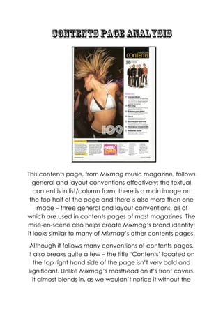
- 1. This contents page, from Mixmag music magazine, follows general and layout conventions effectively; the textual content is in list/column form, there is a main image on the top half of the page and there is also more than one image – three general and layout conventions, all of which are used in contents pages of most magazines. The mise-en-scene also helps create Mixmag‟s brand identity; it looks similar to many of Mixmag‟s other contents pages. Although it follows many conventions of contents pages, it also breaks quite a few – the title „Contents‟ located on the top right hand side of the page isn‟t very bold and significant. Unlike Mixmag‟s masthead on it‟s front covers, it almost blends in, as we wouldn‟t notice it without the
- 2. black background behind it. This therefore breaks conventions of music magazines, as in other magazines such as Top Of The Pops and NMEthere is almost always a bold „Contents‟ written around the top of the page.Mixmag have made „contents‟ less bold so that it goes with their simplistic, yet trendy, layout; if it was written in a larger font it may look tacky and not as aesthetically pleasing. However, in magazines, if the title isn‟t placed at the top of the contents page, it tends to be placed on the top left or right hand side and so, in some ways it follows conventions. It doesn‟t feature a main headline/sell-line on it however, which is also unconventional, and instead all we see is a bold “109” in a funky font underneath the main image. This suggests that Mixmag isn‟t afraid to stand out and be unique, whilst also hinting to the audience that the main story they will want to read will be on page 109 without giving away too much or using cheesy headlines/sell-lines. We only see two images feature on the contents page, which is usually full of images and looks very hectic/complex – this contents page links with the front cover in the sense that it too has a simplistic layout compared to other contents pages. The main image is really vibrant and refreshing, and makes the contents page look interesting (if you removed the main image the contents page would look basic and bare) as we see a girl dancing in a bikini top in the middle of a club/rave atmosphere. Her blonde hair is mid-air and looks slightly wild, and it is clear to the audience it is not a model posing as the image feels as if it was „caught in the moment‟ making the reader feel as if they too are in a club/rave atmosphere – they image may also remind
- 3. them of nights out they‟ve had and so they may also reminisce. The girl dancing also looks really caught up in the moment, and this makes the magazine feel much more edgy and urban. The image of the girl reflects the euphoria and freedom experienced in a club and clearly signals the genre of the magazine, which is important considering the ambiguity of the second image. The use of a „real‟ partygoer also allows the audience to feel that they are included and made part of Mixmag. They or someone they know could end up in the magazine. Although the girl is in provocative clothing, she isn‟t presented overly sexually, which is unlike Mixmag as they tend to present women in a more sexual/seductive manner. The male reader may still find her attractive, however, she isn‟t simply there to be something the male audience can look at and objectify; she is there to make the magazine feel more fun and to remind the reader of raves and clubs they have been to and why they love dance music so much. She also doesn‟t make direct address with the audience, creating a sense of mystery which may make the reader curious to find out what is on page 109. The other image which features on the page is extremely unconventional as it shows a band with five members; a few of which are holding guitars. This is a common image which would feature in magazines such as NME and Kerrang!however, guitars are never usually featured in Mixmag as that is rock iconography – Mixmag focuses solely on dance music. This is extremely unconventional and so, as said before, may reflect how Mixmag isn‟t afraid to break boundaries and conventions (it wants to stand out). There is also no other genre specific iconography on the cover which could confuse
- 4. new readers as to whether Mixmag is a dance magazine or rock magazine, however, it does reflect the loyal readers Mixmaghas as they will not question the genre of the magazine. The second image will however intrigue the readers, who will want to find out what the article is about, as it doesn‟t directly link to dance music/dance culture. The layout is also key for the main image as it is the first thing the reader will see, due to its placement on the left hand side of the page. These images – especially the main image – will draw in the reader as, stated earlier, they create a sense of anticipation and mystery, like a sell-line on a front cover, the reader will want to know the back story behind the image. They will also remind the reader of their favourite artists and memories on nights out etc. The list of contents follows the format of Mixmag as a magazine; the textual content is laid out in columns on the cover and throughout the magazine. There is a long column/list going down the right hand side and across the bottom we see smaller columns. The text on the contents page is also very light and spacious, so it doesn‟t intimidate the reader who may be put off by lots of text within the magazine.They don‟t tend to be very organised in terms of topics, and tend to just have the main article titles with a small piece of text explaining the article underneath. The articles inside are presented to the audience in a really serious way; the text under the article title hints about the article whilst not giving too much away. It suggests the reader is very spare of the moment; although they like to be organised and have some sort of
- 5. structure in their life, they like to be spontaneous and impulsive sometimes. Mode of address also helps to spark the readers interest in the articles, such as the use of direct address in the sell-line “the club live acts you must see” (underneath „live and direct‟). The reader will feel that it is imperative to turn to the article otherwise they may miss out on something which they need to know and the use of direct address will draw the target audience in. The information under articles such as „Survive you euro rave‟ (“Avoid jail, brothels and Scooteron your clubbing trip abroad with our survival guide”) is very ambiguous and wacky (making the reader curious) but also refers to dance artists/genre terms they will know such as “scooter” (Scooter is a techno artist who had a hit in the early 2000‟s which was very cheesy). Some page numbers such as 109 and 38 are also written in different font to the others signifying that these are key articles that the reader needs to take in – this could be reflective of the funky, fun-loving target audience that Mixmag appeals to; rather than having the same font within the whole contents page, Mixmag have made their contents page more aesthetically pleasing and fun to look at. The text that the content is presented in is very plain, black serif text which isn‟t really fun or vibrant at all. This may be reflective of the fact that the readership knows how to have fun but takes music seriously. The layout also follows Mixmag‟s own conventions; it has a main image on the left hand side and column on the right hand side going down, with a horizontal column going across the bottom. It maintains brand identity as it has the
- 6. same layout every issue, and the main image also shows a girl in the midst of a club/rave environment – this is a common image (a person in a club/rave environment) on the contents page. It follows the front cover in its sophisticated yet simple layout; the reader knows where to look to find what they want. It is spacious looking and easy/clear to read, even though the font is little. As there aren‟t many images featured the layout doesn‟t look very tacky or complex, and so in ways it the layout helps to maintain Mixmag‟s brand identity and theme. The information on the cover mount at the bottom of the page, which again, is a convention of Mixmag‟s contents pages, will help the reader be informed – they will be able to determine whether or not the music on the cover mount CD is for them and so they will feel as if the magazine is catered to them, personally. The contents page is nowhere near as colourful as the front cover usually is and looks much more basic compared to it. It features mostly white, black and yellow as a colour scheme and it doesn‟t seem very vibrant. However, the colour scheme reflects the male readership and makes the magazine seem much more serious than it would with a bright colour scheme for the contents page. Although it looks slightly bland, it also helps to make the contents page look more spacious therefore the information is easier to digest for the reader. As stated before, these colours reflect the serious side to the reader‟s love of dance music, showing that although they like to go out and have fun they are passionate about dance music and take this passion seriously.
- 7. In conclusion this contents page from Mixmag maintains and creates their brand identity and also reflects readership within the magazine through things such as font, typeface and colour scheme.