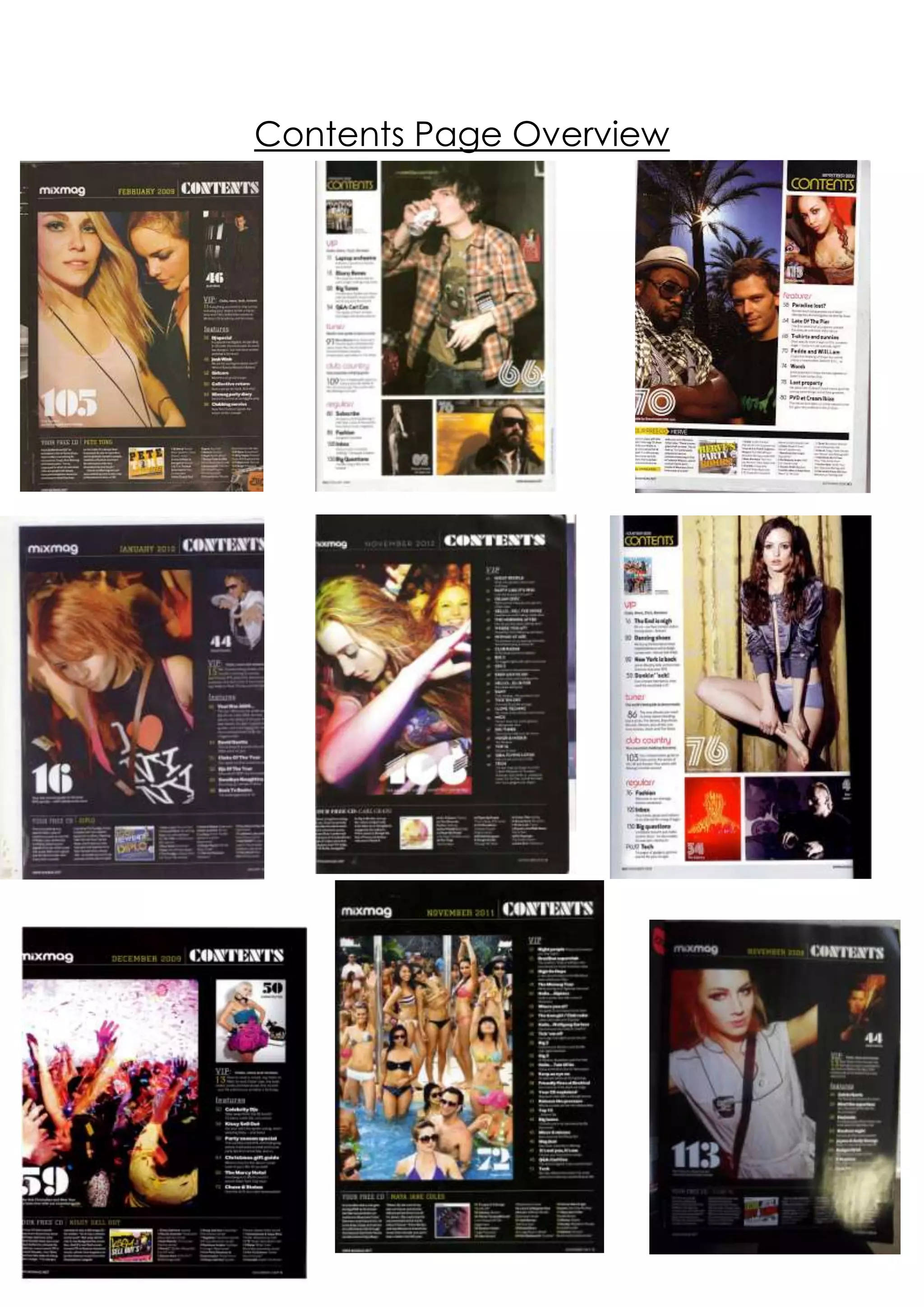
Contents Page Overview
Mixmaghave managed to create and maintain brand
identity and maintain a link throughout each issue of their
magazinethrough their repetitive use of layout within their
contents pages. Although each contents page is different
or unique in some way, they all look very similar.

Firstly, where the main image is placed is a key factor in
their similarity; with the exception of two contents pages,
the main image tends to be placed on the left hand side
of the page; this is to catch the readers eye as it is the first
thing they will see when they open the front cover. This
may attract them to a certain feature which also
appeared on the front cover and so it may also be for
convenience purposes. The main images are also all very
similar; apart from the sixth contents page (which features
a woman in shorts posing with a wall behind her) as they
are all images taken in a party type setting, and they also
predominantly feature partygoers (apart from the one
stated before and the third which features Will.I.Am and
Fedde Le Grand) and so it creates a very party/rave feel
to the magazine, which the readers can relate to as they
too will have been in this type of setting. Another feature
which is common amongst nearly all the main images is
that they feature women; some are presented more
provocatively than others, however, all are good looking
– this will appeal to and attract the target audience of
young males.

Within all the contents pages, there is no main headline or
title that would be common in magazines such as NME. It
simply has ‘contents’ in a display font at either top left or
right; this is so it goes with the simplistic layout of each
contents page and also as it will leave the reader
ambiguous as to what is in the magazine – they will want
to see for themselves what is in the magazine and wont
be able to know until they read it. It also reinforces
Mixmag’s trendy and cool image; they don’t use tacky
gimmicks or make a really obvious effort to draw in their
readers. In the same way, instead of having a huge big of
text on their contents page which signals where a main
article is, they have a large number in a different display
font at the corner of the main image.

Almost all text which appears on the contents pages is
also in acolumn/list type format, which reflects the design
of the magazine (inside Mixmagit is very textual, and text
tends to be set out in columns). It helps to maintain and
reinforce brand identity, and also reflects the mature,
cool nature of the magazine. By keeping the contents
page’s text in a column layout each week, the reader will
feel as if they recognise and know the magazine and will
also know where to look to find certain articles.

Although the contents pages are all very similar, they do
differ in some ways. For example, the majority have a
black background to reflect the nightlife that is
associated with dance music, however, three of the
contents pages instead have a white background; this
could be due to a revamp Mixmag had in 2006. However,
it also shows how Mixmag has evolved as a brand identity
– their contents pages that are more recent mesh more
with the magazine and look very polished and
professional. The black background helps to keep in line
with colour schemes whereas before hand, the white
background with black text and a yellow ‘contents’ title
made it look slightly tacky and out of place.

Another feature which differentiates the contents pages is
feature article photographs; Mixmag don’t tend to
feature any of these on the front cover which helps to
maintain their cool and trendy image. However, they do
appear on some of the contents pages, which suggests
that Mixmag isn’t afraid to break conventions and likes to
switch up their style sometimes, just like their readers.

Contents page overview

  • 1.
  • 2.
    Mixmaghave managed tocreate and maintain brand identity and maintain a link throughout each issue of their magazinethrough their repetitive use of layout within their contents pages. Although each contents page is different or unique in some way, they all look very similar. Firstly, where the main image is placed is a key factor in their similarity; with the exception of two contents pages, the main image tends to be placed on the left hand side of the page; this is to catch the readers eye as it is the first thing they will see when they open the front cover. This may attract them to a certain feature which also appeared on the front cover and so it may also be for convenience purposes. The main images are also all very similar; apart from the sixth contents page (which features a woman in shorts posing with a wall behind her) as they are all images taken in a party type setting, and they also predominantly feature partygoers (apart from the one stated before and the third which features Will.I.Am and Fedde Le Grand) and so it creates a very party/rave feel to the magazine, which the readers can relate to as they too will have been in this type of setting. Another feature which is common amongst nearly all the main images is that they feature women; some are presented more provocatively than others, however, all are good looking – this will appeal to and attract the target audience of young males. Within all the contents pages, there is no main headline or title that would be common in magazines such as NME. It
  • 3.
    simply has ‘contents’in a display font at either top left or right; this is so it goes with the simplistic layout of each contents page and also as it will leave the reader ambiguous as to what is in the magazine – they will want to see for themselves what is in the magazine and wont be able to know until they read it. It also reinforces Mixmag’s trendy and cool image; they don’t use tacky gimmicks or make a really obvious effort to draw in their readers. In the same way, instead of having a huge big of text on their contents page which signals where a main article is, they have a large number in a different display font at the corner of the main image. Almost all text which appears on the contents pages is also in acolumn/list type format, which reflects the design of the magazine (inside Mixmagit is very textual, and text tends to be set out in columns). It helps to maintain and reinforce brand identity, and also reflects the mature, cool nature of the magazine. By keeping the contents page’s text in a column layout each week, the reader will feel as if they recognise and know the magazine and will also know where to look to find certain articles. Although the contents pages are all very similar, they do differ in some ways. For example, the majority have a black background to reflect the nightlife that is associated with dance music, however, three of the contents pages instead have a white background; this could be due to a revamp Mixmag had in 2006. However, it also shows how Mixmag has evolved as a brand identity – their contents pages that are more recent mesh more with the magazine and look very polished and
  • 4.
    professional. The blackbackground helps to keep in line with colour schemes whereas before hand, the white background with black text and a yellow ‘contents’ title made it look slightly tacky and out of place. Another feature which differentiates the contents pages is feature article photographs; Mixmag don’t tend to feature any of these on the front cover which helps to maintain their cool and trendy image. However, they do appear on some of the contents pages, which suggests that Mixmag isn’t afraid to break conventions and likes to switch up their style sometimes, just like their readers.