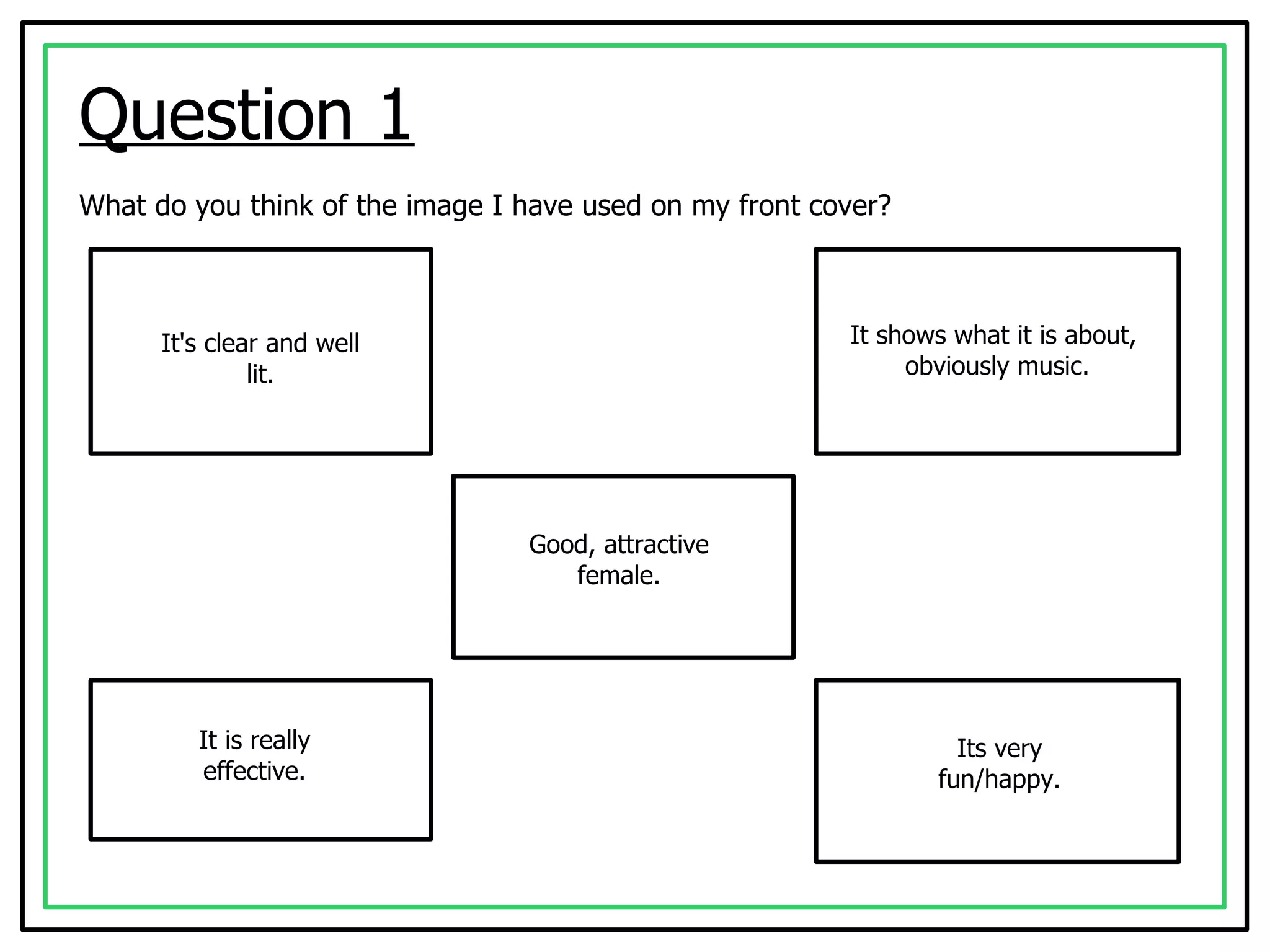
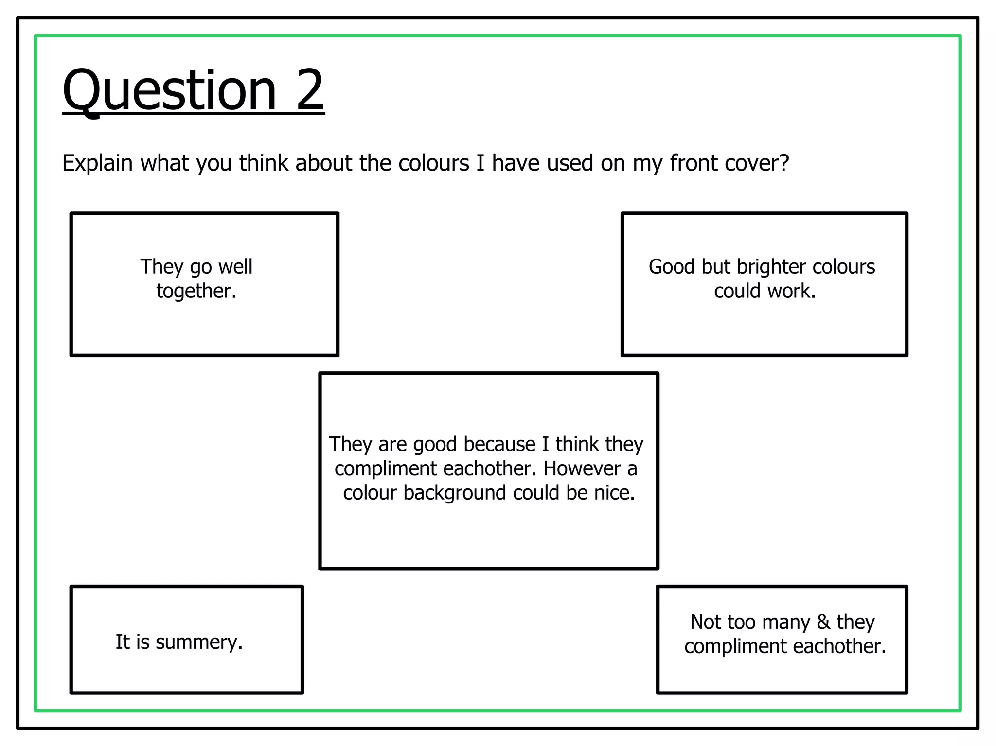
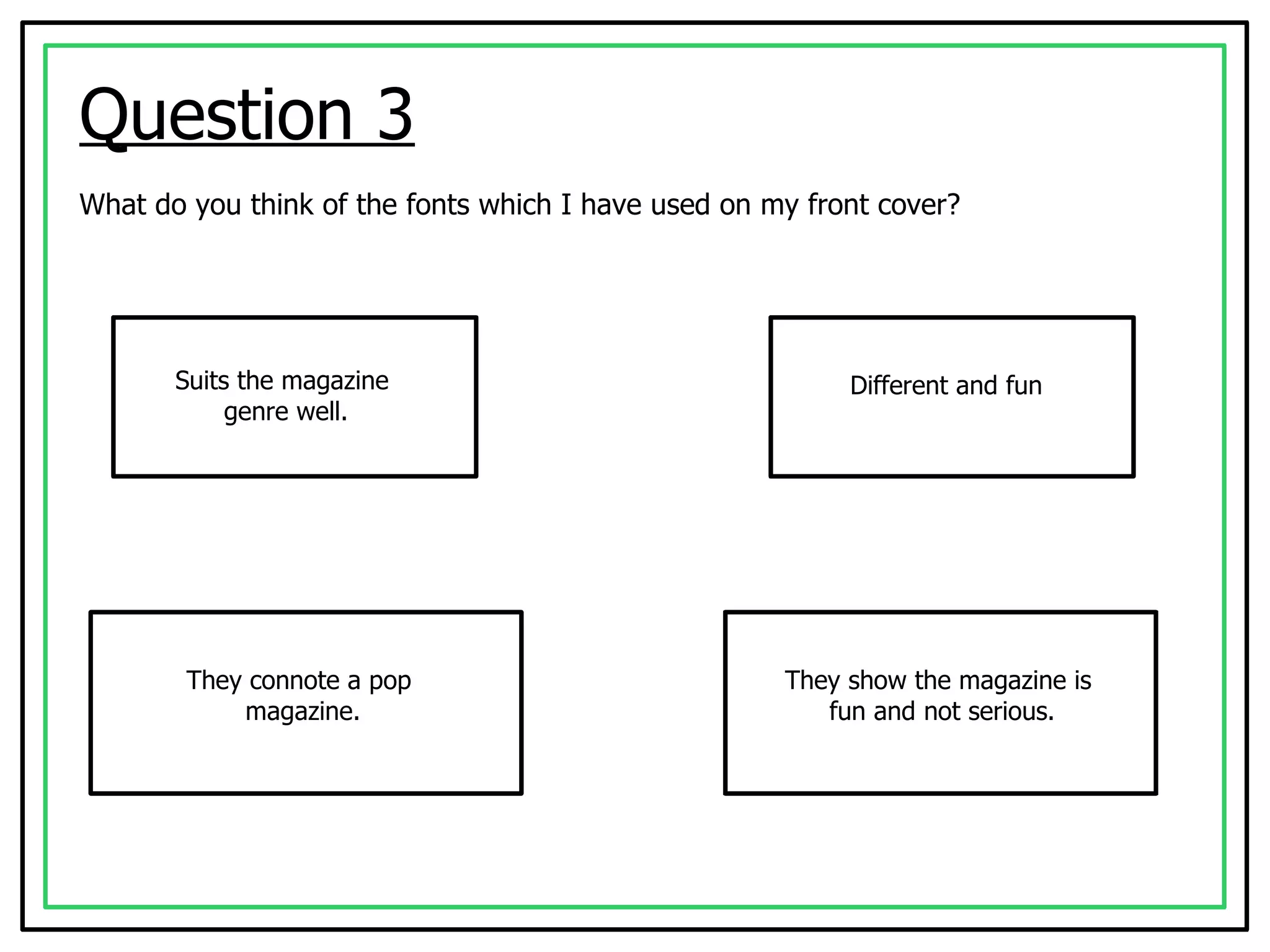
Audience Feedback   Open Questionnaire Beth Shannon
Question 1 What do you think of the image I have used on my front cover? It's clear and well lit. It shows what it is about,  obviously music. Good, attractive female. It is really effective. Its very fun/happy.
Question 2 Explain what you think about the colours I have used on my front cover? They go well together. Good but brighter colours  could work. They are good because I think they  compliment eachother. However a  colour background could be nice. It is summery. Not too many & they  compliment eachother.
Question 3 What do you think of the fonts which I have used on my front cover? Suits the magazine  genre well. Different and fun They connote a pop  magazine. They show the magazine is  fun and not serious.
Question 4 Explain what you think of the layout of my contents page? It's clear and easy to read. It looks cool with a wide  range of images. Looks neat. The layout is great. It's very neat and easy  to understand.
Question 5 What do you think of the pages I have put on my contents page? They all seem realistic. They seem quite  interesting. Authentic & professional. They connote a pop  magazine. They are easy to  understand.
Question 6 What do you think of the images I have used on my contents page? They link to front cover. Good. They relate to the pages  in the magazine. It makes you want to  see what it is about. They go with the theme  of the magazine.
Question 7 Explain what you think of my double page article? I like the colours. It's brilliant. Easy to understand. Its well laid out. Looks quite interesting and  a lot of text to read.
Question 8 What do you think of the images used on my double page article? They relate to the  text. Immediately know it is a music  magazine just by the images. Clear & professional. They are really  effective.
Question 9 What do you think of the colours I have used on my double page article? They go well  together. Links with house style. Simple but brilliant. They are simple. The contrast is a positive thing.
Question 10 Explain your opinion on how all three of my pages link together. Wicked. Colours link together. Colour scheme runs  through all three. Seem interesting  and exciting. Looks entertaining. Can tell there  all from the same magazine .
Question 11 What could I improve on for all of my pages? I really don't know. Adding more images  on article. The colour range, use brighter  colours to make it stand out. More pictures.
Question 12 Explain how you think my magazine fits with my target audience? Very well, I would  buy it. Because the text connotes a pop magazine. Its clear that the genre is pop  so it will appeal to pop lovers. It looks fun and is a simple design for young adults.

Audience feedback open

  • 1.
    Audience Feedback Open Questionnaire Beth Shannon
  • 2.
    Question 1 Whatdo you think of the image I have used on my front cover? It's clear and well lit. It shows what it is about, obviously music. Good, attractive female. It is really effective. Its very fun/happy.
  • 3.
    Question 2 Explainwhat you think about the colours I have used on my front cover? They go well together. Good but brighter colours could work. They are good because I think they compliment eachother. However a colour background could be nice. It is summery. Not too many & they compliment eachother.
  • 4.
    Question 3 Whatdo you think of the fonts which I have used on my front cover? Suits the magazine genre well. Different and fun They connote a pop magazine. They show the magazine is fun and not serious.
  • 5.
    Question 4 Explainwhat you think of the layout of my contents page? It's clear and easy to read. It looks cool with a wide range of images. Looks neat. The layout is great. It's very neat and easy to understand.
  • 6.
    Question 5 Whatdo you think of the pages I have put on my contents page? They all seem realistic. They seem quite interesting. Authentic & professional. They connote a pop magazine. They are easy to understand.
  • 7.
    Question 6 Whatdo you think of the images I have used on my contents page? They link to front cover. Good. They relate to the pages in the magazine. It makes you want to see what it is about. They go with the theme of the magazine.
  • 8.
    Question 7 Explainwhat you think of my double page article? I like the colours. It's brilliant. Easy to understand. Its well laid out. Looks quite interesting and a lot of text to read.
  • 9.
    Question 8 Whatdo you think of the images used on my double page article? They relate to the text. Immediately know it is a music magazine just by the images. Clear & professional. They are really effective.
  • 10.
    Question 9 Whatdo you think of the colours I have used on my double page article? They go well together. Links with house style. Simple but brilliant. They are simple. The contrast is a positive thing.
  • 11.
    Question 10 Explainyour opinion on how all three of my pages link together. Wicked. Colours link together. Colour scheme runs through all three. Seem interesting and exciting. Looks entertaining. Can tell there all from the same magazine .
  • 12.
    Question 11 Whatcould I improve on for all of my pages? I really don't know. Adding more images on article. The colour range, use brighter colours to make it stand out. More pictures.
  • 13.
    Question 12 Explainhow you think my magazine fits with my target audience? Very well, I would buy it. Because the text connotes a pop magazine. Its clear that the genre is pop so it will appeal to pop lovers. It looks fun and is a simple design for young adults.