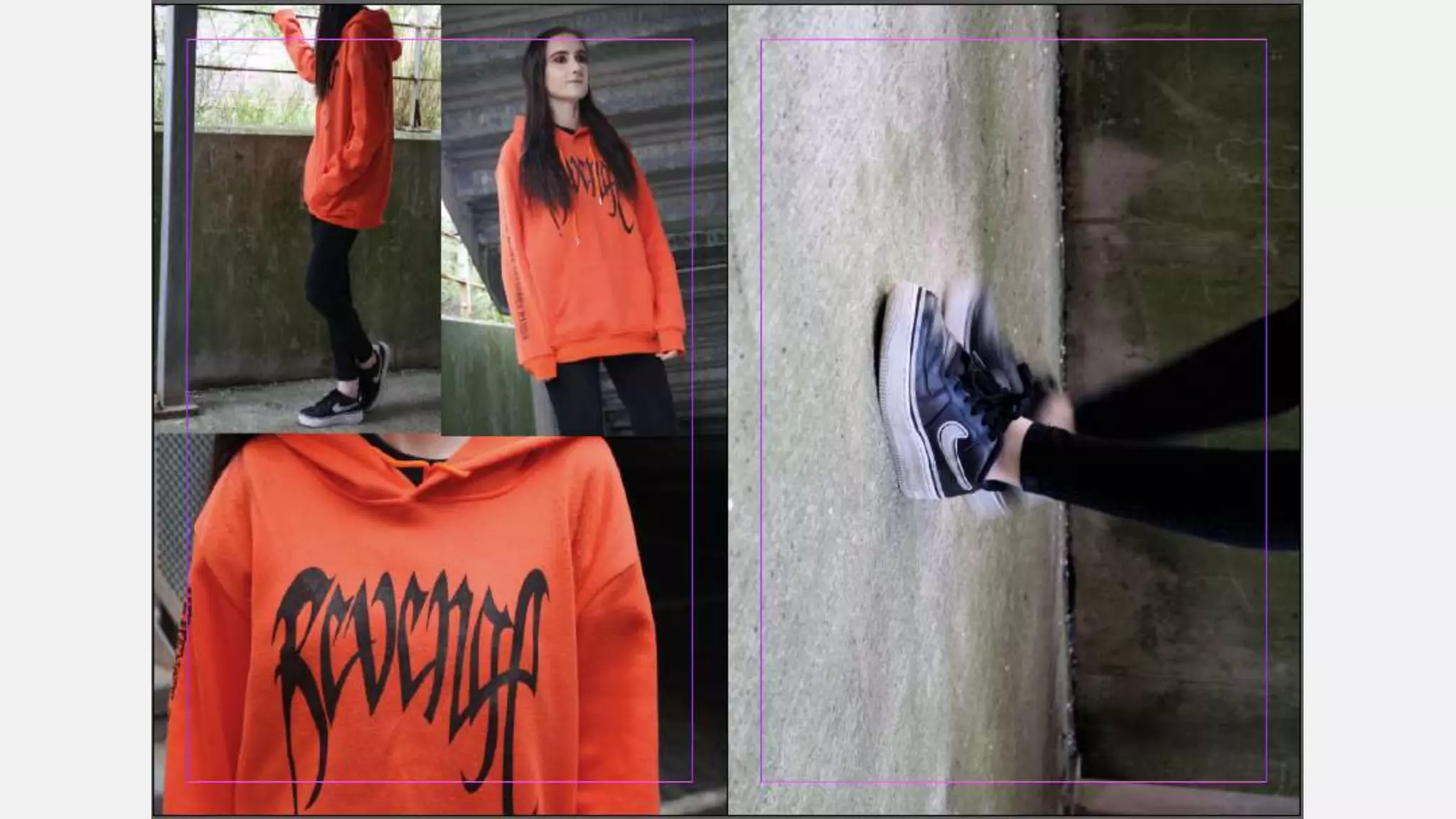
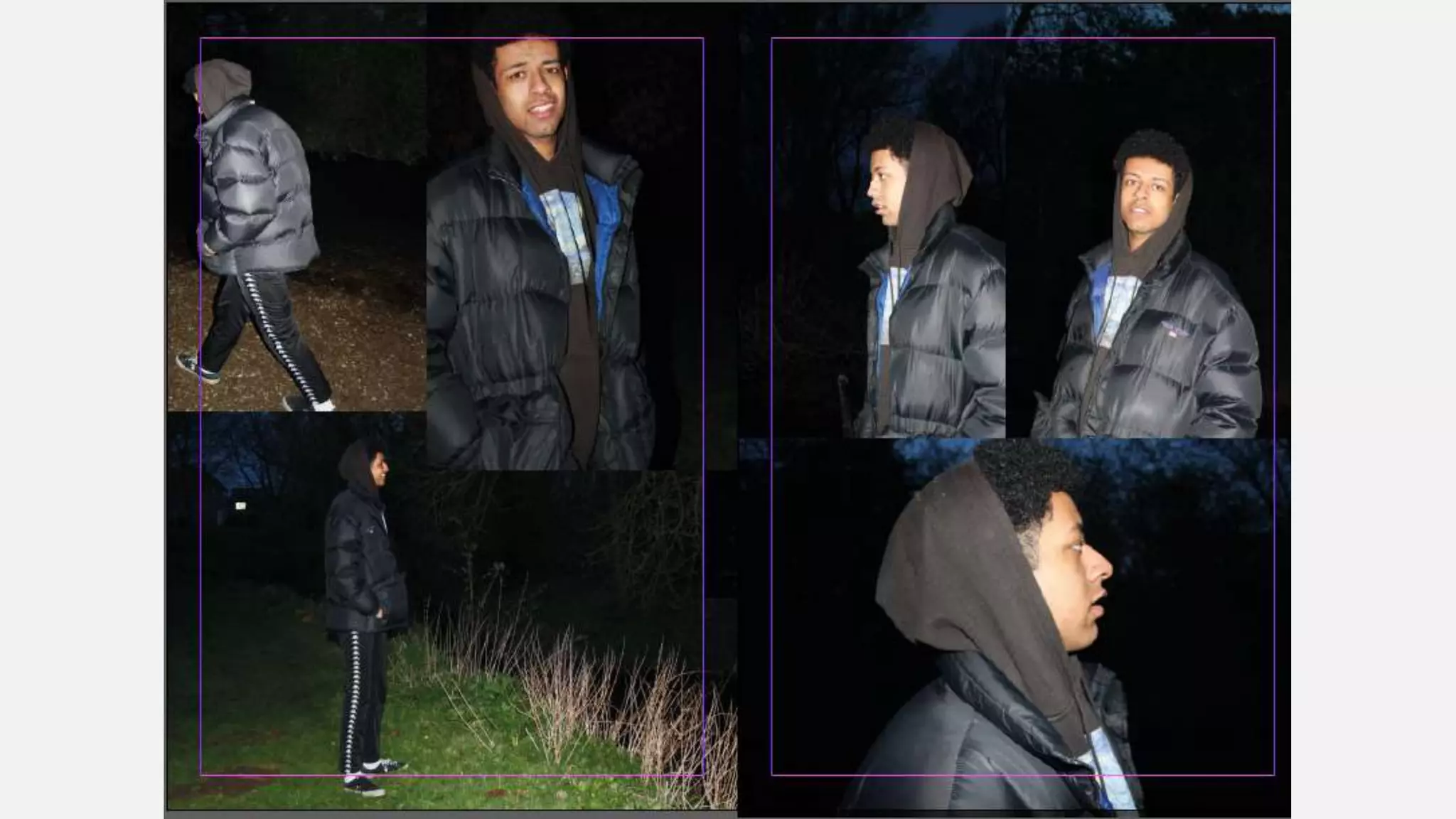
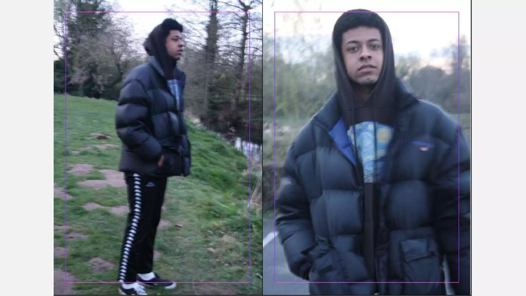
SlideShare a Scribd company logo
STREETWEAR FASHION/PHOTOGRAPHY
MAGAZINE
• What do you think of the layouts? Very basic
• Is the colour scheme too broad? Does it need to be more specific? Why? No it goes
with the pages nicely
• What do you think of the photography? Not the best quality, doesn't look like a lot of
thought has gone into them especially with Horatio – idea with the page on just
horatio maybe have the background black and them layer the images over the black
background rather than the images just fitting an over laying each other
• What would you change? The layouts, looks like it was put together on word
1. What do you think of the layouts? I like the layouts, I think they all work well together
and they’re simple enough to be easy and nice to look at, but you can tell thought has
been put into all the placement of everything.
2. Is the colour scheme too broad? Does it need to be more specific? Why? No I think the
colour scheme works well as it is as it gives each page something more unique, if
everything was exactly the same it could get boring and repetitive. You also seem to
have based the colour scheme off of the images and I think this works really well as it
makes the colour scheme relevant rather than random.
3. What do you think of the photography? I think it has been done well most of the time,
but some of it could be used better on the pages, as the structure of some of them
seems a bit random. But the photography itself is good and I think when there are
articles involved you’ve worked the photo’s into this well.
4. What would you change? Some of the pages that are just photography based I would
change. The structure of them isn’t the best, I think just moving a few things around
would be good just to change some of the layouts, but apart from that everything else
seems very good and well thought through.
1. What do you think of the layouts?
2. The layouts differ from page to page which keeps me interested as I am not just
reading through the same format over and over. The layout of the text seems quite
dense on slide 12 and the writing is fairly small so this could be changed as it was quite
hard to read.
3. Is the colour scheme too broad? Does it need to be more specific? Why?
4. I like the simplicity of the existing colour scheme. Too many colours would make it too
in your face for something that is meant to be read for an interest so the simplicity
makes the reader comfortable when they read it.
5. What do you think of the photography?
6. I really like the photography on Slide 9 as it looks really professional however I am
unsure about the photography on Slide 11. I think that it may have been the better
option to have edited the blur on in Photoshop instead of taking an unfocused photo.
This way you could bring the model more into focus as this would mean the attention
is drawn more towards the model and what he is wearing rather than the image as a
whole.
7. What would you change?
8. The font for the articles could be a larger size and the empty white space could be
changed so that there are some images or shapes or patterns in the background. The
front cover is a bit empty as well. I think that an image like the one used on slide 9
SUMMARY
I think I would agree with a few of the comments and its nice that most of
these comments are quite positive with the odd constructive criticism. I think
some comments on the pages with just photos are just personal preference
because I want it to be a fashion/photography magazine the photos are an
important part. I think I will change the last two pages because people didn’t
seem to like them as much within the feed back and I think this has made me
realise I need to edit my photos a little more because I think they look a little
like they’ve had no effort put into them therefore I think that will be next to do
within production. I also am not a fan of my front cover either so therefore I
think I will change this as well while I’m editing the photos that I have at the
moment. However it has also reassured me about my colour schemes as I think
that I was scared that a different colour scheme on each page would be too
messy but its nice to have so much positive feedback on it has made me
happier with it.

More Related Content

What's hot

Analysis of magazine cover and contents page
Analysis of magazine cover and contents pageAnalysis of magazine cover and contents page
Analysis of magazine cover and contents page
haydenwright
 
Task 2A evaluation photography
Task 2A  evaluation photographyTask 2A  evaluation photography
Task 2A evaluation photography
gaetan lundula
 
Looking into layouts for my guide
Looking into layouts for my guideLooking into layouts for my guide
Looking into layouts for my guide
Nazish
 
Looking into layouts for my guide
Looking into layouts for my guideLooking into layouts for my guide
Looking into layouts for my guide
Nazish
 
Looking into layouts for my guide
Looking into layouts for my guideLooking into layouts for my guide
Looking into layouts for my guide
Nazish
 
Looking into layouts for my guide
Looking into layouts for my guideLooking into layouts for my guide
Looking into layouts for my guide
Nazish
 
Looking into layouts for my guide
Looking into layouts for my guideLooking into layouts for my guide
Looking into layouts for my guide
Nazish
 
6. production reflection
6. production reflection6. production reflection
6. production reflection
BaileyDyble
 
Double page process
Double page processDouble page process
Double page process
r06424
 
6. production reflection(1)
6. production reflection(1)6. production reflection(1)
6. production reflection(1)
Ben Wincup
 
Post production for content page
Post production for content pagePost production for content page
Post production for content page
Rachell_94
 

What's hot (20)

7. Evaluation
7. Evaluation7. Evaluation
7. Evaluation
 
Analysis of magazine cover and contents page
Analysis of magazine cover and contents pageAnalysis of magazine cover and contents page
Analysis of magazine cover and contents page
 
Magazine evaluation
Magazine evaluation Magazine evaluation
Magazine evaluation
 
Feedback fmp
Feedback fmpFeedback fmp
Feedback fmp
 
Task 2A evaluation photography
Task 2A  evaluation photographyTask 2A  evaluation photography
Task 2A evaluation photography
 
Looking into layouts for my guide
Looking into layouts for my guideLooking into layouts for my guide
Looking into layouts for my guide
 
Looking into layouts for my guide
Looking into layouts for my guideLooking into layouts for my guide
Looking into layouts for my guide
 
Looking into layouts for my guide
Looking into layouts for my guideLooking into layouts for my guide
Looking into layouts for my guide
 
Looking into layouts for my guide
Looking into layouts for my guideLooking into layouts for my guide
Looking into layouts for my guide
 
Looking into layouts for my guide
Looking into layouts for my guideLooking into layouts for my guide
Looking into layouts for my guide
 
Feedback fmp
Feedback fmpFeedback fmp
Feedback fmp
 
Magazine reflection
Magazine reflectionMagazine reflection
Magazine reflection
 
6. production reflection
6. production reflection6. production reflection
6. production reflection
 
Double page process
Double page processDouble page process
Double page process
 
Development pro forma
Development pro formaDevelopment pro forma
Development pro forma
 
Evaluation
EvaluationEvaluation
Evaluation
 
6. production reflection(1)
6. production reflection(1)6. production reflection(1)
6. production reflection(1)
 
Post production for content page
Post production for content pagePost production for content page
Post production for content page
 
Development pro forma by james horbury
Development pro forma by james horbury Development pro forma by james horbury
Development pro forma by james horbury
 
1. research
1. research1. research
1. research
 

Similar to Feedback (20)

7. evaluation
7. evaluation 7. evaluation
7. evaluation
 
7. evaluation
7. evaluation7. evaluation
7. evaluation
 
7. evaluation(3)
7. evaluation(3)7. evaluation(3)
7. evaluation(3)
 
Evaluation/reflection
Evaluation/reflectionEvaluation/reflection
Evaluation/reflection
 
7. evaluation(3)
7. evaluation(3)7. evaluation(3)
7. evaluation(3)
 
Evaluation
EvaluationEvaluation
Evaluation
 
Peer feedback fmp
Peer feedback fmpPeer feedback fmp
Peer feedback fmp
 
Evaluation
EvaluationEvaluation
Evaluation
 
Feedback
FeedbackFeedback
Feedback
 
Contents page feedback
Contents page feedbackContents page feedback
Contents page feedback
 
Evaluation
EvaluationEvaluation
Evaluation
 
Evaluation for magazine contents page
Evaluation for magazine contents pageEvaluation for magazine contents page
Evaluation for magazine contents page
 
Media peer 1
Media peer 1Media peer 1
Media peer 1
 
Feedback
FeedbackFeedback
Feedback
 
7. evaluation(3)
7. evaluation(3)7. evaluation(3)
7. evaluation(3)
 
Hot Desking
Hot DeskingHot Desking
Hot Desking
 
Magazine design evaluation
Magazine design evaluationMagazine design evaluation
Magazine design evaluation
 
Peer feedback(1)
Peer feedback(1)Peer feedback(1)
Peer feedback(1)
 
Peer feedback
Peer feedbackPeer feedback
Peer feedback
 
Evaluation
EvaluationEvaluation
Evaluation
 

More from Emma Garthwaite (20)

Theorywork 190110134223
Theorywork 190110134223Theorywork 190110134223
Theorywork 190110134223
 
Presentation2
Presentation2Presentation2
Presentation2
 
Progression (1)
Progression (1)Progression (1)
Progression (1)
 
Ual ucas pro forma (1)
Ual ucas pro forma (1)Ual ucas pro forma (1)
Ual ucas pro forma (1)
 
Task 6 evaluation(1) (1)
Task 6 evaluation(1) (1)Task 6 evaluation(1) (1)
Task 6 evaluation(1) (1)
 
Planning 190404141732
Planning 190404141732Planning 190404141732
Planning 190404141732
 
Progression
ProgressionProgression
Progression
 
Presentation2
Presentation2Presentation2
Presentation2
 
Presentation
PresentationPresentation
Presentation
 
Portfolio
PortfolioPortfolio
Portfolio
 
Production diaries
Production diariesProduction diaries
Production diaries
 
evaluation
evaluationevaluation
evaluation
 
Magazine
Magazine Magazine
Magazine
 
Problem solving
Problem solving Problem solving
Problem solving
 
Fmp proposal
Fmp proposal Fmp proposal
Fmp proposal
 
Fmp proposal
Fmp proposal Fmp proposal
Fmp proposal
 
Planning
PlanningPlanning
Planning
 
Production diaries
Production diariesProduction diaries
Production diaries
 
Problem solving2
Problem solving2Problem solving2
Problem solving2
 
Problem solving
Problem solvingProblem solving
Problem solving
 

Recently uploaded

Industrial Training Report- AKTU Industrial Training Report
Industrial Training Report- AKTU Industrial Training ReportIndustrial Training Report- AKTU Industrial Training Report
Industrial Training Report- AKTU Industrial Training Report
Avinash Rai
 

Recently uploaded (20)

Industrial Training Report- AKTU Industrial Training Report
Industrial Training Report- AKTU Industrial Training ReportIndustrial Training Report- AKTU Industrial Training Report
Industrial Training Report- AKTU Industrial Training Report
 
aaaaaaaaaaaaaaaaaaaaaaaaaaaaaaaaaaaaaaaaa
aaaaaaaaaaaaaaaaaaaaaaaaaaaaaaaaaaaaaaaaaaaaaaaaaaaaaaaaaaaaaaaaaaaaaaaaaaaaaaaaaa
aaaaaaaaaaaaaaaaaaaaaaaaaaaaaaaaaaaaaaaaa
 
size separation d pharm 1st year pharmaceutics
size separation d pharm 1st year pharmaceuticssize separation d pharm 1st year pharmaceutics
size separation d pharm 1st year pharmaceutics
 
Keeping Your Information Safe with Centralized Security Services
Keeping Your Information Safe with Centralized Security ServicesKeeping Your Information Safe with Centralized Security Services
Keeping Your Information Safe with Centralized Security Services
 
How to Manage Notification Preferences in the Odoo 17
How to Manage Notification Preferences in the Odoo 17How to Manage Notification Preferences in the Odoo 17
How to Manage Notification Preferences in the Odoo 17
 
Sha'Carri Richardson Presentation 202345
Sha'Carri Richardson Presentation 202345Sha'Carri Richardson Presentation 202345
Sha'Carri Richardson Presentation 202345
 
Basic_QTL_Marker-assisted_Selection_Sourabh.ppt
Basic_QTL_Marker-assisted_Selection_Sourabh.pptBasic_QTL_Marker-assisted_Selection_Sourabh.ppt
Basic_QTL_Marker-assisted_Selection_Sourabh.ppt
 
Basic Civil Engineering Notes of Chapter-6, Topic- Ecosystem, Biodiversity G...
Basic Civil Engineering Notes of Chapter-6,  Topic- Ecosystem, Biodiversity G...Basic Civil Engineering Notes of Chapter-6,  Topic- Ecosystem, Biodiversity G...
Basic Civil Engineering Notes of Chapter-6, Topic- Ecosystem, Biodiversity G...
 
Danh sách HSG Bộ môn cấp trường - Cấp THPT.pdf
Danh sách HSG Bộ môn cấp trường - Cấp THPT.pdfDanh sách HSG Bộ môn cấp trường - Cấp THPT.pdf
Danh sách HSG Bộ môn cấp trường - Cấp THPT.pdf
 
Salient features of Environment protection Act 1986.pptx
Salient features of Environment protection Act 1986.pptxSalient features of Environment protection Act 1986.pptx
Salient features of Environment protection Act 1986.pptx
 
[GDSC YCCE] Build with AI Online Presentation
[GDSC YCCE] Build with AI Online Presentation[GDSC YCCE] Build with AI Online Presentation
[GDSC YCCE] Build with AI Online Presentation
 
The impact of social media on mental health and well-being has been a topic o...
The impact of social media on mental health and well-being has been a topic o...The impact of social media on mental health and well-being has been a topic o...
The impact of social media on mental health and well-being has been a topic o...
 
INU_CAPSTONEDESIGN_비밀번호486_업로드용 발표자료.pdf
INU_CAPSTONEDESIGN_비밀번호486_업로드용 발표자료.pdfINU_CAPSTONEDESIGN_비밀번호486_업로드용 발표자료.pdf
INU_CAPSTONEDESIGN_비밀번호486_업로드용 발표자료.pdf
 
Morse OER Some Benefits and Challenges.pptx
Morse OER Some Benefits and Challenges.pptxMorse OER Some Benefits and Challenges.pptx
Morse OER Some Benefits and Challenges.pptx
 
MARUTI SUZUKI- A Successful Joint Venture in India.pptx
MARUTI SUZUKI- A Successful Joint Venture in India.pptxMARUTI SUZUKI- A Successful Joint Venture in India.pptx
MARUTI SUZUKI- A Successful Joint Venture in India.pptx
 
Telling Your Story_ Simple Steps to Build Your Nonprofit's Brand Webinar.pdf
Telling Your Story_ Simple Steps to Build Your Nonprofit's Brand Webinar.pdfTelling Your Story_ Simple Steps to Build Your Nonprofit's Brand Webinar.pdf
Telling Your Story_ Simple Steps to Build Your Nonprofit's Brand Webinar.pdf
 
Basic phrases for greeting and assisting costumers
Basic phrases for greeting and assisting costumersBasic phrases for greeting and assisting costumers
Basic phrases for greeting and assisting costumers
 
Students, digital devices and success - Andreas Schleicher - 27 May 2024..pptx
Students, digital devices and success - Andreas Schleicher - 27 May 2024..pptxStudents, digital devices and success - Andreas Schleicher - 27 May 2024..pptx
Students, digital devices and success - Andreas Schleicher - 27 May 2024..pptx
 
The Art Pastor's Guide to Sabbath | Steve Thomason
The Art Pastor's Guide to Sabbath | Steve ThomasonThe Art Pastor's Guide to Sabbath | Steve Thomason
The Art Pastor's Guide to Sabbath | Steve Thomason
 
NCERT Solutions Power Sharing Class 10 Notes pdf
NCERT Solutions Power Sharing Class 10 Notes pdfNCERT Solutions Power Sharing Class 10 Notes pdf
NCERT Solutions Power Sharing Class 10 Notes pdf
 

Feedback

  • 2.
  • 3.
  • 4.
  • 5.
  • 6.
  • 7.
  • 8.
  • 9.
  • 10.
  • 11.
  • 12.
  • 13. • What do you think of the layouts? Very basic • Is the colour scheme too broad? Does it need to be more specific? Why? No it goes with the pages nicely • What do you think of the photography? Not the best quality, doesn't look like a lot of thought has gone into them especially with Horatio – idea with the page on just horatio maybe have the background black and them layer the images over the black background rather than the images just fitting an over laying each other • What would you change? The layouts, looks like it was put together on word
  • 14. 1. What do you think of the layouts? I like the layouts, I think they all work well together and they’re simple enough to be easy and nice to look at, but you can tell thought has been put into all the placement of everything. 2. Is the colour scheme too broad? Does it need to be more specific? Why? No I think the colour scheme works well as it is as it gives each page something more unique, if everything was exactly the same it could get boring and repetitive. You also seem to have based the colour scheme off of the images and I think this works really well as it makes the colour scheme relevant rather than random. 3. What do you think of the photography? I think it has been done well most of the time, but some of it could be used better on the pages, as the structure of some of them seems a bit random. But the photography itself is good and I think when there are articles involved you’ve worked the photo’s into this well. 4. What would you change? Some of the pages that are just photography based I would change. The structure of them isn’t the best, I think just moving a few things around would be good just to change some of the layouts, but apart from that everything else seems very good and well thought through.
  • 15. 1. What do you think of the layouts? 2. The layouts differ from page to page which keeps me interested as I am not just reading through the same format over and over. The layout of the text seems quite dense on slide 12 and the writing is fairly small so this could be changed as it was quite hard to read. 3. Is the colour scheme too broad? Does it need to be more specific? Why? 4. I like the simplicity of the existing colour scheme. Too many colours would make it too in your face for something that is meant to be read for an interest so the simplicity makes the reader comfortable when they read it. 5. What do you think of the photography? 6. I really like the photography on Slide 9 as it looks really professional however I am unsure about the photography on Slide 11. I think that it may have been the better option to have edited the blur on in Photoshop instead of taking an unfocused photo. This way you could bring the model more into focus as this would mean the attention is drawn more towards the model and what he is wearing rather than the image as a whole. 7. What would you change? 8. The font for the articles could be a larger size and the empty white space could be changed so that there are some images or shapes or patterns in the background. The front cover is a bit empty as well. I think that an image like the one used on slide 9
  • 16. SUMMARY I think I would agree with a few of the comments and its nice that most of these comments are quite positive with the odd constructive criticism. I think some comments on the pages with just photos are just personal preference because I want it to be a fashion/photography magazine the photos are an important part. I think I will change the last two pages because people didn’t seem to like them as much within the feed back and I think this has made me realise I need to edit my photos a little more because I think they look a little like they’ve had no effort put into them therefore I think that will be next to do within production. I also am not a fan of my front cover either so therefore I think I will change this as well while I’m editing the photos that I have at the moment. However it has also reassured me about my colour schemes as I think that I was scared that a different colour scheme on each page would be too messy but its nice to have so much positive feedback on it has made me happier with it.