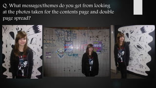
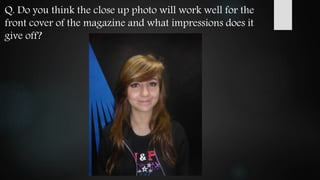
The feedback received about the layout, photos, and design elements for a rock music magazine was overall positive. The unique layout and angles used in the cover, contents page, and double page spread were said to look interesting and grab attention. Photos taken for the contents page and double spread successfully conveyed themes of energy and an edgy rock genre. A close-up photo considered for the cover was said to challenge stereotypes while still representing the genre well through clothing and style. Some improvements noted were to ensure consistent style across pages and an eye-catching background for the cover photo.
Forbes usaee lecture lehigh university nov 5 2015Kevin Forbes
A growing literature has affirmed with great confidence the feasibility of high penetration levels of wind and solar energy in electric generation under existing technology. This optimism is based in part on the belief that improved forecasting has effectively “solved” the challenge of intermittency. For example, the UK’s Royal Academy of Engineering has recently noted that wind energy’s capacity weighted forecast error of about five percent is evidence that the wind energy forecasts in Great Britain are highly accurate.
This paper assesses this claim using data from Great Britain, 50Hertz in Germany, Amprion in Germany, the California ISO, the Bonneville Power Administration, the Midcontinent ISO, France, Western Demark, Eastern Denmark, and Belgium. The analysis proceeds by comparing the forecast accuracy of load, wind, and solar energy with the accuracy of the corresponding persistence forecasts for load, wind, and solar energy. The analysis indicates that while the load forecasts are generally more accurate than a persistence load forecast, the wind and solar energy forecasts are generally less accurate than the corresponding persistence forecasts for wind and solar energy. Specifically, with a persistence forecast as reference, the mean-square-error-skill-score (MSESS) of the load forecasts are generally positive while the MSESS of the wind or solar energy forecast are generally negative.
Evidence is also presented that the forecast errors have a systematic component. Modelling of this systematic component can yield short-run solar and wind energy forecasts that are significantly more accurate. This does not resolve the challenge of intermittency but may mitigate matters.
Bed and breakfast Bran-Unterkunft Bran-Accommodation Bran.
Accommodation rentals are the ultimate in mountain Carpatien retreats rustic style and bed and breakfast-Restaurant Bran Pensiunea Katharina. Resort village during Summer and Winter season are availabe also visiting Castle Dracula Bran Transylvanien.
http://www.cazare-pensiune-bran.ro,
http://www.cazarebranpensiune-katharina.com,
http://www.cazare-pensiuni-bran-moeciu.ro,
Weekend la munte, Team Building si Traning in zona Bran Moeciu la Pensiunea Katharina 4*. Cazare cu pensiune complata sala de conferinte cu capacitatea de 45 locuri. Restaurant traditional cu capacitate de 130 de locuri ideal pentru mese festive, nunti,botez,etc la Bran. Cazare la Pensiuni Bran Moeciu. Cazare la categorie de 4 margarete pensiune turistica de lux.
http://www.cazare-pensiune-bran.ro,
http://www.cazare-pensiuni-bran-moeciu.ro,
http://www.cazarebranpensiune-katharina.com,
Expert Accessory Dwelling Unit (ADU) Drafting ServicesResDraft
Whether you’re looking to create a guest house, a rental unit, or a private retreat, our experienced team will design a space that complements your existing home and maximizes your investment. We provide personalized, comprehensive expert accessory dwelling unit (ADU)drafting solutions tailored to your needs, ensuring a seamless process from concept to completion.
Transforming Brand Perception and Boosting Profitabilityaaryangarg12
In today's digital era, the dynamics of brand perception, consumer behavior, and profitability have been profoundly reshaped by the synergy of branding, social media, and website design. This research paper investigates the transformative power of these elements in influencing how individuals perceive brands and products and how this transformation can be harnessed to drive sales and profitability for businesses.
Through an exploration of brand psychology and consumer behavior, this study sheds light on the intricate ways in which effective branding strategies, strategic social media engagement, and user-centric website design contribute to altering consumers' perceptions. We delve into the principles that underlie successful brand transformations, examining how visual identity, messaging, and storytelling can captivate and resonate with target audiences.
Methodologically, this research employs a comprehensive approach, combining qualitative and quantitative analyses. Real-world case studies illustrate the impact of branding, social media campaigns, and website redesigns on consumer perception, sales figures, and profitability. We assess the various metrics, including brand awareness, customer engagement, conversion rates, and revenue growth, to measure the effectiveness of these strategies.
The results underscore the pivotal role of cohesive branding, social media influence, and website usability in shaping positive brand perceptions, influencing consumer decisions, and ultimately bolstering sales and profitability. This paper provides actionable insights and strategic recommendations for businesses seeking to leverage branding, social media, and website design as potent tools to enhance their market position and financial success.
Hello everyone! I am thrilled to present my latest portfolio on LinkedIn, marking the culmination of my architectural journey thus far. Over the span of five years, I've been fortunate to acquire a wealth of knowledge under the guidance of esteemed professors and industry mentors. From rigorous academic pursuits to practical engagements, each experience has contributed to my growth and refinement as an architecture student. This portfolio not only showcases my projects but also underscores my attention to detail and to innovative architecture as a profession.
Can AI do good? at 'offtheCanvas' India HCI preludeAlan Dix
Invited talk at 'offtheCanvas' IndiaHCI prelude, 29th June 2024.
https://www.alandix.com/academic/talks/offtheCanvas-IndiaHCI2024/
The world is being changed fundamentally by AI and we are constantly faced with newspaper headlines about its harmful effects. However, there is also the potential to both ameliorate theses harms and use the new abilities of AI to transform society for the good. Can you make the difference?
Book Formatting: Quality Control Checks for DesignersConfidence Ago
This presentation was made to help designers who work in publishing houses or format books for printing ensure quality.
Quality control is vital to every industry. This is why every department in a company need create a method they use in ensuring quality. This, perhaps, will not only improve the quality of products and bring errors to the barest minimum, but take it to a near perfect finish.
It is beyond a moot point that a good book will somewhat be judged by its cover, but the content of the book remains king. No matter how beautiful the cover, if the quality of writing or presentation is off, that will be a reason for readers not to come back to the book or recommend it.
So, this presentation points designers to some important things that may be missed by an editor that they could eventually discover and call the attention of the editor.
You could be a professional graphic designer and still make mistakes. There is always the possibility of human error. On the other hand if you’re not a designer, the chances of making some common graphic design mistakes are even higher. Because you don’t know what you don’t know. That’s where this blog comes in. To make your job easier and help you create better designs, we have put together a list of common graphic design mistakes that you need to avoid.
7 Alternatives to Bullet Points in PowerPointAlvis Oh
So you tried all the ways to beautify your bullet points on your pitch deck but it just got way uglier. These points are supposed to be memorable and leave a lasting impression on your audience. With these tips, you'll no longer have to spend so much time thinking how you should present your pointers.
2. Q. From looking at the flat plans of the cover page, the contents page
and the double page spread, do you think the overall layout of the
magazine will look interesting and grab the attention of the
magazines target audience?
3. I think that the layout of the front cover will definitely look interesting due to the unique look about the
text composition of the main cover line because not many magazines change the angle of their text and
just keep it horizontally straight. I also feel that the layout of the contents page and the DPS has a good
layout as it is conventional yet interesting due to the angles as I mentioned before and the way that it is
styled around or on the images that you are going to use.
The layout of the front cover is likely to catch the attention of the target audience due to its unique
composition in comparison to other magazines. The contents page would also grab the attention of the
reader with the use of a variety of pictures of different sizes allows the attention of the audience to be
drawn towards the more important pictures/ articles. The double page spread looks interesting as it
appears easy to read with the placement of the picture within and throughout the main body of text.
I think the layout of the front cover is unique and interesting which I think will definitely draw readers in.
The contents page and double page spread are more conventional, however I feel this fits really well as it
will be easy to read and understand.
I think it will grab the attention. It is very different and affective compared to others.
Peer feedback:
4. Evaluation of my feedback:
After reading the feedback I received from my peers, I have learnt that in my work there are many
areas of strength as well as areas which could be improved. Some areas of strength I identified include
the positive response to my flat plans of how I want my magazine to look. My aim was to make each
page exciting and interesting so that my target audience’s attention will be drawn to the pages all the
time and not get bored of them. My feedback shows that I did do this, and that my pages come across
as interesting and engaging. My feedback told me that my mix of different sizes of images and text
draws attention to each page and would keep the reader interested as there will be an exciting variety
to look at on each page without it being too crowded or difficult to read. Another positive comment I
received was about presenting the main cover line on the front of the magazine at an angle. This
doesn’t follow normal magazine conventions, however it does make the front cover more exciting.
When constructing my front cover I will have to experiment with the different angles I can present
the text at to ensure it is exciting but it also still readable. The response to my flat plans also told me
that my contents page and double page spread are more conventional compared to my front cover.
Although the feedback told me that this would indeed look interesting, I will have to make sure that all
of the pages still match up and look as if they are all part of the same magazine. I will be able to do
this my making sure I continue the same ‘house style’ across all of my pages by using the same
colours, fonts and themes.
6. Peer feedback:
I feel that the masthead gives off an exciting message and it makes me feel
that this magazine will interesting and wild. It is definitely not giving off a
calm effect and instead I feel like this will be a fun, and jumpy magazine.
The masthead is experimental and makes a statement on the page showing
me that the magazine is more likely to be a rock or alternative magazine
than a pop genre magazine. The name itself of the magazine is interesting
and helps link with the genre of the magazine.
The masthead gives off a lot of energy and is very interesting. It instantly
tells me that this is a music magazine and that the contents inside are going
to be fun to read.
I think it will stand out. But then depends on the colours that you use.
7. Evaluation of my feedback:
I got a positive response from the masthead I designed for my magazine, and I found out that
the name and the design successfully portrays the music genre my magazine is about, rock.
This means my masthead is giving off the right signs which would attract my target audience.
The general response to my masthead is that it looks interesting, exciting, jumpy and full of
energy. All of this helps my masthead to make a statement on the page. This means it will
stand out and draw in the attention of many people, especially my target audience. However,
my feedback did tell me that at the moment my masthead is a bit boring, and doesn’t stand
out much. This means when I add the masthead to the front cover of my magazine I will
change the colours so that they stand out, but so that they still give off signs promoting the
rock genre. The colour I use will help determine what colours I use in the rest of my
magazine as it is important my magazine follows the sane house style. The completed
masthead for my rock music magazine will make a powerful statement on the front cover
similarly to how rock music makes a strong statement in the wide world of music.
8. Q. What messages/themes do you get from looking
at the photos taken for the contents page and double
page spread?
9. Peer feedback:
The messages and themes that I get from looking at these photos are energetic,
due to the graffiti on the wall behind the model. From these photographs, I feel
that this magazine is related to the rock side of genre and if this is the case then I
feel that it has been portrayed very well with how the model has been posed and
by what she is wearing.
The theme of the images matches that of the genre and is a good indication of
what the artist is all about and the message that they want to give off. Both the
location and the attire of the subject have been well thought of to give off the
genre of the magazine and show an edgy theme to the magazine.
The messages I get from the pictures is that music is an art form and that this
magazine respects the words which are being said by the artists.
It represents the magazine very clearly because of the background too not just
the model.
10. Evaluation of my feedback:
The photos I took which I decided to use on the contents page and the double page
spread of my rock music magazine have received very positive feedback from my
peers. The feedback said each photo is energetic and edgy and successfully illustrates
that my magazine is about rock music which ensures it will attract my target audience.
This is successfully shown through the mise-en-scene, which is the location of the
photoshoot, the artists pose, the dark coloured clothing and make up, and the hair
style. My feedback also shows me that the hidden message behind the photos, that
music is a form of art and that for this article, my cover story, the words really play an
important part in the artists music, come across through the art and graffiti at the
location of my photoshoot. When I edit my photos I will make sure that these messages
still come across clearly to the reader.
11. Q. Do you think the close up photo will work well for the
front cover of the magazine and what impressions does it
give off?
12. Peer feedback:
I think the photo will work well for the front cover of the magazine and I feel like
this magazine will give an in-depth close up of the model’s lifestyle perhaps, relating
to a rock/emo genre. I definitely feel that the producer has organised this magazine
well and I would love to read it once it has finished.
The smile from the subject almost juxtaposes the typical stereotype of this style of
magazine which is interesting and looks as if it is there to defy conventions of the
typical magazine genre. I think the overall look of the image will work well on the
front cover and add to the theme of the magazine.
The smile contrasts with the stereotypical style of this genre of magazine, however it
definitely makes it more interesting and intriguing.
I could say it’s stereotypical but effective, make sure you have the right background
for your magazine.
13. Evaluation of my feedback:
The feedback I received from my peers tells me that the photo I took, and have decided to use
on the front cover of my magazine works well. This is as the image represents the rock genre
though the artists clothing and the style of her hair and make up. The photo is quite
conventional and stereotypical for a front cover of a magazine, however, my feedback shows
that having a young female model smiling challenged the common stereotype that artists
linked to rock music are scary or angry old men. The close up shot I have taken for the front
cover also successfully hints at what my main cover story is about, and that the article will be
an in-depth close up in to the artists lifestyle. My feedback told me that I should make sure
the background of the photo is suitable for the front cover of my magazine. I will make sure
the background is suitable when constructing my front cover, and if I feel the background
does not work, I will edit the photo so that the artist is shown against a different background.