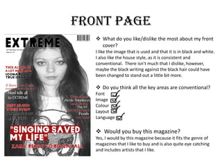
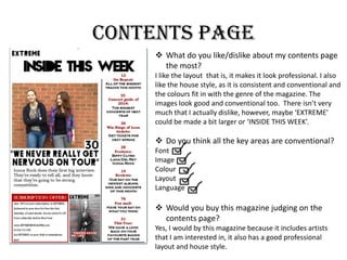
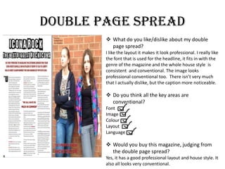
Final magazine feedback
Front page
 What do you like/dislike the most about my front
cover?
I like the image that is used and that it is in black and white.
I also like the house style, as it is consistent and
conventional. There isn’t much that I dislike, however,
maybe the black writing against the black hair could have
been changed to stand out a little bit more.
 Do you think all the key areas are conventional?
Font
Image
Colour
Layout
Language
 Would you buy this magazine?
Yes, I would by this magazine because it fits the genre of
magazines that I like to buy and is also quite eye catching
and includes artists that I like.
Contents page
 What do you like/dislike about my contents page
the most?
I like the layout that is, it makes it look professional. I also
like the house style, as it is consistent and conventional and
the colours fit in with the genre of the magazine. The
images look good and conventional too. There isn’t very
much that I actually dislike, however, maybe ‘EXTREME’
could be made a bit larger or ‘INSIDE THIS WEEK’.
 Do you think all the key areas are conventional?
Font
Image
Colour
Layout
Language
 Would you buy this magazine judging on the
contents page?
Yes, I would by this magazine because it includes artists
that I am interested in, it also has a good professional
layout and house style.
Double page spread
 What do you like/dislike about my double
page spread?
I like the layout it makes it look professional. I really like
the font that is used for the headline, it fits in with the
genre of the magazine and the whole house style is
consistent and conventional. The image looks
professional conventional too. There isn’t very much
that I actually dislike, but the caption more noticeable.
 Do you think all the key areas are
conventional?
Font
Image
Colour
Layout
Language
 Would you buy this magazine, judging from
the double page spread?
Yes, it has a good professional layout and house style. It
also all looks very conventional.

Final Magazine Feedback

  • 1.
  • 2.
    Front page  Whatdo you like/dislike the most about my front cover? I like the image that is used and that it is in black and white. I also like the house style, as it is consistent and conventional. There isn’t much that I dislike, however, maybe the black writing against the black hair could have been changed to stand out a little bit more.  Do you think all the key areas are conventional? Font Image Colour Layout Language  Would you buy this magazine? Yes, I would by this magazine because it fits the genre of magazines that I like to buy and is also quite eye catching and includes artists that I like.
  • 3.
    Contents page  Whatdo you like/dislike about my contents page the most? I like the layout that is, it makes it look professional. I also like the house style, as it is consistent and conventional and the colours fit in with the genre of the magazine. The images look good and conventional too. There isn’t very much that I actually dislike, however, maybe ‘EXTREME’ could be made a bit larger or ‘INSIDE THIS WEEK’.  Do you think all the key areas are conventional? Font Image Colour Layout Language  Would you buy this magazine judging on the contents page? Yes, I would by this magazine because it includes artists that I am interested in, it also has a good professional layout and house style.
  • 4.
    Double page spread What do you like/dislike about my double page spread? I like the layout it makes it look professional. I really like the font that is used for the headline, it fits in with the genre of the magazine and the whole house style is consistent and conventional. The image looks professional conventional too. There isn’t very much that I actually dislike, but the caption more noticeable.  Do you think all the key areas are conventional? Font Image Colour Layout Language  Would you buy this magazine, judging from the double page spread? Yes, it has a good professional layout and house style. It also all looks very conventional.