Download to read offline


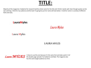


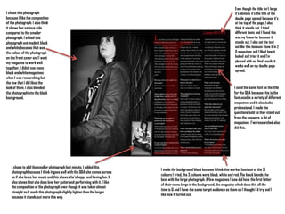

The document provides details on the design choices made for a double page magazine spread interview. It includes: 1) An explanation of why two photographs were chosen - one shows the subject's happy personality, while the other shows her serious side. 2) Details on editing the photographs to black and white to match the magazine's color scheme. 3) Information on formatting choices for the title, questions, and layout based on researching other magazines. 4) Notes on blending the large photograph into the black background and adding design elements like borders and fonts to enhance readability and visual interest.


![Technical comments research_sheet[1]](https://cdn.slidesharecdn.com/ss_thumbnails/technicalcommentsresearchsheet1-130321041106-phpapp02-thumbnail.jpg?width=640&height=640&fit=bounds)


