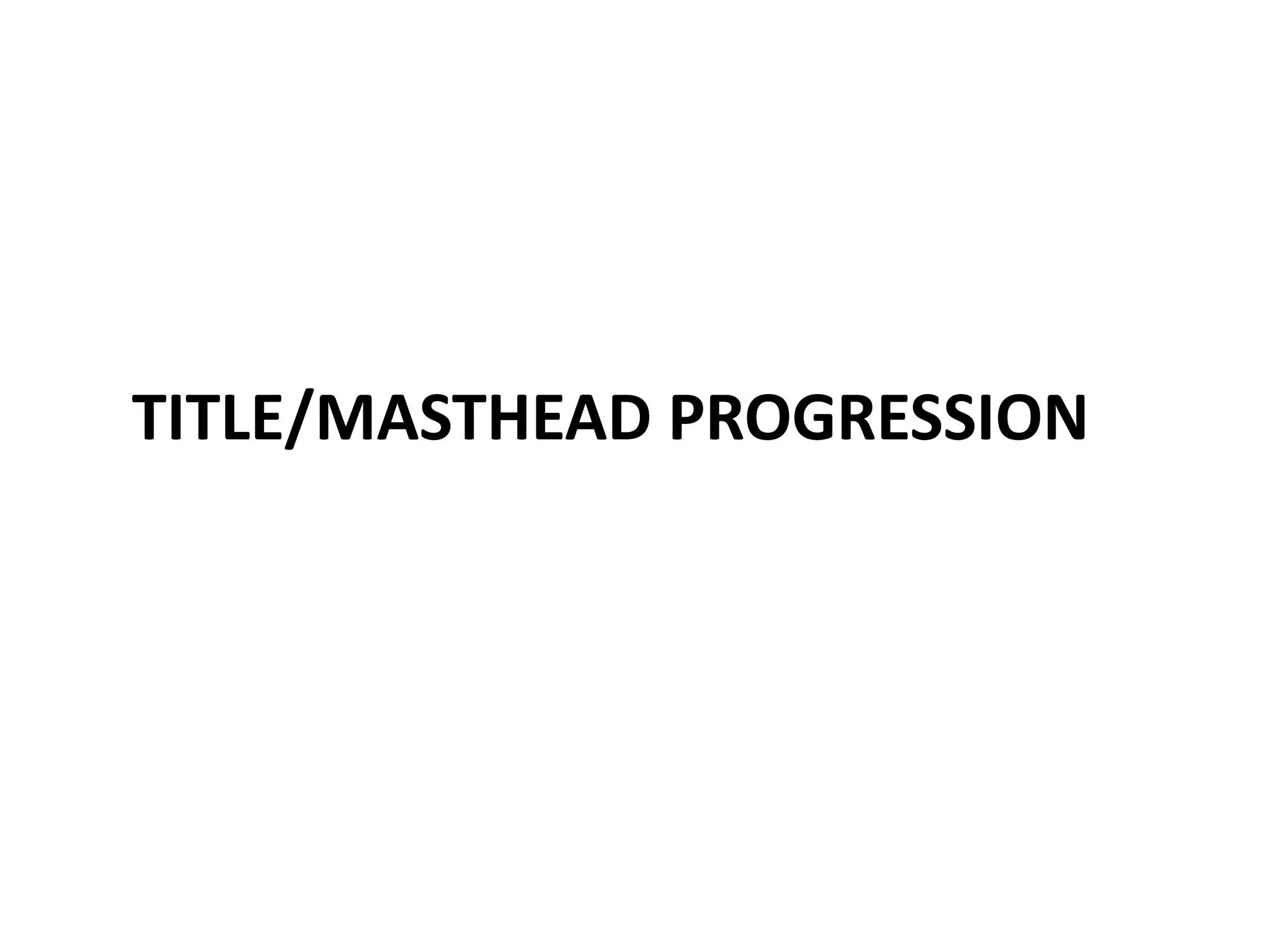
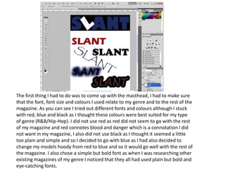
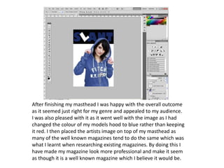
TITLE/MASTHEAD PROGRESSION
The first thing I had to do was to come up with the masthead, I had to make sure that the font, font size and colours I used relate to my genre and to the rest of the magazine. As you can see I tried out different fonts and colours although I stuck with red, blue and black as I thought these colours were best suited for my type of genre (R&B/Hip-Hop). I did not use red as red did not seem to go with the rest of my magazine and red connotes blood and danger which is a connotation I did not want in my magazine, I also did not use black as I thought it seemed a little too plain and simple and so I decided to go with blue as I had also decided to change my models hoody from red to blue and so it would go well with the rest of the magazine. I also chose a simple but bold font as when I was researching other existing magazines of my genre I noticed that they all had used plain but bold and eye-catching fonts.
After  deciding on the font I was going to use I decided I wanted to make it stand out a little more as it seemed a little too plain.I decided to slant the letter ‘L’ as I thought that would make it more eye-catching and also as it goes with the name of the magazine ‘slant’, it emphasizes the whole idea of it being slanted. I then added a solid black background as I though this made it more bold and allowed it to stand out better, also as when I had researched existing magazines of my genre I noticed that the majority of them use this technique.I then filled the letter ‘L’ in white, different from the rest of the title as I thought it adds to the whole dramatic effect of it being slanted and going with the name ‘slant’, also as it made it more appealing for my audience
After finishing my masthead I was happy with the overall outcome as it seemed just right for my genre and appealed to my audience. I was also pleased with it as it went well with the image as I had changed the colour of my models hood to blue rather than keeping it red. I then placed the artists image on top of my masthead as many of the well known magazines tend to do the same which was what I learnt when researching existing magazines. By doing this I have made my magazine look more professional and make it seem as though it is a well known magazine which I believe it would be.

Title progression

  • 1.
  • 2.
    The first thingI had to do was to come up with the masthead, I had to make sure that the font, font size and colours I used relate to my genre and to the rest of the magazine. As you can see I tried out different fonts and colours although I stuck with red, blue and black as I thought these colours were best suited for my type of genre (R&B/Hip-Hop). I did not use red as red did not seem to go with the rest of my magazine and red connotes blood and danger which is a connotation I did not want in my magazine, I also did not use black as I thought it seemed a little too plain and simple and so I decided to go with blue as I had also decided to change my models hoody from red to blue and so it would go well with the rest of the magazine. I also chose a simple but bold font as when I was researching other existing magazines of my genre I noticed that they all had used plain but bold and eye-catching fonts.
  • 3.
    After decidingon the font I was going to use I decided I wanted to make it stand out a little more as it seemed a little too plain.I decided to slant the letter ‘L’ as I thought that would make it more eye-catching and also as it goes with the name of the magazine ‘slant’, it emphasizes the whole idea of it being slanted. I then added a solid black background as I though this made it more bold and allowed it to stand out better, also as when I had researched existing magazines of my genre I noticed that the majority of them use this technique.I then filled the letter ‘L’ in white, different from the rest of the title as I thought it adds to the whole dramatic effect of it being slanted and going with the name ‘slant’, also as it made it more appealing for my audience
  • 4.
    After finishing mymasthead I was happy with the overall outcome as it seemed just right for my genre and appealed to my audience. I was also pleased with it as it went well with the image as I had changed the colour of my models hood to blue rather than keeping it red. I then placed the artists image on top of my masthead as many of the well known magazines tend to do the same which was what I learnt when researching existing magazines. By doing this I have made my magazine look more professional and make it seem as though it is a well known magazine which I believe it would be.