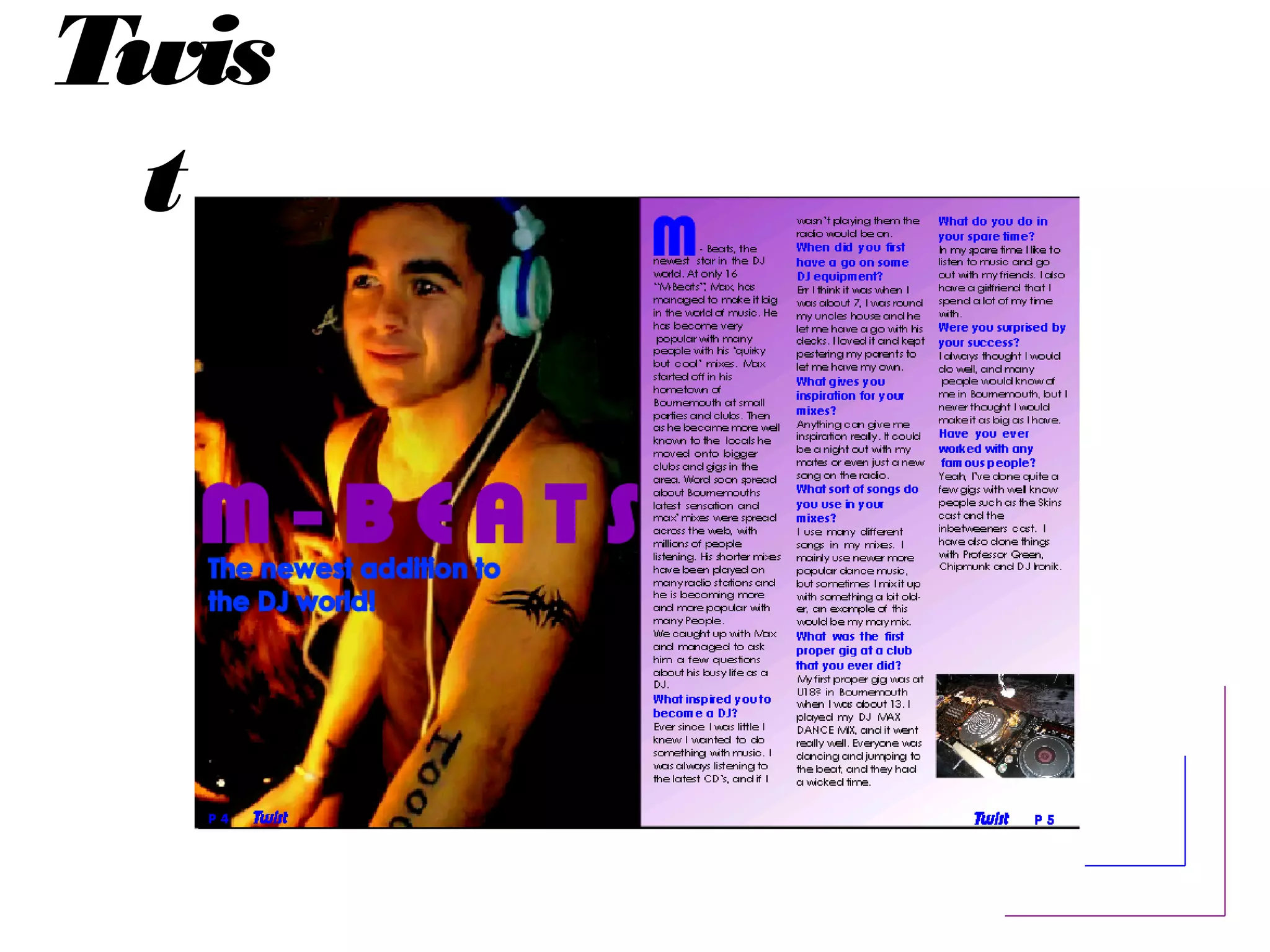
Twis
t
Twis
t
What Genres of music are
represented?
-Rock/Pop
-Dance
Are the artists new? Established?
Iconic?
Most of the artists in my magazine are established
and a few of them are new.
Twis
t
House Colours
My house colours are purple and blue. This is
because I believe they will be popular with my
target audience of teenage girls.
Twis
t
Style features and layout?
-Columning - i have split my writing into 3 columns.
-Leading - i have used leading on the heading.
-Heading – i have stretched it across the picture
on the first page.
-Subheading – i have put a subheading
underneath my heading on the first page.
-Paragraphs – i have used paragraphs in my
interview to make it neater.
Twis
t
Language style/Mode of address?
My magazine sets out to make the reader feel as
if they know the artist’s personality by using first
names. The interview uses catchy, shortened
forms to help appeal to it’s target audience. The
article also uses questions to make the interview
clearer.
Twis
t
Typeface
The text I have used in the interview is sans-serif. I
have chosen this because it is less personal to the
reader, as many people within my target
audience have different personalities.
Twis
t
Branding through motifs or logos?
I have put the logo of the magazine in the
bottom corners of the pages next to the age
number (in the folio). By doing this people will
know what magazine they are reading by looking
at any of the pages.
Twis
t
Photography style
The images on my features page use indirect
address, so the picture is taken live. This is so that
the reader feels as if they are actually there and
they get a better idea of what the artist is like.
Twis
t
Where are the images and text
positioned on the page?
The main image is on the left hand side taking up
a whole page, and the text is on the right hand
side.
Why did you decide on this layout?
I decided to lay my features page out like this because
I thought it worked quite well as it was clear and simple,
but still looked professional. I put the text on the right
hand side as that’s the side that readers would look at
the most as they flick through the magazine.

Features page presentation

  • 1.
  • 2.
    Twis t What Genres ofmusic are represented? -Rock/Pop -Dance Are the artists new? Established? Iconic? Most of the artists in my magazine are established and a few of them are new.
  • 3.
    Twis t House Colours My housecolours are purple and blue. This is because I believe they will be popular with my target audience of teenage girls.
  • 4.
    Twis t Style features andlayout? -Columning - i have split my writing into 3 columns. -Leading - i have used leading on the heading. -Heading – i have stretched it across the picture on the first page. -Subheading – i have put a subheading underneath my heading on the first page. -Paragraphs – i have used paragraphs in my interview to make it neater.
  • 5.
    Twis t Language style/Mode ofaddress? My magazine sets out to make the reader feel as if they know the artist’s personality by using first names. The interview uses catchy, shortened forms to help appeal to it’s target audience. The article also uses questions to make the interview clearer.
  • 6.
    Twis t Typeface The text Ihave used in the interview is sans-serif. I have chosen this because it is less personal to the reader, as many people within my target audience have different personalities.
  • 7.
    Twis t Branding through motifsor logos? I have put the logo of the magazine in the bottom corners of the pages next to the age number (in the folio). By doing this people will know what magazine they are reading by looking at any of the pages.
  • 8.
    Twis t Photography style The imageson my features page use indirect address, so the picture is taken live. This is so that the reader feels as if they are actually there and they get a better idea of what the artist is like.
  • 9.
    Twis t Where are theimages and text positioned on the page? The main image is on the left hand side taking up a whole page, and the text is on the right hand side. Why did you decide on this layout? I decided to lay my features page out like this because I thought it worked quite well as it was clear and simple, but still looked professional. I put the text on the right hand side as that’s the side that readers would look at the most as they flick through the magazine.
  • 10.
    Twis t Where are theimages and text positioned on the page? The main image is on the left hand side taking up a whole page, and the text is on the right hand side. Why did you decide on this layout? I decided to lay my features page out like this because I thought it worked quite well as it was clear and simple, but still looked professional. I put the text on the right hand side as that’s the side that readers would look at the most as they flick through the magazine.