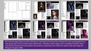
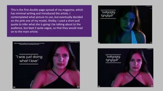
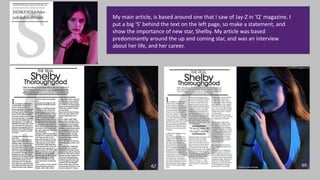
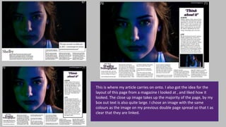
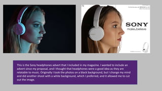
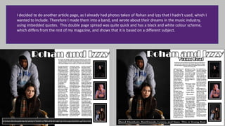
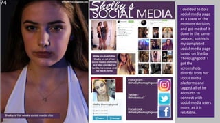
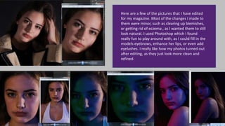
Here is how my magazine front cover has changed throughout the process
of making it. I started out without a magazine name, and with unedited
pictures. I planned out my colour scheme, and knew what I wanted it to
look like. Slowly, I kept going back to it, adding in text, and changing the
fonts, positions to see what looks good. Eventually, I decided on the layout
of the picture to the left which I am happy with.
My contents page started out with nothing but a few boxes and minimal text, however this was a good guide for my
and a good way to find out what layout worked best. I had place holder images until I completed my photo-shoot
and started inputting all of these photos. My contents is quite dark, but it think this makes it look more edgy and
fitting for the genre, R&B.
This is the first double page spread of my magazine, which
has minimal writing and introduced the artists. I
contemplated what picture to use, but eventually decided
on the pink one of my model, Shelby. I used a short pull
quote to infer what she is going t be talking about to the
audience, but kept it quite vague, so that they would read
on to the main article.
My main article, is based around one that I saw of Jay-Z in ‘Q’ magazine. I
put a big ‘S’ behind the text on the left page, so make a statement, and
show the importance of new star, Shelby. My article was based
predominantly around the up and coming star, and was an interview
about her life, and her career.
This is where my article carries on onto. I also got the idea for the
layout of this page from a magazine I looked at , and liked how it
looked. The close up image takes up the majority of the page, by my
box out text is also quite large. I chose an image with the same
colours as the image on my previous double page spread so that t as
clear that they are linked.
This is the Sony headphones advert that I included in my magazine. I wanted to include an
advert since my proposal, and I thought that headphones were a good idea as they are
relatable to music. Originally I took the photos on a black background, but I change my mind
and did another shoot with a white background, which I preferred, and it allowed me to cut
out the image.
I decided to do another article page, as I already had photos taken of Rohan and Izzy that I hadn’t used, which I
wanted to include. Therefore I made them into a band, and wrote about their dreams in the music industry,
using imbedded quotes. This double page spread was quite quick and has a black and white colour scheme,
which differs from the rest of my magazine, and shows that it is based on a different subject.
I decided to do a
social media page
as a spare of the
moment decision,
and got most of it
done in the same
session, so this is
my completed
social media page
based on Shelby
Thoroughgood. I
got the
screenshots
directly from her
social media
platforms and
tagged all of he
accounts to
connect with
social media users
more, as it is
relatable.
Here are a few of the pictures that I have edited
for my magazine. Most of the changes I made to
them were minor, such as clearing up blemishes,
or getting rid of eczema , as I wanted them to still
look natural. I used Photoshop which I found
really fun to play around with, as I could fill in the
models eyebrows, enhance her lips, or even add
eyelashes. I really like how my photos turned out
after editing, as they just look more clean and
refined.

Progress magazine

  • 1.
    Here is howmy magazine front cover has changed throughout the process of making it. I started out without a magazine name, and with unedited pictures. I planned out my colour scheme, and knew what I wanted it to look like. Slowly, I kept going back to it, adding in text, and changing the fonts, positions to see what looks good. Eventually, I decided on the layout of the picture to the left which I am happy with.
  • 2.
    My contents pagestarted out with nothing but a few boxes and minimal text, however this was a good guide for my and a good way to find out what layout worked best. I had place holder images until I completed my photo-shoot and started inputting all of these photos. My contents is quite dark, but it think this makes it look more edgy and fitting for the genre, R&B.
  • 3.
    This is thefirst double page spread of my magazine, which has minimal writing and introduced the artists. I contemplated what picture to use, but eventually decided on the pink one of my model, Shelby. I used a short pull quote to infer what she is going t be talking about to the audience, but kept it quite vague, so that they would read on to the main article.
  • 4.
    My main article,is based around one that I saw of Jay-Z in ‘Q’ magazine. I put a big ‘S’ behind the text on the left page, so make a statement, and show the importance of new star, Shelby. My article was based predominantly around the up and coming star, and was an interview about her life, and her career.
  • 5.
    This is wheremy article carries on onto. I also got the idea for the layout of this page from a magazine I looked at , and liked how it looked. The close up image takes up the majority of the page, by my box out text is also quite large. I chose an image with the same colours as the image on my previous double page spread so that t as clear that they are linked.
  • 6.
    This is theSony headphones advert that I included in my magazine. I wanted to include an advert since my proposal, and I thought that headphones were a good idea as they are relatable to music. Originally I took the photos on a black background, but I change my mind and did another shoot with a white background, which I preferred, and it allowed me to cut out the image.
  • 7.
    I decided todo another article page, as I already had photos taken of Rohan and Izzy that I hadn’t used, which I wanted to include. Therefore I made them into a band, and wrote about their dreams in the music industry, using imbedded quotes. This double page spread was quite quick and has a black and white colour scheme, which differs from the rest of my magazine, and shows that it is based on a different subject.
  • 8.
    I decided todo a social media page as a spare of the moment decision, and got most of it done in the same session, so this is my completed social media page based on Shelby Thoroughgood. I got the screenshots directly from her social media platforms and tagged all of he accounts to connect with social media users more, as it is relatable.
  • 9.
    Here are afew of the pictures that I have edited for my magazine. Most of the changes I made to them were minor, such as clearing up blemishes, or getting rid of eczema , as I wanted them to still look natural. I used Photoshop which I found really fun to play around with, as I could fill in the models eyebrows, enhance her lips, or even add eyelashes. I really like how my photos turned out after editing, as they just look more clean and refined.