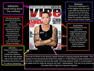
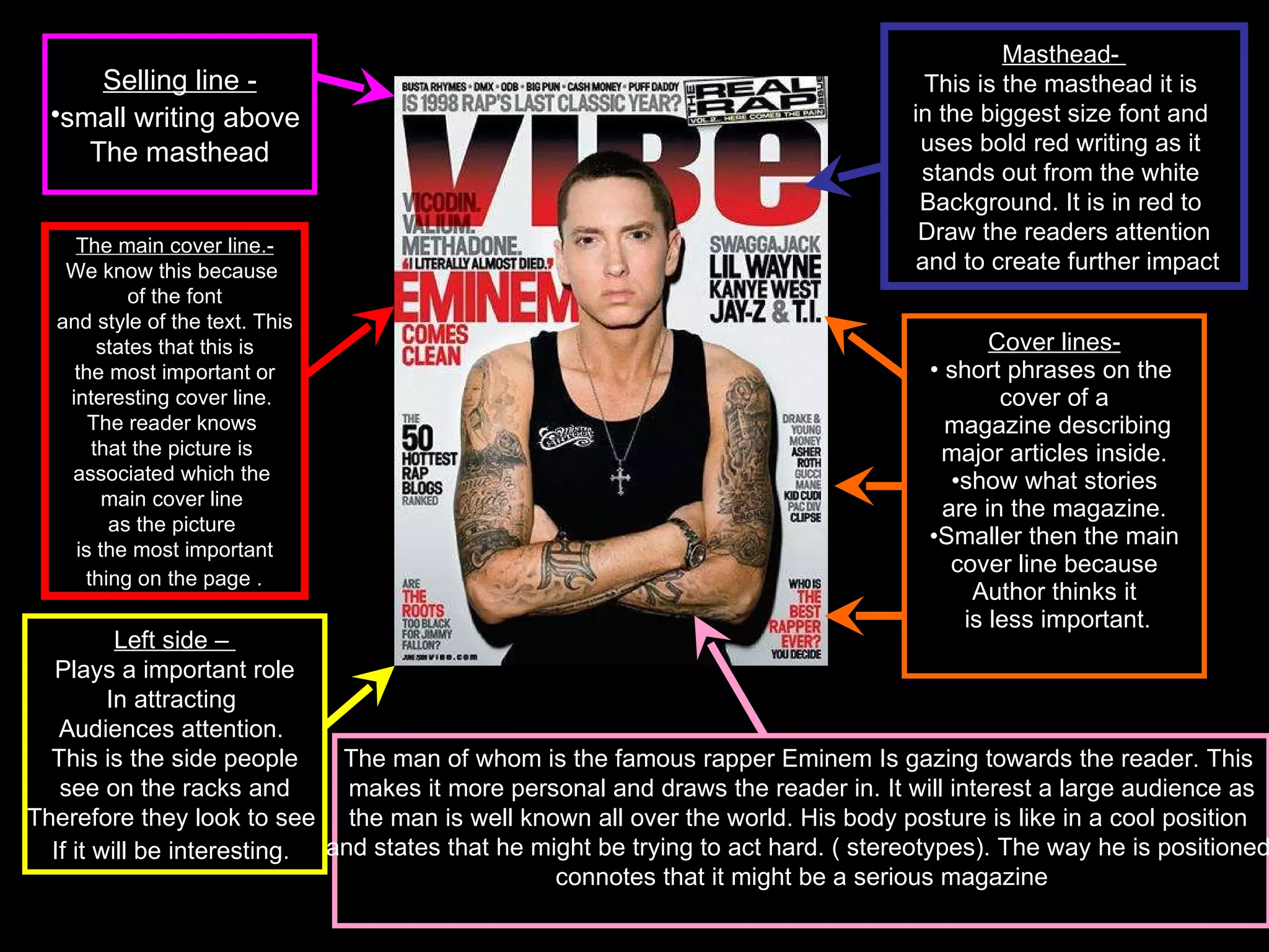
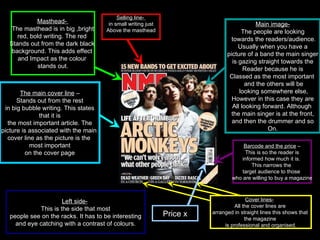
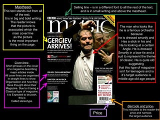
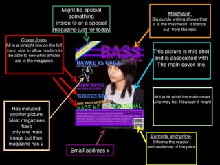
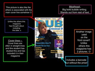
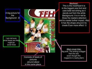
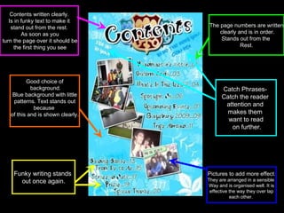
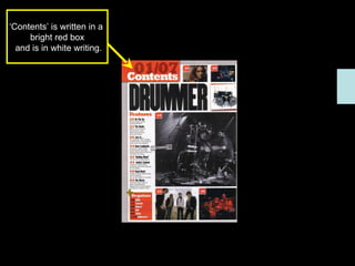
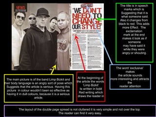
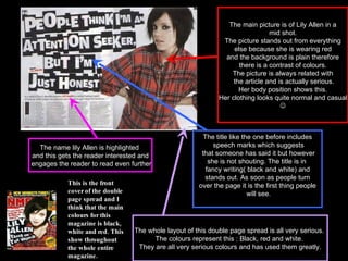
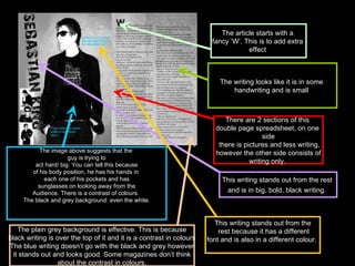
A Strategic Approach: GenAI in EducationPeter Windle
Artificial Intelligence (AI) technologies such as Generative AI, Image Generators and Large Language Models have had a dramatic impact on teaching, learning and assessment over the past 18 months. The most immediate threat AI posed was to Academic Integrity with Higher Education Institutes (HEIs) focusing their efforts on combating the use of GenAI in assessment. Guidelines were developed for staff and students, policies put in place too. Innovative educators have forged paths in the use of Generative AI for teaching, learning and assessments leading to pockets of transformation springing up across HEIs, often with little or no top-down guidance, support or direction.
This Gasta posits a strategic approach to integrating AI into HEIs to prepare staff, students and the curriculum for an evolving world and workplace. We will highlight the advantages of working with these technologies beyond the realm of teaching, learning and assessment by considering prompt engineering skills, industry impact, curriculum changes, and the need for staff upskilling. In contrast, not engaging strategically with Generative AI poses risks, including falling behind peers, missed opportunities and failing to ensure our graduates remain employable. The rapid evolution of AI technologies necessitates a proactive and strategic approach if we are to remain relevant.
June 3, 2024 Anti-Semitism Letter Sent to MIT President Kornbluth and MIT Cor...Levi Shapiro
Letter from the Congress of the United States regarding Anti-Semitism sent June 3rd to MIT President Sally Kornbluth, MIT Corp Chair, Mark Gorenberg
Dear Dr. Kornbluth and Mr. Gorenberg,
The US House of Representatives is deeply concerned by ongoing and pervasive acts of antisemitic
harassment and intimidation at the Massachusetts Institute of Technology (MIT). Failing to act decisively to ensure a safe learning environment for all students would be a grave dereliction of your responsibilities as President of MIT and Chair of the MIT Corporation.
This Congress will not stand idly by and allow an environment hostile to Jewish students to persist. The House believes that your institution is in violation of Title VI of the Civil Rights Act, and the inability or
unwillingness to rectify this violation through action requires accountability.
Postsecondary education is a unique opportunity for students to learn and have their ideas and beliefs challenged. However, universities receiving hundreds of millions of federal funds annually have denied
students that opportunity and have been hijacked to become venues for the promotion of terrorism, antisemitic harassment and intimidation, unlawful encampments, and in some cases, assaults and riots.
The House of Representatives will not countenance the use of federal funds to indoctrinate students into hateful, antisemitic, anti-American supporters of terrorism. Investigations into campus antisemitism by the Committee on Education and the Workforce and the Committee on Ways and Means have been expanded into a Congress-wide probe across all relevant jurisdictions to address this national crisis. The undersigned Committees will conduct oversight into the use of federal funds at MIT and its learning environment under authorities granted to each Committee.
• The Committee on Education and the Workforce has been investigating your institution since December 7, 2023. The Committee has broad jurisdiction over postsecondary education, including its compliance with Title VI of the Civil Rights Act, campus safety concerns over disruptions to the learning environment, and the awarding of federal student aid under the Higher Education Act.
• The Committee on Oversight and Accountability is investigating the sources of funding and other support flowing to groups espousing pro-Hamas propaganda and engaged in antisemitic harassment and intimidation of students. The Committee on Oversight and Accountability is the principal oversight committee of the US House of Representatives and has broad authority to investigate “any matter” at “any time” under House Rule X.
• The Committee on Ways and Means has been investigating several universities since November 15, 2023, when the Committee held a hearing entitled From Ivory Towers to Dark Corners: Investigating the Nexus Between Antisemitism, Tax-Exempt Universities, and Terror Financing. The Committee followed the hearing with letters to those institutions on January 10, 202
Palestine last event orientationfvgnh .pptxRaedMohamed3
An EFL lesson about the current events in Palestine. It is intended to be for intermediate students who wish to increase their listening skills through a short lesson in power point.
Instructions for Submissions thorugh G- Classroom.pptxJheel Barad
This presentation provides a briefing on how to upload submissions and documents in Google Classroom. It was prepared as part of an orientation for new Sainik School in-service teacher trainees. As a training officer, my goal is to ensure that you are comfortable and proficient with this essential tool for managing assignments and fostering student engagement.
Embracing GenAI - A Strategic ImperativePeter Windle
Artificial Intelligence (AI) technologies such as Generative AI, Image Generators and Large Language Models have had a dramatic impact on teaching, learning and assessment over the past 18 months. The most immediate threat AI posed was to Academic Integrity with Higher Education Institutes (HEIs) focusing their efforts on combating the use of GenAI in assessment. Guidelines were developed for staff and students, policies put in place too. Innovative educators have forged paths in the use of Generative AI for teaching, learning and assessments leading to pockets of transformation springing up across HEIs, often with little or no top-down guidance, support or direction.
This Gasta posits a strategic approach to integrating AI into HEIs to prepare staff, students and the curriculum for an evolving world and workplace. We will highlight the advantages of working with these technologies beyond the realm of teaching, learning and assessment by considering prompt engineering skills, industry impact, curriculum changes, and the need for staff upskilling. In contrast, not engaging strategically with Generative AI poses risks, including falling behind peers, missed opportunities and failing to ensure our graduates remain employable. The rapid evolution of AI technologies necessitates a proactive and strategic approach if we are to remain relevant.
Francesca Gottschalk - How can education support child empowerment.pptxEduSkills OECD
Francesca Gottschalk from the OECD’s Centre for Educational Research and Innovation presents at the Ask an Expert Webinar: How can education support child empowerment?
Honest Reviews of Tim Han LMA Course Program.pptxtimhan337
Personal development courses are widely available today, with each one promising life-changing outcomes. Tim Han’s Life Mastery Achievers (LMA) Course has drawn a lot of interest. In addition to offering my frank assessment of Success Insider’s LMA Course, this piece examines the course’s effects via a variety of Tim Han LMA course reviews and Success Insider comments.
Operation “Blue Star” is the only event in the history of Independent India where the state went into war with its own people. Even after about 40 years it is not clear if it was culmination of states anger over people of the region, a political game of power or start of dictatorial chapter in the democratic setup.
The people of Punjab felt alienated from main stream due to denial of their just demands during a long democratic struggle since independence. As it happen all over the word, it led to militant struggle with great loss of lives of military, police and civilian personnel. Killing of Indira Gandhi and massacre of innocent Sikhs in Delhi and other India cities was also associated with this movement.
Acetabularia Information For Class 9 .docxvaibhavrinwa19
Acetabularia acetabulum is a single-celled green alga that in its vegetative state is morphologically differentiated into a basal rhizoid and an axially elongated stalk, which bears whorls of branching hairs. The single diploid nucleus resides in the rhizoid.
2. Masthead- The masthead is in big ,bright red, bold writing. The red Stands out from the dark black background. This adds effect and Impact as the colour stands out. Barcode and the price – This is so the reader is informed how much it is. This narrows the target audience to those who are willing to buy a magazine The main cover line – Stands out from the rest in big bubble writing. This states that it is the most important article. The picture is associated with the main cover line as the picture is the most important on the cover page Cover lines- All the cover lines are arranged in straight lines this shows that the magazine is professional and organised. Selling line- in small writing just Above the masthead Main image- The people are looking towards the readers/audience. Usually when you have a picture of a band the main singer is gazing straight towards the Reader because he is Classed as the most important and the others will be looking somewhere else, However in this case they are All looking forward. Although the main singer is at the front, and then the drummer and so On. Left side- This is the side that most people see on the racks. It has to be interesting and eye catching with a contrast of colours. Price x
3. Masthead- This text stands out from all of the rest. It is in big and bold writing. The reader knows that the picture is associated which the main cover line as the picture is the most important thing on the page . Barcode and price- This indicates to the reader the price and narrows the target audience Cover lines- Short phrases on the cover of a magazine describing major articles inside. All cover lines are organised in straight lines to show Organisation and how they Have thought about their Magazine. Due to it being a Classical type of magazine, it is Expected to be posh, this is Called stereotype. Selling line – is in a different font to all the rest of the text, and is in small writing and above the masthead. The man who looks like he is a famous orchestra because he is dressed smartly and Has a stick in his and He Is looking at a certain Angle. He is dressed Smartly in a bow tie and a suit to represent the theme of classic. He is quite old suggesting that this type of magazine isn’t for teenagers and is it’s target audience is middle age-old age people Price
4. Barcode and price- Informs the reader and audience of the price Masthead- Big purple writing shows that it is the masthead. It stands out from the rest. Cover lines- All in a straight line on the left hand side to allow readers to be able to see what articles are in the magazine. This picture is mid shot and is associated with The main cover line. Email address x Has included another picture. Most magazines have only one main image but thus magazine has 2 Might be special something inside or a special magazine just for today Not sure what the main cover Line may be. However it might
5. Masthead- Big bold bubble writing. Stands out from rest of text. Cover lines – Cover lines are often in straight lines and this student has studied this and has included it in their magazine This picture is also like the others is associated with the main cover line somehow Unlike the others this magazine has thought about including the date. x Includes a barcode but without the price! Another image used on the front cover!! Unlike others this magazine has 2 pictures.
6. Masthead- This is the masthead it is in the biggest size font and uses bold red writing as it stands out from the white Background. It is in red to Draw the readers attention and to create further impact. Also It has the shape around it to create Even more effect: Main cover line- Big bold. The writing is Bigger then the rest (even though this magazine is nearly plain) Consists of loads of pictures around about in the same place. A big picture for the Background :D I am not sure what these are they might be cover lines
7. Contents written clearly. Is in funky text to make it stand out from the rest. As soon as you turn the page over it should be the first thing you see The page numbers are written clearly and is in order. Stands out from the Rest. Pictures to add more effect . They are arranged in a sensible Way and is organised well. It is effective the way they over lap each other. Good choice of background. Blue background with little patterns. Text stands out because of this and is shown clearly. Funky writing stands out once again. Catch Phrases- Catch the reader attention and makes them want to read on further.
8. Going all the way down there is a list of pages and what you can find on them. The word ’contents’ is in big simple white writing. Like all of the other it stands out. The background is very simple and is a picture of Some balloons. The colours stand out from the rest of the whole page. The layout is rather Simple and is easy to Understand. Has a simple picture as the main picture.
9. These pictures add more effect and most magazines only include one big picture to stand out. The two on the right hand side has big bold boarders around them. This adds extra effect as they will make the pictures stand out. The word ‘contents’ is written in a funky way to make it stand out from the rest of the Writing however it is the same colour as the boxes on the lower half. This is effective because it looks good and will attract the target audience. There is a good choice of colours used. Pink and white both stand out and go together perfectly. The numbers are white and the writing is black and this also Works. Columns show the features included in the magazine. Like in some content pages they are not highlighted but they are in a different colour which makes them stand out. In big funky writing so stands out. The main picture covering half of the content page.
10. On the right hand side of the page there is a column that highlights the main features Included in this weeks issue The features are numbered which correspond with the number of the picture. This is effective and makes the reader want to read on Further. Little subheading are used and there are in the bright Yellow font this is to show The importance of the Subheadings. These split up the page and makes it easier for the reader to find what they are looking for. On the left hand corner there is a little message from the Editor this is along side a picture from the front cover. Normally the type of language used is chatty and informal. This is effective as they are attracting the target Audience and offers a more personal approach to the reader. There are a number of different pictures included on this contents page, each display the image of rockers . At the top of the page is a black box with a contrast of yellow Writing to make the page more noticeable.
11. In the right top hand Corner - highlights the main Features included. The features are Numbered in a small font which is the same as the writing. Colour Contrast, Black writing on a grey plain sky. The fonts are bold but also seem like some sort of handwriting but created in a way that it is clear to the audience that it is the features. Mood has been set for the type Of music genre for the magazine. The background picture is rather dull and has set a certain mood. The man is in all black which suggests That he is a famous/important person. Contrast with the grey and black. Includes a image of the front cover. Includes no Message from the editor, and some might say that this contents page could be boring and plain. The word contents is placed at the top left hand corner. It is in big, bold writing which stands out. It is in simple Font. Background is dull and is a grey colour.
12. ‘ Contents’ is written in a bright red box and is in white writing.
13. The main picture is of the band Limp Bizkit and their body language is an angry sort of pose which Suggests that the article is serious. Having this picture in colour wouldn’t been so effective as having it in dull colours, because it is a serious article. The title is in speech marks which is Suggesting that it is what someone said. Also it changes from black to red. This adds more Effect. The exclamation mark at the end makes it look as if someone may have said it while they were angry or shouting. The word ‘exclusive’ makes the article sounds more interesting and attracts the reader attention At the beginning of the article the words ‘ Limp Bizkit’ Is written in bold Red writing which draws the reader in The layout of the double page spread is not cluttered it is very simple and not over the top. The reader can find it very easy.
14. The main picture is of Lily Allen in a mid shot. The picture stands out from everything else because she is wearing red and the background is plain therefore there is a contrast of colours. The picture is always related with the article and is actually serious. Her body position shows this. Her clothing looks quite normal and casual This is the front cover of the double page spread and I think that the main colours for this magazine is black, white and red. This show throughout the whole entire magazine. The title like the one before includes speech marks which suggests that someone has said it but however she is not shouting. The title is in fancy writing( black and white) and stands out. As soon as people turn over the page it is the first thing people will see. The name lily Allen is highlighted and this gets the reader interested and engages the reader to read even further The whole layout of this double page spread is all very serious. The colours represent this : Black, red and white. They are all very serious colours and has used them greatly.
15. The image above suggests that the guy is trying to act hard/ big. You can tell this because of his body position, he has his hands in each one of his pockets and has sunglasses on looking away from the Audience. There is a contrast of colours. The black and grey background: even the white. The article starts with a fancy ‘W’. This is to add extra effect There are 2 sections of this double page spreadsheet, on one side there is pictures and less writing, however the other side consists of writing only. This writing stands out from the rest and is in big, bold, black writing. This writing stands out from the rest because it has a different font and is also in a different colour. The plain grey background is effective. This is because black writing is over the top of it and it is a contrast in colours The blue writing doesn’t go with the black and grey however it stands out and looks good. Some magazines don’t think about the contrast in colours. The writing looks like it is in some handwriting and is small