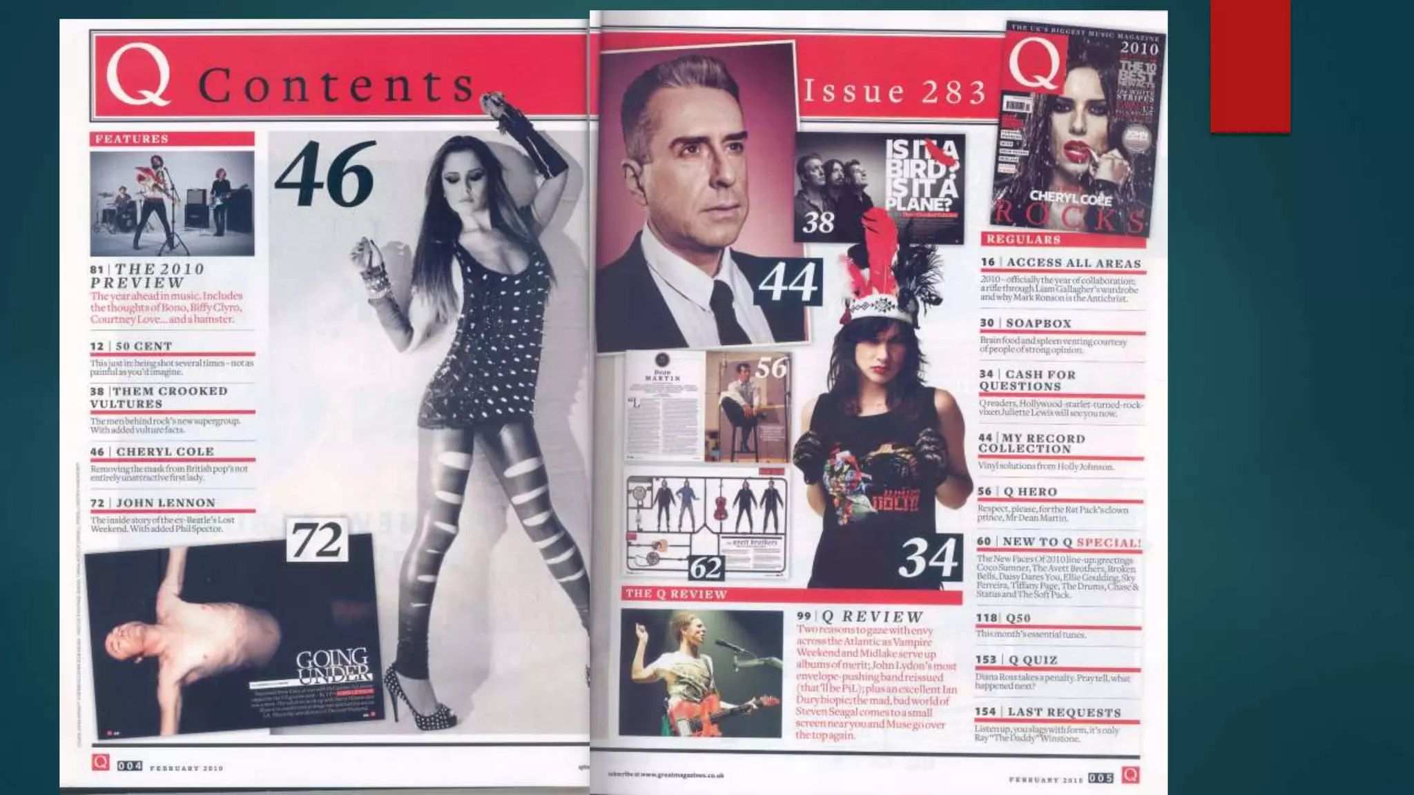
The main image of the left hand side of the contents page is a mid long shot of Cheryl
Cole. This suggests that there will be a big feature surrounding her, it also relates to the
front cover of the magazine, as this contents page has come from the issue with Cheryl
Cole on the front cover. She’s wearing ripped trousers/leggings revealing a lot of ‘skin’
and a low cut vest top. This represents her as quite provocative and confident, her
positioning reinforces this as she’s stood against a wall with her arms raised and legs
stood apart. Her top and shoes are both studded and she has a leather glove on one of
her arms and lots of bracelets on the other. These all have connotations of rock and
grunge, which challenges the stereotypical representation of Cheryl Cole being quite girly
and usually associated pop music. This could be to make Cheryl Cole be more appealing
to the older target audience of Q magazine. She is portrayed as if she’s a more of a rock
artist which also relates to the main cover of this issue that has the headline ‘Cheryl Cole
Rocks’. The image is in black and white which also connotes a rock genre.
The headline- The contents page is spread over two pages rather than one which is
unconventional as most music magazines only have side for the contents page. This
will appeal to the audience as it shows that magazine has a huge variety of articles,
features and reviews. As the page is a double spread the headline ‘Q Contents’ is
placed on the right hand side of the page. The headline is also in the red banner that
runs across the top of both pages. The ‘Q’ remains in the iconic white font to keep the
magazine’s brand identity and to appeal to the loyal regular reader. ‘Contents’ is in a
block font which contrast against the white ‘Q’. White has connotations of innocence
and purity whereas black is the complete opposite, connoting mystery and power. This
suggests that the magazine seems like most magazines from the outside but it’s the
contents of the magazine that differentiates the magazine from others. It suggests that
the magazine reveals the ‘deep dark secrets’ of artists and gives exclusive interviews.
The red banner behind the headline also reinforces the ‘rock’ theme of the issue as it
connotes danger, energy and power.
Lighting- the lighting used on the first page of the contents is generally high key lighting.
The lighting on John Lennon at the bottom of the page is an example of high lighting
being used to highlight him against the dark background. He’s positioned led down with
his arms open, facing upwards with his eyes closed and a minimal expression. This
represents him as rising up against the darkness in almost ‘god like’ position. However,
it could also be showing the struggle that John Lennon faced, representing him as
experiencing a lot of hardship. This is reinforced with the headline under the image
‘Going Under’ which suggests he wasn’t able to fight his problems and they often got
the better of him leaving him spiralling out of control and ‘going under’. The text under
this ‘Separated from Yoko, at war with McCartney, his phone tapped by the US
government…By 1947 John Lennon was a mess. The solution: hook up with Harry
Nillson and blaze a 16 month trail of drugs and destruction across LA. This is the untold
story of the lost weekend.’ This shows the reader the difficulties Lennon faced and
gives a hint into the his out control 16 months. This would appeal to them as it entices
and attracts them to the feature as it says the ‘untold story of the lost weekend’
suggesting it’s never been heard before and an exclusive to Q Magazine.
Features- the features of the magazine are placed at the top on the right hand side of the contents
page which meets the typical conventions of a music magazine as it’s where the audiences attention
will usually be drawn to first. The features will appeal to a wider audience because the features
section consists of new, interesting stories that the audience will be intrigued to see whereas, the
regular features are what they expect to see. The features will gratify the consumers needs of
entertainment and information. The features consist of ‘the 2010 preview, 50 Cent, them crooked
vultures, Cheryl Cole and John Lennon. This shows that the magazine is a hybrid magazine featuring
articles on all different types of music allowing it to appeal to a large audience ranging from students
to older people in their 30’s and 40’s. The page number and description are both in a bold black font
in capital letters and underlined by a thick red line separating them from each other. This is so that
each feature individually stands out.
The page the audience feel that the magazine is reliable and up to date, it gratifies their needs of
information. number and date are both placed at the bottom of the page. The page number appeals to the
audience as it makes it easier for them to navigate the magazine without any confusion. The date is also
included to ensure that
Colour scheme-The red, black and white colour scheme has been continued from the
cover to both sides of the contents page. This shows consistency within the magazine,
this will appeal to the audience, especially loyal readers, who know that these colours are
iconic to the magazine as they’re used on the masthead.
Layout- The layout of the first page is quite simplistic and manageable in comparison to
the second page which is busy and full. There is a large amount of text and images which
fill most of the second page. This represents the magazine as being full of new stories
which would appeal to the audience who would want to discover the latest music
updates. The second page could also represent the rock theme of the issue as rock music
is quite bold and loud. The images are also placed at a slant and not straight which also
represents the magazine as quite edgy.
The website- The website of Q is also featured at the bottom of the contents pages. This
encourages the reader to view the website which will increase the audience as
younger/busier audiences might prefer the magazine website which they can view on
their phones/tablets on the go. This shows that the magazine satisfies a wide variety of
people.
The issue number- the issue number is important to the magazine as it proves to the audience that
the magazine is not only reliable but successful as it emphasise the large amount that’s been sold. To
be on issue 283 suggests that the business is doing well which signifies the content of the magazine
still satisfies a large audience.
Images- An image of the cover of the magazine is placed amongst the other images on the contents
page, it reminds the reader what issue they’re reading and creates independence for each issue Q
magazine releases. The magazine also consists images of pages with their page numbers along side
them. This is different to most magazines which will have an image with description. This gives the
audience a preview of the pages they can read and persuades them to do. It also shows that the
audience of Q will recognise the features of the page therefore description of them is not required.
Font- The serif font is consistent throughout the contents pages, however different sizes and colours
are used to highlight key points. For example, ‘special’ is written in a red whereas the other words are
in black this shows that the magazine wants to draw attention to the ‘special’ and attract the reader.
The masthead of the magazine is placed small at the bottom of the contents page. This is to remind
the reader of the magazine and also make a lasting impression on the readers mind due to the fact it
is placed more frequently than other magazine’s mastheads which are conventionally just seen on the
cover.

Q Contents Page Analysis

  • 2.
    The main imageof the left hand side of the contents page is a mid long shot of Cheryl Cole. This suggests that there will be a big feature surrounding her, it also relates to the front cover of the magazine, as this contents page has come from the issue with Cheryl Cole on the front cover. She’s wearing ripped trousers/leggings revealing a lot of ‘skin’ and a low cut vest top. This represents her as quite provocative and confident, her positioning reinforces this as she’s stood against a wall with her arms raised and legs stood apart. Her top and shoes are both studded and she has a leather glove on one of her arms and lots of bracelets on the other. These all have connotations of rock and grunge, which challenges the stereotypical representation of Cheryl Cole being quite girly and usually associated pop music. This could be to make Cheryl Cole be more appealing to the older target audience of Q magazine. She is portrayed as if she’s a more of a rock artist which also relates to the main cover of this issue that has the headline ‘Cheryl Cole Rocks’. The image is in black and white which also connotes a rock genre.
  • 3.
    The headline- Thecontents page is spread over two pages rather than one which is unconventional as most music magazines only have side for the contents page. This will appeal to the audience as it shows that magazine has a huge variety of articles, features and reviews. As the page is a double spread the headline ‘Q Contents’ is placed on the right hand side of the page. The headline is also in the red banner that runs across the top of both pages. The ‘Q’ remains in the iconic white font to keep the magazine’s brand identity and to appeal to the loyal regular reader. ‘Contents’ is in a block font which contrast against the white ‘Q’. White has connotations of innocence and purity whereas black is the complete opposite, connoting mystery and power. This suggests that the magazine seems like most magazines from the outside but it’s the contents of the magazine that differentiates the magazine from others. It suggests that the magazine reveals the ‘deep dark secrets’ of artists and gives exclusive interviews. The red banner behind the headline also reinforces the ‘rock’ theme of the issue as it connotes danger, energy and power.
  • 4.
    Lighting- the lightingused on the first page of the contents is generally high key lighting. The lighting on John Lennon at the bottom of the page is an example of high lighting being used to highlight him against the dark background. He’s positioned led down with his arms open, facing upwards with his eyes closed and a minimal expression. This represents him as rising up against the darkness in almost ‘god like’ position. However, it could also be showing the struggle that John Lennon faced, representing him as experiencing a lot of hardship. This is reinforced with the headline under the image ‘Going Under’ which suggests he wasn’t able to fight his problems and they often got the better of him leaving him spiralling out of control and ‘going under’. The text under this ‘Separated from Yoko, at war with McCartney, his phone tapped by the US government…By 1947 John Lennon was a mess. The solution: hook up with Harry Nillson and blaze a 16 month trail of drugs and destruction across LA. This is the untold story of the lost weekend.’ This shows the reader the difficulties Lennon faced and gives a hint into the his out control 16 months. This would appeal to them as it entices and attracts them to the feature as it says the ‘untold story of the lost weekend’ suggesting it’s never been heard before and an exclusive to Q Magazine.
  • 5.
    Features- the featuresof the magazine are placed at the top on the right hand side of the contents page which meets the typical conventions of a music magazine as it’s where the audiences attention will usually be drawn to first. The features will appeal to a wider audience because the features section consists of new, interesting stories that the audience will be intrigued to see whereas, the regular features are what they expect to see. The features will gratify the consumers needs of entertainment and information. The features consist of ‘the 2010 preview, 50 Cent, them crooked vultures, Cheryl Cole and John Lennon. This shows that the magazine is a hybrid magazine featuring articles on all different types of music allowing it to appeal to a large audience ranging from students to older people in their 30’s and 40’s. The page number and description are both in a bold black font in capital letters and underlined by a thick red line separating them from each other. This is so that each feature individually stands out. The page the audience feel that the magazine is reliable and up to date, it gratifies their needs of information. number and date are both placed at the bottom of the page. The page number appeals to the audience as it makes it easier for them to navigate the magazine without any confusion. The date is also included to ensure that
  • 6.
    Colour scheme-The red,black and white colour scheme has been continued from the cover to both sides of the contents page. This shows consistency within the magazine, this will appeal to the audience, especially loyal readers, who know that these colours are iconic to the magazine as they’re used on the masthead. Layout- The layout of the first page is quite simplistic and manageable in comparison to the second page which is busy and full. There is a large amount of text and images which fill most of the second page. This represents the magazine as being full of new stories which would appeal to the audience who would want to discover the latest music updates. The second page could also represent the rock theme of the issue as rock music is quite bold and loud. The images are also placed at a slant and not straight which also represents the magazine as quite edgy. The website- The website of Q is also featured at the bottom of the contents pages. This encourages the reader to view the website which will increase the audience as younger/busier audiences might prefer the magazine website which they can view on their phones/tablets on the go. This shows that the magazine satisfies a wide variety of people.
  • 7.
    The issue number-the issue number is important to the magazine as it proves to the audience that the magazine is not only reliable but successful as it emphasise the large amount that’s been sold. To be on issue 283 suggests that the business is doing well which signifies the content of the magazine still satisfies a large audience. Images- An image of the cover of the magazine is placed amongst the other images on the contents page, it reminds the reader what issue they’re reading and creates independence for each issue Q magazine releases. The magazine also consists images of pages with their page numbers along side them. This is different to most magazines which will have an image with description. This gives the audience a preview of the pages they can read and persuades them to do. It also shows that the audience of Q will recognise the features of the page therefore description of them is not required. Font- The serif font is consistent throughout the contents pages, however different sizes and colours are used to highlight key points. For example, ‘special’ is written in a red whereas the other words are in black this shows that the magazine wants to draw attention to the ‘special’ and attract the reader. The masthead of the magazine is placed small at the bottom of the contents page. This is to remind the reader of the magazine and also make a lasting impression on the readers mind due to the fact it is placed more frequently than other magazine’s mastheads which are conventionally just seen on the cover.