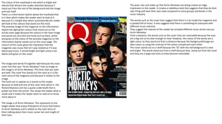
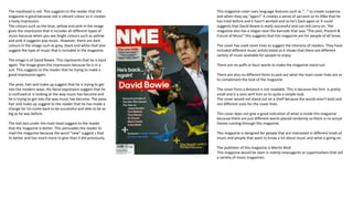
The masthead is red which attracts attention as it stands out from the background. There is an information skyline in blue above the masthead. The preview image on the skyline has light green colours that stand out against the dull tones used elsewhere on the cover. The colours give the impression that the magazine focuses on non-pop music genres. The image and words fit together well as the cover line references the image of Arctic Monkeys. The fonts used are bold to draw attention. The cover line stands out the most as the main story. The fonts are in capitals so they stand out clearly to readers. The image represents the target readers who enjoy that genre of music. The cover stands out on shelves due to the