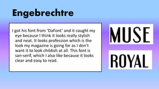
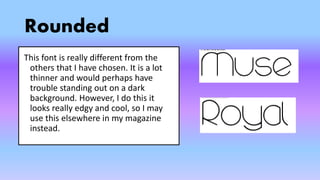
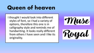
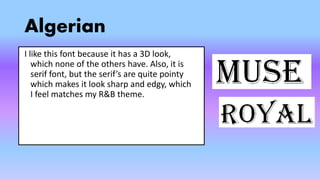
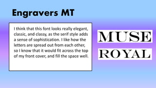
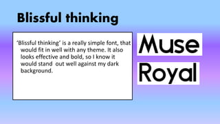
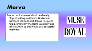
Masthead Designs
By Bethany Barrows
Quartzo:
A Few ideas
Engebrechtre:
Rounded: Anstraste:
Queen
of heaven:
John Handcock CP:
Engebrechtre
I got his font from ‘DaFont’ and it caught my
eye because I think it looks really stylish
and neat. It looks profession which is the
look my magazine is going for as I don't
want it to look childish at all. This font is
san-serif, which I also like because it looks
clear and easy to read.
Rounded
This font is really different from the
others that I have chosen. It is a lot
thinner and would perhaps have
trouble standing out on a dark
background. However, I do this it
looks really edgy and cool, so I may
use this elsewhere in my magazine
instead.
Anstraste
This font is very spread out, which I like,
because then it could fill up the top of my
magazine cover nicely, and be really bold in
presenting the magazine name. It reminds
me of writing that you might find on an
album cover, so this makes it even more
relevant to my music magazine.
Queen of heaven
I thought I would look into different
styles of font, so I had a variety of
options, therefore this one is in
calligraphy style and reminds me of
handwriting. It looks really different
from others I have seen and I like its
originality.
Algerian
I like this font because it has a 3D look,
which none of the others have. Also, it is
serif font, but the serif’s are quite pointy
which makes it look sharp and edgy, which
I feel matches my R&B theme.
Engravers MT
I think that this font looks really elegant,
classic, and classy, as the serif style adds
a sense of sophistication. I like how the
letters are spread out from each other,
so I know that it would fit across the top
of my front cover, and fill the space well.
Blissful thinking
‘Blissful thinking’ is a really simple font, that
would fit in well with any theme. It also
looks effective and bold, so I know it
would stand out well against my dark
background.
Franks
This font stood out to me because it looks
really funky and urban, as it is quite curly
letters. I think it is completely different to
any other magazine masthead I have seen
on other magazines, therefore it would look
unique and attract intrigued readers
Morva
Morva reminds me of classic and really
elegant writing, as it had a kind of old
fashioned look about it. I think this could
help promote my magazine is a classy and
timeless way, so this would be a successful
masthead.
John Handcock CP
Although, this font is quite mainstream, I
think there is a reason fonts like it are so
popular, because you cant go wrong with
it. This would match any style of magazine,
or any images around it, which is a really
positive thing for a font to be able to do.

Masthead designs

  • 1.
  • 2.
    Quartzo: A Few ideas Engebrechtre: Rounded:Anstraste: Queen of heaven: John Handcock CP:
  • 3.
    Engebrechtre I got hisfont from ‘DaFont’ and it caught my eye because I think it looks really stylish and neat. It looks profession which is the look my magazine is going for as I don't want it to look childish at all. This font is san-serif, which I also like because it looks clear and easy to read.
  • 4.
    Rounded This font isreally different from the others that I have chosen. It is a lot thinner and would perhaps have trouble standing out on a dark background. However, I do this it looks really edgy and cool, so I may use this elsewhere in my magazine instead.
  • 5.
    Anstraste This font isvery spread out, which I like, because then it could fill up the top of my magazine cover nicely, and be really bold in presenting the magazine name. It reminds me of writing that you might find on an album cover, so this makes it even more relevant to my music magazine.
  • 6.
    Queen of heaven Ithought I would look into different styles of font, so I had a variety of options, therefore this one is in calligraphy style and reminds me of handwriting. It looks really different from others I have seen and I like its originality.
  • 7.
    Algerian I like thisfont because it has a 3D look, which none of the others have. Also, it is serif font, but the serif’s are quite pointy which makes it look sharp and edgy, which I feel matches my R&B theme.
  • 8.
    Engravers MT I thinkthat this font looks really elegant, classic, and classy, as the serif style adds a sense of sophistication. I like how the letters are spread out from each other, so I know that it would fit across the top of my front cover, and fill the space well.
  • 9.
    Blissful thinking ‘Blissful thinking’is a really simple font, that would fit in well with any theme. It also looks effective and bold, so I know it would stand out well against my dark background.
  • 10.
    Franks This font stoodout to me because it looks really funky and urban, as it is quite curly letters. I think it is completely different to any other magazine masthead I have seen on other magazines, therefore it would look unique and attract intrigued readers
  • 11.
    Morva Morva reminds meof classic and really elegant writing, as it had a kind of old fashioned look about it. I think this could help promote my magazine is a classy and timeless way, so this would be a successful masthead.
  • 12.
    John Handcock CP Although,this font is quite mainstream, I think there is a reason fonts like it are so popular, because you cant go wrong with it. This would match any style of magazine, or any images around it, which is a really positive thing for a font to be able to do.