The document summarizes the layout, images, and sections featured on two music magazine contents pages.
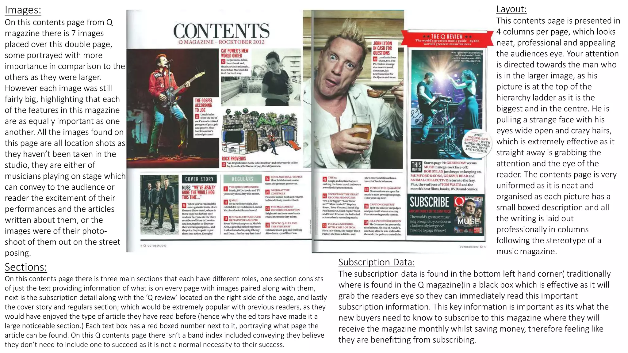
The Q magazine contents page contains 14 mixed-sized images of musicians, with some given more prominence. The layout is organized into 4 columns with the largest image at the top to draw attention. Subscription information is located typically in the bottom left corner.
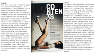
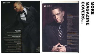
The Vibe magazine contents page features a single large image of Ciara in a powerful pose. The layout subverts conventions with its single image focus, bold title, and mix of text and advertisements. Colors are dark to seem formal.
Both pages effectively showcase content through visual hierarchy and organization to attract and guide readers' attention.


![Magazine research really official [recovered]](https://cdn.slidesharecdn.com/ss_thumbnails/magazine-research-really-official-recovered-160211094822-thumbnail.jpg?width=640&height=640&fit=bounds)

![Magazine research really official [recovered]](https://cdn.slidesharecdn.com/ss_thumbnails/magazineresearchreallyofficialrecovered-160222160255-thumbnail.jpg?width=640&height=640&fit=bounds)


