
More Related Content
What's hot
What's hot (17)
Viewers also liked
Similar to Technical Magazine Deconstruction
Similar to Technical Magazine Deconstruction (20)
Recently uploaded
Recently uploaded (20)
Technical Magazine Deconstruction
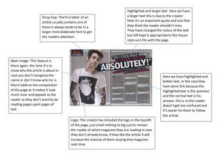
- 1. Drop-Cap- Thefirst letter of an article usually contains one of these it always tends to be in a larger moreelaborate font to get the readers attention. Main image- This feature is there again, this time it’s to show who the article is about in case you don’t recognisethe name or don’tknow who he is. Also it adds to the composition of the page as it makes it look much nicer and appeals to the reader as they don’t wantto be reading pages upon pages of text. Highlighted and larger text- Here we have a larger text this is due to the creator feels it’s an important quote and one that they think the reader shouldn’tmiss. They have changed the colour of the text but still kept it appropriateto the house style so it fits with the page. Here we have highlighted and bolder text, in this casethey have done this becausethe highlighted text is the question and the normal text is his answer, this is so the reader doesn’tget too confused and it’s easier for them to follow the article. Logo- The creator has included the logo in the top left of the page, justsmall nothing to big justto remain the reader of which magazine they are reading in case they don’t already know, if they like the article it will increase the chances of them buying that magazine next time.
- 2. Main image- Allows the reader to see who the article is aboutlooks like. You can tell by looking at the image how the mood and feeling of the article/interview is because they wouldn’tput a image of him all happy if the article was all about sad parts of his life. Housestyle- They havegone very colour co-ordinated on this spread as they have linked the title of the article text colour with the colours on the image, this helps makes the spread look very appealing and nice to look at for the reader. Once again with the text we have the questions being in bold and his answers justin normal text, once again this is done so the reader doesn’tget confused with who’s saying whatand allows the reader a smooth and comfortable experience. Intro text- This has had a different font style added to it compared to the rest as it is an important piece of information, it is showing the reader that they should read that before anything else. Itshould give them an insight in whatthe article is actually about a bit of context maybe.
- 3. Masthead- This has been done the way it is so the reader is drawn straightto it, very stand out and you can’t really miss it. Also the colours give us an indication of what the magazine is abut and who they are aiming it at. The colour red connotates that the magazinelike its readers is passionateabout music and likes to stand out fromthe crowd and be noticed. Main sell line- Positioned towards the centre of the magazine, a display fonthas been used. Main image- Once again looking at the image you can tell that a lot of the mag is going to be about them as they are the main focus on the front cover. Here they have used a pyramid style layout for the photo, they have the lead singer at the frontand the less important they are nearer the back of the photo, as people are more incline to recognisethe lead singer than the drummer who sits in the back. Skyline- This has been used to give the reader something else to buy the mag in this case it’s a free poster, it is placed around the masthead so it’s like the reader will notice it when browsing the magazineon the shelf. Ithighlights the word free because when the reader notices that they will be getting something for nothing so the magazine is better value also. Sell lines- These havebeen added to the frontcover so the reader can get a small taste of what’s to come in the magazine, is has used a specific type of language that makes the reader more incline to read it, they try to add emphasis onto the story or interview they are showing. Here we have the barcode, date line, price and the issuenumber all in one place makes it easier to find.
- 4. Here the housestyle has been continued from the frontcover page with the same fonts and images been used to make it look professionaland organised. Also links in with the structure. Once again photos of the band are on the page and take up the majority of that page, it has a running theme of bands and artists performing. Ithas done this so the reader knows exactly what it’s about. Main image of the band, shows there is going to be more information about them than the band with the small image, most likely due to popularity as more people will read it if its someone good. Table of contents- Here it gives us an indication of what’s to come in the magazine and enables you to find it quickly and easily, also gives you a short snippet into what that article is about and whatyou’rein store for. Also gives us a smallcontents for regulars this allows people who buy the magazine every week quickly find their favourite part of the magazine Additional images to allow people to find their favouritebands that they want to read about but don’t want to know much details about what the article is. You can tell this mag is aimed at a younger generation as younger people like to skip ahead and look at photos also they aren’tinterested in all of the information they justwant to read about their bands
- 5. Once again the housestyle has been continued onto the contents page, with the red, white and black colours. This has been used to help create a good look with the magazine and help keep it structured, also it helps the overall image as if they keep the same style throughoutit looks more professional. Main image- Once again we have the majority of the page took over by an image of a popular band as if people see this band who they recogniseand like they are morelively to read the magazine, also helps to improvethe sales if it includes more bands people know. Table of contents- The titles of each page are all in bold so they are easy to find and see for the reader. Itis much like sell lines as if the reader sees an article they like they will probably buy the mag. Ithas additional information but only a small snippet of somearticles to give the reader a taste of what’s to come. Also there has been graphics used to make the contents page more aesthetically pleasing. This is an extra part of the contents page that has been highlighted for effect, the colour scheme has changed because this part is more important than the other parts of the contents as it is about a much bigger band e.g., oasis in this case, helps people to find that section easier
- 6. Main image- This is the main focal point of the magazine, the image shows whatthe largest amountof content in the magazine is on. Also they tend to pick popular people this means if they havea lot of fans they are likely to buy it to read about that person. Sell lines- The language used on these has been used for a specific reason. Itwill make the reader want to open it and buy the magazine, they act as teasers for the content of the magazine. Itoffers a description of the story and is also aimed to intrigue the audience. Main sell line- The sizeof the text here has been increaseto stand out once again to draw attention to the buyer its giving them a small taste of what the magazine has to offer so they will be more incline to buy it. Masthead- This has been put in to draw the reader in so they can see at firstglance whatmagazine it is. Ithas been constructed through a display of font. Ithas a mixture of red and black colour but red being the main one. The colour of the masthead changes depending who’s on the front of the magazine in this case Itcould be telling us that this man maybe bold and loud but also quite fiery and may lose his temper fromtime to time. Dateline, price and issue number Skyline- This has been added to help draw attention to the magazinewhen on the shelf. Itis placed above the masthead rather than below as the reader is more likely to notice it based on wherethe masthead is positioned. Itcan vary froma free item or in this case a contriver shall question which may makethe reader wantto continue reading and buy the magazine.