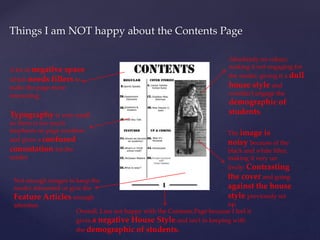
‘Uniform’ Magazine 
{ 
Evaluation
Things I am happy with about the Front Cover 
Masthead to give the 
Magazine an important 
connotation 
Puff to give the 
magazine a 
sense of 
status 
Cover line to 
give the major 
article of the 
issue most 
attention 
A mid-shot smiling, 
Feature Article 
Photograph to give a 
warm and inviting tone 
to the magazine 
A barcode as a 
filler, in keeping 
with convention.
Things I am NOT happy about the Front Cover 
I used a typography that was very 
large and confrontational because it 
was very much like army writing, 
giving it a harsh connotation. 
Which is against the happy and 
welcoming vibe I was trying to create 
in this cover. As this is the only font 
used I also feel the cover lacks 
variation and seems very 
unnegotiable. 
There is also only two colours 
used on the cover, which I feel isn’t 
enough variation to attract a 
reader. 
Also, because there are not 
many plugs, the reader 
doesn’t really know what is 
inside the magazine. 
Creating a lack of interest 
and a not clear of 
mode of address, 
which will perhaps leave a 
reader confused as to what 
the demographic is. 
I am not happy with the overall miss-en-scene with the cover because I feel it does 
not give off the overall feeling I was looking for
Things I am happy about the Contents Page 
Used an image, related 
to the Feature 
Article, to give the 
connotation that Page 4 
is the most important in 
the whole issue. 
I numbered the page 
which is good because 
people like order 
and creates a 
functional 
connotation 
Very easy to read 
typography, making it 
easy for the reader to 
follow the content of the 
magazine and skip to the 
features that matter to 
them. 
Because it is orderly, it 
creates a house style. 
Which will help build the 
Brand of the magazine
Things I am NOT happy about the Contents Page 
A lot of negative space 
which needs fillers to 
make the page more 
interesting. 
Absolutely no colour, 
making it not engaging for 
the reader, giving it a dull 
house style and 
wouldn’t engage the 
demographic of 
Typography is very small students. 
so there is too much 
emphasis on page numbers 
and gives a confused 
connotation for the 
reader. 
The image is 
noisy because of the 
black and white filter, 
making it very un 
lively: Contrasting 
the cover and going 
against the house 
style previously set 
up. 
Not enough images to keep the 
reader interested or give the 
Feature Articles enough 
attention 
Overall, I am not happy with the Contents Page because I feel it 
gives a negative House Style and isn’t in keeping with 
the demographic of students.
Tools used when creating the Front Cover 
I used Type Tool 
and chose my 
typography Eye-dropper Tool to 
ensure my text is the same 
colour 
I used the Ellipse 
Tool and made it the 
same colour as my title to 
put in a Plug 
Move Tool to move text and 
shapes around the cover
Tools used when creating the Contents Page 
Move Tool, to move text, 
images and shapes around the 
page 
I Cropped the 
image so there wasn’t 
too much left over 
space around Louise 
Type Tool to change 
the typography, 
and size 
Rectangle Tool to make the page 
number more dominant and to make the 
columns of the page more clear
The conventions I used 
I used a mid-shot on the front 
cover 
Barcode as a space 
filler 
Large numbers to 
emphasise importance of 
articles 
Quote from the feature 
article 
I used columns on the 
contents page 
Page numbers on the 
contents page 
An image related to the 
feature article

Uniform magazine evaluation

  • 1.
  • 2.
    Things I amhappy with about the Front Cover Masthead to give the Magazine an important connotation Puff to give the magazine a sense of status Cover line to give the major article of the issue most attention A mid-shot smiling, Feature Article Photograph to give a warm and inviting tone to the magazine A barcode as a filler, in keeping with convention.
  • 3.
    Things I amNOT happy about the Front Cover I used a typography that was very large and confrontational because it was very much like army writing, giving it a harsh connotation. Which is against the happy and welcoming vibe I was trying to create in this cover. As this is the only font used I also feel the cover lacks variation and seems very unnegotiable. There is also only two colours used on the cover, which I feel isn’t enough variation to attract a reader. Also, because there are not many plugs, the reader doesn’t really know what is inside the magazine. Creating a lack of interest and a not clear of mode of address, which will perhaps leave a reader confused as to what the demographic is. I am not happy with the overall miss-en-scene with the cover because I feel it does not give off the overall feeling I was looking for
  • 4.
    Things I amhappy about the Contents Page Used an image, related to the Feature Article, to give the connotation that Page 4 is the most important in the whole issue. I numbered the page which is good because people like order and creates a functional connotation Very easy to read typography, making it easy for the reader to follow the content of the magazine and skip to the features that matter to them. Because it is orderly, it creates a house style. Which will help build the Brand of the magazine
  • 5.
    Things I amNOT happy about the Contents Page A lot of negative space which needs fillers to make the page more interesting. Absolutely no colour, making it not engaging for the reader, giving it a dull house style and wouldn’t engage the demographic of Typography is very small students. so there is too much emphasis on page numbers and gives a confused connotation for the reader. The image is noisy because of the black and white filter, making it very un lively: Contrasting the cover and going against the house style previously set up. Not enough images to keep the reader interested or give the Feature Articles enough attention Overall, I am not happy with the Contents Page because I feel it gives a negative House Style and isn’t in keeping with the demographic of students.
  • 6.
    Tools used whencreating the Front Cover I used Type Tool and chose my typography Eye-dropper Tool to ensure my text is the same colour I used the Ellipse Tool and made it the same colour as my title to put in a Plug Move Tool to move text and shapes around the cover
  • 7.
    Tools used whencreating the Contents Page Move Tool, to move text, images and shapes around the page I Cropped the image so there wasn’t too much left over space around Louise Type Tool to change the typography, and size Rectangle Tool to make the page number more dominant and to make the columns of the page more clear
  • 8.
    The conventions Iused I used a mid-shot on the front cover Barcode as a space filler Large numbers to emphasise importance of articles Quote from the feature article I used columns on the contents page Page numbers on the contents page An image related to the feature article