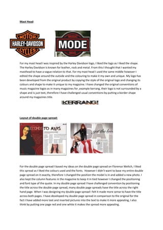
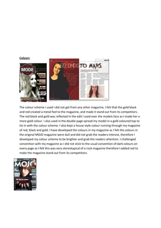
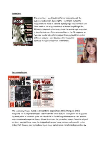
The document discusses the design choices made for various elements of a magazine. For the masthead, the designer was inspired by the Harley Davidson logo and adapted its shape and colors to create something unique. For the double page spread, the designer took inspiration from another magazine spread but changed the model's position and added a new photo while keeping column features. The designer added more text and images to the double page spread to make it more appealing. Colors of red, black, and gold were chosen to create a metallic feel and make the magazine stand out. Cover lines were put in different colors to grab attention, and secondary images on the contents page were made brighter to be more obvious and easy to read, challenging conventions.
