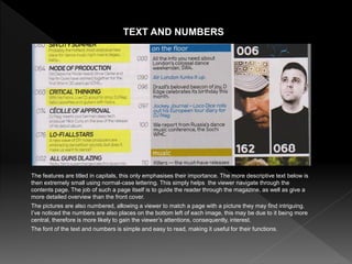
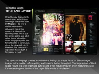
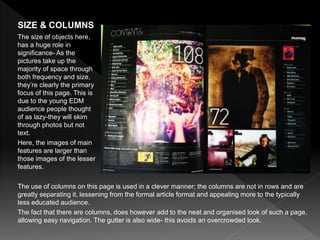
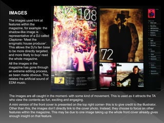
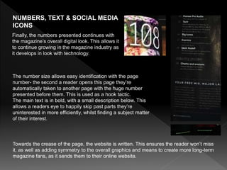
SlideShare a Scribd company logo
magazine 1: DJ
The title of DJ Magazine’s contents page is seen on the
top right corner. It’s quite small and overlaps the page
border. It’s also in a thin font. All these factors contribute
to, although it being clear, it’s purposely out of place. The
reason for this is to focus the viewer on the features
shown, not distract from them.
The style of the font is sans serif- this makes it easier to
read and is stereo-typically aimed at a younger audience.
The content is laid over a single page. The majority of the
page is text- this is fragmented through the use of colour.
The images border the text. The straight forward, neat
structure of page makes it easy to follow, and also gives it
more of an adult-like, article effect. There is much white
space, but this only foregrounds the images and text-
guiding the viewer’s eye.
The text and the images are all relatively the same size-
giving each feature the same amount of significance.
contents page: TITLE & LAYOUT
The images here used cover a wide range of areas- from clubbing
to DJs, fashion to music production. Everything EDM related can
be seen here with an image. This ensures someone quickly
skimming through the magazine, to find something they will enjoy.
Although there is one picture of a female, this is used for the
feature of ‘fashion’, which is stereo-typical towards this genre.
IMAGES
The people in the images range from 25-50 year olds. This is due
to the slightly younger EDM audience (late teens- early twenties),
looking up to such people. I’ve also noticed there are a range of
expressions (e.g. a silly shocked face), again linking to youth.
•
The image I enlarged to
the left, has been used to
highlight the cultural
aspects of the magazine.
Due to it being taken at
night, the lights and
silhouettes make it an
easily recognisable place-
a festival. Such simplistic
denotations allow it to be
easy to the eye.
Although the colours from the chosen photos are
quite random, there is a shared trend- darkness. All
the colours contain a large amount of black and
shadows. This reflects the night-light feel of the
magazine, connoting the genre ‘EDM’. It also follows
on from the dark colours used for the front cover.
Much of the text is also highlighted with colour. The
first column useds bright yellow, this connotes an
exclusive area, which proves correct by the headline
‘Features’ The use of multiple colours does give the
magazine a more child-like feel, as pink, blue and
gold (in the middle column), are almost the primary
colours: red, blue and yellow. The colours do
however, separate the featured content from the
regular, making it easier for a reader to follow. The
colour white is a simply used as a canvas for such
content.
COLOUR SCHEME AND HOUSE STYLE
The features are titled in capitals, this only emphasises their importance. The more descriptive text below is
then extremely small using normal-case lettering. This simply helps the viewer navigate through the
contents page. The job of such a page itself is to guide the reader through the magazine, as well as give a
more detailed overview than the front cover.
The pictures are also numbered, allowing a viewer to match a page with a picture they may find intriguing.
I’ve noticed the numbers are also places on the bottom left of each image, this may be due to it being more
central, therefore is more likely to gain the viewer’s attentions, consequently, interest.
The font of the text and numbers is simple and easy to read, making it useful for their functions.
TEXT AND NUMBERS
magazine 2: MIXMAG
The layout of the page creates a symmetrical feeling- your eyes focus on the two larger
images in the middle, before getting lead towards the bordering text. The large extent of blank
space results in a well-organised outlook and a well focused viewer- every feature takes up
it’s own rectangular fraction of the page. This results in no clashes.
contents page:
TITLE AND LAYOUT
Straight away, this contents
page is seen as having an
advantage space-wise from
DJ Magazine- It’s over a
double page spread.
Although it has all this
space, the title again is
relatively small. This is due
to it simple acting as a label
rather than a min subject
within this page spread. The
font of the title is continuous,
giving it a glow-stick, night-
life effect. The fact that it’s
capitalised makes such a
font easier to read.
The use of columns on this page is used in a clever manner; the columns are not in rows and are
greatly separating it, lessening from the formal article format and appealing more to the typically
less educated audience.
The fact that there are columns, does however add to the neat and organised look of such a page,
allowing easy navigation. The gutter is also wide- this avoids an overcrowded look.
SIZE & COLUMNS
The size of objects here,
has a huge role in
significance- As the
pictures take up the
majority of space through
both frequency and size,
they’re clearly the primary
focus of this page. This is
due to the young EDM
audience people thought
of as lazy-they will skim
through photos but not
text.
Here, the images of main
features are larger than
those images of the lesser
features.
The images are all caught in the moment- with some kind of movement. This is used as it attracts the TA
who view the contents as fun, exciting and engaging.
A mini version of the front cover is presented on the top right corner- this is to give credit to the illustrator.
Other than this, the images don’t directly link to the cover photo. Instead, they choose to focus on other
features within the magazine. This may be due to one image taking up the whole front cover already gives
enough insight on that feature.
IMAGES
The images used hint at
features within the
magazine, for example: the
shadow-like image is
representative of a DJ called
Claptone- ‘Meet the
enigmatic house producer’.
This allows the DJ’s fan base
to be more directly targeted,
and more likely to buy/ read
the whole magazine.
All the images in the
magazine has gone through
an extreme editing process,
as been made obvious. This
relates the artificial sound of
EDM music.
QUOTES, COLOUR
SCHEME &
HOUSE STYLE
The colour scheme follows off from the front colour through the high saturation
allowing the pinks, indigos and yellows to strongly show through. The simplistic
house style of the magazine is also seen here are the photos are placed as
squares- they’re not cut around.
•Surprisingly, no
quotes from
inside articles are
seen featured on
this page. This
may be due to
summaries being
a shorter way to
give insight on
the content.
NUMBERS, TEXT & SOCIAL MEDIA
ICONS
Towards the crease of the page, the website is written. This ensures the reader won’t miss
it, as well as adding symmetry to the overall graphics and means to create more long-term
magazine fans, as it sends them to their online website.
Finally, the numbers presented continues with
the magazine’s overall digital look. This allows it
to continue growing in the magazine industry as
it develops in look with technology.
The number size allows easy identification with the page
number- the second a reader opens this page they’re
automatically taken to another page with the huge number
presented before them. This is used as a hook tactic.
The main text is in bold, with a small description below. This
allows a readers eye to happily skip past parts they’re
uninterested in more efficiently, whilst finding a subject matter
of their interest.
I’VE LEARNT HOW A CONTENT PAGE
EFFICIENTLY OPPERATES TO ACHIEVE IT’S
PRIMARY PURPOSES. THIS WILL INFLUENCE
MY FURTHUR RESEARCH AS I NOW HAVE
BACKGROUND KNOWELDGE.
Produced by Cherie Herman

More Related Content

What's hot

C&C FRONT COVER
C&C FRONT COVERC&C FRONT COVER
C&C FRONT COVER
mollybeck_
 
Magazine Cover/Contents/DPS Analysis
Magazine Cover/Contents/DPS AnalysisMagazine Cover/Contents/DPS Analysis
Magazine Cover/Contents/DPS Analysis
Oliver Brayshaw
 
Evaluation q1
Evaluation q1Evaluation q1
Evaluation q1
mollybeck_
 
Classic rock contents deconstruction
Classic rock contents deconstructionClassic rock contents deconstruction
Classic rock contents deconstruction
Georgia Cummings
 
Dizze rascal
Dizze rascalDizze rascal
Dizze rascal
gabbieatwal
 
Magazine analysis
Magazine analysisMagazine analysis
Magazine analysis
Alice Bates
 
Music magazine analysis
Music magazine analysisMusic magazine analysis
Music magazine analysis
Kaylee Heckford
 
Kerrang dps deconstruction
Kerrang dps deconstructionKerrang dps deconstruction
Kerrang dps deconstruction
Georgia Cummings
 
Magazine analysis
Magazine analysisMagazine analysis
Magazine analysis
Alice Bates
 
Nme cover deconstruction
Nme cover deconstructionNme cover deconstruction
Nme cover deconstruction
Georgia Cummings
 
Classic rock dps deconstruction
Classic rock dps deconstruction Classic rock dps deconstruction
Classic rock dps deconstruction
Georgia Cummings
 
Dizze rascal
Dizze rascalDizze rascal
Dizze rascal
gabbieatwal
 
Dizze rascal
Dizze rascalDizze rascal
Dizze rascal
gabbieatwal
 
Nme contents deconstruction
Nme contents deconstruction Nme contents deconstruction
Nme contents deconstruction
Georgia Cummings
 
Magazine content analysi
Magazine content analysiMagazine content analysi
Magazine content analysi
sarahcunningham17
 
Contents pages
Contents pagesContents pages
Contents pages
danobrien93
 
Analysing contents pages
Analysing contents pagesAnalysing contents pages
Analysing contents pages
lauramas0n
 
Contents Page Research
Contents Page ResearchContents Page Research
Contents Page Research
beckyjay26
 
Drafts annotations
Drafts annotationsDrafts annotations
Drafts annotations
AS Media Column E
 
Cotents page analysis
Cotents page analysisCotents page analysis
Cotents page analysis
RyanDenner
 

What's hot (20)

C&C FRONT COVER
C&C FRONT COVERC&C FRONT COVER
C&C FRONT COVER
 
Magazine Cover/Contents/DPS Analysis
Magazine Cover/Contents/DPS AnalysisMagazine Cover/Contents/DPS Analysis
Magazine Cover/Contents/DPS Analysis
 
Evaluation q1
Evaluation q1Evaluation q1
Evaluation q1
 
Classic rock contents deconstruction
Classic rock contents deconstructionClassic rock contents deconstruction
Classic rock contents deconstruction
 
Dizze rascal
Dizze rascalDizze rascal
Dizze rascal
 
Magazine analysis
Magazine analysisMagazine analysis
Magazine analysis
 
Music magazine analysis
Music magazine analysisMusic magazine analysis
Music magazine analysis
 
Kerrang dps deconstruction
Kerrang dps deconstructionKerrang dps deconstruction
Kerrang dps deconstruction
 
Magazine analysis
Magazine analysisMagazine analysis
Magazine analysis
 
Nme cover deconstruction
Nme cover deconstructionNme cover deconstruction
Nme cover deconstruction
 
Classic rock dps deconstruction
Classic rock dps deconstruction Classic rock dps deconstruction
Classic rock dps deconstruction
 
Dizze rascal
Dizze rascalDizze rascal
Dizze rascal
 
Dizze rascal
Dizze rascalDizze rascal
Dizze rascal
 
Nme contents deconstruction
Nme contents deconstruction Nme contents deconstruction
Nme contents deconstruction
 
Magazine content analysi
Magazine content analysiMagazine content analysi
Magazine content analysi
 
Contents pages
Contents pagesContents pages
Contents pages
 
Analysing contents pages
Analysing contents pagesAnalysing contents pages
Analysing contents pages
 
Contents Page Research
Contents Page ResearchContents Page Research
Contents Page Research
 
Drafts annotations
Drafts annotationsDrafts annotations
Drafts annotations
 
Cotents page analysis
Cotents page analysisCotents page analysis
Cotents page analysis
 

Similar to Conents

Contents codes and covs
Contents codes and covsContents codes and covs
Contents codes and covs
india smith
 
Codes and convention new
Codes and convention newCodes and convention new
Codes and convention new
india smith
 
Contents analysis
Contents analysis Contents analysis
Contents analysis
tafigaza
 
Evaluation 1
Evaluation 1 Evaluation 1
Evaluation 1
ellawakerell
 
Magazine front cover and contents page analysis
Magazine front cover and contents page analysisMagazine front cover and contents page analysis
Magazine front cover and contents page analysis
gg05047897
 
Shout contents analysis
Shout contents analysisShout contents analysis
Shout contents analysis
katiess07
 
Annotations of contents pages
Annotations of contents pagesAnnotations of contents pages
Annotations of contents pages
lucyvh
 
Eval 1
Eval 1Eval 1
Eval 1
ellawakerell
 
Content analysis
Content analysisContent analysis
Content analysis
Kiya Cussans
 
Analysing contents pages
Analysing  contents pages Analysing  contents pages
Analysing contents pages
hargravee1
 
AlexaDippold MusicMagazineResearch
AlexaDippold MusicMagazineResearchAlexaDippold MusicMagazineResearch
AlexaDippold MusicMagazineResearch
AlexaDippold
 
Task 3c
Task 3cTask 3c
Task 3c
asmediae15
 
As unit g321 research and planning presentation
As unit g321 research and planning presentationAs unit g321 research and planning presentation
As unit g321 research and planning presentation
nathanhicks1999
 
Own magazine analysis
Own magazine analysisOwn magazine analysis
Own magazine analysis
AS Media Column C
 
Contents Pages of Magazines
Contents Pages of Magazines Contents Pages of Magazines
Contents Pages of Magazines
stonee1
 
Task one and two
Task one and twoTask one and two
Task one and two
Maddy39241
 
Task 2 analysis of nme music magazine
Task 2  analysis of nme music magazineTask 2  analysis of nme music magazine
Task 2 analysis of nme music magazine
asmediab15
 
Analysis of contents pages and double page spreads
Analysis of contents pages and double page spreadsAnalysis of contents pages and double page spreads
Analysis of contents pages and double page spreads
JoePriestleyCollege
 
Contents page analysis
Contents page analysisContents page analysis
Contents page analysis
shaniajay
 
Music magazine analysis
Music magazine analysisMusic magazine analysis
Music magazine analysis
BethanyPhilippa
 

Similar to Conents (20)

Contents codes and covs
Contents codes and covsContents codes and covs
Contents codes and covs
 
Codes and convention new
Codes and convention newCodes and convention new
Codes and convention new
 
Contents analysis
Contents analysis Contents analysis
Contents analysis
 
Evaluation 1
Evaluation 1 Evaluation 1
Evaluation 1
 
Magazine front cover and contents page analysis
Magazine front cover and contents page analysisMagazine front cover and contents page analysis
Magazine front cover and contents page analysis
 
Shout contents analysis
Shout contents analysisShout contents analysis
Shout contents analysis
 
Annotations of contents pages
Annotations of contents pagesAnnotations of contents pages
Annotations of contents pages
 
Eval 1
Eval 1Eval 1
Eval 1
 
Content analysis
Content analysisContent analysis
Content analysis
 
Analysing contents pages
Analysing  contents pages Analysing  contents pages
Analysing contents pages
 
AlexaDippold MusicMagazineResearch
AlexaDippold MusicMagazineResearchAlexaDippold MusicMagazineResearch
AlexaDippold MusicMagazineResearch
 
Task 3c
Task 3cTask 3c
Task 3c
 
As unit g321 research and planning presentation
As unit g321 research and planning presentationAs unit g321 research and planning presentation
As unit g321 research and planning presentation
 
Own magazine analysis
Own magazine analysisOwn magazine analysis
Own magazine analysis
 
Contents Pages of Magazines
Contents Pages of Magazines Contents Pages of Magazines
Contents Pages of Magazines
 
Task one and two
Task one and twoTask one and two
Task one and two
 
Task 2 analysis of nme music magazine
Task 2  analysis of nme music magazineTask 2  analysis of nme music magazine
Task 2 analysis of nme music magazine
 
Analysis of contents pages and double page spreads
Analysis of contents pages and double page spreadsAnalysis of contents pages and double page spreads
Analysis of contents pages and double page spreads
 
Contents page analysis
Contents page analysisContents page analysis
Contents page analysis
 
Music magazine analysis
Music magazine analysisMusic magazine analysis
Music magazine analysis
 

Recently uploaded

❼❷⓿❺❻❷❽❷❼❽ Dpboss Kalyan Satta Matka Guessing Matka Result Main Bazar chart
❼❷⓿❺❻❷❽❷❼❽ Dpboss Kalyan Satta Matka Guessing Matka Result Main Bazar chart❼❷⓿❺❻❷❽❷❼❽ Dpboss Kalyan Satta Matka Guessing Matka Result Main Bazar chart
❼❷⓿❺❻❷❽❷❼❽ Dpboss Kalyan Satta Matka Guessing Matka Result Main Bazar chart
 
2024 MATFORCE Youth Poster Contest Winners
2024 MATFORCE Youth Poster Contest Winners2024 MATFORCE Youth Poster Contest Winners
2024 MATFORCE Youth Poster Contest Winners
matforce
 
Heart Touching Romantic Love Shayari In English with Images
Heart Touching Romantic Love Shayari In English with ImagesHeart Touching Romantic Love Shayari In English with Images
Heart Touching Romantic Love Shayari In English with Images
Short Good Quotes
 
➒➌➎➏➑➐➋➑➐➐ Dpboss Satta Matka Matka Guessing Kalyan Chart Indian Matka Satta ...
➒➌➎➏➑➐➋➑➐➐ Dpboss Satta Matka Matka Guessing Kalyan Chart Indian Matka Satta ...➒➌➎➏➑➐➋➑➐➐ Dpboss Satta Matka Matka Guessing Kalyan Chart Indian Matka Satta ...
➒➌➎➏➑➐➋➑➐➐ Dpboss Satta Matka Matka Guessing Kalyan Chart Indian Matka Satta ...
➒➌➎➏➑➐➋➑➐➐Dpboss Matka Guessing Satta Matka Kalyan Chart Indian Matka
 
Ealing London Independent Photography meeting - June 2024
Ealing London Independent Photography meeting - June 2024Ealing London Independent Photography meeting - June 2024
Ealing London Independent Photography meeting - June 2024
Sean McDonnell
 
一比一原版(BC毕业证)波士顿学院毕业证如何办理
一比一原版(BC毕业证)波士顿学院毕业证如何办理一比一原版(BC毕业证)波士顿学院毕业证如何办理
一比一原版(BC毕业证)波士顿学院毕业证如何办理
40fortunate
 
All the images mentioned in 'See What You're Missing'
All the images mentioned in 'See What You're Missing'All the images mentioned in 'See What You're Missing'
All the images mentioned in 'See What You're Missing'
Dave Boyle
 
This is a test powerpoint!!!!!!!!!!!!!!!
This is a test powerpoint!!!!!!!!!!!!!!!This is a test powerpoint!!!!!!!!!!!!!!!
This is a test powerpoint!!!!!!!!!!!!!!!
briannedpegg
 
In Focus_ The Evolution of Boudoir Photography in NYC.pdf
In Focus_ The Evolution of Boudoir Photography in NYC.pdfIn Focus_ The Evolution of Boudoir Photography in NYC.pdf
In Focus_ The Evolution of Boudoir Photography in NYC.pdf
Boudoir Photography by Your Hollywood Portrait
 
Colour Theory for Painting - Fine Artist.pdf
Colour Theory for Painting - Fine Artist.pdfColour Theory for Painting - Fine Artist.pdf
Colour Theory for Painting - Fine Artist.pdf
Ketan Naik
 
➒➌➎➏➑➐➋➑➐➐ Dpboss Matka Guessing Satta Matka Kalyan panel Chart Indian Matka ...
➒➌➎➏➑➐➋➑➐➐ Dpboss Matka Guessing Satta Matka Kalyan panel Chart Indian Matka ...➒➌➎➏➑➐➋➑➐➐ Dpboss Matka Guessing Satta Matka Kalyan panel Chart Indian Matka ...
➒➌➎➏➑➐➋➑➐➐ Dpboss Matka Guessing Satta Matka Kalyan panel Chart Indian Matka ...
➒➌➎➏➑➐➋➑➐➐Dpboss Matka Guessing Satta Matka Kalyan Chart Indian Matka
 
一比一原版美国亚利桑那大学毕业证(ua毕业证书)如何办理
一比一原版美国亚利桑那大学毕业证(ua毕业证书)如何办理一比一原版美国亚利桑那大学毕业证(ua毕业证书)如何办理
一比一原版美国亚利桑那大学毕业证(ua毕业证书)如何办理
homgo
 
FinalFinalSelf-PortraiturePowerPoint.pptx
FinalFinalSelf-PortraiturePowerPoint.pptxFinalFinalSelf-PortraiturePowerPoint.pptx
FinalFinalSelf-PortraiturePowerPoint.pptx
abbieharman
 
Tibbetts_HappyAwesome_NewArc Sketch to AI
Tibbetts_HappyAwesome_NewArc Sketch to AITibbetts_HappyAwesome_NewArc Sketch to AI
Tibbetts_HappyAwesome_NewArc Sketch to AI
Todd Tibbetts
 
哪里购买美国乔治城大学毕业证硕士学位证书原版一模一样
哪里购买美国乔治城大学毕业证硕士学位证书原版一模一样哪里购买美国乔治城大学毕业证硕士学位证书原版一模一样
哪里购买美国乔治城大学毕业证硕士学位证书原版一模一样
tc73868
 
Codes n Conventions Website Media studies.pptx
Codes n Conventions Website Media studies.pptxCodes n Conventions Website Media studies.pptx
Codes n Conventions Website Media studies.pptx
ZackSpencer3
 
Fashionista Chic Couture Mazes and Coloring AdventureA
Fashionista Chic Couture Mazes and Coloring AdventureAFashionista Chic Couture Mazes and Coloring AdventureA
Fashionista Chic Couture Mazes and Coloring AdventureA
julierjefferies8888
 
一比一原版美国加州大学圣地亚哥分校毕业证(ucsd毕业证书)如何办理
一比一原版美国加州大学圣地亚哥分校毕业证(ucsd毕业证书)如何办理一比一原版美国加州大学圣地亚哥分校毕业证(ucsd毕业证书)如何办理
一比一原版美国加州大学圣地亚哥分校毕业证(ucsd毕业证书)如何办理
taqyea
 
HOW TO USE PINTEREST_by: Clarissa Credito
HOW TO USE PINTEREST_by: Clarissa CreditoHOW TO USE PINTEREST_by: Clarissa Credito
HOW TO USE PINTEREST_by: Clarissa Credito
ClarissaAlanoCredito
 
FinalA1LessonPlanMaking.docxdvdnlskdnvsldkvnsdkvn
FinalA1LessonPlanMaking.docxdvdnlskdnvsldkvnsdkvnFinalA1LessonPlanMaking.docxdvdnlskdnvsldkvnsdkvn
FinalA1LessonPlanMaking.docxdvdnlskdnvsldkvnsdkvn
abbieharman
 

Recently uploaded (20)

❼❷⓿❺❻❷❽❷❼❽ Dpboss Kalyan Satta Matka Guessing Matka Result Main Bazar chart
❼❷⓿❺❻❷❽❷❼❽ Dpboss Kalyan Satta Matka Guessing Matka Result Main Bazar chart❼❷⓿❺❻❷❽❷❼❽ Dpboss Kalyan Satta Matka Guessing Matka Result Main Bazar chart
❼❷⓿❺❻❷❽❷❼❽ Dpboss Kalyan Satta Matka Guessing Matka Result Main Bazar chart
 
2024 MATFORCE Youth Poster Contest Winners
2024 MATFORCE Youth Poster Contest Winners2024 MATFORCE Youth Poster Contest Winners
2024 MATFORCE Youth Poster Contest Winners
 
Heart Touching Romantic Love Shayari In English with Images
Heart Touching Romantic Love Shayari In English with ImagesHeart Touching Romantic Love Shayari In English with Images
Heart Touching Romantic Love Shayari In English with Images
 
➒➌➎➏➑➐➋➑➐➐ Dpboss Satta Matka Matka Guessing Kalyan Chart Indian Matka Satta ...
➒➌➎➏➑➐➋➑➐➐ Dpboss Satta Matka Matka Guessing Kalyan Chart Indian Matka Satta ...➒➌➎➏➑➐➋➑➐➐ Dpboss Satta Matka Matka Guessing Kalyan Chart Indian Matka Satta ...
➒➌➎➏➑➐➋➑➐➐ Dpboss Satta Matka Matka Guessing Kalyan Chart Indian Matka Satta ...
 
Ealing London Independent Photography meeting - June 2024
Ealing London Independent Photography meeting - June 2024Ealing London Independent Photography meeting - June 2024
Ealing London Independent Photography meeting - June 2024
 
一比一原版(BC毕业证)波士顿学院毕业证如何办理
一比一原版(BC毕业证)波士顿学院毕业证如何办理一比一原版(BC毕业证)波士顿学院毕业证如何办理
一比一原版(BC毕业证)波士顿学院毕业证如何办理
 
All the images mentioned in 'See What You're Missing'
All the images mentioned in 'See What You're Missing'All the images mentioned in 'See What You're Missing'
All the images mentioned in 'See What You're Missing'
 
This is a test powerpoint!!!!!!!!!!!!!!!
This is a test powerpoint!!!!!!!!!!!!!!!This is a test powerpoint!!!!!!!!!!!!!!!
This is a test powerpoint!!!!!!!!!!!!!!!
 
In Focus_ The Evolution of Boudoir Photography in NYC.pdf
In Focus_ The Evolution of Boudoir Photography in NYC.pdfIn Focus_ The Evolution of Boudoir Photography in NYC.pdf
In Focus_ The Evolution of Boudoir Photography in NYC.pdf
 
Colour Theory for Painting - Fine Artist.pdf
Colour Theory for Painting - Fine Artist.pdfColour Theory for Painting - Fine Artist.pdf
Colour Theory for Painting - Fine Artist.pdf
 
➒➌➎➏➑➐➋➑➐➐ Dpboss Matka Guessing Satta Matka Kalyan panel Chart Indian Matka ...
➒➌➎➏➑➐➋➑➐➐ Dpboss Matka Guessing Satta Matka Kalyan panel Chart Indian Matka ...➒➌➎➏➑➐➋➑➐➐ Dpboss Matka Guessing Satta Matka Kalyan panel Chart Indian Matka ...
➒➌➎➏➑➐➋➑➐➐ Dpboss Matka Guessing Satta Matka Kalyan panel Chart Indian Matka ...
 
一比一原版美国亚利桑那大学毕业证(ua毕业证书)如何办理
一比一原版美国亚利桑那大学毕业证(ua毕业证书)如何办理一比一原版美国亚利桑那大学毕业证(ua毕业证书)如何办理
一比一原版美国亚利桑那大学毕业证(ua毕业证书)如何办理
 
FinalFinalSelf-PortraiturePowerPoint.pptx
FinalFinalSelf-PortraiturePowerPoint.pptxFinalFinalSelf-PortraiturePowerPoint.pptx
FinalFinalSelf-PortraiturePowerPoint.pptx
 
Tibbetts_HappyAwesome_NewArc Sketch to AI
Tibbetts_HappyAwesome_NewArc Sketch to AITibbetts_HappyAwesome_NewArc Sketch to AI
Tibbetts_HappyAwesome_NewArc Sketch to AI
 
哪里购买美国乔治城大学毕业证硕士学位证书原版一模一样
哪里购买美国乔治城大学毕业证硕士学位证书原版一模一样哪里购买美国乔治城大学毕业证硕士学位证书原版一模一样
哪里购买美国乔治城大学毕业证硕士学位证书原版一模一样
 
Codes n Conventions Website Media studies.pptx
Codes n Conventions Website Media studies.pptxCodes n Conventions Website Media studies.pptx
Codes n Conventions Website Media studies.pptx
 
Fashionista Chic Couture Mazes and Coloring AdventureA
Fashionista Chic Couture Mazes and Coloring AdventureAFashionista Chic Couture Mazes and Coloring AdventureA
Fashionista Chic Couture Mazes and Coloring AdventureA
 
一比一原版美国加州大学圣地亚哥分校毕业证(ucsd毕业证书)如何办理
一比一原版美国加州大学圣地亚哥分校毕业证(ucsd毕业证书)如何办理一比一原版美国加州大学圣地亚哥分校毕业证(ucsd毕业证书)如何办理
一比一原版美国加州大学圣地亚哥分校毕业证(ucsd毕业证书)如何办理
 
HOW TO USE PINTEREST_by: Clarissa Credito
HOW TO USE PINTEREST_by: Clarissa CreditoHOW TO USE PINTEREST_by: Clarissa Credito
HOW TO USE PINTEREST_by: Clarissa Credito
 
FinalA1LessonPlanMaking.docxdvdnlskdnvsldkvnsdkvn
FinalA1LessonPlanMaking.docxdvdnlskdnvsldkvnsdkvnFinalA1LessonPlanMaking.docxdvdnlskdnvsldkvnsdkvn
FinalA1LessonPlanMaking.docxdvdnlskdnvsldkvnsdkvn
 

Conents

  • 1.
  • 3. The title of DJ Magazine’s contents page is seen on the top right corner. It’s quite small and overlaps the page border. It’s also in a thin font. All these factors contribute to, although it being clear, it’s purposely out of place. The reason for this is to focus the viewer on the features shown, not distract from them. The style of the font is sans serif- this makes it easier to read and is stereo-typically aimed at a younger audience. The content is laid over a single page. The majority of the page is text- this is fragmented through the use of colour. The images border the text. The straight forward, neat structure of page makes it easy to follow, and also gives it more of an adult-like, article effect. There is much white space, but this only foregrounds the images and text- guiding the viewer’s eye. The text and the images are all relatively the same size- giving each feature the same amount of significance. contents page: TITLE & LAYOUT
  • 4. The images here used cover a wide range of areas- from clubbing to DJs, fashion to music production. Everything EDM related can be seen here with an image. This ensures someone quickly skimming through the magazine, to find something they will enjoy. Although there is one picture of a female, this is used for the feature of ‘fashion’, which is stereo-typical towards this genre. IMAGES The people in the images range from 25-50 year olds. This is due to the slightly younger EDM audience (late teens- early twenties), looking up to such people. I’ve also noticed there are a range of expressions (e.g. a silly shocked face), again linking to youth. • The image I enlarged to the left, has been used to highlight the cultural aspects of the magazine. Due to it being taken at night, the lights and silhouettes make it an easily recognisable place- a festival. Such simplistic denotations allow it to be easy to the eye.
  • 5. Although the colours from the chosen photos are quite random, there is a shared trend- darkness. All the colours contain a large amount of black and shadows. This reflects the night-light feel of the magazine, connoting the genre ‘EDM’. It also follows on from the dark colours used for the front cover. Much of the text is also highlighted with colour. The first column useds bright yellow, this connotes an exclusive area, which proves correct by the headline ‘Features’ The use of multiple colours does give the magazine a more child-like feel, as pink, blue and gold (in the middle column), are almost the primary colours: red, blue and yellow. The colours do however, separate the featured content from the regular, making it easier for a reader to follow. The colour white is a simply used as a canvas for such content. COLOUR SCHEME AND HOUSE STYLE
  • 6. The features are titled in capitals, this only emphasises their importance. The more descriptive text below is then extremely small using normal-case lettering. This simply helps the viewer navigate through the contents page. The job of such a page itself is to guide the reader through the magazine, as well as give a more detailed overview than the front cover. The pictures are also numbered, allowing a viewer to match a page with a picture they may find intriguing. I’ve noticed the numbers are also places on the bottom left of each image, this may be due to it being more central, therefore is more likely to gain the viewer’s attentions, consequently, interest. The font of the text and numbers is simple and easy to read, making it useful for their functions. TEXT AND NUMBERS
  • 8. The layout of the page creates a symmetrical feeling- your eyes focus on the two larger images in the middle, before getting lead towards the bordering text. The large extent of blank space results in a well-organised outlook and a well focused viewer- every feature takes up it’s own rectangular fraction of the page. This results in no clashes. contents page: TITLE AND LAYOUT Straight away, this contents page is seen as having an advantage space-wise from DJ Magazine- It’s over a double page spread. Although it has all this space, the title again is relatively small. This is due to it simple acting as a label rather than a min subject within this page spread. The font of the title is continuous, giving it a glow-stick, night- life effect. The fact that it’s capitalised makes such a font easier to read.
  • 9. The use of columns on this page is used in a clever manner; the columns are not in rows and are greatly separating it, lessening from the formal article format and appealing more to the typically less educated audience. The fact that there are columns, does however add to the neat and organised look of such a page, allowing easy navigation. The gutter is also wide- this avoids an overcrowded look. SIZE & COLUMNS The size of objects here, has a huge role in significance- As the pictures take up the majority of space through both frequency and size, they’re clearly the primary focus of this page. This is due to the young EDM audience people thought of as lazy-they will skim through photos but not text. Here, the images of main features are larger than those images of the lesser features.
  • 10. The images are all caught in the moment- with some kind of movement. This is used as it attracts the TA who view the contents as fun, exciting and engaging. A mini version of the front cover is presented on the top right corner- this is to give credit to the illustrator. Other than this, the images don’t directly link to the cover photo. Instead, they choose to focus on other features within the magazine. This may be due to one image taking up the whole front cover already gives enough insight on that feature. IMAGES The images used hint at features within the magazine, for example: the shadow-like image is representative of a DJ called Claptone- ‘Meet the enigmatic house producer’. This allows the DJ’s fan base to be more directly targeted, and more likely to buy/ read the whole magazine. All the images in the magazine has gone through an extreme editing process, as been made obvious. This relates the artificial sound of EDM music.
  • 11. QUOTES, COLOUR SCHEME & HOUSE STYLE The colour scheme follows off from the front colour through the high saturation allowing the pinks, indigos and yellows to strongly show through. The simplistic house style of the magazine is also seen here are the photos are placed as squares- they’re not cut around. •Surprisingly, no quotes from inside articles are seen featured on this page. This may be due to summaries being a shorter way to give insight on the content.
  • 12. NUMBERS, TEXT & SOCIAL MEDIA ICONS Towards the crease of the page, the website is written. This ensures the reader won’t miss it, as well as adding symmetry to the overall graphics and means to create more long-term magazine fans, as it sends them to their online website. Finally, the numbers presented continues with the magazine’s overall digital look. This allows it to continue growing in the magazine industry as it develops in look with technology. The number size allows easy identification with the page number- the second a reader opens this page they’re automatically taken to another page with the huge number presented before them. This is used as a hook tactic. The main text is in bold, with a small description below. This allows a readers eye to happily skip past parts they’re uninterested in more efficiently, whilst finding a subject matter of their interest.
  • 13. I’VE LEARNT HOW A CONTENT PAGE EFFICIENTLY OPPERATES TO ACHIEVE IT’S PRIMARY PURPOSES. THIS WILL INFLUENCE MY FURTHUR RESEARCH AS I NOW HAVE BACKGROUND KNOWELDGE. Produced by Cherie Herman