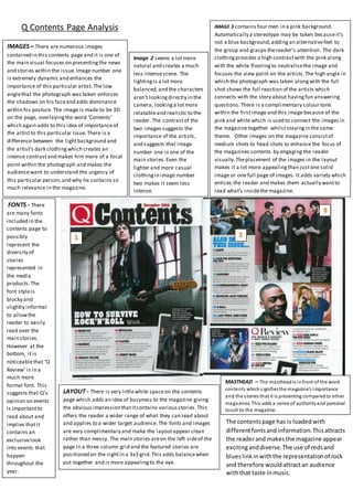
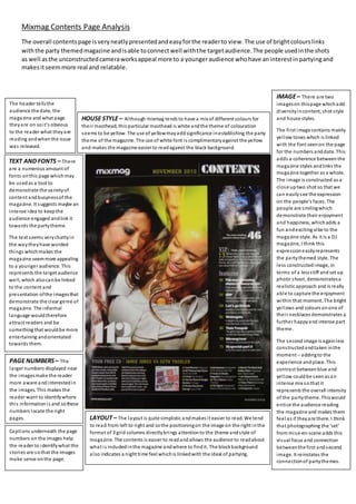
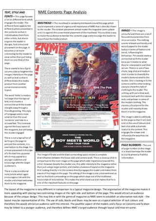
The document analyzes the contents pages of four different music magazines: Q, Mixmag, NME, and an unnamed magazine. It examines elements like images, layout, fonts, and color schemes. Key findings include:
- Magazines use colors associated with their genre's stereotypes to attract the right audience. For example, rock magazines employ reds and blacks.
- Layout styles also define the target age range - neater designs appeal to mature readers while busier styles work for youth.
- Alternative magazines like NME break conventions to differentiate themselves and their indie audiences.
- Photo styles and featured artists are chosen to represent the magazine's brand and subject matter authentically for readers.
Read| The latest issue of The Challenger is here! We are thrilled to announce that our school paper has qualified for the NATIONAL SCHOOLS PRESS CONFERENCE (NSPC) 2024. Thank you for your unwavering support and trust. Dive into the stories that made us stand out!
Honest Reviews of Tim Han LMA Course Program.pptxtimhan337
Personal development courses are widely available today, with each one promising life-changing outcomes. Tim Han’s Life Mastery Achievers (LMA) Course has drawn a lot of interest. In addition to offering my frank assessment of Success Insider’s LMA Course, this piece examines the course’s effects via a variety of Tim Han LMA course reviews and Success Insider comments.
June 3, 2024 Anti-Semitism Letter Sent to MIT President Kornbluth and MIT Cor...Levi Shapiro
Letter from the Congress of the United States regarding Anti-Semitism sent June 3rd to MIT President Sally Kornbluth, MIT Corp Chair, Mark Gorenberg
Dear Dr. Kornbluth and Mr. Gorenberg,
The US House of Representatives is deeply concerned by ongoing and pervasive acts of antisemitic
harassment and intimidation at the Massachusetts Institute of Technology (MIT). Failing to act decisively to ensure a safe learning environment for all students would be a grave dereliction of your responsibilities as President of MIT and Chair of the MIT Corporation.
This Congress will not stand idly by and allow an environment hostile to Jewish students to persist. The House believes that your institution is in violation of Title VI of the Civil Rights Act, and the inability or
unwillingness to rectify this violation through action requires accountability.
Postsecondary education is a unique opportunity for students to learn and have their ideas and beliefs challenged. However, universities receiving hundreds of millions of federal funds annually have denied
students that opportunity and have been hijacked to become venues for the promotion of terrorism, antisemitic harassment and intimidation, unlawful encampments, and in some cases, assaults and riots.
The House of Representatives will not countenance the use of federal funds to indoctrinate students into hateful, antisemitic, anti-American supporters of terrorism. Investigations into campus antisemitism by the Committee on Education and the Workforce and the Committee on Ways and Means have been expanded into a Congress-wide probe across all relevant jurisdictions to address this national crisis. The undersigned Committees will conduct oversight into the use of federal funds at MIT and its learning environment under authorities granted to each Committee.
• The Committee on Education and the Workforce has been investigating your institution since December 7, 2023. The Committee has broad jurisdiction over postsecondary education, including its compliance with Title VI of the Civil Rights Act, campus safety concerns over disruptions to the learning environment, and the awarding of federal student aid under the Higher Education Act.
• The Committee on Oversight and Accountability is investigating the sources of funding and other support flowing to groups espousing pro-Hamas propaganda and engaged in antisemitic harassment and intimidation of students. The Committee on Oversight and Accountability is the principal oversight committee of the US House of Representatives and has broad authority to investigate “any matter” at “any time” under House Rule X.
• The Committee on Ways and Means has been investigating several universities since November 15, 2023, when the Committee held a hearing entitled From Ivory Towers to Dark Corners: Investigating the Nexus Between Antisemitism, Tax-Exempt Universities, and Terror Financing. The Committee followed the hearing with letters to those institutions on January 10, 202
Synthetic Fiber Construction in lab .pptxPavel ( NSTU)
Synthetic fiber production is a fascinating and complex field that blends chemistry, engineering, and environmental science. By understanding these aspects, students can gain a comprehensive view of synthetic fiber production, its impact on society and the environment, and the potential for future innovations. Synthetic fibers play a crucial role in modern society, impacting various aspects of daily life, industry, and the environment. ynthetic fibers are integral to modern life, offering a range of benefits from cost-effectiveness and versatility to innovative applications and performance characteristics. While they pose environmental challenges, ongoing research and development aim to create more sustainable and eco-friendly alternatives. Understanding the importance of synthetic fibers helps in appreciating their role in the economy, industry, and daily life, while also emphasizing the need for sustainable practices and innovation.
Macroeconomics- Movie Location
This will be used as part of your Personal Professional Portfolio once graded.
Objective:
Prepare a presentation or a paper using research, basic comparative analysis, data organization and application of economic information. You will make an informed assessment of an economic climate outside of the United States to accomplish an entertainment industry objective.
Embracing GenAI - A Strategic ImperativePeter Windle
Artificial Intelligence (AI) technologies such as Generative AI, Image Generators and Large Language Models have had a dramatic impact on teaching, learning and assessment over the past 18 months. The most immediate threat AI posed was to Academic Integrity with Higher Education Institutes (HEIs) focusing their efforts on combating the use of GenAI in assessment. Guidelines were developed for staff and students, policies put in place too. Innovative educators have forged paths in the use of Generative AI for teaching, learning and assessments leading to pockets of transformation springing up across HEIs, often with little or no top-down guidance, support or direction.
This Gasta posits a strategic approach to integrating AI into HEIs to prepare staff, students and the curriculum for an evolving world and workplace. We will highlight the advantages of working with these technologies beyond the realm of teaching, learning and assessment by considering prompt engineering skills, industry impact, curriculum changes, and the need for staff upskilling. In contrast, not engaging strategically with Generative AI poses risks, including falling behind peers, missed opportunities and failing to ensure our graduates remain employable. The rapid evolution of AI technologies necessitates a proactive and strategic approach if we are to remain relevant.
Acetabularia Information For Class 9 .docxvaibhavrinwa19
Acetabularia acetabulum is a single-celled green alga that in its vegetative state is morphologically differentiated into a basal rhizoid and an axially elongated stalk, which bears whorls of branching hairs. The single diploid nucleus resides in the rhizoid.
Unit 8 - Information and Communication Technology (Paper I).pdfThiyagu K
This slides describes the basic concepts of ICT, basics of Email, Emerging Technology and Digital Initiatives in Education. This presentations aligns with the UGC Paper I syllabus.
Model Attribute Check Company Auto PropertyCeline George
In Odoo, the multi-company feature allows you to manage multiple companies within a single Odoo database instance. Each company can have its own configurations while still sharing common resources such as products, customers, and suppliers.
1. Q Contents Page Analysis
MASTHEAD – The mastheadis infront of the word
contents whichsignifiesthe magazine’s importance
and the stories that it is presenting comparedto other
magazines. This adds a sense of authorityand personal
touch to the magazine.
IMAGES– There are numerous images
contained in this contents page and it is one of
the main visual focuses on presentingthe news
and stories within the issue.Image number one
is extremely dynamic and enhances the
importance of this particular artist.The low
anglethat the photograph was taken enforces
the shadows on his faceand adds dominance
within his posture. The image is made to be 3D
on the page, overlayingthe word ‘Contents’
which again adds to this idea of importanceof
the artistto this particular issue.There is a
difference between the lightbackground and
the artist’s dark clothing which creates an
intense contrastand makes him more of a focal
point within the photograph and makes the
audiencewant to understand the urgency of
this particular person,and why he contains so
much relevance in the magazine.
LAYOUT - There is very littlewhite spaceon the contents
page which adds an idea of busyness to the magazine giving
the obvious impression thatitcontains variousstories.This
offers the reader a wider range of what they can read about
and applies to a wider target audience.The fonts and images
are very complimentary and make the layoutappear clean
rather than messy. The main stories areon the left sideof the
page in a three column grid and the featured stories are
positioned on the rightin a 3x3 grid.This adds balancewhen
put together and is more appealingto the eye.
FONTS - There
are many fonts
included in the
contents page to
possibly
represent the
diversity of
stories
represented in
the media
products.The
font styleis
blocky and
slightly informal
to allowthe
reader to easily
read over the
main stories.
However at the
bottom, it is
noticeablethat ‘Q
Review’ is in a
much more
formal font. This
suggests that Q’s
opinion on events
is importantto
read about and
implies thatit
contains an
exclusivelook
into events that
happen
throughout the
year.
IMAGE 3 contains four men in a pink background.
Automatically a stereotype may be taken becauseit’s
not a blue background,addingan alternativefeel to
the group and grasps thereader’s attention. The dark
clothingprovides a high contrastwith the pink along
with the white flooringto neutralisethe image and
focuses the view point on the artists.The high angle in
which the photograph was taken alongwith the full
shot shows the full reaction of the artists which
connects with the story about havingfun answering
questions.There is a complimentary colour tone
within the firstimage and this image because of the
pink and white which is used to connect the images in
the magazine together whilststayingin the same
theme. Other images on the magazine consistof
medium shots to head shots to enhance the focus of
the magazines contents by engaging the reader
visually.Theplacement of the images in the layout
makes it a lot more appealingthan justone solid
image or one full page of images. It adds variety which
entices the reader and makes them actually wantto
read what’s insidethe magazine.
Image 2 seems a lot more
natural and creates a much
less intensescene. The
lightingis a lotmore
balanced,and the characters
aren’t lookingdirectly in the
camera, lookinga lotmore
relatableand realistic to the
reader. The contrastof the
two images suggests the
importance of the artists,
and suggests that image
number one is one of the
main stories.Even the
lighter and more casual
clothing in image number
two makes it seem less
intense.
The contentspage has is loadedwith
differentfontsandinformation.Thisattracts
the readerand makesthe magazine appear
excitinganddiverse.The use of redsand
blueslinkinwiththe representationof rock
and therefore wouldattractan audience
withthat taste inmusic.
2. Mixmag Contents Page Analysis
The overall contentspage isveryneatlypresentedandeasyforthe readerto view.The use of brightcolourslinks
withthe party themedmagazine andisable toconnectwell withthe targetaudience.The people usedinthe shots
as well asthe unconstructedcameraworksappeal more to a youngeraudience whohave aninterestinpartyingand
makesitseemmore real and relatable.
IMAGE– There are two
imageson thispage whichadd
diversityincontent, shot style
and house styles.
The first image contains mainly
yellow tones which is linked
with the font seenon the page
for the numbers anddate. This
adds a coherence betweenthe
magazine styles andlinks the
magazine together as a whole.
The image is constructed as a
close uptwo shot so that we
can easilysee the expression
on the people’s faces. The
people are smilingwhich
demonstrate their enjoyment
and happiness, whichadds a
fun andexciting vibe to the
magazine style. As it is a DJ
magazine, I think this
expressioneasilyrepresents
the partythemed style. The
less constructedimage, in
terms of a lessstiff and set up
photo shoot, demonstratesa
realistic approach and is really
able to capture the enjoyment
within that moment. The bright
yellows and colours onone of
their necklaces demonstrates a
further happyand intense part
theme.
The second image is againless
constructedandtaken inthe
moment – addingto the
experience andplace. This
contrast betweenblue and
yellow could be seenas an
intense mix sothat it
represents the overall intensity
of the partytheme. Thiswould
entice the audience reading
the magazine and makes them
feel as if theyare there. I think
that photographing the ‘set’
from mise-en-scene adds this
visual focus and connection
betweenthe first andsecond
image. It reinstates the
connectionof partythemes.
TEXT AND FONTS – There
are a numerous amount of
fonts onthis page whichmay
be usedas a tool to
demonstrate the varietyof
content andbusynessof the
magazine. It suggests maybe an
intense idea to keepthe
audience engaged andlink it
towards the partytheme.
The text seems verychattyin
the waytheyhave worded
things whichmakes the
magazine seemmore appealing
to a younger audience. This
represents the target audience
well, which alsocanbe linked
to the content and
presentation ofthe imagesthat
demonstrate the clear genre of
magazine. The informal
language wouldtherefore
attract readers and be
something that wouldbe more
entertaining andorientated
towards them.
HOUSE STYLE – Although mixmag tends to have a mix of different colours for
their masthead, this particular masthead is white andthe theme of colouration
seems to be yellow. The use of yellowmayaddsignificance inestablishing the party
theme of the magazine. The use of white font is complimentaryagainst the yellow
and makes the magazine easier to readagainst the black background.
PAGE NUMBERS– The
larger numbers displayed near
the imagesmake the reader
more aware andinterestedin
the images. This makes the
reader want to identifywhere
this informationis and sothese
numbers locate the right
pages. LAYOUT – The layout is quite simplistic andmakes it easier to read. We tend
to read from left to right and sothe positioningon the image on the right inthe
format of 3 grid columns directlybrings attentionto the theme andstyle of
magazine. The contents is easier to readandallows the audience to readabout
what is includedinthe magazine andwhere to findit. The blackbackground
also indicates a night time feel whichis linkedwith the ideal of partying.
The header tellsthe
audience the date, the
magazine and what page
theyare on soit’s obvious
to the reader what theyare
reading andwhenthe issue
was released.
Captions underneath the page
numbers on the images help
the reader to identifywhat the
stories are sothat the images
make sense onthe page.
3. NME Contents Page Analysis
MASTHEAD – The masthead is randomlydistributedaroundthe page which
could represent a sense of urgencyandimportance of NME that is directlyshown
to the reader. The random placement almost makes the magazine seemupbeat
and it is against the conventional placement of the masthead. Thiscouldbe a way
to make the audience remember the contents page andencourage the reader to
repurchase the media product.
IMAGE– The image is
colourful and there are a lot of
focusedcharacteristics from
mise-en-scene. The clothing
seems relevant andtrendyand
wouldappeal to the reader
todayin terms of fashionand
trend, influencingthe
behaviour. This would create a
connectionwiththe reader
because it relates to what
they’re interestedin and their
values. There is a use of two
shots, long shot andmedium
shot inorder to diversifythe
models demonstratedto the
reader. One is looking in to the
camera andthe other looking
awayto showthe style of
clothingto the reader. The
setting, with just a blue wall,
contrasts well withthe intense
reds andyellows insome of
the models clothing. This
creates a focalpoint for the
reader andinstantlydraws
them in to the magazine.
The image is able to addbody
to the page so that it isn’t dull,
and sothe use of colours and
two shot adds a dramatic
layout to the content. This
engages the viewer and
influences the waytheysee
the magazine.
TEXT, STYLE AND
FONTS – This page focuses
a lot on different fonts which
engages the reader. The
different fonts applyto the
different artists presentedin
the contents sothat it
individualises themfrom
other artists, but alsoto
engross the reader in
designs, font colour and
placement onthe page. It
becomes a lot more
interesting for the reader to
view rather thanjust listing
them on one third of the
page.
There seems to be a 3 grid
columnstyle to heightenthe
imagesintensityon the page
as well as text sothat it
differentiates this media
product from another
conventionalcontents
layout.
The word ‘Hello’ is made a
lot larger thanthe typical
text, and creates a
connectionwiththe reader
straight awaythrougha
friendlygreeting. This style
of language seems more
adverse thanthe usual
‘contents’ and links to a
relaxedfeel. This contrasts
against the busylayout of
the magazine, but still keeps
the reader engaged.
There is not a typical list of
writingon the page to
present the contents, it is
overlaidon to the image. It is
almost presented inthe style
of a festival line upposter
which mayappeal to a
younger audience and
encourage whothe target
audience is.
There is also aneditorial
note/article which again
encouragesa link withthe
reader andalmost welcomes
them to the magazine.
The image ofDrake andthe black surrounding space creates a complete
diversification between the house style and camera work. Thisis a closeup shot in
comparisonto the main image onthe page whichadds importance towards this
artist. However despite the smaller size, this adds intensityto the magazine rather
than just usinga larger picture, and creates a balance of layout onthe magazine.
Him looking directlyinto the camera directlyengagesthe reader andmakes them
aware of hisimage onthe page. The editing of the image is also unconventional as
well as the blacksurroundings onthe page which steps out of the traditional
house style of redandblue. This makes the artist stand out andimplies that he is
one of the important features onthe page.
PAGE NUMBERS- The use
of page number onthe image
in a black box helps the reader
to clarifywhere to findthis
information.
The layout of the magazine is very different in comparison to a typical magazinedesign. The organisation of the magazine makes it
more appealing with placing two contrasting images at the right side and bottom of the page. This would attract an audience
because of the unique design. This may link in with the genreof magazine as NME seem to establish an alternative rock style - the
layout may be representative of this. The use of reds, blacks and blues may be seen as a typical selection of rock colours and
therefore this would attract an audience with this interest. The youthful aspect of the models and a focus on concerts and fashion
may be linked to a younger audience, and therefore defines NME’s target audience through layout and mise-en-scene.
4. Evaluation of Contents
Fromlooking at the organisation of contents pages and seeing what each magazine has put
on them has allowed me to see the difference between genres of music in magazines.
The use of housecolours plays an important role which helps to establish what genre of
magazine it is and who it wants to appeal to. Typical colour selections such as reds and
black would be linked to a rock genre becauseof the supposed meaning of ‘danger’ and
‘darkness’ which would stereotypically belinked with bands in this genre. Many rock bands
use these colours which is wherethe association may derive from, and so using these
associated colours easily shows theaudience what the magazine’s content is. Using colours
like black and yellow however gives a different effect and demonstrates a more party style
theme becauseof the nightlife colours being bright and contrasting. Looking at these
magazines, it is clear that certain colours havebeen chosen to make the reader easily
identify what the magazine is about and attracts the targeted audience who associates
these colours with their genre of music.
As well as colour, layout forms an important visualaspect to draw in the audience. By
presenting a neater style, this makes the reader able to read the magazinewell without
being overly distracted. The layout may be moreformally presented and appeal to either a
mature audience or messily in order to apply to a younger audience. The connection
between layouts and use of colours, images and fonts would also suggestwhether this
applies to a younger or mature audience.
Furthermorethe layout may also link with the music genre it writes about. Certain genres
may be classed as loud and outrageous which would link to a less constructed layoutwith
numerous of different elements going out at once to channel that ideal. Other genres like
indie-rock (NME contents) may link with differentiating themselves and changing the
traditional conventions of contents pages.
After looking at layouts, fonts, and colours I think that this has shown how important these
elements are in order to attract the right target audience and create a magazine that
represents its focused music genre. Within my magazine, I wantto be able to incorporate
these ideas of layout especially as this is key for these factors. I could think about creating a
magazine design based on my audience preferences and relate it to them so that it makes
senseand appeals to them. I need to think about the possibleclothes that they wear so
that I can create content based on their style ideas which would be more interesting to
them.