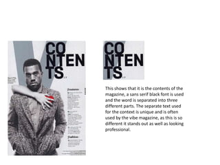
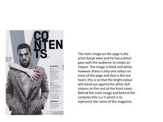
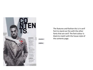
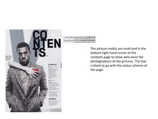
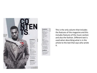
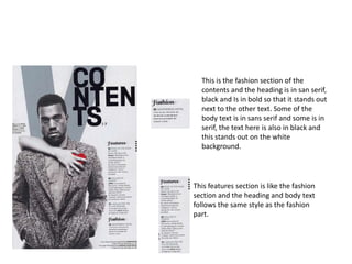
Vibe contents page research 2
VIBE
This shows that it is the contents of the
magazine, a sans serif black font is used
and the word is separated into three
different parts. The separate text used
for the context is unique and is often
used by the vibe magazine, as this is so
different it stands out as well as looking
professional.
The main image on the page is the
artist Kanye west and he has a direct
gaze with the audience to create an
impact. The image is black and white
however there is only one colour on
most of the page and that is the red
heart, this is so that the bright colour
will stand out against the other dull
colours on the rest of the front cover.
Behind the main image and behind the
contents title is a V which is to
represent the name of the magazine.
The features and fashion tits is in serif
font to stand out the with the other
fonts that are serif. The font colour is
black to match with the house style of
the contents page.
The picture credits are small and in the
bottom right hand corner of the
contents page to show who were the
photographers of the pictures. The text
is black to go with the colour scheme of
the page.
This is the only column that includes
the features of the magazine and this
includes features of the music section
and also the fashion. Different text is
used when describing what is in the
article to the text that says who wrote
it.
This is the fashion section of the
contents and the heading is in san serif,
black and Is in bold so that it stands out
next to the other text. Some of the
body text is in sans serif and some is in
serif, the text here is also in black and
this stands out on the white
background.
This features section is like the fashion
section and the heading and body text
follows the same style as the fashion
part.
This shows that their will be 3 sections
to the contents page.

Vibe contents page research 2

  • 1.
  • 2.
  • 3.
    This shows thatit is the contents of the magazine, a sans serif black font is used and the word is separated into three different parts. The separate text used for the context is unique and is often used by the vibe magazine, as this is so different it stands out as well as looking professional.
  • 4.
    The main imageon the page is the artist Kanye west and he has a direct gaze with the audience to create an impact. The image is black and white however there is only one colour on most of the page and that is the red heart, this is so that the bright colour will stand out against the other dull colours on the rest of the front cover. Behind the main image and behind the contents title is a V which is to represent the name of the magazine.
  • 5.
    The features andfashion tits is in serif font to stand out the with the other fonts that are serif. The font colour is black to match with the house style of the contents page.
  • 6.
    The picture creditsare small and in the bottom right hand corner of the contents page to show who were the photographers of the pictures. The text is black to go with the colour scheme of the page.
  • 7.
    This is theonly column that includes the features of the magazine and this includes features of the music section and also the fashion. Different text is used when describing what is in the article to the text that says who wrote it.
  • 8.
    This is thefashion section of the contents and the heading is in san serif, black and Is in bold so that it stands out next to the other text. Some of the body text is in sans serif and some is in serif, the text here is also in black and this stands out on the white background. This features section is like the fashion section and the heading and body text follows the same style as the fashion part.
  • 9.
    This shows thattheir will be 3 sections to the contents page.