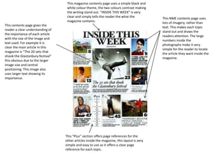
1. This magazine contents page uses a simple black and white colour theme, the two colours contrast making the writing stand out. “INSIDE THIS WEEK” is very clear and simply tells the reader the what the magazine contains. This NME contents page uses lots of imagery, rather than text. This makes each topic stand out and draws the readers attention. The large numbers inside the photographs make it very simple for the reader to locate the article they want inside the magazine. This contents page gives the reader a clear understanding of the importance of each article with the size of the image and text used. For example it is clear the main article in this magazine is “The 20 sets that shook the Glastonbury festival” this obvious due to the larger image size and central positioning. This image also uses larger text showing its importance. This “Plus” section offers page references for the other articles inside the magazine, this layout is very simple and easy to use as it offers a clear page reference for each topic.
2. This edition of VIBE’s contents page is very different to that of NME. This contents page is less clear than the NME contents page. However it is still effective, as it concentrates more on the subject of the main article and rather than using many different images this magazine focuses on one. This photograph is linked the main article of the magazine and also the cover. The head mast of the magazine has been broken up into three parts, and spread out across three lines, this again adds to the artistic nature of the contents page. The text is very large and a very dark colour which contrasts with the background with the background colour making the This magazine uses small and varying text, it also offers page references for the featured articles only, i believe this is effective as it leads to less text being used and allows the reader to focus on the photograph and the featured article. However the downside to this is that the reader may have difficulties finding articles inside the magazine that are not featured on the cover. Despite the downside I like this simple and artistic contents design. The magazine uses an odd colour pallet, the text is black and the background is a grey colour, with the VIBE V is a grey/teal colour. The Photograph is in black and white, which is very effective as the is draws attention to the brightly coloured red heart, which cunningly links to the article name “PRIDE (IN THE NAME OF LOVE)”
3. This contents page from Q magazine is much more simple than that of VIBE. This contents page uses a simple but consistent white back and red colour palette. The layout is also much more simple as is has a clear section of articles and page references down the left hand side of the page. This magazine gives the reader a clear understanding of which article is most important and the main one inside the magazine by placing a large picture of the band (The Courteeners) on the page. This magazine contents page is very simple but effective, it is very clear and easy for the reader to find exactly what they are looking for. However despite the ease of use, I prefer the more complex and artistic layout of the VIBE magazine. By using a different colour makes the text standout, which is effective as it is an “oasis special” and by using gold and words like special encourage the reader to investigate.