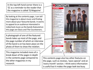
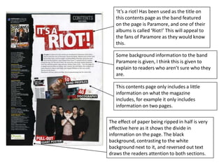
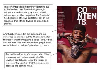
Contents page analysisresearch
The bold heading is written in an unusual way and it is reversed out to make it stand out in contrast to the dark background.There is an out line of a ‘V’ in the back ground as the magazine is called Vibe. It has subtly been put in to remind the reader of what magazine they are reading.Dark colours have been used for the back ground so the heading stands out.The back ground is a paler colour where the black text is so it is easier to read.An eye catching image is used which takes up most of the page. Ciara is the celebrity used on the page which will attract readers who are fans of her. The writing is placed around her which shows her importance on the page.
This contents page is slightly different from the others as it is over a double page spread instead of just being on one page. There is little text on this contents page, which I think is more appealing to one with more text. It keeps it looking simple and clear and more sophisticated.  The text is a white/light grey colour which is easy to read over the darker background. The text is transparent over the picture which draws more attention to the importance of the manThe first thing I am drawn to when I look at this contents page is the black and white photo as it is placed right in the centre of the two pages.  The photo is a darker grey/black colour to the back ground which is a lighter grey which makes it stand out more. The photo is a close up of a character’s face which makes the reader feel like they are looking directly at them and are at the same eye level.
In the top left hand corner there is a ‘Q’ as a reminder to the reader that the magazine is called ‘Q Magazine’By looking at the contents page, I can tell this magazine is about music and finding more about your favourite bands. It seems to appeal to an audience interested in indie/rock music as the bands featured on this page are Oasis and The Courteeners.A photograph of one of the featured bands takes up most of the page, and the page number of which an interview of the band is on has been place on the photo of them to show the relation.This magazine included more of a break down of the pages in depth in the contents page compared to the other magazines in my research.This contents page also has other features on the page, such as reviews, ‘oasis special’ and an ‘every month’ section. I think extra information is useful but it makes the page look too busy.
This is an unconventional contents page and very eye catching due to the bold, bright colours used on top of a plain white background.This appeals to a younger audience as it’s very artistic and the page seems busy and the text is bunched up close together. The text is still relatively easy to read due to the different colours used for the separate words.This contents page makes it obvious to the reader that the magazine is about fashion, music, concerts and events, which also supports the fact that I think this magazine is for a younger audience.
‘It’s a riot! Has been used as the title on this contents page as the band featured on the page is Paramore, and one of their albums is called ‘Riot!’ This will appeal to the fans of Paramore as they would know this.Some background information to the band Paramore is given, I think this is given to explain to readers who aren’t sure who they are.This contents page only includes a little information on what the magazine includes, for example it only includes information on two pages.The effect of paper being ripped in half is very effective here as it shows the divide in information on the page. The black background, contrasting to the white background next to it, and reversed out text draws the readers attention to both sections.
This contents page is instantly eye catching due  to the bold red used for the background, in comparison to the usual grey, white or black colours used in other magazines. The ‘contents’ heading is very effective as it stands out on the red, more than I think it would on a black back ground.A ‘V’ has been placed in the back ground in a darker red so it is more subtle. This is a reminder to the reader that the magazine is called ‘Vibe’. Vibe is also written in a smaller font in the top right hand corner in black so it doesn’t stand out too much.The medium close up of a rapper called ‘Plies’ is also very eye catching due to all of his jewellery and tattoos. Having the rapper on the contents page show that this magazine is about up and coming music.
The background is natural, showing the photo isn’t staged and making it clear that the magazine is about out door bike riding. This magazine will appeal to a specific audience. Even though the contents page only shows someone bike riding, the magazine could be about many different types of challenging sports, therefore the magazine could appeal to anyone interested in various sports. However I think it’s aimed at people between 18 and 30 who would be more interested in more difficult sports.This contents page is very different from the others as it revolves around a picture which is placed in the centre of the page. The text surrounding the picture follows the out line of the bike rider, drawing your attention to the picture and then to the text.
This contents page is also taken from a ‘Vibe’ magazine, so the ‘V’ is again in the background in a darker shade of the grey used for the background colour. the contents heading is bold and black which stand out over the lighter colours behind.The whole colour theme running through the page is dull, grey, washed out colours and the photograph of Kanye West is in greyscale. However in the photograph, there is a bright red heart being held over Kanye West’s chest which is the most eye catching object on the page as it is the only colour used.Black test is put over the light grey background about features and fashion including page numbers of where you can find the information. The words ‘features’ and ‘fashion’ have been put in a different font to the rest of the text as they’re headers.
Even though this magazine hasn’t put a title of ‘contents’ on to this page, it is obvious that it is a contents page as information is given about different features included in the magazine, and includes a list of credits.I think that the grey/white contrast in the two halves of the page is quite effective as it shows the division in information. Also because it’s been separated by a vertical line of different photographs of some one skate boarding. The photographs are also in a greyscale colour, even though it’s a darker colour to the grey used for the background, this carries out the colour scheme throughout the whole page.The contents page shows the reader that the magazine is about skate boarding, due to the photos and some of the features, e.g. ‘Night of the living skate zombies.’

research- contents pages

  • 1.
  • 2.
    The bold headingis written in an unusual way and it is reversed out to make it stand out in contrast to the dark background.There is an out line of a ‘V’ in the back ground as the magazine is called Vibe. It has subtly been put in to remind the reader of what magazine they are reading.Dark colours have been used for the back ground so the heading stands out.The back ground is a paler colour where the black text is so it is easier to read.An eye catching image is used which takes up most of the page. Ciara is the celebrity used on the page which will attract readers who are fans of her. The writing is placed around her which shows her importance on the page.
  • 3.
    This contents pageis slightly different from the others as it is over a double page spread instead of just being on one page. There is little text on this contents page, which I think is more appealing to one with more text. It keeps it looking simple and clear and more sophisticated. The text is a white/light grey colour which is easy to read over the darker background. The text is transparent over the picture which draws more attention to the importance of the manThe first thing I am drawn to when I look at this contents page is the black and white photo as it is placed right in the centre of the two pages. The photo is a darker grey/black colour to the back ground which is a lighter grey which makes it stand out more. The photo is a close up of a character’s face which makes the reader feel like they are looking directly at them and are at the same eye level.
  • 4.
    In the topleft hand corner there is a ‘Q’ as a reminder to the reader that the magazine is called ‘Q Magazine’By looking at the contents page, I can tell this magazine is about music and finding more about your favourite bands. It seems to appeal to an audience interested in indie/rock music as the bands featured on this page are Oasis and The Courteeners.A photograph of one of the featured bands takes up most of the page, and the page number of which an interview of the band is on has been place on the photo of them to show the relation.This magazine included more of a break down of the pages in depth in the contents page compared to the other magazines in my research.This contents page also has other features on the page, such as reviews, ‘oasis special’ and an ‘every month’ section. I think extra information is useful but it makes the page look too busy.
  • 5.
    This is anunconventional contents page and very eye catching due to the bold, bright colours used on top of a plain white background.This appeals to a younger audience as it’s very artistic and the page seems busy and the text is bunched up close together. The text is still relatively easy to read due to the different colours used for the separate words.This contents page makes it obvious to the reader that the magazine is about fashion, music, concerts and events, which also supports the fact that I think this magazine is for a younger audience.
  • 6.
    ‘It’s a riot!Has been used as the title on this contents page as the band featured on the page is Paramore, and one of their albums is called ‘Riot!’ This will appeal to the fans of Paramore as they would know this.Some background information to the band Paramore is given, I think this is given to explain to readers who aren’t sure who they are.This contents page only includes a little information on what the magazine includes, for example it only includes information on two pages.The effect of paper being ripped in half is very effective here as it shows the divide in information on the page. The black background, contrasting to the white background next to it, and reversed out text draws the readers attention to both sections.
  • 7.
    This contents pageis instantly eye catching due to the bold red used for the background, in comparison to the usual grey, white or black colours used in other magazines. The ‘contents’ heading is very effective as it stands out on the red, more than I think it would on a black back ground.A ‘V’ has been placed in the back ground in a darker red so it is more subtle. This is a reminder to the reader that the magazine is called ‘Vibe’. Vibe is also written in a smaller font in the top right hand corner in black so it doesn’t stand out too much.The medium close up of a rapper called ‘Plies’ is also very eye catching due to all of his jewellery and tattoos. Having the rapper on the contents page show that this magazine is about up and coming music.
  • 8.
    The background isnatural, showing the photo isn’t staged and making it clear that the magazine is about out door bike riding. This magazine will appeal to a specific audience. Even though the contents page only shows someone bike riding, the magazine could be about many different types of challenging sports, therefore the magazine could appeal to anyone interested in various sports. However I think it’s aimed at people between 18 and 30 who would be more interested in more difficult sports.This contents page is very different from the others as it revolves around a picture which is placed in the centre of the page. The text surrounding the picture follows the out line of the bike rider, drawing your attention to the picture and then to the text.
  • 9.
    This contents pageis also taken from a ‘Vibe’ magazine, so the ‘V’ is again in the background in a darker shade of the grey used for the background colour. the contents heading is bold and black which stand out over the lighter colours behind.The whole colour theme running through the page is dull, grey, washed out colours and the photograph of Kanye West is in greyscale. However in the photograph, there is a bright red heart being held over Kanye West’s chest which is the most eye catching object on the page as it is the only colour used.Black test is put over the light grey background about features and fashion including page numbers of where you can find the information. The words ‘features’ and ‘fashion’ have been put in a different font to the rest of the text as they’re headers.
  • 10.
    Even though thismagazine hasn’t put a title of ‘contents’ on to this page, it is obvious that it is a contents page as information is given about different features included in the magazine, and includes a list of credits.I think that the grey/white contrast in the two halves of the page is quite effective as it shows the division in information. Also because it’s been separated by a vertical line of different photographs of some one skate boarding. The photographs are also in a greyscale colour, even though it’s a darker colour to the grey used for the background, this carries out the colour scheme throughout the whole page.The contents page shows the reader that the magazine is about skate boarding, due to the photos and some of the features, e.g. ‘Night of the living skate zombies.’