Role Of Transgenic Animal In Target Validation-1.pptx
Contents Page Research
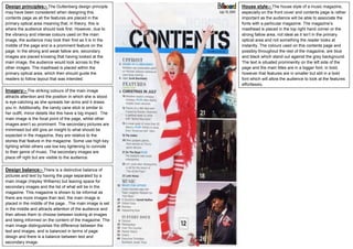
1. Design balance:- There is a distinctive balance of
pictures and text by having the page separated by a
main image (Hayley Williams) but leaving space for
secondary images and the list of what will be in the
magazine. This magazine is shown to be informal as
there are more images than text, the main image is
placed in the middle of the page.. The main image is set
in the middle and attracts attention of the audience and
then allows them to choose between looking at images
and being informed on the content of the magazine. The
main image distinguishes the difference between the
text and images, and is balanced in terms of page
design and there is a balance between text and
secondary image.
Imagery:- The striking colours of the main image
attracts attention and the position in which she is stood
is eye-catching as she spreads her arms and it draws
you in. Additionally, the candy cane stick is similar to
her outfit, minor details like this have a big impact. The
main image is the focal point of the page, whilst other
images aren’t so prominent. The secondary pictures are
minimised but still give an insight to what should be
expected in the magazine, they are relative to the
stories that feature in the magazine. Some use high key
lighting whilst others use low key lightening to connote
to their genre of music. The secondary images are
place off right but are visible to the audience.
Design principles:- The Guttenberg design principle
may have been considered when designing this
contents page as all the features are placed in the
primary optical area meaning that, in theory, this is
where the audience should look first. However, due to
the vibrancy and intense colours used on the main
image, the audience may look their first as it is in the
middle of the page and is a prominent feature on the
page. In the strong and weak fallow are, secondary
images are placed knowing that having looked at the
main image, the audience would look across to the
other images. The masthead is placed within the
primary optical area, which then should guide the
readers to follow layout that was intended.
House style:- The house style of a music magazine,
especially on the front cover and contents page is rather
important as the audience will be able to associate the
fonts with a particular magazine. The magazine’s
masthead is placed in the top right hand corner or the
strong fallow area, not ideal as it isn’t in the primary
optical area and not something the reader looks at
instantly. The colours used on this contents page and
possibly throughout the rest of the magazine, are blue
and black which stand out against the grey background.
The text is situated prominently on the left side of the
page and the main titles are in a bigger font, in bold,
however that features are in smaller but still in a bold
font which will allow the audience to look at the features
effortlessly.