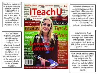
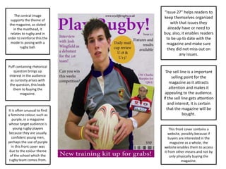
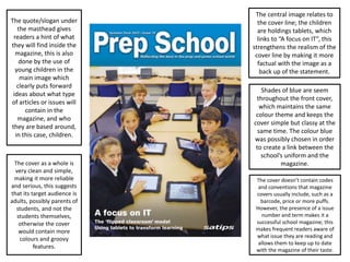
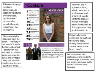
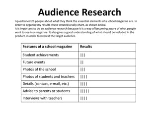
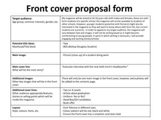
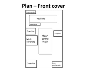
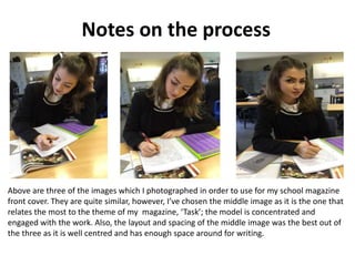
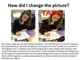
2. The model’s outfit helps the
audience to recognise the
main theme of the magazine.
She is holding books and
wearing a common school
uniform, which clearly relates
to the magazine’s contents
and makes it clear that its
topics are school related.
Colour scheme flows
throughout the whole cover,
making it look professional
and organized. The same
colour pattern (red, white and
black) also creates a sense of
professionalism.
As it is a school
magazine, the use of
date (September
2011) makes the
audience aware of
what the articles will
include based on the
school term. For
example, as it is a
September issue,
articles about on start
of the academic year
are expected to be
found inside the
magazine.
Masthead gives a hint
of what the magazine
is about. “iTeachU”
suggests that it is
about teaching or
aims at who wants to
learn, therefore the
masthead attracts
audiences who are
interested in these.
Puffs attract attention of the
target audience as it offers
help and guidance, for
example, “the best tips &
tricks,” the inclusion of this
makes the magazine more
appealing to its potential
buyers.
3. The central image
supports the theme of
the magazine, as stated
in the masthead, it
relates to rugby and in
order to reinforce this the
model is posing with a
rugby ball.
The sell line is a important
selling point for the
magazine as it attracts
attention and makes it
appealing to the audience.
If the sell line gets attention
and interest, it is certain
that the magazine will be
bought.
“Issue 27” helps readers to
keep themselves organized
with that issues they
already have or need to
buy, also, it enables readers
to be up to date with the
magazine and make sure
they did not miss out on
any issues.
Puff containing rhetorical
question brings up
interest in the audience
as curiosity arises with
the question, this leads
them to buying the
magazine.
It is often unusual to find
a feminine colour, such as
purple, in a magazine
whose target audience is
young rugby players
because they are usually
confident young men,
perhaps the use of purple
in this front cover was
due to the colour theme
of the school which the
rugby team comes from.
This front cover contains a
website, possibly because if
buyers are interested in the
magazine as a whole, the
website enables them to access
it from other means and not by
only physically buying the
magazine.
4. The central image relates to
the cover line; the children
are holdings tablets, which
links to “A focus on IT”, this
strengthens the realism of the
cover line by making it more
factual with the image as a
back up of the statement.
Shades of blue are seem
throughout the front cover,
which maintains the same
colour theme and keeps the
cover simple but classy at the
same time. The colour blue
was possibly chosen in order
to create a link between the
school’s uniform and the
magazine.
The quote/slogan under
the masthead gives
readers a hint of what
they will find inside the
magazine, this is also
done by the use of
young children in the
main image which
clearly puts forward
ideas about what type
of articles or issues will
contain in the
magazine, and who
they are based around,
in this case, children.
The cover as a whole is
very clean and simple,
making it more reliable
and serious, this suggests
that its target audience is
adults, possibly parents of
students, and not the
students themselves,
otherwise the cover
would contain more
colours and groovy
features.
The cover doesn’t contain codes
and conventions that magazine
covers usually include, such as a
barcode, price or more puffs.
However, the presence of a issue
number and term makes it a
successful school magazine; this
makes frequent readers aware of
what issue they are reading and
allows them to keep up to date
with the magazine of their taste.
5. This contents page
meets its
conventions as
secondary pictures
were included,
usually these
pictures also
include the main
model from the
front cover.
Numbers are in
numerical form,
which maintains a
professional and
organized look to
contents page, as
well as making it
easier for readers to
find pages that they
are interested in.
Colour scheme is
continued throughout
the whole page,
usually these colours
are the same as the
front cover’s.
The main articles
stand out from the
others. “Top story of
this month” is at the
bottom and a short
description was
included, in order to
gain more attention
as it is the key topic.
Also, a picture was
included next to each
significant article.
The photos used look
sophisticated and link to the
contents page as a whole; clean
and simple, reinforced by the
models’ academic body
language.
6. Audience Research
I questioned 25 people about what they think the essential elements of a school magazine are. In
order to organise my results I have created a tally chart, as shown below.
It is important to do an audience research because it is a way of becoming aware of what people
want to see in a magazine. It also gives a good understanding of what should be included in the
product, in order to interest the target audience.
Features of a school magazine Results
Student achievements |||
Future events ||
Photos of the school |||
Photos of students and teachers ||||
Details (contact, e-mail, etc.) ||||
Advice to parents or students |||||
Interviews with teachers ||||
7. Front cover proposal form
Target audience:
Age group, common interests, gender, etc.
My magazine will be aimed at 16-18 years old, both males and females, these are sixth
form students of a specific school; the magazine will not be available to students of
other schools. However, younger students (potential sixth formers) might also be
interested in the magazine as they will want to know about sixth form life, but current
students are a priority. In order to appeal to my target audience, the magazine will
vary between text and images, it will not be writing based as it might become
uninteresting to young people. In parts in which writing is necessary, I will provide
engaging and exciting stories/articles.
Potential title ideas:
Masthead/Title block
- Task
- BDS (Bishop Douglass Student)
Main image: - Picture (close up) of a student doing work
Main cover line:
What will be the main story?
“Exclusive interview with the new Sixth Form’s headteacher.”
Additional images:
Other key images that will be in the front
cover.
There will only be one main image in the front cover, however, extra photos will
be added to the contents page.
Additional cover lines:
Other audience appropriate features,
stories or selling points which will be
inside the magazine.
- Tips on A-Levels
- Article about graduation
- Uniform: Yes or No?
- Head Boy/Girl candidates
- Book offer
Layout:
Style, colours, fonts, etc.
- Font Tahoma in different sizes
- Colour pattern will be red, black and white
- Ensure the front cover has a simplistic and clean look
8. Plan – Front cover
Issue number
Headline
Website
Coverline
Main
coverline
Main/
central
image
Coverline
Coverline Free
gift/promo
9. Plan – Contents page
Title
Contents –
page
numbers
with text
Pictures
School
logo
Website and social
networks addresses
(school’s)
12. Notes on the process
Above are three of the images which I photographed in order to use for my school magazine
front cover. They are quite similar, however, I’ve chosen the middle image as it is the one that
relates the most to the theme of my magazine, ‘Task’; the model is concentrated and
engaged with the work. Also, the layout and spacing of the middle image was the best out of
the three as it is well centred and has enough space around for writing.
13. How did I change the picture?
My chosen image was not dramatically changed as I was satisfied with its outcome. However,
by using PicMonkey I adjusted its brightness and exposure, so that it stands out more than it
did originally. Also, I cropped a part of the background as other people were showing, and I
wanted the image to consist of only one person. Firstly I thought of changing the background
of the image to completely white, but the original background creates a stronger sense of the
theme of the magazine, as lockers and cupboards are shown (relating to school), therefore I
decided to not alter it.
14. Brief
• This task requested me to create a front cover and a contents page for a school
magazine, I’ve decided to base it on sixth form. The front cover had to include a
image related to the theme, which I had to take myself. This task was done as a
practice for the music magazine, Also, it will be used as a comparison at the
end, when I’ll have to evaluate my final music magazine.
What have I learnt?
• From making this magazine, I have learnt how to use PicMonkey more
professionally, as before I could only use its basic tools. Also, from making the
school magazine front cover and contents page I have gained a better
understanding of what needs to be done in order to make a product appealing for
a target audience. Additionally, I learnt what works well on a magazine and what
doesn’t, for example for a front cover a medium shot looks good, however, a long
shot would not be as suitable.