Kodo Millet PPT made by Ghanshyam bairwa college of Agriculture kumher bhara...
A Grade Media Studies Contents Page Analysis
1. Contents Page
Analysis
By Rebecca French
Image from
http://isabel-media.blogspot.com/2012/10/kerrang-magazine-front-
cover-anaylisis.html
5/11/2015
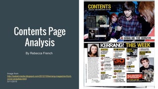
2. Image
The main image is of Bring Me The Horizon.
They use an image of a band that fits with the
genre of the magazine to catch the attention of
the readers. It has the page number and title
underneath but because of the conducts of the
magazine it doesn't have any smaller
information about the contents of that page.
Below is a picture of the editor. They add a
picture of the editor so you can see who is
behind the magazine and it makes it more
personal. It also brings attention to the column
she wrote because it might be missed.
There are some smaller pictures on the page to
reveal what else is featured in the magazine.
3. Text
All the headings and titles are in capitals so
it grabs the attention of the reader and
makes the titles seem more important.
The subheadings point out what categories
of contents the magazine has and it makes
it easier for the reader to find what they are
looking for.
The colour of the text is a bright yellow that
is used for the headings and subheadings
throughout the contents page. It matches
the rock/rebel theme of the magazine.
4. Layout
The contents page is split into half. The top
half has a photo of Bring Me The Horizon.
The reason why they take up half the page
is because it is a big feature in the magazine
but not big enough for the front cover and
they want to draw as much attention to it as
possible.
The other half contains the rest of the
contents in the magazine. It is split into two
columns to make it easier for the reader to
see what's inside.
The title for the contents page is to the side,
big enough so you can see it but it isn't
distracting what else is featured in the
magazine
5. Summary
The layout, text, and images all play a huge
part in making the magazine look pleasing
to the eye and enticing the reader to look
further into the magazine. Having the text
set out like it is helps make it easier for the
reader to navigate around the magazine.
A lot of work goes into the cover and
contents page making it fit the theme of the
magazine and sell as many copies as
possible.