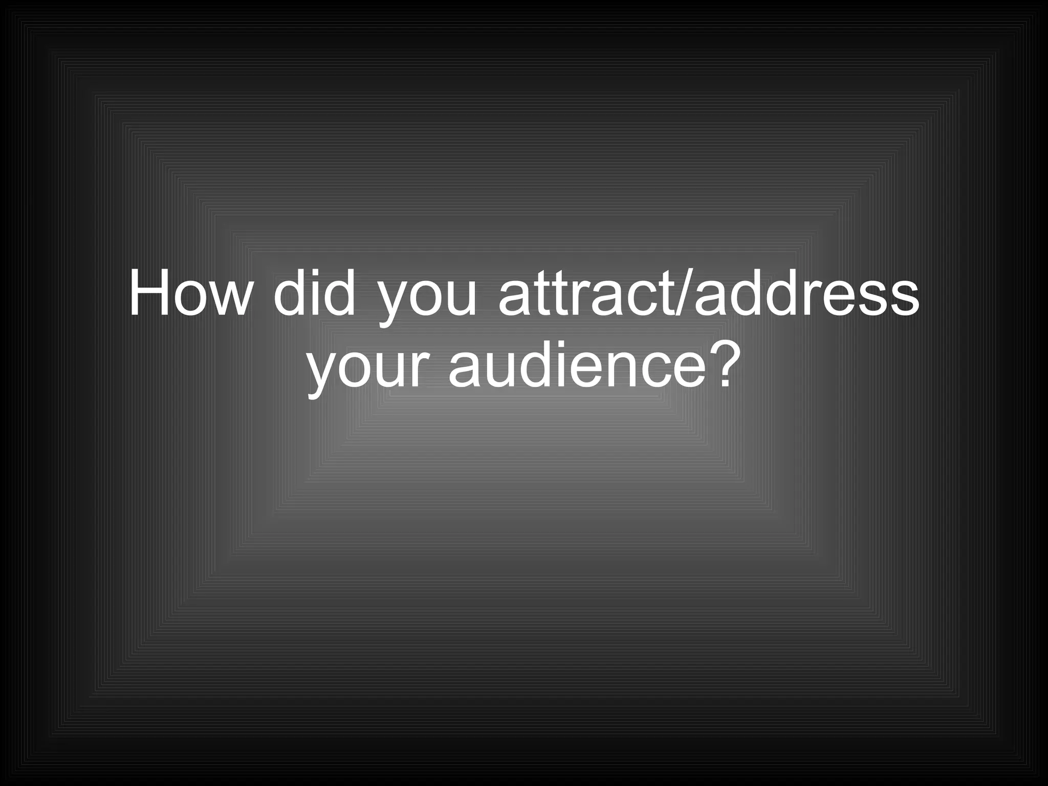
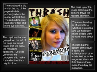
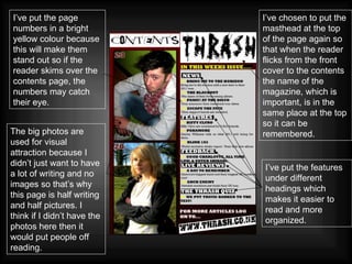
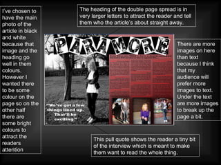
How did you attract/address your audience?
Ways to attract your audience Its important to think about what ways you need to include to make your product appealing to an audience. There are a lot of factors that need to be considered. These are: Colour scheme Font Titles/headings Photos Captions Features Layout Masthead Boxes/frames Free things Posters Language
The close up of the image looking at the camera draws the readers attention. The masthead is big and at the top of the page which is probably where the reader will look first. The red outline give it a better effect and more eye catching.   The captions that are going down the left of the page are small things that will make the magazine appealing. I’ve used yellow as the background to make it stand out as it is a bright colour. The main heading is of something which is interesting and will hopefully make people want to read more about it. The band at the bottom of the cover is telling the audience what other artists feature in the magazine which will, if it interests them, make them buy the magazine.
The big photos are used for visual attraction because I didn’t just want to have a lot of writing and no images so that’s why this page is half writing and half pictures. I think if I didn’t have the photos here then it would put people off reading. I’ve put the page numbers in a bright yellow colour because this will make them stand out so if the reader skims over the contents page, the numbers may catch their eye. I’ve chosen to put the masthead at the top of the page again so that when the reader flicks from the front cover to the contents the name of the magazine, which is important, is in the same place at the top so it can be remembered. I’ve put the features under different headings which makes it easier to read and more organized.
This pull quote shows the reader a tiny bit of the interview which is meant to make them want to read the whole thing. There are more images on here than text because I think that my audience will prefer more images to text. Under the text are more images to break up the page a bit. The heading of the double page spread is in very larger letters to attract the reader and tell them who the article’s about straight away. I’ve chosen to have the main photo of the article in black and white because that image and the heading go well in them colours. However I wanted there to be some colour on the page so on the other half there are some bright colours to attract the readers attention .
All of my photos except tow on the front, were posed but in a natural setting. The clothes that they are all wearing are just normal clothes because I think that if the audience of my magazine see artists wearing clothes they wear it will attract and address them. I have used two photos on the front cover which are live shots so they are of bands in action on stage playing gigs. This will attract the audience because it shows that not all the photos are done the same.

Attracting The Reader

  • 1.
    How did youattract/address your audience?
  • 2.
    Ways to attractyour audience Its important to think about what ways you need to include to make your product appealing to an audience. There are a lot of factors that need to be considered. These are: Colour scheme Font Titles/headings Photos Captions Features Layout Masthead Boxes/frames Free things Posters Language
  • 3.
    The close upof the image looking at the camera draws the readers attention. The masthead is big and at the top of the page which is probably where the reader will look first. The red outline give it a better effect and more eye catching. The captions that are going down the left of the page are small things that will make the magazine appealing. I’ve used yellow as the background to make it stand out as it is a bright colour. The main heading is of something which is interesting and will hopefully make people want to read more about it. The band at the bottom of the cover is telling the audience what other artists feature in the magazine which will, if it interests them, make them buy the magazine.
  • 4.
    The big photosare used for visual attraction because I didn’t just want to have a lot of writing and no images so that’s why this page is half writing and half pictures. I think if I didn’t have the photos here then it would put people off reading. I’ve put the page numbers in a bright yellow colour because this will make them stand out so if the reader skims over the contents page, the numbers may catch their eye. I’ve chosen to put the masthead at the top of the page again so that when the reader flicks from the front cover to the contents the name of the magazine, which is important, is in the same place at the top so it can be remembered. I’ve put the features under different headings which makes it easier to read and more organized.
  • 5.
    This pull quoteshows the reader a tiny bit of the interview which is meant to make them want to read the whole thing. There are more images on here than text because I think that my audience will prefer more images to text. Under the text are more images to break up the page a bit. The heading of the double page spread is in very larger letters to attract the reader and tell them who the article’s about straight away. I’ve chosen to have the main photo of the article in black and white because that image and the heading go well in them colours. However I wanted there to be some colour on the page so on the other half there are some bright colours to attract the readers attention .
  • 6.
    All of myphotos except tow on the front, were posed but in a natural setting. The clothes that they are all wearing are just normal clothes because I think that if the audience of my magazine see artists wearing clothes they wear it will attract and address them. I have used two photos on the front cover which are live shots so they are of bands in action on stage playing gigs. This will attract the audience because it shows that not all the photos are done the same.