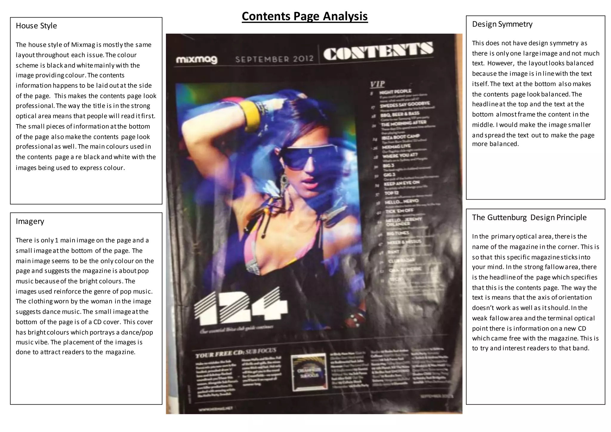
The document analyzes the design of a magazine contents page. It discusses the house style, imagery, design symmetry, and Gutenberg design principles used. The contents page uses a black and white color scheme with images providing color. There is one large main image of a woman reinforcing the magazine's focus on pop music. While there is no strict symmetry, the layout looks balanced with the large image framed by text at the top and bottom.