Masthead,
behind the
main image
so the focus is
on the feature
article
photograph
Selling line
with the
plug of a
free CD
Puff
Cover line on
the left third, in
order to get
readers’
attention
Masthead, the font
helps give the
reader an
impression of the
genre of magazine
Barcod
Cover lines
advertise the
bands within the
magazine to
entice fans of
their music to
buy
Cover lines in smaller
font as smaller
articles or less
popular bands so less
Cover lines
differentiated
between the three
thirds
Colour scheme of blues
and orange. Low
lighting used to create
a lot of shadow
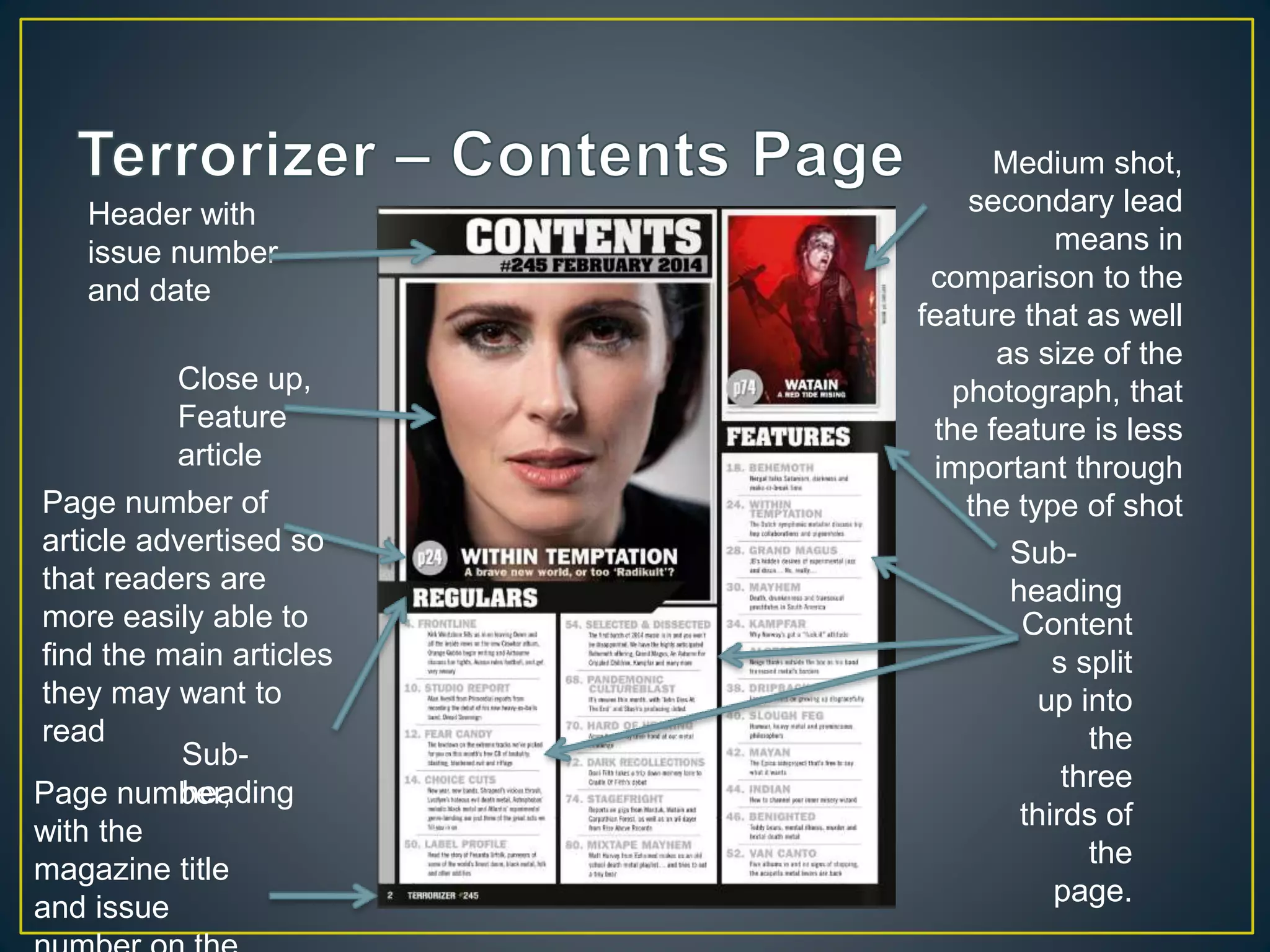
Close up,
Feature
article
Medium shot,
secondary lead
means in
comparison to the
feature that as well
as size of the
photograph, that
the feature is less
important through
the type of shot
Header with
issue number
and date
Content
s split
up into
the
three
thirds of
the
page.
Sub-
heading
Page number,
with the
magazine title
and issue
Sub-
heading
Page number of
article advertised so
that readers are
more easily able to
find the main articles
they may want to
read
Band name on
the left third, on
the left page so
when flicking
through, it will
catch the
reader’s
attention
Introduction gives
the reader an
impression of
what the article is
about, with the
band name and
lead’s name in a
larger font to catch
Page number, Magazine
name and issue number
always remain in the same
place for each page on the
Page title in
bold on a slant
on the left third.
It’s eye-
catching and
suits the title’s
meaning
Article split into
columns in the thirds of
each page
Main image is
medium shots so
that faces aren’t
covered by the
article and text is
visible because it
fade to black.
There are also
two members of
the band on each
page so none of
the faces are cut
by the centrefold.
Start of each
new
paragraph is
noticeable by
the bold first
letter.
Interesting
quote from the
article
persuades
readers to read
Tagline partially
unreadable because of
the splash image
Selling line has band
name over the
masthead showing
importance. The
quote however is
there to intrigue the
reader with it coming
across strange
without a context.
Masthead font
is a mix of the
recognisable
logo and the
font to match
the cover
theme
Cover lines highlight
the bands focused on
within the articles in
order to attract
readers
Feature article image of
a recognisable band
member, his pose is
relevant to the genre
and main article
Use of buzz word
attracts readers
as it’s the only
one of its kind
Main feature is the
selling point of having
a popular band
interview
Quote is
powerful words
to grab readers
attention
Publisher
Exclamation that
gives idea of an
article in the
magazine, white font
colour to contrast the
Use of a plug to
intrigue the
reader
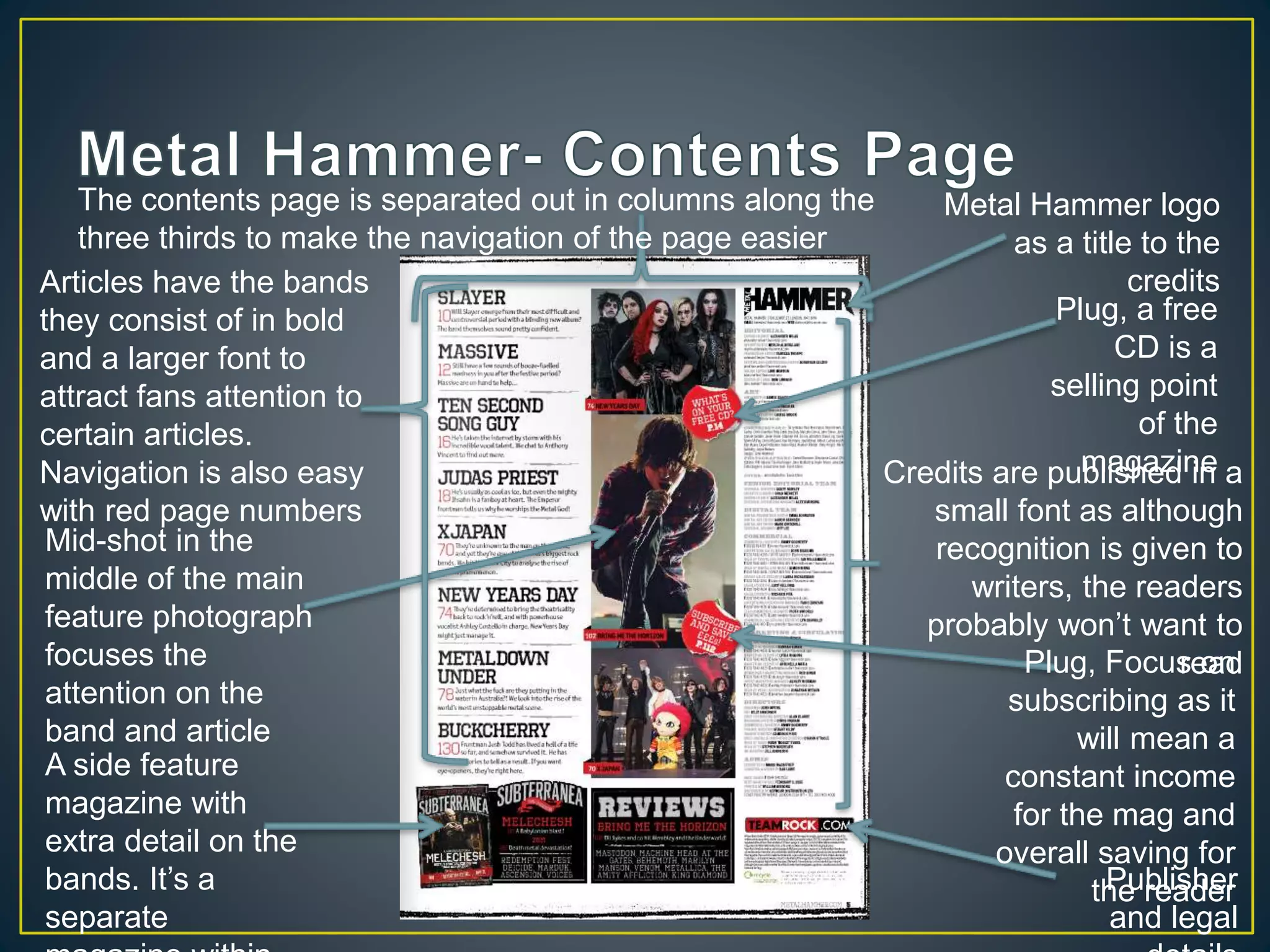
The contents page is separated out in columns along the
three thirds to make the navigation of the page easier
Metal Hammer logo
as a title to the
credits
Plug, a free
CD is a
selling point
of the
magazineCredits are published in a
small font as although
recognition is given to
writers, the readers
probably won’t want to
readPlug, Focus on
subscribing as it
will mean a
constant income
for the mag and
overall saving for
the readerPublisher
and legal
A side feature
magazine with
extra detail on the
bands. It’s a
separate
Mid-shot in the
middle of the main
feature photograph
focuses the
attention on the
band and article
Articles have the bands
they consist of in bold
and a larger font to
attract fans attention to
certain articles.
Navigation is also easy
with red page numbers
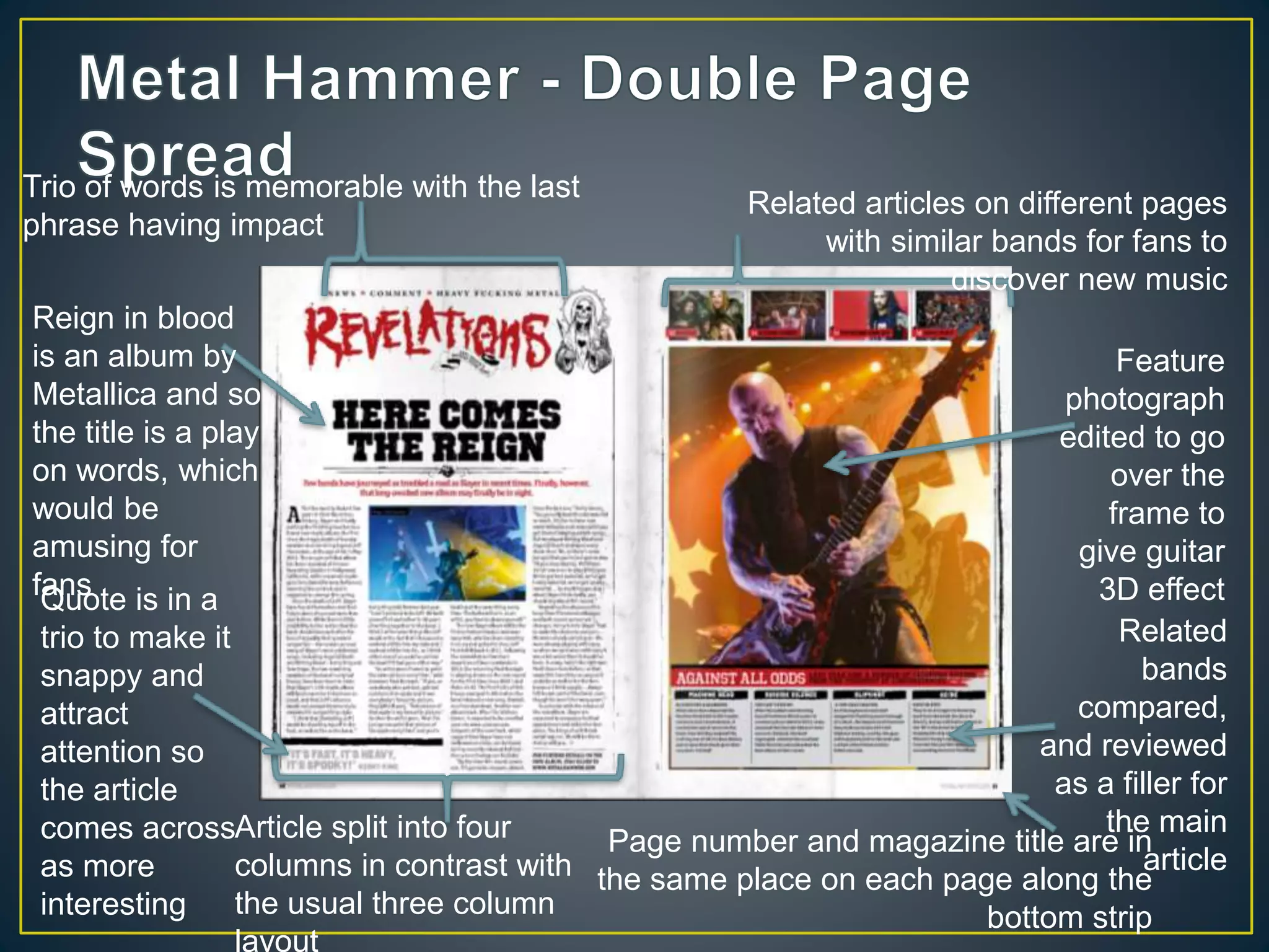
Reign in blood
is an album by
Metallica and so
the title is a play
on words, which
would be
amusing for
fans
Related articles on different pages
with similar bands for fans to
discover new music
Trio of words is memorable with the last
phrase having impact
Feature
photograph
edited to go
over the
frame to
give guitar
3D effect
Related
bands
compared,
and reviewed
as a filler for
the main
article
Page number and magazine title are in
the same place on each page along the
bottom strip
Article split into four
columns in contrast with
the usual three column
layout
Quote is in a
trio to make it
snappy and
attract
attention so
the article
comes across
as more
interesting
Header in
different font
and colour to
catch attention
Religious graphic art
twisted to suit theme
Introduction
gives a taster
with its larger
font and
different
colour it grabs
the readers
attention
With the letter form of larger font,
it gives the article a definitive start
Colour
scheme
consists of
reds and
black, this
coincides
with the
front cover
as a
running
colour
scheme
throughout
the
magazine
Masthead is the
traditional logo for
the magazine, with
the word rock
being the main
focus as it is the
largest and most
contrasting with
white on a black
background
Feature article image
covers the centre of
the masthead. Its black
and white photography
matches with the
colour scheme and
idea of ‘classic’
Tagline partially
covered by the image
also matches the
colour scheme with the
red lightening bolt to
attract attention
Selling line
uses the
buzz word of
‘best of’
Publisher branding
and barcode both
work with the colour
Plug using buzz
words such as
‘explosive’ and ‘kings’
with a font that
matches the idea of
explosion
Left third contains the
brand name, issue
number and bands
within the issue, this
means that when
stacked in store it
would be visible and
eye-catching with its
bright red colour
Enlarged version of image
in the tagline breaks up
black and white
Quote gives the reader
a teaser of the feature
article as a selling point
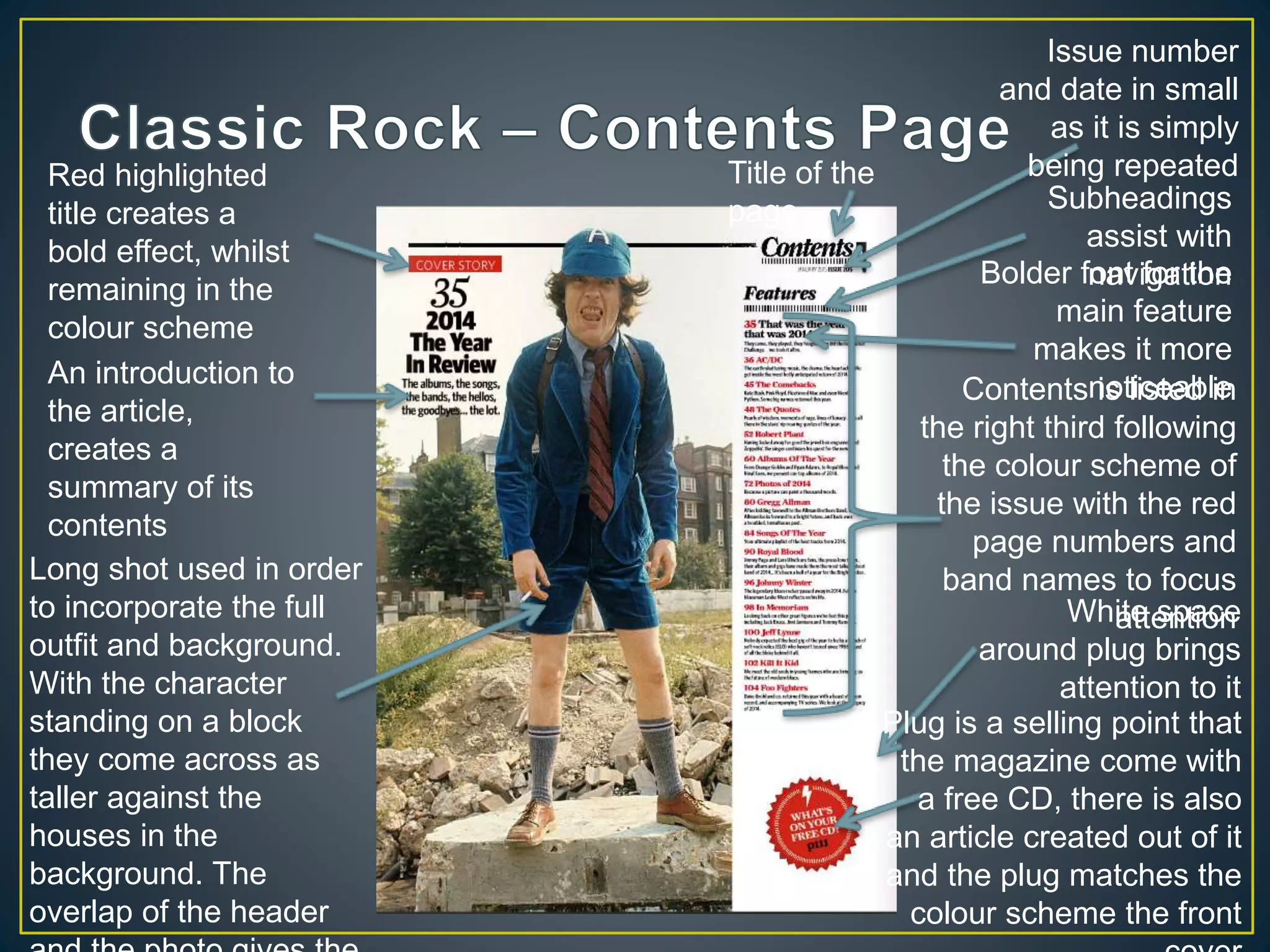
Plug is a selling point that
the magazine come with
a free CD, there is also
an article created out of it
and the plug matches the
colour scheme the front
White space
around plug brings
attention to it
Contents is listed in
the right third following
the colour scheme of
the issue with the red
page numbers and
band names to focus
attention
Bolder font for the
main feature
makes it more
noticeable
Subheadings
assist with
navigation
Issue number
and date in small
as it is simply
being repeatedTitle of the
page
Long shot used in order
to incorporate the full
outfit and background.
With the character
standing on a block
they come across as
taller against the
houses in the
background. The
overlap of the header
An introduction to
the article,
creates a
summary of its
contents
Red highlighted
title creates a
bold effect, whilst
remaining in the
colour scheme
Collage of
images breaks
up text and
interests the
reader as it
has captions
to give
context. There
is also a focus
on a larger
central image
with a plain
white
background,
that draws
attention to
the characters
within the
photograph
New paragraph beginning with a
larger bold letter to draw attention
to the next point in the article
Columns are split into the three thirds of the
page with vertical lines in between each
column to make navigation easier and create
A feature
image breaks
up the text
making it more
appealing to
read, with the
text curving
around the
arms to make
the text clearly
visible and
display the
importance of
the image
Recurring
feature that
has it’s own
branding in
the
magazine
Introduction
summarises the
article and is
followed by the
credits with the
names in bold
The title is the same as a song from
a 1937 musical. It’s elongated font
gives it a proffesional in the
sophisticated way that is linked to
Hollywood

Magazine analysis

  • 2.
    Masthead, behind the main image sothe focus is on the feature article photograph Selling line with the plug of a free CD Puff Cover line on the left third, in order to get readers’ attention Masthead, the font helps give the reader an impression of the genre of magazine Barcod Cover lines advertise the bands within the magazine to entice fans of their music to buy Cover lines in smaller font as smaller articles or less popular bands so less Cover lines differentiated between the three thirds Colour scheme of blues and orange. Low lighting used to create a lot of shadow
  • 3.
    Close up, Feature article Medium shot, secondarylead means in comparison to the feature that as well as size of the photograph, that the feature is less important through the type of shot Header with issue number and date Content s split up into the three thirds of the page. Sub- heading Page number, with the magazine title and issue Sub- heading Page number of article advertised so that readers are more easily able to find the main articles they may want to read
  • 4.
    Band name on theleft third, on the left page so when flicking through, it will catch the reader’s attention Introduction gives the reader an impression of what the article is about, with the band name and lead’s name in a larger font to catch Page number, Magazine name and issue number always remain in the same place for each page on the Page title in bold on a slant on the left third. It’s eye- catching and suits the title’s meaning Article split into columns in the thirds of each page Main image is medium shots so that faces aren’t covered by the article and text is visible because it fade to black. There are also two members of the band on each page so none of the faces are cut by the centrefold. Start of each new paragraph is noticeable by the bold first letter. Interesting quote from the article persuades readers to read
  • 5.
    Tagline partially unreadable becauseof the splash image Selling line has band name over the masthead showing importance. The quote however is there to intrigue the reader with it coming across strange without a context. Masthead font is a mix of the recognisable logo and the font to match the cover theme Cover lines highlight the bands focused on within the articles in order to attract readers Feature article image of a recognisable band member, his pose is relevant to the genre and main article Use of buzz word attracts readers as it’s the only one of its kind Main feature is the selling point of having a popular band interview Quote is powerful words to grab readers attention Publisher Exclamation that gives idea of an article in the magazine, white font colour to contrast the Use of a plug to intrigue the reader
  • 6.
    The contents pageis separated out in columns along the three thirds to make the navigation of the page easier Metal Hammer logo as a title to the credits Plug, a free CD is a selling point of the magazineCredits are published in a small font as although recognition is given to writers, the readers probably won’t want to readPlug, Focus on subscribing as it will mean a constant income for the mag and overall saving for the readerPublisher and legal A side feature magazine with extra detail on the bands. It’s a separate Mid-shot in the middle of the main feature photograph focuses the attention on the band and article Articles have the bands they consist of in bold and a larger font to attract fans attention to certain articles. Navigation is also easy with red page numbers
  • 7.
    Reign in blood isan album by Metallica and so the title is a play on words, which would be amusing for fans Related articles on different pages with similar bands for fans to discover new music Trio of words is memorable with the last phrase having impact Feature photograph edited to go over the frame to give guitar 3D effect Related bands compared, and reviewed as a filler for the main article Page number and magazine title are in the same place on each page along the bottom strip Article split into four columns in contrast with the usual three column layout Quote is in a trio to make it snappy and attract attention so the article comes across as more interesting
  • 8.
    Header in different font andcolour to catch attention Religious graphic art twisted to suit theme Introduction gives a taster with its larger font and different colour it grabs the readers attention With the letter form of larger font, it gives the article a definitive start Colour scheme consists of reds and black, this coincides with the front cover as a running colour scheme throughout the magazine
  • 9.
    Masthead is the traditionallogo for the magazine, with the word rock being the main focus as it is the largest and most contrasting with white on a black background Feature article image covers the centre of the masthead. Its black and white photography matches with the colour scheme and idea of ‘classic’ Tagline partially covered by the image also matches the colour scheme with the red lightening bolt to attract attention Selling line uses the buzz word of ‘best of’ Publisher branding and barcode both work with the colour Plug using buzz words such as ‘explosive’ and ‘kings’ with a font that matches the idea of explosion Left third contains the brand name, issue number and bands within the issue, this means that when stacked in store it would be visible and eye-catching with its bright red colour Enlarged version of image in the tagline breaks up black and white Quote gives the reader a teaser of the feature article as a selling point
  • 10.
    Plug is aselling point that the magazine come with a free CD, there is also an article created out of it and the plug matches the colour scheme the front White space around plug brings attention to it Contents is listed in the right third following the colour scheme of the issue with the red page numbers and band names to focus attention Bolder font for the main feature makes it more noticeable Subheadings assist with navigation Issue number and date in small as it is simply being repeatedTitle of the page Long shot used in order to incorporate the full outfit and background. With the character standing on a block they come across as taller against the houses in the background. The overlap of the header An introduction to the article, creates a summary of its contents Red highlighted title creates a bold effect, whilst remaining in the colour scheme
  • 11.
    Collage of images breaks uptext and interests the reader as it has captions to give context. There is also a focus on a larger central image with a plain white background, that draws attention to the characters within the photograph New paragraph beginning with a larger bold letter to draw attention to the next point in the article Columns are split into the three thirds of the page with vertical lines in between each column to make navigation easier and create A feature image breaks up the text making it more appealing to read, with the text curving around the arms to make the text clearly visible and display the importance of the image Recurring feature that has it’s own branding in the magazine Introduction summarises the article and is followed by the credits with the names in bold The title is the same as a song from a 1937 musical. It’s elongated font gives it a proffesional in the sophisticated way that is linked to Hollywood