THE CRACK
MAGAZINE
DECONSTRUCTION
2
HEATHER JOHNSON
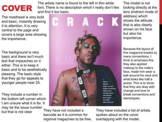
COVER
The masthead is very bold
and basic, instantly drawing
it to attention. It is very
central to the page and
covers a large area showing
the importance.
The background is very
basic and there isn’t much
text that impeaches on it
either. This is to keep it
basic and to be aesthetically
pleasing. The basic style
that they go for appeals to
younger people near 25.
The model is not
looking directly at the
lens (indirect mode of
address) which
shows the attitude
that is also clearly
shown on his face
but also his
importance.
The artists name is found to the left in thin white
font. There is no description which I really don’t like
and find it too basic.
Because the layout of
this magazine breaks so
many conventions, I
think to emphasis this
they also applied
makeup to the male’s
face, made him wear a
belt around his neck and
what looks like half a
jacket. This is to show
that they are okay with
change and love to
break conventions and
stereotypes.
They include a number in
the bottom left corner which
I am unsure what it is for. It
may be the issue number
but that is not clear They have not included a
barcode as it is common for
regional magazines to be free.
They have included a list of artists
spoken about on the cover
overlapping with the model.
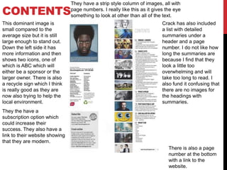
CONTENTS
This dominant image is
small compared to the
average size but it is still
large enough to stand out.
Down the left side it has
more information and then
shows two icons, one of
which is ABC which will
either be a sponsor or the
larger owner. There is also
a recycle sign which I think
is really good as they are
now also trying to help the
local environment.
They the have a
subscription option which
could increase their
success. They also have a
link to their website showing
that they are modern.
They have a strip style column of images, all with
page numbers. I really like this as it gives the eye
something to look at other than all of the text.
Crack has also included
a list with detailed
summaries under a
header and a page
number. I do not like how
long the summaries are
because I find that they
look a little too
overwhelming and will
take too long to read. I
also fund it confusing that
there are no images for
the headings with
summaries.
There is also a page
number at the bottom
with a link to the
website.
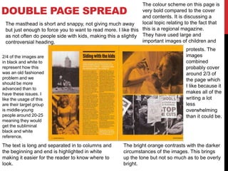
DOUBLE PAGE SPREAD
The colour scheme on this page is
very bold compared to the cover
and contents. It is discussing a
local topic relating to the fact that
this is a regional magazine.
They have used large and
important images of children and
protests. The
images
combined
probably cover
around 2/3 of
the page which
I like because it
makes all of the
writing a lot
less
overwhelming
than it could be.
The bright orange contrasts with the darker
circumstances of the images. This brings
up the tone but not so much as to be overly
bright.
The text is long and separated in to columns and
the beginning and end is highlighted in white
making it easier for the reader to know where to
look.
The masthead is short and snappy, not giving much away
but just enough to force you to want to read more. I like this
as not often do people side with kids, making this a slightly
controversial heading.
2/4 of the images are
in black and white to
represent how this
was an old fashioned
problem and we
should be more
advanced than to
have these issues. I
like the usage of this
are their target group
is middle-young
people around 20-25
meaning they would
get the subliminal
black and white
reference.

Crack magazine deconstruction

  • 1.
  • 2.
    COVER The masthead isvery bold and basic, instantly drawing it to attention. It is very central to the page and covers a large area showing the importance. The background is very basic and there isn’t much text that impeaches on it either. This is to keep it basic and to be aesthetically pleasing. The basic style that they go for appeals to younger people near 25. The model is not looking directly at the lens (indirect mode of address) which shows the attitude that is also clearly shown on his face but also his importance. The artists name is found to the left in thin white font. There is no description which I really don’t like and find it too basic. Because the layout of this magazine breaks so many conventions, I think to emphasis this they also applied makeup to the male’s face, made him wear a belt around his neck and what looks like half a jacket. This is to show that they are okay with change and love to break conventions and stereotypes. They include a number in the bottom left corner which I am unsure what it is for. It may be the issue number but that is not clear They have not included a barcode as it is common for regional magazines to be free. They have included a list of artists spoken about on the cover overlapping with the model.
  • 3.
    CONTENTS This dominant imageis small compared to the average size but it is still large enough to stand out. Down the left side it has more information and then shows two icons, one of which is ABC which will either be a sponsor or the larger owner. There is also a recycle sign which I think is really good as they are now also trying to help the local environment. They the have a subscription option which could increase their success. They also have a link to their website showing that they are modern. They have a strip style column of images, all with page numbers. I really like this as it gives the eye something to look at other than all of the text. Crack has also included a list with detailed summaries under a header and a page number. I do not like how long the summaries are because I find that they look a little too overwhelming and will take too long to read. I also fund it confusing that there are no images for the headings with summaries. There is also a page number at the bottom with a link to the website.
  • 4.
    DOUBLE PAGE SPREAD Thecolour scheme on this page is very bold compared to the cover and contents. It is discussing a local topic relating to the fact that this is a regional magazine. They have used large and important images of children and protests. The images combined probably cover around 2/3 of the page which I like because it makes all of the writing a lot less overwhelming than it could be. The bright orange contrasts with the darker circumstances of the images. This brings up the tone but not so much as to be overly bright. The text is long and separated in to columns and the beginning and end is highlighted in white making it easier for the reader to know where to look. The masthead is short and snappy, not giving much away but just enough to force you to want to read more. I like this as not often do people side with kids, making this a slightly controversial heading. 2/4 of the images are in black and white to represent how this was an old fashioned problem and we should be more advanced than to have these issues. I like the usage of this are their target group is middle-young people around 20-25 meaning they would get the subliminal black and white reference.