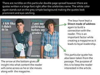
This double page spread features Harry Styles and Zayn Malik of the band One Direction. Large prominent images of each band member anchor each page with intriguing quotes below in large font to attract teenage girls. The article is divided into two columns describing each member. Font colors change from blue to green to hint at their personalities. Quotes and an arrow encourage readers to turn the page. Loyal readership is built through a direct address to connect with readers.
EASY TUTORIAL OF HOW TO USE CAPCUT BY: FEBLESS HERNANEFebless Hernane
CapCut is an easy-to-use video editing app perfect for beginners. To start, download and open CapCut on your phone. Tap "New Project" and select the videos or photos you want to edit. You can trim clips by dragging the edges, add text by tapping "Text," and include music by selecting "Audio." Enhance your video with filters and effects from the "Effects" menu. When you're happy with your video, tap the export button to save and share it. CapCut makes video editing simple and fun for everyone!
White wonder, Work developed by Eva TschoppMansi Shah
White Wonder by Eva Tschopp
A tale about our culture around the use of fertilizers and pesticides visiting small farms around Ahmedabad in Matar and Shilaj.
Fonts play a crucial role in both User Interface (UI) and User Experience (UX) design. They affect readability, accessibility, aesthetics, and overall user perception.
Connect Conference 2022: Passive House - Economic and Environmental Solution...TE Studio
Passive House: The Economic and Environmental Solution for Sustainable Real Estate. Lecture by Tim Eian of TE Studio Passive House Design in November 2022 in Minneapolis.
- The Built Environment
- Let's imagine the perfect building
- The Passive House standard
- Why Passive House targets
- Clean Energy Plans?!
- How does Passive House compare and fit in?
- The business case for Passive House real estate
- Tools to quantify the value of Passive House
- What can I do?
- Resources
Technoblade The Legacy of a Minecraft Legend.Techno Merch
Technoblade, born Alex on June 1, 1999, was a legendary Minecraft YouTuber known for his sharp wit and exceptional PvP skills. Starting his channel in 2013, he gained nearly 11 million subscribers. His private battle with metastatic sarcoma ended in June 2022, but his enduring legacy continues to inspire millions.
Visual Style and Aesthetics: Basics of Visual Design
Visual Design for Enterprise Applications
Range of Visual Styles.
Mobile Interfaces:
Challenges and Opportunities of Mobile Design
Approach to Mobile Design
Patterns
2. What is a double page
spread?
A double page spread
consists of two pages
formed into one by
extending the images
and text across the
binding.
3. In this double spread two images have been made very prominent.These images are covering the negative space on
the page.They have also been cropped out and placed on a plain simple background which helps them stand out
more. Most of the attention has been drawn to these two anchoring images.
The anchoring images are images that are associated with the title. In this particular issue it is harry and Zayn. Here
the editor has added quotes by the two band members beneath their names in a large font to give the readers a clue
about what the article is about.Their names themselves create a hype as it attracts a particular target audience,
mainly teenage girls.
The quotes intrigue the audience creating an enigma code. They have been extracted from the text and written in
explanation marks.
The article has been divided into two parts each describing one band member.Two columns can be seen on the page,
the purpose of this is to make it easier for the reader to understand and read the text.
The font color mainly the headings change from blue to green as you
move on to the next page.These colors may give a hint regarding the
personality of the boys. Zayn being portrayed as shy and mellow. Even
his body language and arm gesture indicated that he is rather
introverted, whereas harry seems confident and expressive.
4. The boys have kept a
Direct mode of address
again to build a
connection with the
reader.This is an
important factor while
creating a magazine as it
leads to loyal readership.
This particular quote has
also been taken from the
passage.The purpose of
this is to keep the reader
interested in the article.
The arrow at the bottom gives an
insight into what content the reader
will come across as he or she moves
along with the magazine.
There are no titles on this particular double page spread however there are
quotes written n a large font right after the celebrities name.The white color
again stands out on the grey simple background making the quotes look
prominent and eye catching.
5. The text has been written in the an auto
biography genre, It has been divided into six
distinct paragraphs. Starting with the two
introductory paragraphs.The heading have been
enlarged and typed in a blue followed by text with
a smaller font.The particular headings given for
example “personality” is followed by relevant text
about of course his personality traits.The reader
or a fan in particular would be curious to read the
text just by looking its heading
The text has been written in the first person
narrative which gives a feeling that the celebrity
is actually speaking to you and is sharing his
personal experience.This again builds a strong
connection between the reader an the text.
6. The image: Ed sheeran is clearly the topic of
discussion in this particular article.
The background shows London as Ed is
originally from the EnglandThe following
quote suggests how the article may be
directed towards Eds recent success in the
music industry. He has become a British pop
star with his albums at number one on the top
charts.
The colors used in the text and
background reflect Eds styles of music
which is again very mellow. Red has been
used to highlight the word “GINGER”
which points at Eds physical traits ( having
ginger hair)
The text:A drop capitol has
been used at the start of the
paragraph again in red to break
the black and white monotony.
The text has further been
divided into two columns and
several paragraphs for easier
readability.
7. To keep the reader interested the Q
magazine editor has included a brief
information box stating the interesting
features about the artists new album.
The magazine logo and page number
Along with the issue date is stated at the bottom
of the page.
There is a separator between the
paragraphs, the. Purpose of this is to
divide the paragraphs and make
them easier to read.
8. Q magazine has kept its house style in
this particular issue. Usually an image is
placed on one side and a large letter, in
this case the “S” on the other.
Q magazine frequently uses a large letter
to demonstrate the beginning of a text.
There is also a quote from the Lana's
interviewer ,This a unique way of keeping
the reader interested in the text.
The text ( divided into 5 paragraphs) has
been written in a plain and simple serif
font with works well with the elegant
theme of the magazine.The name of the
featured artist has been clearly mentioned
on top of the magazine to make it easier
for the reader to identity the artist and
also locate the page .
The name of the magazine along with the
page number can be seen in the footer of
the page.
9. The image is a big close up of Lana, the dim
lighting gives it a mysteries look.The
camera technique being used shows blur
circles across the left side of her face
making her the main focus of the image.
Black could indicate mystery, rebellion etc.
The lighting of the image created a hint of
the color red on the right side of her face.
This color could denote several meanings
such as passion, energy etc. Her facial
expression clearly give a very sexual vibe.
This particular style would appeal to a male
audience. She has also adopted an indirect
mode of address which breaks the
conventions of models looking directly into
the camera to engage the audience.