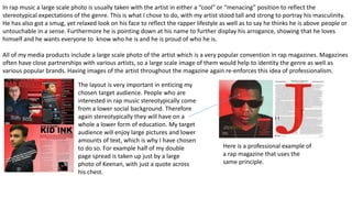
1. In what ways does your media
product use, develop or
challenge forms and conventions
of real media products?
• How does my Media product use media conventions:
My media product ‘RAP ATTACK’ uses various media conventions of real life rap magazines to make it believable, relatable to fans
and realistic to the genre. Firstly my magazine uses strong, bold fonts to reflect quite a male dominate genre where the “hard”
image is everything. Magazines that include this are well known brands such as THE SOURCE and XXL usually to accompany a
large scale image of the artist, which my magazine also includes.
Rap music is stereotypically a genre associated with people from a low social background and I wanted to be able to make my
magazine as relatable to them as possible. So I made my font informal to help reflect the genre and this is also the feedback I got
from my questionnaire on what people would most like to see.
However a way in which my text conforms to stereotypical conventions of a rap genre is some of it especially subheading can
come across slightly cartoonish. In addition to this the main heading “RAPATTACK” almost reflects a horror genre as it looks like
blood splattered on the page, which may have an undesired affect.
Colour is also a very important convention to bare in mind when trying to realistically reflect a genre and I have made this very
obvious. The main colour for my magazine was RED, with some whites and blacks to make it more exciting visually. I used red,
which is one of the most predominantly used colours in the rap industry. I used red because it represents things such as danger,
love and blood which are all topics heavily associated with rap music and used in the lyrics of songs.
The colours in my magazine create quite an aggressive feeling which reflects the rap genre which is somewhat of an oppositional
reading. This may be for people who don’t necessarily like the genre and want to create a negative vibe around it.
I wanted to create a strong house style throughout my magazine in terms of colour and text. I took the main heading from the
front cover adjusted the size and made it the main title of the contents page. I also used the same black, red and white colour
scheme from before. This continued colour scheme and font style not only creates a sense of professionalism but also creates a
brand identity that eventual fans of the magazine will be able to recognise and enjoy.
Colour scheme
consistent between his
hate and the colours of
the font of the article
In rap music a large scale photo is usually taken with the artist in either a “cool” or “menacing” position to reflect the
stereotypical expectations of the genre. This is what I chose to do, with my artist stood tall and strong to portray his masculinity.
He has also got a smug, yet relaxed look on his face to reflect the rapper lifestyle as well as to say he thinks he is above people or
untouchable in a sense. Furthermore he is pointing down at his name to further display his arrogance, showing that he loves
himself and he wants everyone to know who he is and he is proud of who he is.
All of my media products include a large scale photo of the artist which is a very popular convention in rap magazines. Magazines
often have close partnerships with various artists, so a large scale image of them would help to identity the genre as well as
various popular brands. Having images of the artist throughout the magazine again re-enforces this idea of professionalism.
The layout is very important in enticing my
chosen target audience. People who are
interested in rap music stereotypically come
from a lower social background. Therefore
again stereotypically they will have on a
whole a lower form of education. My target
audience will enjoy large pictures and lower
amounts of text, which is why I have chosen
to do so. For example half of my double
page spread is taken up just by a large
photo of Keenan, with just a quote across
his chest.
Here is a professional example of
a rap magazine that uses the
same principle.
In terms of costume I wanted to reflect the flashy, gangster like lifestyle created by various real life rap magazines. My artist is
wearing black jogging bottoms and a dark blue Armani coat. Armani is very flashy and well respected brand which reflect the
desired higher way of living which fans of rap want to obtain threw this music.
Through the use of costume I believe that my magazine conforms to various stereotypically conventions most importantly
including age gender and ethnicity.
Age- My target audience is young adults usually ranging from the ages of 16-25 who in most cases are assumed to be linked with
a low social background. Having relatable brands such as Armani will entice younger viewers who wish to own designer clothes
like that one day.
Gender- Rap is a very male dominated genre of music, which is why I have chosen a male artist. Emporia Armani is defiantly a
brand associated and sported by males so this only adds to the attractiveness of the magazine.
Ethnicity- The costume doesn’t really show the ethnicity but due to the artists skin colour and type of clothing we can tell that
rap music
The story aspect of my magazine includes topics such as the artists background, his influences and latest music for fans to
look forward too. These are all things that fans would want to see in an interview with there favourite rap star. Talking about
the stars background which is stereotypically poor, will entice young readers who will most likely be from somewhat of the
same background. These young readers will aspire to become like the artists in the magazines.
Unconventionally, I have added questions from audience members so that the artist can answer them. This may go against
the stereotypical format of an interview but I feel by allowing the audience to interact with the artist it makes it more
personal and also makes my magazine stand out from others.
INFORMATION ABOUT HIS NEXT ALBUM
RELEASE.
This is usually on another page and again
challenges the conventions of a typical
magazine interview but is a good use of
advertisement.
In conclusion I believe that overall my magazine conforms to stereotypical
conventions of real media products specifically within the rap genre. I have
used stereotypical colours, ethnicity, language, font and consistent styles to
help create a believable magazine and double page spread.
The layout it also much like professional magazines. For example in the
double page spread half of it is taken up by a photo of the artist with the
other half been taken up by simplistic and relatable text. I have also used
various techniques to incorporate more advertisement into the magazine
such as a small picture of an album and subheadings relating to various
other events.
I believe it was wise to completely conform to the genre as is it very
stereotypical and my target audience will know what they are looking for.
This brings forward the phrase if it isn’t broken don’t fix it.

Media evaluation 1

  • 1.
    1. In whatways does your media product use, develop or challenge forms and conventions of real media products?
  • 2.
    • How doesmy Media product use media conventions: My media product ‘RAP ATTACK’ uses various media conventions of real life rap magazines to make it believable, relatable to fans and realistic to the genre. Firstly my magazine uses strong, bold fonts to reflect quite a male dominate genre where the “hard” image is everything. Magazines that include this are well known brands such as THE SOURCE and XXL usually to accompany a large scale image of the artist, which my magazine also includes. Rap music is stereotypically a genre associated with people from a low social background and I wanted to be able to make my magazine as relatable to them as possible. So I made my font informal to help reflect the genre and this is also the feedback I got from my questionnaire on what people would most like to see. However a way in which my text conforms to stereotypical conventions of a rap genre is some of it especially subheading can come across slightly cartoonish. In addition to this the main heading “RAPATTACK” almost reflects a horror genre as it looks like blood splattered on the page, which may have an undesired affect.
  • 3.
    Colour is alsoa very important convention to bare in mind when trying to realistically reflect a genre and I have made this very obvious. The main colour for my magazine was RED, with some whites and blacks to make it more exciting visually. I used red, which is one of the most predominantly used colours in the rap industry. I used red because it represents things such as danger, love and blood which are all topics heavily associated with rap music and used in the lyrics of songs. The colours in my magazine create quite an aggressive feeling which reflects the rap genre which is somewhat of an oppositional reading. This may be for people who don’t necessarily like the genre and want to create a negative vibe around it. I wanted to create a strong house style throughout my magazine in terms of colour and text. I took the main heading from the front cover adjusted the size and made it the main title of the contents page. I also used the same black, red and white colour scheme from before. This continued colour scheme and font style not only creates a sense of professionalism but also creates a brand identity that eventual fans of the magazine will be able to recognise and enjoy. Colour scheme consistent between his hate and the colours of the font of the article
  • 4.
    In rap musica large scale photo is usually taken with the artist in either a “cool” or “menacing” position to reflect the stereotypical expectations of the genre. This is what I chose to do, with my artist stood tall and strong to portray his masculinity. He has also got a smug, yet relaxed look on his face to reflect the rapper lifestyle as well as to say he thinks he is above people or untouchable in a sense. Furthermore he is pointing down at his name to further display his arrogance, showing that he loves himself and he wants everyone to know who he is and he is proud of who he is. All of my media products include a large scale photo of the artist which is a very popular convention in rap magazines. Magazines often have close partnerships with various artists, so a large scale image of them would help to identity the genre as well as various popular brands. Having images of the artist throughout the magazine again re-enforces this idea of professionalism. The layout is very important in enticing my chosen target audience. People who are interested in rap music stereotypically come from a lower social background. Therefore again stereotypically they will have on a whole a lower form of education. My target audience will enjoy large pictures and lower amounts of text, which is why I have chosen to do so. For example half of my double page spread is taken up just by a large photo of Keenan, with just a quote across his chest. Here is a professional example of a rap magazine that uses the same principle.
  • 5.
    In terms ofcostume I wanted to reflect the flashy, gangster like lifestyle created by various real life rap magazines. My artist is wearing black jogging bottoms and a dark blue Armani coat. Armani is very flashy and well respected brand which reflect the desired higher way of living which fans of rap want to obtain threw this music. Through the use of costume I believe that my magazine conforms to various stereotypically conventions most importantly including age gender and ethnicity. Age- My target audience is young adults usually ranging from the ages of 16-25 who in most cases are assumed to be linked with a low social background. Having relatable brands such as Armani will entice younger viewers who wish to own designer clothes like that one day. Gender- Rap is a very male dominated genre of music, which is why I have chosen a male artist. Emporia Armani is defiantly a brand associated and sported by males so this only adds to the attractiveness of the magazine. Ethnicity- The costume doesn’t really show the ethnicity but due to the artists skin colour and type of clothing we can tell that rap music
  • 6.
    The story aspectof my magazine includes topics such as the artists background, his influences and latest music for fans to look forward too. These are all things that fans would want to see in an interview with there favourite rap star. Talking about the stars background which is stereotypically poor, will entice young readers who will most likely be from somewhat of the same background. These young readers will aspire to become like the artists in the magazines. Unconventionally, I have added questions from audience members so that the artist can answer them. This may go against the stereotypical format of an interview but I feel by allowing the audience to interact with the artist it makes it more personal and also makes my magazine stand out from others. INFORMATION ABOUT HIS NEXT ALBUM RELEASE. This is usually on another page and again challenges the conventions of a typical magazine interview but is a good use of advertisement.
  • 7.
    In conclusion Ibelieve that overall my magazine conforms to stereotypical conventions of real media products specifically within the rap genre. I have used stereotypical colours, ethnicity, language, font and consistent styles to help create a believable magazine and double page spread. The layout it also much like professional magazines. For example in the double page spread half of it is taken up by a photo of the artist with the other half been taken up by simplistic and relatable text. I have also used various techniques to incorporate more advertisement into the magazine such as a small picture of an album and subheadings relating to various other events. I believe it was wise to completely conform to the genre as is it very stereotypical and my target audience will know what they are looking for. This brings forward the phrase if it isn’t broken don’t fix it.