
Recommended
More Related Content
What's hot
What's hot (20)
Similar to ColorsTheory
Similar to ColorsTheory (20)
More from uploadlessons
More from uploadlessons (20)
Recently uploaded
Recently uploaded (20)
ColorsTheory
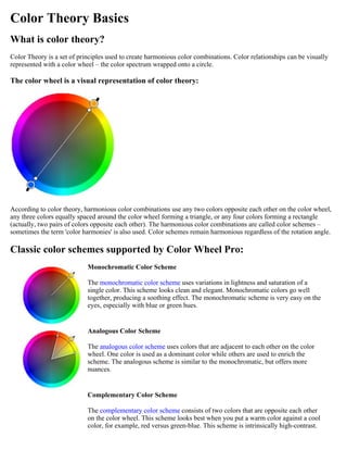
- 1. Color Theory Basics What is color theory? Color Theory is a set of principles used to create harmonious color combinations. Color relationships can be visually represented with a color wheel – the color spectrum wrapped onto a circle. The color wheel is a visual representation of color theory: According to color theory, harmonious color combinations use any two colors opposite each other on the color wheel, any three colors equally spaced around the color wheel forming a triangle, or any four colors forming a rectangle (actually, two pairs of colors opposite each other). The harmonious color combinations are called color schemes – sometimes the term 'color harmonies' is also used. Color schemes remain harmonious regardless of the rotation angle. Classic color schemes supported by Color Wheel Pro: Monochromatic Color Scheme The monochromatic color scheme uses variations in lightness and saturation of a single color. This scheme looks clean and elegant. Monochromatic colors go well together, producing a soothing effect. The monochromatic scheme is very easy on the eyes, especially with blue or green hues. Analogous Color Scheme The analogous color scheme uses colors that are adjacent to each other on the color wheel. One color is used as a dominant color while others are used to enrich the scheme. The analogous scheme is similar to the monochromatic, but offers more nuances. Complementary Color Scheme The complementary color scheme consists of two colors that are opposite each other on the color wheel. This scheme looks best when you put a warm color against a cool color, for example, red versus green-blue. This scheme is intrinsically high-contrast.
- 2. Split Complementary Color Scheme The split complementary scheme is a variation of the standard complementary scheme. It uses a color and the two colors adjacent to its complementary. This provides high contrast without the strong tension of the complementary scheme. Triadic Color Scheme The triadic color scheme uses three colors equally spaced around the color wheel. This scheme is popular among artists because it offers strong visual contrast while retaining harmony and color richness. The triadic scheme is not as contrasting as the complementary scheme, but it looks more balanced and harmonious. Tetradic (Double Complementary) Color Scheme The tetradic (double complementary) scheme is the most varied because it uses two complementary color pairs. This scheme is hard to harmonize; if all four hues are used in equal amounts, the scheme may look unbalanced, so you should choose a color to be dominant or subdue the colors. Color theory does not analyze tints, shades, and tones Color theory analyzes only the relationships of pure colors, it does not take color lightness and saturation into account. While your color scheme can use any tints, shades, and tones, color theory pays attention only to the hue component. Color theory considers both these schemes equal: History of color theory The first color wheel was invented by Sir Isaac Newton. He split white sunlight into red, orange, yellow, green, cyan, and blue beams; then he joined the two ends of the color spectrum together to show the natural progression of colors.
- 3. Newton associated each color with a note of a musical scale. A century after Newton, Johann Wolfgang Goethe began studying psychological effect of colors. He noticed that blue gives a feeling of coolness and yellow has a warming effect. Goethe created a color wheel showing the psychological effect of each color. He divided all the colors into two groups - the plus side (from red through orange to yellow) and the minus side (from green through violet to blue). Colors of the plus side produce excitement and cheerfulness. Colors of the minus side are associated with weakness and unsettled feelings. The current form of color theory was developed by Johannes Itten, a Swiss color and art theorist who was teaching at the School of Applied Arts in Weimar, Germany. This school is also known as 'Bauhaus'. Johannes Itten developed 'color chords' and modified the color wheel. Itten's color wheel is based on red, yellow, and blue colors as the primary triad and includes twelve hues. Related topics: Mixing vs. Visual Color Wheel Color Schemes Color Meaning Copyright © 2002-2003 QSX Software Group. All rights reserved. Color Wheel Pro™ contains Macromedia Flash™ Player software by Macromedia, Inc., Copyright © 1995-2003 Macromedia, Inc. All rights reserved. Macromedia and Flash are trademarks of Macromedia, Inc. Mixing vs. Visual Color Wheel Mixing (red-yellow-blue) color wheel Traditionally, artists used a color wheel composed of the primary colors red, yellow, and blue. Currently, the mixing color wheel is commonly accepted as a visual representation of color theory. This color wheel was invented by Johannes Itten, a Swiss color and art theorist. According to Itten, the primary use of his color wheel is for mixing pigments. However, many artists use this color wheel to create visually harmonious color combinations. Visual (red-green-blue) color wheel
- 4. As opposed to the mixing version of the color wheel, the visual color wheel is based on the primary colors red, green, and blue. The RGB primaries are used for computer monitors, cameras, scanners, etc. The secondary (subtractive) triad of the RGB wheel is CMY (cyan, magenta, yellow), which is a standard in printing. Also, the human eye contains RGB receptors. Because of this fact, many artists believe that the visual RGB color wheel should be used instead of the traditional RYB wheel to create visual complements. Which wheel to choose? The purpose of Color Wheel Pro is to create visually harmonious color schemes, but not to teach you to mix pigments. So we recommend that you use the visual RGB wheel because it reflects human color perception correctly. Of course, you can experiment with both types of the color wheel. Copyright © 2002-2003 QSX Software Group. All rights reserved. Color Wheel Pro™ contains Macromedia Flash™ Player software by Macromedia, Inc., Copyright © 1995-2003 Macromedia, Inc. All rights reserved. Macromedia and Flash are trademarks of Macromedia, Inc. Color Meaning Red Red is the color of fire and blood, so it is associated with energy, war, danger, strength, power, determination as well as passion, desire, and love. Red is a very emotionally intense color. It enhances human metabolism, increases respiration rate, and raises blood pressure. It has very high visibility, which is why stop signs, stoplights, and fire equipment are usually painted red. In heraldry, red is used to indicate courage. It is a color found in many national flags. Red brings text and images to the foreground. Use it as an accent color to stimulate people to make quick decisions; it is a perfect color for 'Buy Now' or 'Click Here' buttons on Internet banners and websites. In advertising, red is often used to evoke erotic feelings (red lips, red nails, red-light districts, 'Lady in Red', etc). Red is widely used to indicate danger (high voltage signs, traffic lights). This color is also commonly associated with energy, so you can use it when promoting energy drinks, games, cars, items related to sports and high physical activity. Light red represents joy, sexuality, passion, sensitivity, and love. Pink signifies romance, love, and friendship. It denotes feminine qualities and passiveness. Dark red is associated with vigor, willpower, rage, anger, leadership, courage, longing, malice, and wrath. Brown suggests stability and denotes masculine qualities. Reddish-brown is associated with harvest and fall. Orange
- 5. Orange combines the energy of red and the happiness of yellow. It is associated with joy, sunshine, and the tropics. Orange represents enthusiasm, fascination, happiness, creativity, determination, attraction, success, encouragement, and stimulation. To the human eye, orange is a very hot color, so it gives the sensation of heat. Nevertheless, orange is not as aggressive as red. Orange increases oxygen supply to the brain, produces an invigorating effect, and stimulates mental activity. It is highly accepted among young people. As a citrus color, orange is associated with healthy food and stimulates appetite. Orange is the color of fall and harvest. In heraldry, orange is symbolic of strength and endurance. Orange has very high visibility, so you can use it to catch attention and highlight the most important elements of your design. Orange is very effective for promoting food products and toys. Dark orange can mean deceit and distrust. Red-orange corresponds to desire, sexual passion, pleasure, domination, aggression, and thirst for action. Gold evokes the feeling of prestige. The meaning of gold is illumination, wisdom, and wealth. Gold often symbolizes high quality. Yellow Yellow is the color of sunshine. It's associated with joy, happiness, intellect, and energy. Yellow produces a warming effect, arouses cheerfulness, stimulates mental activity, and generates muscle energy. Yellow is often associated with food. Bright, pure yellow is an attention getter, which is the reason why taxicabs are painted this color. When overused, yellow may have a disturbing effect; it is known that babies cry more in yellow rooms. Yellow is seen before other colors when placed against black; this combination is often used to issue a warning. In heraldry, yellow indicates honor and loyalty. Later the meaning of yellow was connected with cowardice. Use yellow to evoke pleasant, cheerful feelings. You can choose yellow to promote children's products and items related to leisure. Yellow is very effective for attracting attention, so use it to highlight the most important elements of your design. Men usually perceive yellow as a very lighthearted, 'childish' color, so it is not recommended to use yellow when selling prestigious, expensive products to men - nobody will buy a yellow business suit or a yellow Mercedes. Yellow is an unstable and spontaneous color, so avoid using yellow if you want to suggest stability and safety. Light yellow tends to disappear into white, so it usually needs a dark color to highlight it. Shades of yellow are visually unappealing because they loose cheerfulness and become dingy. Dull (dingy) yellow represents caution, decay, sickness, and jealousy. Light yellow is associated with intellect, freshness, and joy. Green Green is the color of nature. It symbolizes growth, harmony, freshness, and fertility. Green has strong emotional correspondence with safety. Dark green is also commonly associated with money. Green has great healing power. It is the most restful color for the human eye; it can improve vision. Green suggests stability and endurance. Sometimes green denotes lack of experience; for example, a 'greenhorn' is a novice. In heraldry, green indicates growth and hope. Green, as opposed to red, means safety; it is the color of free passage in road traffic. Use green to indicate safety when advertising drugs and medical products. Green is directly related to nature, so you can use it to promote 'green' products. Dull, darker green is commonly associated with money, the financial world, banking, and Wall Street. Dark green is associated with ambition, greed, and jealousy. Yellow-green can indicate sickness, cowardice, discord, and jealousy.
- 6. Aqua is associated with emotional healing and protection. Olive green is the traditional color of peace. Blue Blue is the color of the sky and sea. It is often associated with depth and stability. It symbolizes trust, loyalty, wisdom, confidence, intelligence, faith, truth, and heaven. Blue is considered beneficial to the mind and body. It slows human metabolism and produces a calming effect. Blue is strongly associated with tranquility and calmness. In heraldry, blue is used to symbolize piety and sincerity. You can use blue to promote products and services related to cleanliness (water purification filters, cleaning liquids, vodka), air and sky (airlines, airports, air conditioners), water and sea (sea voyages, mineral water). As opposed to emotionally warm colors like red, orange, and yellow; blue is linked to consciousness and intellect. Use blue to suggest precision when promoting high-tech products. Blue is a masculine color; according to studies, it is highly accepted among males. Dark blue is associated with depth, expertise, and stability; it is a preferred color for corporate America. Avoid using blue when promoting food and cooking, because blue suppresses appetite. When used together with warm colors like yellow or red, blue can create high-impact, vibrant designs; for example, blue-yellow-red is a perfect color scheme for a superhero. Light blue is associated with health, healing, tranquility, understanding, and softness. Dark blue represents knowledge, power, integrity, and seriousness. Purple Purple combines the stability of blue and the energy of red. Purple is associated with royalty. It symbolizes power, nobility, luxury, and ambition. It conveys wealth and extravagance. Purple is associated with wisdom, dignity, independence, creativity, mystery, and magic. According to surveys, almost 75 percent of pre-adolescent children prefer purple to all other colors. Purple is a very rare color in nature; some people consider it to be artificial. Light purple is a good choice for a feminine design. You can use bright purple when promoting children's products. Light purple evokes romantic and nostalgic feelings. Dark purple evokes gloom and sad feelings. It can cause frustration. White White is associated with light, goodness, innocence, purity, and virginity. It is considered to be the color of perfection. White means safety, purity, and cleanliness. As opposed to black, white usually has a positive connotation. White can represent a successful beginning. In heraldry, white depicts faith and purity. In advertising, white is associated with coolness and cleanliness because it's the color of snow. You can use white to suggest simplicity in high-tech products. White is an appropriate color for charitable organizations; angels are usually imagined wearing white clothes. White is associated with hospitals, doctors, and sterility, so you can use white to suggest safety when promoting medical products. White is often associated with low weight, low-fat food, and dairy products.
- 7. Black Black is associated with power, elegance, formality, death, evil, and mystery. Black is a mysterious color associated with fear and the unknown (black holes). It usually has a negative connotation (blacklist, black humor, 'black death'). Black denotes strength and authority; it is considered to be a very formal, elegant, and prestigious color (black tie, black Mercedes). In heraldry, black is the symbol of grief. Black gives the feeling of perspective and depth, but a black background diminishes readability. When designing for a gallery of art or photography, you can use a black or gray background to make the other colors stand out. Black contrasts well with bright colors. Combined with red or orange – other very powerful colors – black gives a very aggressive color scheme. Copyright © 2002-2003 QSX Software Group. All rights reserved. Color Wheel Pro™ contains Macromedia Flash™ Player software by Macromedia, Inc., Copyright © 1995-2003 Macromedia, Inc. All rights reserved. Macromedia and Flash are trademarks of Macromedia, Inc. Color Schemes Monochromatic color scheme Examples: The monochromatic color scheme uses variations in lightness and saturation of a single color. This scheme looks clean and elegant. Monochromatic colors go well together, producing a soothing effect. The monochromatic scheme is very easy on the eyes, especially with blue or green hues. You can use it to establish an overall mood. The primary color can be integrated with neutral colors such as black, white, or gray. However, it can be difficult, when using this scheme, to highlight the most important elements. Pros: The monochromatic scheme is easy to manage, and always looks balanced and visually appealing. Cons: This scheme lacks color contrast. It is not as vibrant as the complementary scheme. Tips: 1. Use tints, shades, and tones of the key color to enhance the scheme. 2. Try the analogous scheme; it offers more nuances while retaining the simplicity and elegance of the monochromatic scheme. Analogous color scheme
- 8. Examples: The analogous color scheme uses colors that are adjacent to each other on the color wheel. One color is used as a dominant color while others are used to enrich the scheme. The analogous scheme is similar to the monochromatic one, but offers more nuances. Pros: The analogous color scheme is as easy to create as the monochromatic, but looks richer. Cons: The analogous color scheme lacks color contrast. It is not as vibrant as the complementary scheme. Tips: 1. Avoid using too many hues in the analogous scheme, because this may ruin the harmony. 2. Avoid combining warm and cool colors in this scheme. Complementary color scheme Examples: The complementary color scheme is made of two colors that are opposite each other on the color wheel. This scheme looks best when you place a warm color against a cool color, for example, red versus green-blue. The complementary scheme is intrinsically high-contrast. When using the complementary scheme, it is important to choose a dominant color and use its complementary color for accents. Using one color for the background and its complementary color to highlight important elements, you will get color dominance combined with sharp color contrast. Pros: The complementary color scheme offers stronger contrast than any other color scheme, and draws maximum attention. Cons: This scheme is harder to balance than monochromatic and analogous schemes, especially when desaturated warm colors are used. Tips: 1. For best results, place cool colors against warm ones, for example, blue versus orange. 2. If you use a warm color (red or yellow) as an accent, you can desaturate the opposite cool colors to put more emphasis on the warm colors. 3. Avoid using desaturated warm colors (e.g. browns or dull yellows). 4. Try the split complementary scheme; it is similar to the complementary scheme but offers more
- 9. variety. Split complementary color scheme Examples: The split complementary scheme is a variation of the standard complementary scheme. It uses a color and the two colors adjacent to its complementary. This provides high contrast without the strong tension of the complementary scheme. Pros: The split complementary scheme offers more nuances than the complementary scheme while retaining strong visual contrast. Cons: The split complementary scheme is harder to balance than monochromatic and analogous color schemes. Tips: 1. Use a single warm color against a range of cool colors to put an emphasis on the warm color (red versus blues and blue-greens, or orange versus blues and blue-violets). 2. Avoid using desaturated warm colors (e.g. browns or dull yellows), because this may ruin the scheme. Triadic color scheme Examples: The triadic color scheme uses three colors equally spaced around the color wheel. This scheme is popular among artists because it offers strong visual contrast while retaining balance, and color richness. The triadic scheme is not as contrasting as the complementary scheme, but it looks more balanced and harmonious. Pros: The triadic color scheme offers high contrast while retaining harmony. Cons: The triadic color scheme is not as contrasting as the complementary scheme. Tips: 1. Choose one color to be used in larger amounts than others.
- 10. 2. If the colors look gaudy, try to subdue them. Tetradic (double complementary) color scheme Examples: The tetradic (double complementary) scheme is the richest of all the schemes because it uses four colors arranged into two complementary color pairs. This scheme is hard to harmonize; if all four colors are used in equal amounts, the scheme may look unbalanced, so you should choose a color to be dominant or subdue the colors. Pros: The tetradic scheme offers more color variety than any other scheme. Cons: This scheme is the hardest scheme to balance. Tips: 1. If the scheme looks unbalanced, try to subdue one or more colors. 2. Avoid using pure colors in equal amounts. Copyright © 2002-2003 QSX Software Group. All rights reserved. Color Wheel Pro™ contains Macromedia Flash™ Player software by Macromedia, Inc., Copyright © 1995-2003 Macromedia, Inc. All rights reserved. Macromedia and Flash are trademarks of Macromedia, Inc. Color Wheel Pro Glossary Color scheme Color schemes are harmonious color combinations that use any two colors opposite each other on the color wheel, any three colors equally spaced around the color wheel forming a triangle, or any four colors forming a rectangle (actually, two pairs of colors opposite each other). There are six classic color schemes: Monochromatic, Analogous, Complementary, Split Complementary, Triadic, and Tetradic (also called Double Complementary). See Color Schemes for more information. Color wheel The colors of the visible spectrum arranged into a circle. Color Wheel Pro supports two types of color wheel: a mixing color wheel (RYB), and a visual color wheel (RGB). See Mixing vs. Visual Color Wheel for more information. Hue
- 11. The color in its purest form, with no black, gray, or white added. For example, scarlet, crimson, and pink have the same hue – red. You can see hues on the outer edge of the color wheel and in the spectrum. Lightness The 'blackness' or 'whiteness' of the color. In terms of Color Wheel Pro, black has the lightness of -1, pure hue has the lightness of 0, and white has the lightness of 1: Primary colors The basic colors that can be mixed to make all other colors. The primary colors cannot be made by combining other colors. Mixing primaries: Red, yellow, blue (RYB) Visual additive primaries: Red, green, blue (RGB) Visual subtractive primaries: Cyan, magenta, yellow (CMY) Saturation The amount of hue in proportion to the neutral gray of the same lightness, that is the intensity of color. In this example, the leftmost swatch has the saturation of 1 (maximum value) and the rightmost swatch has the saturation of 0 (minimum value). Secondary colors Colors that are made by mixing two adjacent primary colors. For example, red and blue light mixed give magenta light. Mixing secondary colors: Orange, violet, and green (according to Johannes Itten) Visual additive secondary colors: Cyan, magenta, and yellow (CMY) Visual subtractive secondary colors: Red, green, blue (RGB) Shades Shades are mixtures of a hue and black. This example shows five different shades of red: Tints Tints are mixtures of a hue and white. This example shows five different tints of red: Tones Tones are mixtures of a hue and its complement or grays. This example shows five different tones of red:
- 12. Copyright © 2002-2003 QSX Software Group. All rights reserved. Color Wheel Pro™ contains Macromedia Flash™ Player software by Macromedia, Inc., Copyright © 1995-2003 Macromedia, Inc. All rights reserved. Macromedia and Flash are trademarks of Macromedia, Inc.