Color Theory for Floral Design
Essential Questions:
Why would a floral designer need to have
an understanding of color theory?
How is color used to create floral designs?
How can color be used for store displays
and merchandising?
Color Theory
Color Theory is a set of principles used to
create harmonious color combinations.
Color relationships can be visually
represented with a color wheel — the
color spectrum wrapped onto a circle.
Color Theory
“History of color theory
The first color wheel was invented by Sir Isaac Newton. He split white
sunlight into red, orange, yellow, green, cyan, and blue beams; then
he joined the two ends of the color spectrum together to show the
natural progression of colors. Newton associated each color with a
note of a musical scale.
A century after Newton, Johann Wolfgang Goethe began studying
psychological effect of colors. He noticed that blue gives a feeling of
coolness and yellow has a warming effect. Goethe created a color
wheel showing the psychological effect of each color. He divided all
the colors into two groups – the plus side (from red through orange
to yellow) and the minus side (from green through violet to blue).
Colors of the plus side produce excitement and cheerfulness.
Colors of the minus side are associated with weakness and
unsettled feelings.
Color Theory
The current form of color theory was developed by
Johannes Itten, a Swiss color and art theorist who was
teaching at the School of Applied Arts in Weimar,
Germany. This school is also known as 'Bauhaus'.
Johannes Itten developed 'color chords' and modified
the color wheel. Itten's color wheel is based on red,
yellow, and blue colors as the primary triad and includes
twelve hues.”
Primary Colors
„ There are three Primary Colors:
red
red,
, yellow
yellow, &
, & blue
blue.
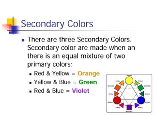
Secondary Colors
„ There are three Secondary Colors.
Secondary color are made when an
there is an equal mixture of two
primary colors:
„ Red & Yellow = Orange
Orange
„ Yellow & Blue = Green
Green
„ Red & Blue = Violet
Violet
Tertiary/Intermediate Colors
„ An equal mixture of a primary
and secondary color.
„ Example: red
red & orange
orange =
red orange
red orange
Color Value
„ The VALUE of a color, the degree of
color purity, is its relative position to
black or white. A light color, such as
yellow, is higher in value because it is
closer to white. A dark color, such as
navy blue, is low in value because it
is closer to black.
Tint
„ Addition of white to make a color
brighter/lighter. Pink is a tint of red.
Shade
„ Addition of black to make a color
darker more muted, burgundy is a
shade of red.
Tone
„ Addition of gray to make a color dull;
dusty rose is a tone of pink.
Combining Colors
„ By combining two of the primary colors, three
secondary colors are formed. They are
orange, green and violet.
„ The six tertiary colors are made by combining
a primary and an adjacent secondary color.
These colors are red-orange, red-violet,
yellow-green, yellow-orange, blue-green and
blue-violet.
Color Wheel
A tool to use to understand the use of color.
Typically consists of 12 hues.
Cool and Warm Colors
„ Colors are also divided into cool and warm categories.
Warm
colors are
red,
orange and
yellow.
The cool
colors are
green, blue
and violet.
Color Harmonies
A grouping of specific hues
and/or a combination of different
values within one hue.
Monochromatic Color Harmony
„ This color harmony uses a
single hue.
„ Example: red and its
varying tints and shades
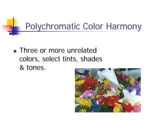
Polychromatic Color Harmony
„ Three or more unrelated
colors, select tints, shades
& tones.
Analogous Color Harmony
„ This harmony uses
adjacent hues.
„ Technically includes
one primary color with
adjacent colors on the
color wheel, which
forms a 90º angle. What are the primary and
secondary colors shown in this
analogous color harmony?
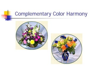
Complementary Color Harmony
„ This harmony uses two
hues that are opposite
each other on the color
wheel.
„ When used together in a
design they make each
other seem brighter and
more intense.
Complementary Color Harmony
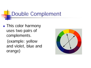
Double Complement
„ This color harmony
uses two pairs of
complements.
(example: yellow
and violet, blue and
orange)
Triad
„ This harmony also
uses three colors.
They are
equidistant on the
color wheel.
What are the three hues
in this design?
Tetrad
„ This harmony uses four
colors evenly spaced on the
color wheel.
„ A primary, secondary and
two tertiary colors are
used.
(example: red, green,
yellow-orange, and blue-
violet)
What four hues are
used in this design?
Split Complement
„ This color harmony
uses three colors:
any hue and the two
adjacent to its
complement.
What is the hue and split
complements in this design?
Foliage & Color
„ The green in foliage
is often considered
neutral in floral
design.
„ Foliage used as a
focal point or accent
should adhere to a
color harmony.
Which color harmony is used in
this design?
References
„ http://www.artsconnected.org/toolkit/encyc_colorwheel.html
„ http://www.color-wheel-pro.com/color-theory-basics.html
„ The AFS Color Wheel (1983). The AFS Education Center.
„ http://www.floralartmall.com/designcolourharmonies2.html
„ Johannes Itten. (1997) The Art of Color: The
Subjective Experience and Objective Rationale of
Color.

color-theory-for-floral-design.pdf

  • 1.
    Color Theory forFloral Design Essential Questions: Why would a floral designer need to have an understanding of color theory? How is color used to create floral designs? How can color be used for store displays and merchandising?
  • 2.
    Color Theory Color Theoryis a set of principles used to create harmonious color combinations. Color relationships can be visually represented with a color wheel — the color spectrum wrapped onto a circle.
  • 3.
    Color Theory “History ofcolor theory The first color wheel was invented by Sir Isaac Newton. He split white sunlight into red, orange, yellow, green, cyan, and blue beams; then he joined the two ends of the color spectrum together to show the natural progression of colors. Newton associated each color with a note of a musical scale. A century after Newton, Johann Wolfgang Goethe began studying psychological effect of colors. He noticed that blue gives a feeling of coolness and yellow has a warming effect. Goethe created a color wheel showing the psychological effect of each color. He divided all the colors into two groups – the plus side (from red through orange to yellow) and the minus side (from green through violet to blue). Colors of the plus side produce excitement and cheerfulness. Colors of the minus side are associated with weakness and unsettled feelings.
  • 4.
    Color Theory The currentform of color theory was developed by Johannes Itten, a Swiss color and art theorist who was teaching at the School of Applied Arts in Weimar, Germany. This school is also known as 'Bauhaus'. Johannes Itten developed 'color chords' and modified the color wheel. Itten's color wheel is based on red, yellow, and blue colors as the primary triad and includes twelve hues.”
  • 5.
    Primary Colors „ Thereare three Primary Colors: red red, , yellow yellow, & , & blue blue.
  • 6.
    Secondary Colors „ Thereare three Secondary Colors. Secondary color are made when an there is an equal mixture of two primary colors: „ Red & Yellow = Orange Orange „ Yellow & Blue = Green Green „ Red & Blue = Violet Violet
  • 7.
    Tertiary/Intermediate Colors „ Anequal mixture of a primary and secondary color. „ Example: red red & orange orange = red orange red orange
  • 8.
    Color Value „ TheVALUE of a color, the degree of color purity, is its relative position to black or white. A light color, such as yellow, is higher in value because it is closer to white. A dark color, such as navy blue, is low in value because it is closer to black.
  • 9.
    Tint „ Addition ofwhite to make a color brighter/lighter. Pink is a tint of red.
  • 10.
    Shade „ Addition ofblack to make a color darker more muted, burgundy is a shade of red.
  • 11.
    Tone „ Addition ofgray to make a color dull; dusty rose is a tone of pink.
  • 12.
    Combining Colors „ Bycombining two of the primary colors, three secondary colors are formed. They are orange, green and violet. „ The six tertiary colors are made by combining a primary and an adjacent secondary color. These colors are red-orange, red-violet, yellow-green, yellow-orange, blue-green and blue-violet.
  • 13.
    Color Wheel A toolto use to understand the use of color. Typically consists of 12 hues.
  • 14.
    Cool and WarmColors „ Colors are also divided into cool and warm categories. Warm colors are red, orange and yellow. The cool colors are green, blue and violet.
  • 15.
    Color Harmonies A groupingof specific hues and/or a combination of different values within one hue.
  • 16.
    Monochromatic Color Harmony „This color harmony uses a single hue. „ Example: red and its varying tints and shades
  • 17.
    Polychromatic Color Harmony „Three or more unrelated colors, select tints, shades & tones.
  • 18.
    Analogous Color Harmony „This harmony uses adjacent hues. „ Technically includes one primary color with adjacent colors on the color wheel, which forms a 90º angle. What are the primary and secondary colors shown in this analogous color harmony?
  • 19.
    Complementary Color Harmony „This harmony uses two hues that are opposite each other on the color wheel. „ When used together in a design they make each other seem brighter and more intense.
  • 20.
  • 21.
    Double Complement „ Thiscolor harmony uses two pairs of complements. (example: yellow and violet, blue and orange)
  • 22.
    Triad „ This harmonyalso uses three colors. They are equidistant on the color wheel. What are the three hues in this design?
  • 23.
    Tetrad „ This harmonyuses four colors evenly spaced on the color wheel. „ A primary, secondary and two tertiary colors are used. (example: red, green, yellow-orange, and blue- violet) What four hues are used in this design?
  • 24.
    Split Complement „ Thiscolor harmony uses three colors: any hue and the two adjacent to its complement. What is the hue and split complements in this design?
  • 25.
    Foliage & Color „The green in foliage is often considered neutral in floral design. „ Foliage used as a focal point or accent should adhere to a color harmony. Which color harmony is used in this design?
  • 26.
    References „ http://www.artsconnected.org/toolkit/encyc_colorwheel.html „ http://www.color-wheel-pro.com/color-theory-basics.html „The AFS Color Wheel (1983). The AFS Education Center. „ http://www.floralartmall.com/designcolourharmonies2.html „ Johannes Itten. (1997) The Art of Color: The Subjective Experience and Objective Rationale of Color.