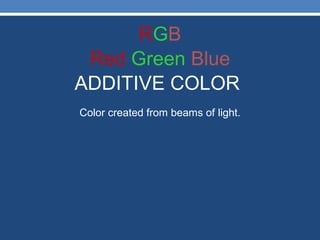
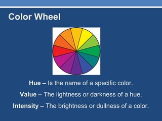
Color
Warhol
colors
AND a WARHOL SELFPORTRAIT
Color doesn’t exist!
Color is created only when our
brain tries to make sense from
light signals it receives from the
outer world.  In other words, it’s
all in your head.
Without that, our world is a
monochromatic place bathing in
electromagnetic radiation of
varied intensity and
wavelengths. Nothing fun about
that unless you’re into physics.
• Color is a property of light. Our eyes see only a small
part of the electromagnetic spectrum.
The perception of the colours
Spectrum of light
• White light can be divided into it's component parts by
passing it through a prism. The light is separated by
wavelength and a spectrum is formed.
• Sir Isaac Newton was the first to discover this phenomenon
in the seventeenth century and he named the colors of the
spectrum.
• If the ends of the spectrum are bent around and joined
a color circle (color wheel) is formed with purple at the
meeting place.
  
An opaque body, that is to say not transparent absorbs great
part of the light that it illuminates and reflects a more or
less small part. When this body absorbs all the colors
contained in the white light, the object seems to be black.
When it reflects all the colors of the spectrum, the object
seems to be white. The absorbed colors disappear inside the
object, the reflected ones come to the human eye. The colors
that we visualize are, therefore, those that the own objects do
not absorb, but they spread them.
HOW WE PERCEIVE THE RED ONE OF AN
OBJECT?
The tomato seems to us of red color, because the eye
only receives the red light reflected by the vegetable,
absorbs the green one and the blue and reflects only the
red one. A yellow banana absorbs the blue color and
reflects the colors red and green, which added allow to
visualize the yellow color.
Now we know how we receive
colours, let´s go to study more
about types of colours and their
features.
RGB
ADDITIVE COLOR
Color created from beams of light.
RGB
Red Green Blue
ADDITIVE COLOR
RGB
Red Green Blue
ADDITIVE COLOR
Color created from beams of light.
RGB
Red Green Blue
ADDITIVE COLOR
Color created from beams of light.
This system applies only to devices employing light
• computer monitors
• television sets
• theater stage lighting
RGB
Red Green Blue
ADDITIVE COLOR
Color created from beams of light.
This system applies only to devices employing light
• computer monitors
• television sets
• theater stage lighting
RGB
Red Green Blue
ADDITIVE COLOR
Color created from beams of light.
This system applies only to devices employing light
• computer monitors
• television sets
• theater stage lighting
RGB
Red Green Blue
ADDITIVE COLOR
Color created from beams of light.
This system applies only to devices employing light
• computer monitors
• television sets
• theater stage lighting
RGB
Red Green Blue
ADDITIVE COLOR
WE ADD COLORS IN ORDER TO GET WHITE
Color created from beams of light.
This system applies only to devices employing light
• computer monitors
• television sets
• theater stage lighting
Primary Color – ADDITIVE RGB
Light!
This is how a computer translates color to a monitor.
RGB
LIGHT
RED + GREEN = YELLOW
BLUE + GREEN = CYAN
RED + BLUE = MEGENTA
RED + GREEN + BLUE =WHITE
RGB
LIGHT
RED + GREEN = YELLOW
BLUE + GREEN = CYAN
RED + BLUE = MEGENTA
RED + GREEN + BLUE =WHITE
RGB
LIGHT
RED + GREEN = YELLOW
BLUE + GREEN = CYAN
RED + BLUE = MEGENTA
RED + GREEN + BLUE =WHITE
Primary Color – ADDITIVE RGB
Light!
This is how a computer translates color to a monitor.
RGB
LIGHT
RED + GREEN = YELLOW
BLUE + GREEN = CYAN
RED + BLUE = MEGENTA
RED + GREEN + BLUE =WHITE
RGB
LIGHT
RED + GREEN = YELLOW
BLUE + GREEN = CYAN
RED + BLUE = MEGENTA
RED + GREEN + BLUE =WHITE
Primary Color – ADDITIVE RGB
Light!
This is how a computer translates color to a monitor.
RGB
LIGHT
RED + GREEN = YELLOW
BLUE + GREEN = CYAN
RED + BLUE = MAGENTA
RED + GREEN + BLUE =WHITE
RGB
LIGHT
RED + GREEN = YELLOW
BLUE + GREEN = CYAN
RED + BLUE = MAGENTA
RED + GREEN + BLUE = WHITE
Primary Color – ADDITIVE RGB
Light!
This is how a computer translates color to a monitor.
RGB
LIGHT
RED + GREEN = YELLOW
BLUE + GREEN = CYAN
RED + BLUE = MAGENTA
RED + GREEN + BLUE = WHITE
RGB
LIGHT
FINAL QUESTION:
RGB
LIGHT
FINAL QUESTION:
HOW DO YOU GET BLACK?
RGB
LIGHT
FINAL QUESTION:
HOW DO YOU GET BLACK?
In LIGHT
black is the absence of color!
Cyan Magenta Yellow Black
SUBTRACTIVE COLOR
Used in printing.
CMYK
Cyan Magenta Yellow Black
SUBTRACTIVE COLOR
Used in printing.
CYAN + MAGENTA = BLUE
CMYK
Cyan Magenta Yellow Black
SUBTRACTIVE COLOR
Used in printing.
CMYK
Cyan Magenta Yellow Black
SUBTRACTIVE COLOR
Used in printing.
CYAN + MAGENTA = BLUE
CMYK
Cyan Magenta Yellow Black
SUBTRACTIVE COLOR
Used in printing.
CYAN + MAGENTA = BLUE
MAGENTA + YELLOW = RED
Cyan Magenta Yellow Black
SUBTRACTIVE COLOR
Used in printing.
CMYK
Cyan Magenta Yellow Black
SUBTRACTIVE COLOR
Used in printing.
CYAN + MAGENTA = BLUE
MAGENTA + YELLOW = RED
CMYK
Cyan Magenta Yellow Black
SUBTRACTIVE COLOR
Used in printing.
CYAN + MAGENTA = BLUE
MAGENTA + YELLOW = RED
CYAN + YELLOW = GREEN
Cyan Magenta Yellow Black
SUBTRACTIVE COLOR
Used in printing.
CMYK
Cyan Magenta Yellow Black
SUBTRACTIVE COLOR
Used in printing.
CYAN + MAGENTA = BLUE
MAGENTA + YELLOW = RED
CYAN + YELLOW = GREEN
CMYK
Cyan Magenta Yellow Black
SUBTRACTIVE COLOR
Used in printing.
FINAL QUESTIONS:
How do we get BLACK?
CMYK
Cyan Magenta Yellow Black
SUBTRACTIVE COLOR
Used in printing.
FINAL QUESTIONS:
How do we get BLACK?
BLACK IS THE PRESNENCE OF ALL COLORS
How do we get WHITE?
CMYK
Cyan Magenta Yellow Black
SUBTRACTIVE COLOR
Used in printing.
FINAL QUESTIONS:
How do we get BLACK?
BLACK IS THE PRESNENCE OF ALL COLORS
How do we get WHITE?
CMYK
Cyan Magenta Yellow Black
SUBTRACTIVE COLOR
Used in printing.
FINAL QUESTIONS:
How do we get BLACK?
BLACK IS THE PRESNENCE OF ALL COLORS
How do we get WHITE?
WHITE IS THE ABSENCE OF ALL COLORS
Color has three distinct properties: Hue, Value and Saturation. To
understand color you must understand how these three properties relate
to each other.
•Hue: When someone is talking about hue they are talking about the
actual color of an object. Green is a hue as are red, yellow, blue, purple,
etc.
•Value/Brightness: Is a measure of how light or dark a hue is. Adding
white to a hue makes it lighter and increases its value or brightness.
Consequently adding black makes it darker and lowers the value or
brightness.
•Saturation: is the degree of purity of a hue. Pure hues are highly
saturated. When gray is added the color becomes de-saturated.
Properties of Color
Properties of Color
Understanding Hue,
Value and
Saturation using the
Adobe Photoshop
Color Picker
Try this out yourself to understand the difference between Value & Saturation
Hue
Saturation Value/Brightness
Color Wheel
Hue – Is the name of a specific color.
Value – The lightness or darkness of a hue.
Intensity – The brightness or dullness of a color.
Hue – Is the name of a
specific color.
Value – The lightness or
darkness of a hue.
Intensity – The brightness or
dullness of a color.
The underlying, fundamental color, dictated by its
dominant wavelength.
Hue
The characteristic of a color which makes it appear either
warm or cool in feeling. Red, orange, and yellow are
usually considered warm while colors containing blue are
thought of as cool.
Refers to the heat that a color generates, both physically
and psychologically
Temperature
Warm Cool
Calientes
Warm Colors
Cool Colours
The lightness (tint, when you add white) or
darkness (shade, when you add black) of a hue.
The quantity of light reflected.
Value
Tint ColoursShade colours
Intensity/Saturation
The brightness or dullness of a hue.
The strength or purity of a color.
Wim Delvoye
EMENBERING
What are the primary colors?
They are the three pigment colors that
cannot be made by mixing any other
colors.
MAGENTA, CYAN, and YELLOW
are primary colors.
These three colors are mixed to create
all other colors
Can I make primarycolors?
Remember, you cannot make primaries;
you must buy them
Primary colors
By mixing two primary colors, a
secondary color is created:
• Magenta + Yellow = Orange
• Yellow + Cyan = Green
• Cyan + Magenta = Purple
What are the secondary color?
Orange, green, and purple are secondary colors.
Can I make secondaries color?
Remember, You can make secondaries. You do not
have to buy them.
Secondary colors
•red-orange
•yellow-orange
•yellow-green
•blue-green
•blue-purple
•red-purple
Tertiary colors are also known as intermediate colors
•We use the names of the two secondary colors to describe them.
•When a hue is yellow and green at the same time, we call it a yellow-
green or a green- yellow, depending on whether it is closer to green or
yellow.
Tertiary colors
COMPLEMENTA
RY COLOURS
Complementary COLORS
Hues that oppose one another on the
color wheel. When paired in a
composition, complementary colors
create contrast; when mixed,
complementary colors produce a wide
range of browns.
WORK
POR ART. A selfportrait imitating Warhol
29th May
POP-ART
• El arte pop (del inglés Pop-
Art, "Arte Popular") fue un
movimiento artístico
surgido a finales de los
años 1950 en Inglaterra y
los Estados Unidos; sus
características son el
empleo de imágenes y
temas tomados del
mundo de la
comunicación de masas
aplicados a las artes
visuales.
El arte pop es el resultado de un
estilo de vida, la manifestación
plástica de una cultura (pop)
caracterizada por la tecnología, el
capitalismo, la moda y el
consumismo, donde los objetos
dejan de ser únicos para ser
pensados como productos en serie.
En este tipo de cultura también el
arte deja de ser único y se convierte
en un objeto más de consumo. El
máximo exponente del movimiento,
Andy Warhol, afirmaba que "La
razón por la que pinto de este modo
es porque quiero ser una máquina".
También es simbólica la afirmación
de Richard Hamilton con respecto a
su deseo de que el arte fuera
"efímero, popular, barato, producido
en serie, joven, ingenioso". Todas
ellas serían cualidades equivalentes
a las de la sociedad de consumo.
Andy Warhol
REALIZACIÓN DE UN AUTORRETRATO
• 1. Se elige una fotografía de uno
mismo, cuanto más nítida y
grande mejor.
• 2. Se amplía en una
fotocopiadora hasta conseguir el
tamaño aproximado de un folio.
• 3. Se hace una copia en la
fotocopiadora con el mayor
contraste posible, consiguiendo
que sólo halla blanco y negro,
nada de grises.
• 4. Se calca todas las veces que
haga falta, con un papel de
calco, en una cartulina blanca y
se colorea.
• 5. Se monta en un formato mayor,
cartón, otra cartulina,etc.
INSTRUCCIONES
• Mínimo 6 repeticiones
• Materiales:
cartulina/hojas bloc
de dibujo, ceras
grasas y tinta negra.
• Colores: blanco,
negro, colores
primarios y colores
secundarios y
terciarios.
EJEMPLOS
3 PRIMARIOS 3
SECUNDARIOS
2 Primarios
1 secundario
1 primario
1 secundario
1 terciario
2
complementarios
1 libre
2
suplementarios
1 libre
color asociación
respuesta
emocional
Magenta Dulzura, amor, quietud Estimulante, sensual
Rojo Peligro, lujo Energía vital, arrogancia
Naranja
Fuego, flores, fruta Excitación, alegría,
dinamismo
Amarillo anaranjado Puesta de sol, calor Sensación de calor, euforia
Amarillo Sol, luz, día, ácido Estimulante, alegría, vivaz
Amarillo verdoso Amanecer, oro Calma, frescor, libertad
Verde Paisajes naturales,
primavera
Esperanza, paz, reposo
Azul verdoso Mar, profundidad Neutralidad, serenidad
Azul cyan Cielo, agua, espacio libre Paz, quietud, frialdad
Simbología del color
color asociación Respuesta emocional
Azul ultramar Serenidad, lealtad
Riqueza, sabiduría,
misterio
Violeta Penitencia, flores, dolor Tranquilidad, humildad
Púrpura Poder, soberanía, realeza Esplendor, dignidad, dolor
Ocres
Tierra, arena, rocas,
madera
Vigor, calidez, firmeza
Blanco El bien, pureza, nieve, paz
Sencillez, inocencia,
pureza
Negro
Muerte, noche, oscuridad,
elegancia
Miedo, poco acogedor

Selfportrait warhol

  • 1.
  • 2.
    colors AND a WARHOLSELFPORTRAIT
  • 4.
    Color doesn’t exist! Coloris created only when our brain tries to make sense from light signals it receives from the outer world.  In other words, it’s all in your head. Without that, our world is a monochromatic place bathing in electromagnetic radiation of varied intensity and wavelengths. Nothing fun about that unless you’re into physics.
  • 5.
    • Color isa property of light. Our eyes see only a small part of the electromagnetic spectrum. The perception of the colours
  • 7.
    Spectrum of light •White light can be divided into it's component parts by passing it through a prism. The light is separated by wavelength and a spectrum is formed. • Sir Isaac Newton was the first to discover this phenomenon in the seventeenth century and he named the colors of the spectrum.
  • 8.
    • If theends of the spectrum are bent around and joined a color circle (color wheel) is formed with purple at the meeting place.   
  • 9.
    An opaque body,that is to say not transparent absorbs great part of the light that it illuminates and reflects a more or less small part. When this body absorbs all the colors contained in the white light, the object seems to be black. When it reflects all the colors of the spectrum, the object seems to be white. The absorbed colors disappear inside the object, the reflected ones come to the human eye. The colors that we visualize are, therefore, those that the own objects do not absorb, but they spread them.
  • 10.
    HOW WE PERCEIVETHE RED ONE OF AN OBJECT? The tomato seems to us of red color, because the eye only receives the red light reflected by the vegetable, absorbs the green one and the blue and reflects only the red one. A yellow banana absorbs the blue color and reflects the colors red and green, which added allow to visualize the yellow color.
  • 11.
    Now we knowhow we receive colours, let´s go to study more about types of colours and their features.
  • 12.
  • 13.
  • 14.
    RGB Red Green Blue ADDITIVECOLOR Color created from beams of light.
  • 15.
    RGB Red Green Blue ADDITIVECOLOR Color created from beams of light. This system applies only to devices employing light • computer monitors • television sets • theater stage lighting
  • 16.
    RGB Red Green Blue ADDITIVECOLOR Color created from beams of light. This system applies only to devices employing light • computer monitors • television sets • theater stage lighting
  • 17.
    RGB Red Green Blue ADDITIVECOLOR Color created from beams of light. This system applies only to devices employing light • computer monitors • television sets • theater stage lighting
  • 18.
    RGB Red Green Blue ADDITIVECOLOR Color created from beams of light. This system applies only to devices employing light • computer monitors • television sets • theater stage lighting
  • 19.
    RGB Red Green Blue ADDITIVECOLOR WE ADD COLORS IN ORDER TO GET WHITE Color created from beams of light. This system applies only to devices employing light • computer monitors • television sets • theater stage lighting
  • 20.
    Primary Color –ADDITIVE RGB Light! This is how a computer translates color to a monitor.
  • 21.
    RGB LIGHT RED + GREEN= YELLOW BLUE + GREEN = CYAN RED + BLUE = MEGENTA RED + GREEN + BLUE =WHITE
  • 22.
    RGB LIGHT RED + GREEN= YELLOW BLUE + GREEN = CYAN RED + BLUE = MEGENTA RED + GREEN + BLUE =WHITE
  • 23.
    RGB LIGHT RED + GREEN= YELLOW BLUE + GREEN = CYAN RED + BLUE = MEGENTA RED + GREEN + BLUE =WHITE
  • 24.
    Primary Color –ADDITIVE RGB Light! This is how a computer translates color to a monitor.
  • 25.
    RGB LIGHT RED + GREEN= YELLOW BLUE + GREEN = CYAN RED + BLUE = MEGENTA RED + GREEN + BLUE =WHITE
  • 26.
    RGB LIGHT RED + GREEN= YELLOW BLUE + GREEN = CYAN RED + BLUE = MEGENTA RED + GREEN + BLUE =WHITE
  • 27.
    Primary Color –ADDITIVE RGB Light! This is how a computer translates color to a monitor.
  • 28.
    RGB LIGHT RED + GREEN= YELLOW BLUE + GREEN = CYAN RED + BLUE = MAGENTA RED + GREEN + BLUE =WHITE
  • 29.
    RGB LIGHT RED + GREEN= YELLOW BLUE + GREEN = CYAN RED + BLUE = MAGENTA RED + GREEN + BLUE = WHITE
  • 30.
    Primary Color –ADDITIVE RGB Light! This is how a computer translates color to a monitor.
  • 31.
    RGB LIGHT RED + GREEN= YELLOW BLUE + GREEN = CYAN RED + BLUE = MAGENTA RED + GREEN + BLUE = WHITE
  • 32.
  • 33.
  • 34.
    RGB LIGHT FINAL QUESTION: HOW DOYOU GET BLACK? In LIGHT black is the absence of color!
  • 35.
    Cyan Magenta YellowBlack SUBTRACTIVE COLOR Used in printing.
  • 36.
    CMYK Cyan Magenta YellowBlack SUBTRACTIVE COLOR Used in printing. CYAN + MAGENTA = BLUE
  • 37.
    CMYK Cyan Magenta YellowBlack SUBTRACTIVE COLOR Used in printing.
  • 38.
    CMYK Cyan Magenta YellowBlack SUBTRACTIVE COLOR Used in printing. CYAN + MAGENTA = BLUE
  • 39.
    CMYK Cyan Magenta YellowBlack SUBTRACTIVE COLOR Used in printing. CYAN + MAGENTA = BLUE MAGENTA + YELLOW = RED
  • 40.
    Cyan Magenta YellowBlack SUBTRACTIVE COLOR Used in printing.
  • 41.
    CMYK Cyan Magenta YellowBlack SUBTRACTIVE COLOR Used in printing. CYAN + MAGENTA = BLUE MAGENTA + YELLOW = RED
  • 42.
    CMYK Cyan Magenta YellowBlack SUBTRACTIVE COLOR Used in printing. CYAN + MAGENTA = BLUE MAGENTA + YELLOW = RED CYAN + YELLOW = GREEN
  • 43.
    Cyan Magenta YellowBlack SUBTRACTIVE COLOR Used in printing.
  • 44.
    CMYK Cyan Magenta YellowBlack SUBTRACTIVE COLOR Used in printing. CYAN + MAGENTA = BLUE MAGENTA + YELLOW = RED CYAN + YELLOW = GREEN
  • 45.
    CMYK Cyan Magenta YellowBlack SUBTRACTIVE COLOR Used in printing. FINAL QUESTIONS: How do we get BLACK?
  • 46.
    CMYK Cyan Magenta YellowBlack SUBTRACTIVE COLOR Used in printing. FINAL QUESTIONS: How do we get BLACK? BLACK IS THE PRESNENCE OF ALL COLORS How do we get WHITE?
  • 47.
    CMYK Cyan Magenta YellowBlack SUBTRACTIVE COLOR Used in printing. FINAL QUESTIONS: How do we get BLACK? BLACK IS THE PRESNENCE OF ALL COLORS How do we get WHITE?
  • 48.
    CMYK Cyan Magenta YellowBlack SUBTRACTIVE COLOR Used in printing. FINAL QUESTIONS: How do we get BLACK? BLACK IS THE PRESNENCE OF ALL COLORS How do we get WHITE? WHITE IS THE ABSENCE OF ALL COLORS
  • 50.
    Color has threedistinct properties: Hue, Value and Saturation. To understand color you must understand how these three properties relate to each other. •Hue: When someone is talking about hue they are talking about the actual color of an object. Green is a hue as are red, yellow, blue, purple, etc. •Value/Brightness: Is a measure of how light or dark a hue is. Adding white to a hue makes it lighter and increases its value or brightness. Consequently adding black makes it darker and lowers the value or brightness. •Saturation: is the degree of purity of a hue. Pure hues are highly saturated. When gray is added the color becomes de-saturated. Properties of Color
  • 51.
    Properties of Color UnderstandingHue, Value and Saturation using the Adobe Photoshop Color Picker Try this out yourself to understand the difference between Value & Saturation Hue Saturation Value/Brightness
  • 52.
    Color Wheel Hue –Is the name of a specific color. Value – The lightness or darkness of a hue. Intensity – The brightness or dullness of a color.
  • 53.
    Hue – Isthe name of a specific color. Value – The lightness or darkness of a hue. Intensity – The brightness or dullness of a color.
  • 54.
    The underlying, fundamentalcolor, dictated by its dominant wavelength. Hue
  • 57.
    The characteristic ofa color which makes it appear either warm or cool in feeling. Red, orange, and yellow are usually considered warm while colors containing blue are thought of as cool. Refers to the heat that a color generates, both physically and psychologically Temperature Warm Cool
  • 58.
  • 59.
  • 60.
    The lightness (tint,when you add white) or darkness (shade, when you add black) of a hue. The quantity of light reflected. Value
  • 62.
  • 63.
    Intensity/Saturation The brightness ordullness of a hue. The strength or purity of a color.
  • 67.
  • 70.
  • 71.
    What are theprimary colors? They are the three pigment colors that cannot be made by mixing any other colors. MAGENTA, CYAN, and YELLOW are primary colors. These three colors are mixed to create all other colors Can I make primarycolors? Remember, you cannot make primaries; you must buy them Primary colors
  • 72.
    By mixing twoprimary colors, a secondary color is created: • Magenta + Yellow = Orange • Yellow + Cyan = Green • Cyan + Magenta = Purple What are the secondary color? Orange, green, and purple are secondary colors. Can I make secondaries color? Remember, You can make secondaries. You do not have to buy them. Secondary colors
  • 73.
    •red-orange •yellow-orange •yellow-green •blue-green •blue-purple •red-purple Tertiary colors arealso known as intermediate colors •We use the names of the two secondary colors to describe them. •When a hue is yellow and green at the same time, we call it a yellow- green or a green- yellow, depending on whether it is closer to green or yellow. Tertiary colors
  • 75.
  • 76.
    Complementary COLORS Hues thatoppose one another on the color wheel. When paired in a composition, complementary colors create contrast; when mixed, complementary colors produce a wide range of browns.
  • 77.
    WORK POR ART. Aselfportrait imitating Warhol 29th May
  • 78.
    POP-ART • El artepop (del inglés Pop- Art, "Arte Popular") fue un movimiento artístico surgido a finales de los años 1950 en Inglaterra y los Estados Unidos; sus características son el empleo de imágenes y temas tomados del mundo de la comunicación de masas aplicados a las artes visuales.
  • 79.
    El arte popes el resultado de un estilo de vida, la manifestación plástica de una cultura (pop) caracterizada por la tecnología, el capitalismo, la moda y el consumismo, donde los objetos dejan de ser únicos para ser pensados como productos en serie. En este tipo de cultura también el arte deja de ser único y se convierte en un objeto más de consumo. El máximo exponente del movimiento, Andy Warhol, afirmaba que "La razón por la que pinto de este modo es porque quiero ser una máquina". También es simbólica la afirmación de Richard Hamilton con respecto a su deseo de que el arte fuera "efímero, popular, barato, producido en serie, joven, ingenioso". Todas ellas serían cualidades equivalentes a las de la sociedad de consumo.
  • 80.
  • 84.
    REALIZACIÓN DE UNAUTORRETRATO • 1. Se elige una fotografía de uno mismo, cuanto más nítida y grande mejor. • 2. Se amplía en una fotocopiadora hasta conseguir el tamaño aproximado de un folio. • 3. Se hace una copia en la fotocopiadora con el mayor contraste posible, consiguiendo que sólo halla blanco y negro, nada de grises. • 4. Se calca todas las veces que haga falta, con un papel de calco, en una cartulina blanca y se colorea. • 5. Se monta en un formato mayor, cartón, otra cartulina,etc.
  • 85.
    INSTRUCCIONES • Mínimo 6repeticiones • Materiales: cartulina/hojas bloc de dibujo, ceras grasas y tinta negra. • Colores: blanco, negro, colores primarios y colores secundarios y terciarios.
  • 86.
  • 89.
    3 PRIMARIOS 3 SECUNDARIOS 2Primarios 1 secundario 1 primario 1 secundario 1 terciario 2 complementarios 1 libre 2 suplementarios 1 libre
  • 90.
    color asociación respuesta emocional Magenta Dulzura,amor, quietud Estimulante, sensual Rojo Peligro, lujo Energía vital, arrogancia Naranja Fuego, flores, fruta Excitación, alegría, dinamismo Amarillo anaranjado Puesta de sol, calor Sensación de calor, euforia Amarillo Sol, luz, día, ácido Estimulante, alegría, vivaz Amarillo verdoso Amanecer, oro Calma, frescor, libertad Verde Paisajes naturales, primavera Esperanza, paz, reposo Azul verdoso Mar, profundidad Neutralidad, serenidad Azul cyan Cielo, agua, espacio libre Paz, quietud, frialdad Simbología del color
  • 91.
    color asociación Respuestaemocional Azul ultramar Serenidad, lealtad Riqueza, sabiduría, misterio Violeta Penitencia, flores, dolor Tranquilidad, humildad Púrpura Poder, soberanía, realeza Esplendor, dignidad, dolor Ocres Tierra, arena, rocas, madera Vigor, calidez, firmeza Blanco El bien, pureza, nieve, paz Sencillez, inocencia, pureza Negro Muerte, noche, oscuridad, elegancia Miedo, poco acogedor

Editor's Notes

  • #8 Gracias a Newton (1642-1727) sabemos que la luz blanca al descomponerse origina los siete colores del espectro visible: rojo, anaranjado, amarillo, verde, azul cian, azul y violeta. La  suma de todos los colores del espectro luminoso recompone la luz blanca.