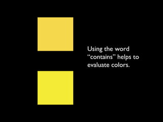
Understanding Color
  Chapter 4: The Vocabulary of Color
The three qualities of
     color are:

•Hue
• Value
• Saturation
RedGreen
  BlueYellow
       Hue means
  the name of the color.
In science, the colors of light are called
            spectral colors.
Spectral colors can be measured precisely by
their different wavelengths (or frequencies.)
The words “hue” and “color” are often
       used interchangeably.
In everday speech (including our
text book), the word “color” is
used in two different ways.
It can mean:
It can mean:
• the HUE of something, or
• the complete visual experience of the
  color’s hue, value and saturation
  together.
The word “hue” should never, however,
be used to mean anything other than the
            name of a color.

    Chroma is a synonym for hue.
Chromatic: having hue
Achromatic: without hue
Polychromatic: having many hues
Monochromatic: having one hue only
It has been theorized that the average person can
distinguish about 150 colors of light and every one can
    be described using one of two of only six words:
Red
Orange
Yellow
Green
Blue
Violet
YellowYellow
Yellow
        Yellow
 A color is called by the name of its
  most obvious, or dominant, hue.
Nearly all color
samples include more
than one hue, but
one hue is most
apparent and others
are present in smaller
proportion.
A sample may
seem to be pure
 yellow until it is
placed next to a
 different yellow
          sample.
Suddenly, one
  yellow is seen to
    contain a bit of
 green, the other a
fraction of orange.
Both are called
 yellow because
         yellow
predominates in
           each.
Using the word
“contains” helps to
evaluate colors.
“This yellow
contains some
orange.”


“This yellow
contains some
green.”
The artists’
spectrum is a
      circle that
illustrates hues
in their natural
       (spectral)
          order.
The spectrum of visible light (additive color) is
linear and is displayed according to wavelength.
The artists’
spectrum is also
fixed in its order of
colors, but it has six
hues instead of seven
and they are
presented as a
continuous circle.
The artists’
spectrum is also
called the
color wheel or
color circle.
There are too many
hues in the range of
human vision to
include all of them in
one circle...
...so the artists’
spectrum is a
sort of visual
outline, or
synopsis, of all
visible hues.
The basic
spectrum is
made up of six
hues: red,
yellow, blue,
orange, green,
and violet
The expanded
spectrum
includes
yellow-orange,
red-orange, red-
violet,
blue-violet,
blue-green, and
yellow-green.
The artists; spectrum is limited to six or twelve hues
only because this is a concise, easily illustrated figure.
It can be expanded to any number of hues as long as
 the added colors are inserted at regular intervals in
                   all hue ranges.
Color wheels come in all types...
But they all recognize the same sequence of colors.
All color circles include the primary hues in some
     way, and all follow the same color order.
A chromatic scale is any linear series of hues in
              spectrum order.


 Each step in the progression is a change in hue.
The words “cool” and “warm” are used to describe
         two opposing qualities of hue.
Warm colors are reds, oranges, yellows, and the
            steps between them.
Cool colors are blues, greens, violets, and the steps
                  between them.
The primary colors are weighted toward the warm.
Only blue is cool, while both red and yellow are
               considered warm.
As a result, the entire spectrum is more heavily
            “warm” than it is “cool.”
Blue is the polar extreme of cool, and orange, made
  of red and yellow, is the polar extreme of warm.
Warmth and coolness in colors are not absolute
qualities. Any color, even a primary, can appear
  warmer or cooler relative to another color.
Warmth and coolness in colors are not absolute
qualities. Any color, even a primary, can appear
  warmer or cooler relative to another color.
Analogous colors are hues that are adjacent on the
                artists’ spectrum
They are described in various ways.
For the purposes of this class, analogous colors are
 simply colors that are next to each other on the
                   color wheel.
And while it is true that the most harmonious
analogous groupings are made up of even intervals of
                         hue...
...all analogous color schemes achieve a sense of
                     harmony.
The text book claims that they never contain all
            three primary colors.
But when you expand your analogous color schemes to
 include hues that contain the third primary–as long as the
colors are next to each other–you still achieve a harmonious
                       color scheme.
Remember that
     analogy is not
  confined to pure
            colors.
  Colors that have
been diluted in any
   way can also be
     analogous–no
 matter what their
           value or
        saturation.
Complementary colors are hues that are
opposite one another on the artists’ spectrum.
Together, the two are called complements, or a
            complementary pair.
The basic complementary pairs of the artists’
              spectrum are:
Yellow and violet
Blue and orange
Red and green
In each of these
pairs, one half is a
primary color and
the other half is the
secondary that is a
mixture of the
remaining two
primaries.
It is important to note that the three
basic complementary pairs are different
  from each other in how much they
        contrast with each other.
Because the complements vary in value,
their contrast is more or less accordingly.
Red and green
Orange and blue
Yellow and violet
Other
complementay
  pairs are less
     contrasting
  because each
color contains
one primary in
 common with
   its opposite.
For instance, red-violet and yellow-green
           each contain blue.
No matter what the
value or saturation of a
color, it maintains at
all times a
complementary
relationship with its
opposite.
Ignore your book on
    the subject of
   tertiary color!
For the purposes
     of this class,
    tertiaries are
  colors that are
 mixed with their
    complement.
There are an
infinite amount of
colors that can be
      produced by
     mixing colors
         with their
      complement.
As you can see, many tertiary colors resemble the color we
call “brown,” and others approach the color we call “gray.”
But remember that brown and gray are not hues.
Black, gray and white are achromatic -
        meaning “without color.”
Absolute blacks and whites exist only in the
             medium of light.
In subtractive media, blacks and whites
always have some colorant that gives them a
              suggestion of hue.
True grays, or mixtures of black and white,
          are also achromatic.
Subtractive grays are characterized as either
               warm or cool.
Value refers to the relative light and dark in
                  a color.
Hue is
circular and
continuous,
but value is
linear and
progressive.
Value exists whether or not hue is present.
The colors of the artists’ spectrum (or color
       wheel) have different values.
White is the lightest possible value, and black is the
darkest possible value. All other colors fall somewhere
                       in between.
Only value contrast
   makes objects
distinguishable from
 their background.
The degree of contrast
between light and dark
 areas determines the
   strength, or graphic
   quality, of an image.
Differences between form and their background
 may be further emphasized by contrasts of hue or
saturation, but difference in value is the only factor
in the ability to see a distinct edge between colors.
The closer in value an image is to its
background, the harder it is to see.
However, high contrast images are not always desirable.
   Strong contrasts of dark and light induce lateral
         inhibition, and can fatigue the eyes.
One of the defining characteristics of a line is that it
         contrasts with the background.


  (The other is that it is longer than it is wide.)
When blocks of color are similar in value, they are
            difficult to make out...
...but the thinnest of contrasting line between them
           creates an immediate separation.
The placement of different values relative to one
another within an image give it individual identity.
In order to transpose an image from one color to
another, the number and placement of values within the
                image must be identical.
Value is also associated with the idea of luminosity. A
   hue that is luminous reflects a great deal of light,
            appears light, and is high in value.
The artists’ spectrum illustrates colors at evenly spaced
intervals of hue, but not of evenly spaced intervals of value.
A tint is a hue that has white added to it.
A shade is a hue that has black added to it.
A tone is a hue that has gray added to it.
This is different than
 in your text book.
   Take notice!!!
A monochromatic value scale is a single
hue illustrated as a full range of values in even
    steps, including both tints and shades.
Any hue can be illustrated as a full range of tints
  and shades, from near-white to near-black.
A chart of seven
steps of equal
value in different
hues illustrates
how a single step
of value may
contain both tints
and shades. On a
limited chart such
as this one, some
saturated hues
may not appear
at all.
It is easy to
determine value
differences in
gray scale but
much harder
when comparing
value in a hue.
It is especially
hard when
comparing values
in two different
hues.
Even complements
with the highest hue
contrast can be made
 unreadable by
manipulating the
value.
Saturation (or chroma)
refers to the hue intensity.
A saturated color is a color at its fullest expression
   of hue. It is a color at maximum chroma.
Saturation is a
comparative
term. It
describes the
contrast
between dull
and vivid.
Saturation, like value, is linear and progressive.
The beginning of a saturation scale is a color that
 is hue-intensive. The end step is a color so dull
         that its hue can not be identified.
Although they are sometimes mixed up, saturation
    is a color quality that is distinct from value.
Shades are already reduced in saturation because
 they contain black, so it is instinctive to think of
muted colors as dark. But any hue or tint can be
reduced in saturation without changing its value.
One way to do this is to mix a hue with a gray of
 the same value. This is what we call a “tone.”
When white is
mixed with a hue, it
           changes
      saturation.

     It also changes
              value.
When black is
mixed with a hue, it
           changes
      saturation.

     It also changes
              value.
When gray is mixed
     with a hue, it
           changes
      saturation.

  But it does NOT
    change value.
Another way to reduce the saturation of a hue is to
              add its complement.


               +                 =
Another way to reduce the saturation of a hue is to
              add its complement.
There are an infinite number of variations within
              this type of mixture.


And for the purposes of this class, ALL of these
  different colors are called tertiary colors.
Within the
tertiary spectrum,
 we can recognize
other distinctions.
To help those in color studies indicate the degrees
  of saturation within a mixture like this, we use
              other descriptive terms.
The hues at maximum chroma are called

          Prismatic
The next step in saturation are called

             Muted
The next step in saturation are called

   Chromatic Grays
The least saturated tertiaries are called

   Achromatic Grays
Theoretically, they are called achromatic because
             there is no discernible hue.

In practice, though, the achromatic gray or the mixture
  of any two complements is the middle point where
                 neither hue dominates.
Keep in mind that this point is subjective and can be
         different for different individuals.


                         ?
The term “theoretical gray” is used in the
text book to indicate a concept used by color
  theorists to characterize a perfect tertiary
       color: one of no discernible hue.
In theory, there should be a middle point between all
            complements that is the same.

          But in practice, it does not exist.

For the purposes of this class, theoretical gray is the
          same thing as achromatic gray.
Some of the most interesting colors result from mixed
complements that have been tinted to raise their value.
     These are the light neutrals you see in many
                  consumer goods.
The exuberance of saturated color is easily found in
nature, but muted colors are by far the greatest part of
                  our visual world.
And remember, that it is the CONTRAST between
  these different qualities of color that draw our
                 attention to them.
And remember, that it is the CONTRAST between
  these different qualities of color that draw our
                 attention to them.

Chapter 4

  • 1.
    Understanding Color Chapter 4: The Vocabulary of Color
  • 2.
    The three qualitiesof color are: •Hue • Value • Saturation
  • 3.
    RedGreen BlueYellow Hue means the name of the color.
  • 4.
    In science, thecolors of light are called spectral colors.
  • 5.
    Spectral colors canbe measured precisely by their different wavelengths (or frequencies.)
  • 6.
    The words “hue”and “color” are often used interchangeably.
  • 7.
    In everday speech(including our text book), the word “color” is used in two different ways. It can mean: It can mean: • the HUE of something, or • the complete visual experience of the color’s hue, value and saturation together.
  • 8.
    The word “hue”should never, however, be used to mean anything other than the name of a color. Chroma is a synonym for hue.
  • 9.
  • 10.
  • 11.
  • 12.
  • 13.
    It has beentheorized that the average person can distinguish about 150 colors of light and every one can be described using one of two of only six words:
  • 14.
  • 15.
  • 16.
  • 17.
  • 18.
  • 19.
  • 20.
    YellowYellow Yellow Yellow A color is called by the name of its most obvious, or dominant, hue.
  • 21.
    Nearly all color samplesinclude more than one hue, but one hue is most apparent and others are present in smaller proportion.
  • 22.
    A sample may seemto be pure yellow until it is placed next to a different yellow sample.
  • 23.
    Suddenly, one yellow is seen to contain a bit of green, the other a fraction of orange.
  • 24.
    Both are called yellow because yellow predominates in each.
  • 25.
    Using the word “contains”helps to evaluate colors.
  • 26.
  • 27.
    The artists’ spectrum isa circle that illustrates hues in their natural (spectral) order.
  • 28.
    The spectrum ofvisible light (additive color) is linear and is displayed according to wavelength.
  • 29.
    The artists’ spectrum isalso fixed in its order of colors, but it has six hues instead of seven and they are presented as a continuous circle.
  • 30.
    The artists’ spectrum isalso called the color wheel or color circle.
  • 31.
    There are toomany hues in the range of human vision to include all of them in one circle...
  • 32.
    ...so the artists’ spectrumis a sort of visual outline, or synopsis, of all visible hues.
  • 33.
    The basic spectrum is madeup of six hues: red, yellow, blue, orange, green, and violet
  • 34.
  • 35.
    The artists; spectrumis limited to six or twelve hues only because this is a concise, easily illustrated figure.
  • 36.
    It can beexpanded to any number of hues as long as the added colors are inserted at regular intervals in all hue ranges.
  • 37.
    Color wheels comein all types...
  • 38.
    But they allrecognize the same sequence of colors.
  • 39.
    All color circlesinclude the primary hues in some way, and all follow the same color order.
  • 40.
    A chromatic scaleis any linear series of hues in spectrum order. Each step in the progression is a change in hue.
  • 41.
    The words “cool”and “warm” are used to describe two opposing qualities of hue.
  • 42.
    Warm colors arereds, oranges, yellows, and the steps between them.
  • 43.
    Cool colors areblues, greens, violets, and the steps between them.
  • 44.
    The primary colorsare weighted toward the warm.
  • 45.
    Only blue iscool, while both red and yellow are considered warm.
  • 46.
    As a result,the entire spectrum is more heavily “warm” than it is “cool.”
  • 47.
    Blue is thepolar extreme of cool, and orange, made of red and yellow, is the polar extreme of warm.
  • 48.
    Warmth and coolnessin colors are not absolute qualities. Any color, even a primary, can appear warmer or cooler relative to another color.
  • 49.
    Warmth and coolnessin colors are not absolute qualities. Any color, even a primary, can appear warmer or cooler relative to another color.
  • 50.
    Analogous colors arehues that are adjacent on the artists’ spectrum
  • 51.
    They are describedin various ways.
  • 52.
    For the purposesof this class, analogous colors are simply colors that are next to each other on the color wheel.
  • 53.
    And while itis true that the most harmonious analogous groupings are made up of even intervals of hue...
  • 54.
    ...all analogous colorschemes achieve a sense of harmony.
  • 55.
    The text bookclaims that they never contain all three primary colors.
  • 56.
    But when youexpand your analogous color schemes to include hues that contain the third primary–as long as the colors are next to each other–you still achieve a harmonious color scheme.
  • 57.
    Remember that analogy is not confined to pure colors. Colors that have been diluted in any way can also be analogous–no matter what their value or saturation.
  • 58.
    Complementary colors arehues that are opposite one another on the artists’ spectrum.
  • 59.
    Together, the twoare called complements, or a complementary pair.
  • 60.
    The basic complementarypairs of the artists’ spectrum are:
  • 61.
  • 62.
  • 63.
  • 64.
    In each ofthese pairs, one half is a primary color and the other half is the secondary that is a mixture of the remaining two primaries.
  • 65.
    It is importantto note that the three basic complementary pairs are different from each other in how much they contrast with each other.
  • 66.
    Because the complementsvary in value, their contrast is more or less accordingly.
  • 67.
  • 68.
  • 69.
  • 70.
    Other complementay pairsare less contrasting because each color contains one primary in common with its opposite.
  • 71.
    For instance, red-violetand yellow-green each contain blue.
  • 72.
    No matter whatthe value or saturation of a color, it maintains at all times a complementary relationship with its opposite.
  • 73.
    Ignore your bookon the subject of tertiary color!
  • 74.
    For the purposes of this class, tertiaries are colors that are mixed with their complement.
  • 75.
    There are an infiniteamount of colors that can be produced by mixing colors with their complement.
  • 76.
    As you cansee, many tertiary colors resemble the color we call “brown,” and others approach the color we call “gray.”
  • 77.
    But remember thatbrown and gray are not hues.
  • 78.
    Black, gray andwhite are achromatic - meaning “without color.”
  • 79.
    Absolute blacks andwhites exist only in the medium of light.
  • 80.
    In subtractive media,blacks and whites always have some colorant that gives them a suggestion of hue.
  • 81.
    True grays, ormixtures of black and white, are also achromatic.
  • 82.
    Subtractive grays arecharacterized as either warm or cool.
  • 83.
    Value refers tothe relative light and dark in a color.
  • 84.
    Hue is circular and continuous, butvalue is linear and progressive.
  • 85.
    Value exists whetheror not hue is present.
  • 86.
    The colors ofthe artists’ spectrum (or color wheel) have different values.
  • 87.
    White is thelightest possible value, and black is the darkest possible value. All other colors fall somewhere in between.
  • 88.
    Only value contrast makes objects distinguishable from their background.
  • 89.
    The degree ofcontrast between light and dark areas determines the strength, or graphic quality, of an image.
  • 90.
    Differences between formand their background may be further emphasized by contrasts of hue or saturation, but difference in value is the only factor in the ability to see a distinct edge between colors.
  • 91.
    The closer invalue an image is to its background, the harder it is to see.
  • 92.
    However, high contrastimages are not always desirable. Strong contrasts of dark and light induce lateral inhibition, and can fatigue the eyes.
  • 93.
    One of thedefining characteristics of a line is that it contrasts with the background. (The other is that it is longer than it is wide.)
  • 94.
    When blocks ofcolor are similar in value, they are difficult to make out...
  • 95.
    ...but the thinnestof contrasting line between them creates an immediate separation.
  • 96.
    The placement ofdifferent values relative to one another within an image give it individual identity.
  • 97.
    In order totranspose an image from one color to another, the number and placement of values within the image must be identical.
  • 98.
    Value is alsoassociated with the idea of luminosity. A hue that is luminous reflects a great deal of light, appears light, and is high in value.
  • 99.
    The artists’ spectrumillustrates colors at evenly spaced intervals of hue, but not of evenly spaced intervals of value.
  • 100.
    A tint isa hue that has white added to it.
  • 101.
    A shade isa hue that has black added to it.
  • 102.
    A tone isa hue that has gray added to it.
  • 103.
    This is differentthan in your text book. Take notice!!!
  • 104.
    A monochromatic valuescale is a single hue illustrated as a full range of values in even steps, including both tints and shades.
  • 105.
    Any hue canbe illustrated as a full range of tints and shades, from near-white to near-black.
  • 106.
    A chart ofseven steps of equal value in different hues illustrates how a single step of value may contain both tints and shades. On a limited chart such as this one, some saturated hues may not appear at all.
  • 107.
    It is easyto determine value differences in gray scale but much harder when comparing value in a hue.
  • 108.
    It is especially hardwhen comparing values in two different hues.
  • 109.
    Even complements with thehighest hue contrast can be made unreadable by manipulating the value.
  • 110.
    Saturation (or chroma) refersto the hue intensity.
  • 111.
    A saturated coloris a color at its fullest expression of hue. It is a color at maximum chroma.
  • 112.
    Saturation is a comparative term.It describes the contrast between dull and vivid.
  • 113.
    Saturation, like value,is linear and progressive.
  • 114.
    The beginning ofa saturation scale is a color that is hue-intensive. The end step is a color so dull that its hue can not be identified.
  • 115.
    Although they aresometimes mixed up, saturation is a color quality that is distinct from value.
  • 116.
    Shades are alreadyreduced in saturation because they contain black, so it is instinctive to think of muted colors as dark. But any hue or tint can be reduced in saturation without changing its value.
  • 117.
    One way todo this is to mix a hue with a gray of the same value. This is what we call a “tone.”
  • 118.
    When white is mixedwith a hue, it changes saturation. It also changes value.
  • 119.
    When black is mixedwith a hue, it changes saturation. It also changes value.
  • 120.
    When gray ismixed with a hue, it changes saturation. But it does NOT change value.
  • 121.
    Another way toreduce the saturation of a hue is to add its complement. + =
  • 122.
    Another way toreduce the saturation of a hue is to add its complement.
  • 123.
    There are aninfinite number of variations within this type of mixture. And for the purposes of this class, ALL of these different colors are called tertiary colors.
  • 124.
    Within the tertiary spectrum, we can recognize other distinctions.
  • 125.
    To help thosein color studies indicate the degrees of saturation within a mixture like this, we use other descriptive terms.
  • 126.
    The hues atmaximum chroma are called Prismatic
  • 127.
    The next stepin saturation are called Muted
  • 128.
    The next stepin saturation are called Chromatic Grays
  • 129.
    The least saturatedtertiaries are called Achromatic Grays
  • 130.
    Theoretically, they arecalled achromatic because there is no discernible hue. In practice, though, the achromatic gray or the mixture of any two complements is the middle point where neither hue dominates.
  • 131.
    Keep in mindthat this point is subjective and can be different for different individuals. ?
  • 133.
    The term “theoreticalgray” is used in the text book to indicate a concept used by color theorists to characterize a perfect tertiary color: one of no discernible hue.
  • 134.
    In theory, thereshould be a middle point between all complements that is the same. But in practice, it does not exist. For the purposes of this class, theoretical gray is the same thing as achromatic gray.
  • 135.
    Some of themost interesting colors result from mixed complements that have been tinted to raise their value. These are the light neutrals you see in many consumer goods.
  • 136.
    The exuberance ofsaturated color is easily found in nature, but muted colors are by far the greatest part of our visual world.
  • 137.
    And remember, thatit is the CONTRAST between these different qualities of color that draw our attention to them.
  • 138.
    And remember, thatit is the CONTRAST between these different qualities of color that draw our attention to them.