This document provides an overview of color theory, including different color systems, color properties, harmonies, and psychology. It discusses key topics such as:
- The Munsell color system, additive (RGB) and subtractive (CMYK) color systems for describing and reproducing color.
- Color properties including primary, secondary, tertiary colors and how colors are arranged on the color wheel.
- Different color harmonies schemes like analogous, complementary, split-complementary, triad, and tetrad colors.
- Achromatic colors like black and white, and monochromatic color schemes using tints, tones and shades of a single hue.
- Color temperature and the
Basic Color Theory that introduces high school students to Munsell Color System. Includes my student's work and images from internet for Educational use only.
Color theory has been described easily with pictures & related information.The slide contains info about color, color wheel, hue, color scheme, & mixing theory .
For my color theory class, we had to put together a "book" that we could use to show clients the various color families and how colors can work together in various combinations.
Color Theory Basics this Slide i tried to share some tips and inspiraion and some major discuss about Color Theory .I hope you enjoy it all.A color wheel or colour circle is an abstract illustrative organization of color hues around a circle, which shows the relationships between primary colors,
A detailed description of color theory and color scheme to make a good understanding about the element of design i.e., color.
Color wheel and pictures allow you to expand your knowledge about colors and help you to make your designs pleasing and interesting.
About color PPT is giving a introducton on colour, from how we see, waht all guidelines we need to take care while we are designing, how it affects us, what all cultural values it got.
An easy color theory ppt that explains all the basic terms of color theory in an easy and engaging way using animations and attractive slides. It is the perfect ppt for you to refresh your knowledge.
Discussion on the subject Colour_by Dharam Mentor.pdfDharam Mentor
The good 'Design-thinking' approach encompasses several tools that enable us to arrive at adequate solutions. The problem can be of any nature, from structural design to cultural appropriation, style segmentation to meaningful communication, corporate branding to products/services branding, or Emotional innovation to Process Innovation.
What drives Dharam in his professional life is practically proving how 'Good Design thinking' translates into 'Good Business' to entrepreneurs, business owners, and startups. He has acquired his master's in Branding degree from the University of the Arts London and is also an alumnus of the prestigious London College of Communication.
A Brief History of Colour_Part 1 by Dharam MentorDharam Mentor
What drives Dharam in his professional life is practically proving how 'Good Design thinking' translates into 'Good Business' to entrepreneurs, business owners, and startups. He has acquired his master's in Branding degree from the University of the Arts London and is also an alumnus of the prestigious London College of Communication.
The French Revolution, which began in 1789, was a period of radical social and political upheaval in France. It marked the decline of absolute monarchies, the rise of secular and democratic republics, and the eventual rise of Napoleon Bonaparte. This revolutionary period is crucial in understanding the transition from feudalism to modernity in Europe.
For more information, visit-www.vavaclasses.com
How to Make a Field invisible in Odoo 17Celine George
It is possible to hide or invisible some fields in odoo. Commonly using “invisible” attribute in the field definition to invisible the fields. This slide will show how to make a field invisible in odoo 17.
Palestine last event orientationfvgnh .pptxRaedMohamed3
An EFL lesson about the current events in Palestine. It is intended to be for intermediate students who wish to increase their listening skills through a short lesson in power point.
The Indian economy is classified into different sectors to simplify the analysis and understanding of economic activities. For Class 10, it's essential to grasp the sectors of the Indian economy, understand their characteristics, and recognize their importance. This guide will provide detailed notes on the Sectors of the Indian Economy Class 10, using specific long-tail keywords to enhance comprehension.
For more information, visit-www.vavaclasses.com
This is a presentation by Dada Robert in a Your Skill Boost masterclass organised by the Excellence Foundation for South Sudan (EFSS) on Saturday, the 25th and Sunday, the 26th of May 2024.
He discussed the concept of quality improvement, emphasizing its applicability to various aspects of life, including personal, project, and program improvements. He defined quality as doing the right thing at the right time in the right way to achieve the best possible results and discussed the concept of the "gap" between what we know and what we do, and how this gap represents the areas we need to improve. He explained the scientific approach to quality improvement, which involves systematic performance analysis, testing and learning, and implementing change ideas. He also highlighted the importance of client focus and a team approach to quality improvement.
We all have good and bad thoughts from time to time and situation to situation. We are bombarded daily with spiraling thoughts(both negative and positive) creating all-consuming feel , making us difficult to manage with associated suffering. Good thoughts are like our Mob Signal (Positive thought) amidst noise(negative thought) in the atmosphere. Negative thoughts like noise outweigh positive thoughts. These thoughts often create unwanted confusion, trouble, stress and frustration in our mind as well as chaos in our physical world. Negative thoughts are also known as “distorted thinking”.
Students, digital devices and success - Andreas Schleicher - 27 May 2024..pptxEduSkills OECD
Andreas Schleicher presents at the OECD webinar ‘Digital devices in schools: detrimental distraction or secret to success?’ on 27 May 2024. The presentation was based on findings from PISA 2022 results and the webinar helped launch the PISA in Focus ‘Managing screen time: How to protect and equip students against distraction’ https://www.oecd-ilibrary.org/education/managing-screen-time_7c225af4-en and the OECD Education Policy Perspective ‘Students, digital devices and success’ can be found here - https://oe.cd/il/5yV
Welcome to TechSoup New Member Orientation and Q&A (May 2024).pdfTechSoup
In this webinar you will learn how your organization can access TechSoup's wide variety of product discount and donation programs. From hardware to software, we'll give you a tour of the tools available to help your nonprofit with productivity, collaboration, financial management, donor tracking, security, and more.
The Roman Empire A Historical Colossus.pdfkaushalkr1407
The Roman Empire, a vast and enduring power, stands as one of history's most remarkable civilizations, leaving an indelible imprint on the world. It emerged from the Roman Republic, transitioning into an imperial powerhouse under the leadership of Augustus Caesar in 27 BCE. This transformation marked the beginning of an era defined by unprecedented territorial expansion, architectural marvels, and profound cultural influence.
The empire's roots lie in the city of Rome, founded, according to legend, by Romulus in 753 BCE. Over centuries, Rome evolved from a small settlement to a formidable republic, characterized by a complex political system with elected officials and checks on power. However, internal strife, class conflicts, and military ambitions paved the way for the end of the Republic. Julius Caesar’s dictatorship and subsequent assassination in 44 BCE created a power vacuum, leading to a civil war. Octavian, later Augustus, emerged victorious, heralding the Roman Empire’s birth.
Under Augustus, the empire experienced the Pax Romana, a 200-year period of relative peace and stability. Augustus reformed the military, established efficient administrative systems, and initiated grand construction projects. The empire's borders expanded, encompassing territories from Britain to Egypt and from Spain to the Euphrates. Roman legions, renowned for their discipline and engineering prowess, secured and maintained these vast territories, building roads, fortifications, and cities that facilitated control and integration.
The Roman Empire’s society was hierarchical, with a rigid class system. At the top were the patricians, wealthy elites who held significant political power. Below them were the plebeians, free citizens with limited political influence, and the vast numbers of slaves who formed the backbone of the economy. The family unit was central, governed by the paterfamilias, the male head who held absolute authority.
Culturally, the Romans were eclectic, absorbing and adapting elements from the civilizations they encountered, particularly the Greeks. Roman art, literature, and philosophy reflected this synthesis, creating a rich cultural tapestry. Latin, the Roman language, became the lingua franca of the Western world, influencing numerous modern languages.
Roman architecture and engineering achievements were monumental. They perfected the arch, vault, and dome, constructing enduring structures like the Colosseum, Pantheon, and aqueducts. These engineering marvels not only showcased Roman ingenuity but also served practical purposes, from public entertainment to water supply.
How to Create Map Views in the Odoo 17 ERPCeline George
The map views are useful for providing a geographical representation of data. They allow users to visualize and analyze the data in a more intuitive manner.
1.4 modern child centered education - mahatma gandhi-2.pptx
Color study
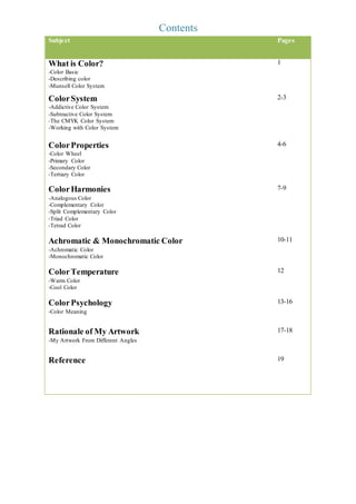
1. Contents
Subject Pages
What is Color?
-Color Basic
-Describing color
-Munsell Color System
1
Color System
-Addictive Color System
-Subtractive Color System
-The CMYK Color System
-Working with Color System
2-3
Color Properties
-Color Wheel
-Primary Color
-Secondary Color
-Tertiary Color
4-6
Color Harmonies
-Analogous Color
-Complementary Color
-Split Complementary Color
-Triad Color
-Tetrad Color
7-9
Achromatic & Monochromatic Color
-Achromatic Color
-Monochromatic Color
10-11
Color Temperature
-Warm Color
-Cool Color
12
Color Psychology
-Color Meaning
13-16
Rationale of My Artwork
-My Artwork From Different Angles
17-18
Reference 19
2. What is Color ?
Sir Isaac Newton (English scientist) discovered that a pure light passing through a prism can separate into all
of the visible color in 1666. In addition, he also found out that those color have their own wavelength and
cannot be separated into other colors.
Light can combine to form another color such as red light mix with yellow light can get orange light. Certain
color mixed with others color can create a new color.
Color Basic
A color name shows the light's emotion characteristic - Color. Color is light. As a result, color that we see is
composed by a variety of color such as the color of visual spectrum : red, orange, yellow, green, blue and
violet. Some wavelengths are absorbed and reflected to the viewer by the objects. The wavelengths is called
color.
Describing Color
We can describe color in three different way. First is by the name of the color, the second is the saturation of
the color and the last one is the value of the color. As an example, pink, crimson and brick are a type of the
red color. They are different because of their chroma, saturation, intensity and value are different.
Munsell Color System
A system that created by Professor Albert H. Munsell in the first decade
of 20th century. The first who separate the hue, chroma and value into a
perceptually uniform and independent dimensions is Munsell. He also be
the first who systemized the color in three-dimensional space. Instead
of using a lot of color name, he created a “rational way to describe color”.
Scientists and artists used the color system differently. Artist will mix blue and yellow to get green while
scientist will mix green and red to get yellow. For addition, there is also another color system for printed
page in magazine.
The first step to understand the color system is very important. We need to define two different type of color
that viewable in the world. The two type color is first, the color that can be touch like the shirt or the skin of
an orange. The second is the color that can’t be touched such as the light and the color produced by the
television. One of the color system is the color from light, another will be the color on the surface of the
objects or printed magazine.
Hue – a common distinction between color positioned around a color wheel.
Value – lightness or darkness quality.
Chroma – color’s purity, intensity or saturation quality.
http://upload.wikimedia.org/wikipedia/com
mons/thumb/d/d5/Munsell-system.
svg/1024px-Munsell-system.svg.png
3. Color Systems - RGB & CMYK
RGB or CMYK ?
Scientists and artists used the color system differently. Artist will mix blue and yellow to get green while
scientist will mix green and red to get yellow. For addition, there is also another color system for printed
page in magazine.
The first step to understand the color system is very important. We need to define two different type of color
that viewable in the world. The two type color is first, the color that can be touch like the shirt or the skin of
an orange. The second is the color that can’t be touched such as the light and the color produced by the
television. One of the color system is the color from light, another will be the color on the surface of the
objects or printed magazine.
Additive Color System
Red - Green - Blue (RGB)
Scientists discovered that red, green and blue is the primary color of light due to the result of combining red
and green light rays will produce yellow, blue and green produce cyan, red and blue produce magenta.
Furthermore, the mix of red, blue and green will create white (light). These color are used in technology
nowadays such as mobile phone, television, computer monitors and theater.
The image from the television is created by the red, green and blue dots of light. This system is only apply to
the devices using light such as television and computer monitors.
https://bpiinc.f iles.wordpress.com/2011/11/rgb.png http://en.wikipedia.org/wiki/Phosphor#mediaviewer/File:CRT_Phosphors.jpg
Subtractive Color System
Red - Yellow - Blue
Pure color without mixing with any color - red, yellow and blue is well-known among artists. Those color
are category as primary color. The mixing of primary color will get secondary color and tertiary color is
from the result of mixing secondary color. Subtractive color method is used during the process of mixing
color when painting. During the process of mixing color, the color goes darker and darker and end with
result of black color. This is what we call a subtractive color system.
4. https://upload.wikimedia.org/wikipedia/commons/7/79/Subtractive_color_mixing.jpg
The CMYK Color System
Cyan - Magenta - Yellow - Black
This color system is only used in the printing industries. CMYK stand for cyan, magenta, yellow and black.
Those color are the primary color in this industry. When the four color is mix together, color grey is observe.
https://natashabillington.files.wordpress.com/2014/02/subtractive-colour-mixing.png
Working with Color System
An older computer system is limited to 216 cross-platform of color whereas a
high quality of printer able to produce thousand of color, continue with a
monitor able to display million of color and the highest object that consist of
billion of color is the visible spectrum. Printing and digital media may have
problem on reproducing color but our eyes no. The printer unable to print out
the color exactly what we see through monitor as the color produce is not inside
the rage of a printer. Consequently, the RGB system is normally used by digital
design. Nonetheless, CMYK must be used in those design partly or else it will not
produce proper color rendering. If want to work without using CMYK system, you can choose color from
Pantone palettes to make sure proper color rendering.
http://www.worqx.com/color/imag
es/spectrum.jpg
5. Color Properties
Color Wheel
A color wheel (color circle interchangeable) show the relationship between primary, secondary and tertiary
color. Color wheel also call as color circle interchangeably in some term. In certain fields or certain version
color wheel also named color tops or filter wheels. Furthermore, color wheel also classified as color disc,
color chart and color scale varieties.
Red, blue and yellow is arranged in an equal side triangle with a point pointing around the color wheel.
Normally the center of the color wheel is white or gray. The color is arrange to be correspondence in the
color wheel with the wavelengths of light (opposed to hue).
Color wheel is a tool that can help you choose color with confidence. Human brain can differentiate hues,
tints, tones and shades and can find out the different if color scheme is wrong.
Color wheel also can be transform in three ways – tints, tones, and shades.
Tints
Sometime call as a pastel. Tints just a normal color that add white to it. There is another complicated way to
create a tints color. By adding all the color in color wheel and add white into it then you can get a tints color.
Tints mean the color is very pale and almost like white color. Example like bright red become pink. All
those color that use tints especially the lighter color will normally look soft, youthful and smoothing.
Tones
6. Those color that we always see is normally toned a little bit or more that make it more appealing color
combinations. Tones is adding the color of grey to normal color. Those color that have been added grey is
consider a tones.
Sometime tones is pleasing to eyes because more complex, subtle and sophisticated. Undeniable, tones is
very suitable for interior decorating because of their interesting characteristic.
Shades
Any color that adding black into it is call shades. By adding a amount of black then a shades of the mixture
is created. Shades is the color become darker and almost black. Black color is used wisely to prevent the
destroy of main color and some artists chose not to use it.
Deep, powerful and mysterious are used to describe the shades. The black color should not be add with a big
quantity because it will overpowering. In masculine environment, shades are very suitable for it.
Primary Color
Primary color are the very first color in every hue. The primary pigments is from the pure source element of
that hue is used in the manufacture of paint. Consequently, there is no other pigments can use.
Red, blue and yellow are the only color that can’t be create by mixing other color. That is why those printing
machines primary color is yellow, cyan and magenta.
7. Secondary Color
Secondary color is the color that mixed from primary color. There are three secondary color that can be
created.
Red + Yellow = Orange
Red + Blue = Violet (purple)
Blue + Yellow = Green
Tertiary Color
The color mixed from primary color and secondary color can create 6 new color call tertiary color. The
result of the color is list as below :-
Red + Orange = Red Orange Yellow + Green = Yellow Green
Red + Violet = Red Violet Blue + Violet = Blue Violet
Yellow + Orange = Yellow Orange Blue + Green = Blue Green
8. Color Harmonies
Combining color in a good way and look comfortable is call color harmonies. Some color look good
together while some no. Looking at the color wheel can help in choosing which color look nicer when mix
together. Color harmonies is divided into 5 categories – analogous color, complementary color, split
complementary color, triad color and tetrad color.
Analogous Color
Analogous color used 3 color that next to each other such as red, orange red and orange. Normally, those
three color match well and can create serene and comfortable design. Analogous color are normally
harmonious and pleasing to eyes. There are three steps when choosing analogous color, first is choose a
dominate color then choose a support color finally choose a color as an accent.
Complementary Color
Complementary color is the color mix by the color that opposite to each other in color wheel. Example :
yellow orange and blue violet. Using high contrast of complementary color can create a very special vibrant
look. To prevent jarring situation, color complementary must be managed well. This color works when want
to show something but very tricky when use in large quantity and also look bad in text.
9. Split Complementary Color
Split complementary color is a evolution of complementary color. Complementary color is only two color
whereas split complementary color contain of three color that is base color and another two color which near
eac other. It has the same characteristic with complementary color such as strong visual contrast.
Nonetheless, it has a lower tension. It is suitable for beginner as it is not difficult to mess up.
10. Triad Color
The color that space equally around the color wheel is use in triad color. Though using unsaturated color,
triad color always very vibrant. If want to use triad color successfully, make sure you balance your color by
choose one dominate color and two accent color.
Tetrad Color
The tetrad color is use the four color that placed around the color wheel. Tetrad color can be very nice if one
color is chosen to be the dominant color. Tetrad color normally is using both warm and cold color.
Consequently, the balance of the warm and cold color should pay more attention.
11. Achromatic & Monochromatic Color
Achromatic Color
“Free of color” is the meaning of achromatic. Achromatic is same as black and white. Greyscale also
consider as achromatic due to the result that grey cannot be classified as a subset of RGB or yellow.
Monochromatic Color
Monochromatic color is showing the tints, tones and shades of a color such as red (from the lightest to the
darkest). Tints can be obtain by adding white to the color whereas tones is adding grey and the shades is
adding black.
Monochromatic color show the color tone of the design that can attract attention and show a place to focus
in the design. The monochromatic can strongly show the sense of visual cohesion. Variation in tone and
adding texture can offset the absence of hue contrast.
12.
13. Color Temperature
Color temperature is divided into two categories : warm color and cool color.
Warm Color
The warm color show the color of fire and heat. When you look at the warm color you can feel the heat.
There are some color of warm color like red, yellow, orange and red orange. Compare to cold color, warm
color appear closer and are more eye catching. Vivid and energetic are the characteristics of warm color.
You will think of sunlight and heat when you heard that name.
Cool Color
Cool color show the color of the water and cold. When you look at cool color you can feel peaceful and
calming. The example of cool color is blue, blue green, and blue violet. Cool color represent calm and
soothe. The cool color is recede and look smaller in visual and not easy to be seen from a far distance.
14. Color Psychology
Pablo Picasso said that color, like features, follow the changes of the emotions.
You will feel anxious when you look at yellow color whereas the blue color can make you feel calm and
relaxed. Color can affect mood, feelings and emotions dramatically. It also a strong communication tool that
used in signal action, influence mood, and cause physiological reactions.
Color also have it own meaning and cultures. A research shows that many cases that the mood-altering
effects of color only temporary. The temperature of environment play a role in color preference. Color also
can have an impact toward performance of a human.
Color Meaning
RED color represent : -
Red color can boost our physical energy level. Furthermore, it also can increase our heart rate and blood
pressure. In addition, it also promotes a need for action and movement as it is fast moving. Besides that it
also stand for desire in all forms. Passionate of love and hate is also can be shown by red color. However,
anger is the negative passion in red color.
Effect of Red
Red color able to stimulate the deeper passions in us such as sex, love, courage, hatred and revenge. It also
can excite our emotion and able to inspires us to take action. Red color also alert us to be cautious to danger.
Red color also call as the universal danger color. If a car is red in color, it will annoy the driver behind them
and made them feel aggressive
Orange color represent : -
Orange color can represent adventure because it promotes the physical confidence and enthusiasm. Thus, it
related well with sportsmen and adventure-seekers. It also stand for the social communication. It able to
stimulate two-way conversation among human. With orange color, you capable to have a good relationship
with your friend and having fun with them.
Effect of Orange
Orange able to let a person show the personality of optimistic and extroverted because the orange is the
color of the uninhibited. Besides that, orange also helps in restoring our physical energy. Compare to red,
orange is less passionate and excitable, but also stimulating. If you are on diet, orange color will be the worst
color in kitchen because it will stimulate you to eat. Additionally, orange can give us courage to continue
move on. Orange is more balance than red because it not very passionate and aggressive but full of vitality.
Yellow color represent : -
Yellow represent the stimulation of our mental faculties. It able to activate left brain. Besides, yellow also
stand for happiness and fun because it look like the sunshine and can uplift our spirit and can let us have
greater confidence and optimism. Yellow also represent the new ideas or thoughts.
Effect of Yellow
15. Yellow can make a people become creative by helping to find a new ways to do thing. It also can help us
make a quick decision. Yellow also lead to the nervousness and emotion instability because it is fast moving.
It is non-emotional as it relates to head not to heart.
Green color represent : -
Green is a color that show harmony and balance as it is the great balance to our mental, emotional and
physical energies. Green also represent the heart centre of the body. As a result of plant growing in the
nature, it also show the characteristic of growth. Furthermore, green color also represent the hope.
Effect of Green
When we are exhausted, green color is the color that can let us revive mentally, physically and emotionally.
Because green connecting to our heart, it can nurturing us. Green color also help in seeig situation clearly
from all sides. In addition, it will let us have the courage to own things and people because it has the
characteristic of possessiveness. There is a negative reaction of green – envy.
Blue color represent : -
As blue color is a cool color, it represent calm and peaceful. It also call the color of truth because it shows
honesty. When the blue color become darker, the authority of it become more. It also has the symbol of
devotion and religious study. Besides that, blue also a color of intelligent.
Effect of Blue
The color of blue is a safe color, many of mankind like blue. It does not impulsive and spontaneous so it no
need to be rushed, so that a person can think nicely and plan wisely before do something. it can lead
someone do thing stubbornly with own way although there is a better way.
Purple / violet color represent : -
Purple, also call as violet is very inspire during brainstorming session. It also represent the creativity with
intellect. Purple also can show a person personality that is individual and original. Purple also stand for
spirituality as it helps to get touch with deep subconscious thoughts. It also show a dignity of a person.
Effect of Purple / Violet
Purple can let a person shows his humanity such as compassion and kindness. Purple is also like red that
show passionate but show it privately only. It also show the royalty and the wealthy with the darker shades
of violet. It can be impractical, with its head in the clouds rather than having its feet on the ground. It can
lead someone to imagine live that different from how it is. Purple can let someone become immature,
encouraging fantasy and an idealism that is often difficult to achieve in real life. There is a negative side of
purple. That is cynical.
Pink color represent : -
Pink is the color that represent unconditional love and romantic love. It is also represent compassion. It
receive and give love, understanding and respect. Pink is also another color that show hope by inspiring the
possibility of a positive outcome.
Effect of Pink
16. Pink can affect someone to calm our emotional energy. Furthermore, it is not aggressive and anger. Thus, it
is not a negative color for human. It also can let us have a warmth and tenderness relationship of friends and
family. Pink coor also has a sensitivity on caring about each other. It is also the color of young girl before
taking over the experience of life.
Brown color represent : -
Brown color represent the stability as the color is very comforting, earthy and contained. It also a symbol of
encourage to orderliness and organization. It is also a color that stand for safe and protective from a chaos.
Furthermore, it also a color of natural and wholesome because it related to earth, nutrition, health and
goodness.
Effect of Brown
The brown color can lead someone to a feeling of calm and safety. It also created a safe haven of support for
family and friends as it is very natural color. It also encourages material security and the accumulation of
possessions.
Grey color represent : -
Neutrality is a characteristic of grey. It does not take any side as it is impartial and dispassionate. It is
between two non-color : black and white. Thus, it stand for compromise. Grey also stand for control as it
reserved, quite and conservation. It will become a steady effect with other color around it.
Effect of Grey
Grey prefer to stand as a middle as it not making a decision or sitting on the fence. It also effect a person to
feel indifferent, uncaring, cold and aloof. Grey can let a person feel stifle and depress but it is also mean a
new and positive coming. Grey color does not bring any emotion as it is neutral, disinterested, objective or
impartial.
Silver color represent : -
Silver color stand for illumination because that silver can open mind and lights the way in front. It is also
reflect the energy no matter is positive or negative. It is a symbol of prestige and wealth because silver is
seen as glamorous and sophisticated, and relates to the professional and corporate market. Silver color is
also related to the femininity of the moon’s energy, sensitive, emotional and fluid.
Effect of Silver
Silver brings the effect of calming and smoothing because it is gentle and comforting qualities relate to the
sensitivity of the moon’s cycle of ebb and flow. It also can let people feel the colorless energy that is
negative feeling such as coldness, indecision and being non-committal. Silver is also a color that brings
dignified and responsibility due to its mature and determined, wise and organized.
Gold color represent : -
When say about gold, you can know it is about an achievement, victory and also wealth. It also represent the
luxury as it is associated with sophistication, elegance, value, quality and status.
Effect of Gold
17. Gold color can enlighten someone to have a deep understand of his self and the soul. It also a color that
show compassion such as caring, loving, generous and giving. Gold is the benefactor or patron. It loves to
share its wisdom, knowledge and wealth with others.
White color represent : -
White – the symbol of innocence and purity. It is a beginning for everything, before being colored. It stand
for a new beginning which represent clean state, help us through times of stress and put the past behind us
and continue to move on. White contains of equal balance of all the color of the spectrum.
Black color represent : -
Normally, black is stand for mystery. This is because black is usually an unknown for everyone, bury inside
and don’t willing to show real feeling. Furthermore, black also the power and control of self and other. It
also will create fear and intimidation.
Effect of Black
Black color can bring formal, dignified and sophisticated if wearing a little black dress and formal suit.
Black has set itself aside from others with its heavy and intense energy. Black also can bring the depression
and disappointment because it is a very negative color in life. Additionally, it also can lead someone to a
pessimistic life as it is very negative.
18. Rationale of My Artwork
There is two color I chose as the main color – black and yellow.
I choose yellow because yellow bring the personality of happy disposition, cheerful and fun to be with.
Yellow color also stand for a personality that critical to everything this is because I am perfectionist.
Furthermore, with a yellow personality I am impulsive and decide a thing out of anxiety and rush thing
rather than do it slowly. Besides, it also can show the personality that I have a strong independent and also
show the selective of friends, I would rather stay with a small group and like-minded than involve in a large
social gathering. Yellow color also show the personality of stubborn, but dislike pettiness and spitefulness of
all kinds.
Another color that I chose is black because it show the personality of independent, strong-willed and
determination. It also show that I like to be in control of myself and situations. Keep distance from people
also is my personality. Thus, black is my choice. Additionally, I would like to keep myself mystery and
intrigue. Black also shows that I am a teenage that still searching for my own true color. Sometime I also
suppressing my own desires and aspirations due to fear and black is the best color to show it.