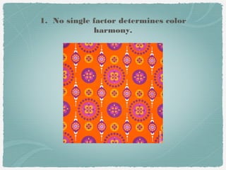
This document discusses color harmony and how different color attributes like hue, value, saturation, and surface affect harmony. Some key points:
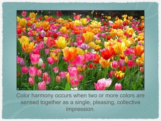
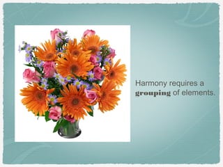
1. Color harmony occurs when colors are sensed together as a pleasing collective impression. It requires balance and relationships between elements.
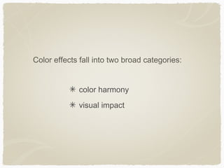
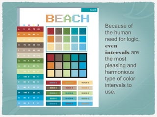
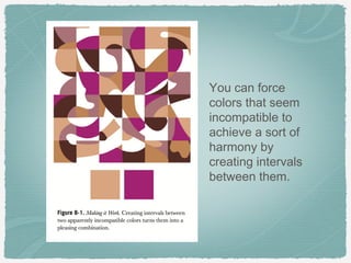
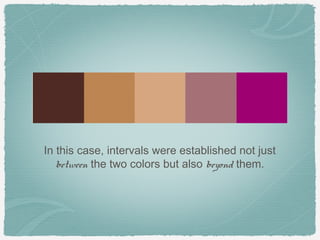
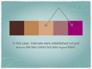
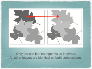
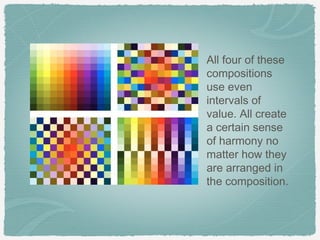
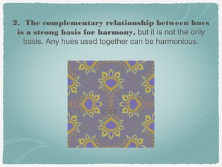
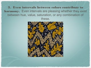
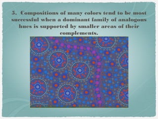
2. Guidelines for harmony include using analogous hues, complementary colors, and even intervals between hues, values, and saturations.
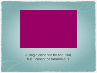
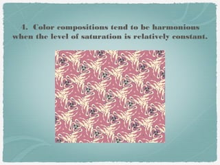
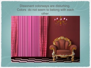
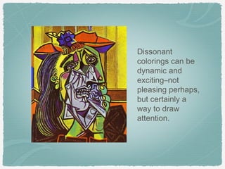
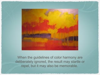
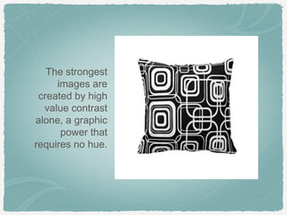
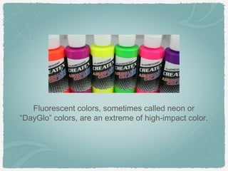
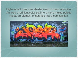
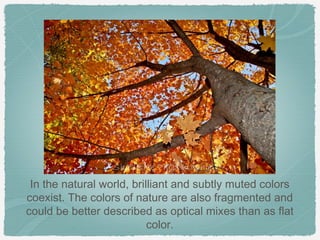
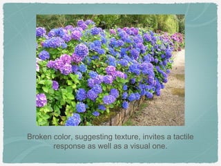
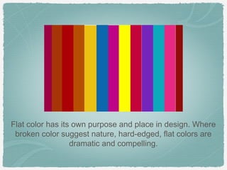
3. High-impact colors can be used for attention but may not be harmonious on their own. Balance is needed. Surface also impacts harmony - flat colors suggest control while broken colors relate to nature.