The document discusses the cohesion between the author's main regional magazine product and two ancillary products: a radio advertisement and billboard advertisement. It analyzes elements that link the three products together, such as consistent use of the magazine's name, tagline, website, and imagery depicting the rural countryside. Consistency in fonts, colors and regional iconography are also discussed to tie the brand's marketing campaign together in a cohesive manner.
The French Revolution, which began in 1789, was a period of radical social and political upheaval in France. It marked the decline of absolute monarchies, the rise of secular and democratic republics, and the eventual rise of Napoleon Bonaparte. This revolutionary period is crucial in understanding the transition from feudalism to modernity in Europe.
For more information, visit-www.vavaclasses.com
2024.06.01 Introducing a competency framework for languag learning materials ...Sandy Millin
http://sandymillin.wordpress.com/iateflwebinar2024
Published classroom materials form the basis of syllabuses, drive teacher professional development, and have a potentially huge influence on learners, teachers and education systems. All teachers also create their own materials, whether a few sentences on a blackboard, a highly-structured fully-realised online course, or anything in between. Despite this, the knowledge and skills needed to create effective language learning materials are rarely part of teacher training, and are mostly learnt by trial and error.
Knowledge and skills frameworks, generally called competency frameworks, for ELT teachers, trainers and managers have existed for a few years now. However, until I created one for my MA dissertation, there wasn’t one drawing together what we need to know and do to be able to effectively produce language learning materials.
This webinar will introduce you to my framework, highlighting the key competencies I identified from my research. It will also show how anybody involved in language teaching (any language, not just English!), teacher training, managing schools or developing language learning materials can benefit from using the framework.
Model Attribute Check Company Auto PropertyCeline George
In Odoo, the multi-company feature allows you to manage multiple companies within a single Odoo database instance. Each company can have its own configurations while still sharing common resources such as products, customers, and suppliers.
Unit 8 - Information and Communication Technology (Paper I).pdfThiyagu K
This slides describes the basic concepts of ICT, basics of Email, Emerging Technology and Digital Initiatives in Education. This presentations aligns with the UGC Paper I syllabus.
How to Make a Field invisible in Odoo 17Celine George
It is possible to hide or invisible some fields in odoo. Commonly using “invisible” attribute in the field definition to invisible the fields. This slide will show how to make a field invisible in odoo 17.
The Roman Empire A Historical Colossus.pdfkaushalkr1407
The Roman Empire, a vast and enduring power, stands as one of history's most remarkable civilizations, leaving an indelible imprint on the world. It emerged from the Roman Republic, transitioning into an imperial powerhouse under the leadership of Augustus Caesar in 27 BCE. This transformation marked the beginning of an era defined by unprecedented territorial expansion, architectural marvels, and profound cultural influence.
The empire's roots lie in the city of Rome, founded, according to legend, by Romulus in 753 BCE. Over centuries, Rome evolved from a small settlement to a formidable republic, characterized by a complex political system with elected officials and checks on power. However, internal strife, class conflicts, and military ambitions paved the way for the end of the Republic. Julius Caesar’s dictatorship and subsequent assassination in 44 BCE created a power vacuum, leading to a civil war. Octavian, later Augustus, emerged victorious, heralding the Roman Empire’s birth.
Under Augustus, the empire experienced the Pax Romana, a 200-year period of relative peace and stability. Augustus reformed the military, established efficient administrative systems, and initiated grand construction projects. The empire's borders expanded, encompassing territories from Britain to Egypt and from Spain to the Euphrates. Roman legions, renowned for their discipline and engineering prowess, secured and maintained these vast territories, building roads, fortifications, and cities that facilitated control and integration.
The Roman Empire’s society was hierarchical, with a rigid class system. At the top were the patricians, wealthy elites who held significant political power. Below them were the plebeians, free citizens with limited political influence, and the vast numbers of slaves who formed the backbone of the economy. The family unit was central, governed by the paterfamilias, the male head who held absolute authority.
Culturally, the Romans were eclectic, absorbing and adapting elements from the civilizations they encountered, particularly the Greeks. Roman art, literature, and philosophy reflected this synthesis, creating a rich cultural tapestry. Latin, the Roman language, became the lingua franca of the Western world, influencing numerous modern languages.
Roman architecture and engineering achievements were monumental. They perfected the arch, vault, and dome, constructing enduring structures like the Colosseum, Pantheon, and aqueducts. These engineering marvels not only showcased Roman ingenuity but also served practical purposes, from public entertainment to water supply.
How to Create Map Views in the Odoo 17 ERPCeline George
The map views are useful for providing a geographical representation of data. They allow users to visualize and analyze the data in a more intuitive manner.
This is a presentation by Dada Robert in a Your Skill Boost masterclass organised by the Excellence Foundation for South Sudan (EFSS) on Saturday, the 25th and Sunday, the 26th of May 2024.
He discussed the concept of quality improvement, emphasizing its applicability to various aspects of life, including personal, project, and program improvements. He defined quality as doing the right thing at the right time in the right way to achieve the best possible results and discussed the concept of the "gap" between what we know and what we do, and how this gap represents the areas we need to improve. He explained the scientific approach to quality improvement, which involves systematic performance analysis, testing and learning, and implementing change ideas. He also highlighted the importance of client focus and a team approach to quality improvement.
Read| The latest issue of The Challenger is here! We are thrilled to announce that our school paper has qualified for the NATIONAL SCHOOLS PRESS CONFERENCE (NSPC) 2024. Thank you for your unwavering support and trust. Dive into the stories that made us stand out!
Synthetic Fiber Construction in lab .pptxPavel ( NSTU)
Synthetic fiber production is a fascinating and complex field that blends chemistry, engineering, and environmental science. By understanding these aspects, students can gain a comprehensive view of synthetic fiber production, its impact on society and the environment, and the potential for future innovations. Synthetic fibers play a crucial role in modern society, impacting various aspects of daily life, industry, and the environment. ynthetic fibers are integral to modern life, offering a range of benefits from cost-effectiveness and versatility to innovative applications and performance characteristics. While they pose environmental challenges, ongoing research and development aim to create more sustainable and eco-friendly alternatives. Understanding the importance of synthetic fibers helps in appreciating their role in the economy, industry, and daily life, while also emphasizing the need for sustainable practices and innovation.
How to Split Bills in the Odoo 17 POS ModuleCeline George
Bills have a main role in point of sale procedure. It will help to track sales, handling payments and giving receipts to customers. Bill splitting also has an important role in POS. For example, If some friends come together for dinner and if they want to divide the bill then it is possible by POS bill splitting. This slide will show how to split bills in odoo 17 POS.
MARUTI SUZUKI- A Successful Joint Venture in India.pptx
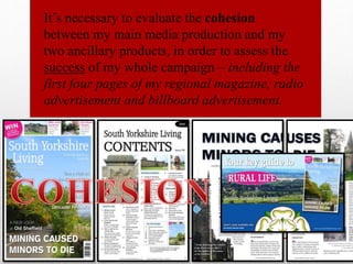
Cohesion (Q.2)
1. It’s necessary to evaluate the cohesion
between my main media production and my
two ancillary products, in order to assess the
success of my whole campaign – including the
first four pages of my regional magazine, radio
advertisement and billboard advertisement.
3. BILLBOARD POSTER
• I didn’t use the same images found within the regional magazine on the billboard
poster as an image of the regional magazine, portraying the prime images, is found on
the billboard anyway. I couldn’t see how professional it would have been if I’d
illustrated a repetition of the same image on the billboard poster (e.g. an image of
Wentworth Woodhouse being shown twice; one on the billboard itself, maybe as a
main focal image, and another seen within the image of the regional magazine on the
billboard advert – shows a lack of professionalism/effort/variation in images).
• The repetition of images would have been quite a narrow marketing technique for a
new brand; an oppositional reading could have taken place, being that ‘there isn’t
much in the magazine’. I was keen to give my older readers a range of content,
therefore, I didn’t want this kind of oppositional reading to take place, which is partly
why I didn’t want to show a repetition of images on the billboard poster from the
regional magazine. It’s evident that the more variety of content seen on the
advertisement, the increase in appeal from a wider range of my A/B income bracket
consumers (however, still maintaining simplicity).
• However, maybe I could have featured the same images found within the regional
magazine on the billboard poster itself, in order for my target audience to
immediately recognise the images or for there to be a clearer link between the two
products (would may have illustrated some consistency of conventions).
4. BILLBOARD POSTER
• Consistency in the use of colours…
- I have used the same tone of pink found within the puff on the front cover, within the oval shaped
design on the billboard (found behind ‘RURAL LIFE’) – I wanted there to be more variation in
colours, instead of the constant use of blue, green and white.
- Indirect colours of green and blue found within extreme long shot of the countryside on billboard,
similar to the tone of indirect colours in the other images found within the regional magazine – i.e.
green of the trees, grass, fields (connoting the beauty of the natural colours found within the rural
countryside – all have links with nature).
- Continuity of white coloured text to contrast against the darker background on billboard – similar to
white text on front cover.
• Continuity of style of font…
- Same style of font used known as ‘Accord SF’ within the tagline and masthead on billboard, and
found on the contents page and front cover – style of masthead is consistent throughout the marketing
campaign, in order for the audience to receive some recognisability in the brand’s conventions.
- A suitable style of font for the billboard poster (and magazine) as the sharpness in its design and
similarity with the front ‘Times New Roman’ connotes the sophistication of the nature of the brand
campaign in itself and its target audience – is conventionally the type of font other existing regional
magazines use.
How does the billboard advertisement and regional magazine link together?
Consistency in HOUSE STYLE
5. BILLBOARD POSTER
• It would make sense if a local billboard advertisement portrays a focal large
image of an iconic location/subject found within the region, in order for the
local audience to recognise immediately the particular region the product is
based on in which the billboard is promoting.
• However, although the main focal image on my billboard advert is of a plain
generic countryside, which doesn’t really clearly portray any links with the
region of South Yorkshire, the image along the bottom of the Yorkshire flag
makes up for it and acts as iconography – straight away conveys strong
connections with my chosen region the product being promoted is based on.
• On the other hand, I could have portrayed an image of the statue of the
famous sports cricketer Dickie Bird, found in Barnsley Town Centre, South
Yorkshire, as this subject is popular with its local audience.
• In general there is a constant link of images portraying iconic
subjects/areas which are only found in South Yorkshire within the regional
magazine, and the iconography of the Yorkshire flag on the billboard poster.
6. BILLBOARD POSTER
• There is a sense of regional pride within the community, which is illustrated through the use of
images on the billboard and regional magazine – e.g. the Yorkshire flag connotes how patriotic
and proud the community are of their region, or the images of the monument illustrating the
names of the children who died in the Silkstone mining disaster connote that the local audience
will always remember this key event that tragically took place in their own region (they don’t
feel sorry for the working class as much, since my primary audience are A/B income bracket,
but are still proud to share the story in order for others to receive some information &
surveillance – may also receive some personal identity or social interaction from the billboard
poster and magazine product).
• The large volume of the rural countryside and nature portrayed within the images on the
billboard and regional magazine would make the older audience want to receive some
entertainment & diversion – want a sense of escapism from their busy lifestyle, therefore,
causing them to find out more about the magazine (primarily on the website on web 2.0) and see
if the magazine offers their personal needs.
• Both the billboard and regional magazine inform the audience that the magazine being
promoted is a monthly magazine, and they convey the contact details in which the target
audience can use to find out more information about the product (via the website) – informs
where the magazine is available by using strong brand trademarks at a central point on the
page.
How does the billboard advertisement and regional magazine link together?
7. • My regional magazine product will be produced through the large conglomerate known as
‘Archant’ – a publishing company who are vertically and horizontally integrated and use
a wide range of media products and platforms (but primarily in the magazine area);
concentrate on producing regional identity magazines all around the UK (e.g. such as
‘Yorkshire Life’, ‘Derbyshire Life’ or ‘Kent Life’ etc.) – however, don’t specifically have a
regional magazine based on SOUTH Yorkshire.
• They are an established company, therefore, would have distribution deals with
established shops such as ‘WHSmith’ , ‘Asda’ and ‘Tesco’ – would be able to focus their
regional productions to their location on a nation wide deal.
• The regional magazine will be sold in these particular shops because the majority of
people like to shop at established shops, therefore, would feel more confident in buying a
niche product – however, I hadn't portrayed these stores on my billboard poster as I
believe it would have been too overwhelming if there were too much content/information
about the magazine conveyed on the billboard, and conventionally the logo of the shops
aren’t typically found on this particular advert product (only need one form of contact on
the billboard, and I decided on showing the website address which is also found
repeatedly within the regional magazine; however, I did mention on the poster that the
issue can be found ‘at local stores only’) – if the primary audience wanted to find out
more on whereabouts the magazine is sold, they can find out on the website on web 2.0.
ARCHANT
8. • The support of these companies (‘WHSmith’, ‘Asda’and ‘Tesco’) will allow
easier and an increase of direct access to the public, excluding the audiences’
time and effort of having to go and search for the magazine - this forms a
connection between the regional magazine and the shop, enabling a association
between the target reader and the magazine product.
ARCHANT
9. BILLBOARD POSTER
• At the end of the radio advert, the voiceover (Stacey Flowers) states the website address, the name of my
regional magazine (‘South Yorkshire Living’) and the tagline (‘Your key guide to rural life’), which is also
found on the billboard poster so there is some link between the two products – creates a cohesive marketing
campaign as the target audience may see the product and then relate to that experience once they hear it
again (recognisable/memorable conventions); the repetition of the website being mentioned may eventually
cause the audience to take some form of action and actually have a look through the magazine’s website
online (part of the AIDA theory).
• For both the radio advert and billboard poster, I didn’t mention any social media network sites (such as
‘Facebook’or ‘Twitter’) as this extra detail isn’t necessary for an older audience of 35-5 year olds who aren’t
really digital natives themselves, and additionally only one form of contact should conventionally be
mentioned on the advertising products anyway (the website) – the audience can still be active and have
direct access to information based on the magazine on the website, which may convey a link to our ‘Twitter’
and ‘Facebook’ page; still some use of social media, appealing also to the digital natives within my primary
audience (as I am still marketing to a secondary audience who have the capability to purchase luxury
converged devices where they can read the magazine).
• In order to produce a bigger brand identity, I could have added more social media marketing although this
isn’t the most necessary distribution channel – but as print becomes less popular and online/web 2.0
increases, I would be able to still communicate to my primary audience through social media.
• I believe traditional marketing is still effective today and it’s this type of marketing I will primarily be
using to promote my regional magazine, however, online marketing will supplement this and will make
sure my magazine product will reach as much of my target audience as possible (digital natives or not).
How does the billboard advertisement and radio advert link together?
10. • As I have already briefly stated, I didn’t mention any social media links / web 2.0 on my
billboard poster. However, I can still apply a couple of online theories to the relationship
between the audience and promoting my brand, to evaluate how necessary web 2.0 would
be for my audience...
• Tapscott and Williams Wikinomics (global village); if companies don’t adapt to the audience
power, by engaging them in user-generated distribution of their brand, and web 2.0, then they will
fail. It makes sense that I should have included more web 2.0 within my productions, even though my
target consumers aren’t really digital natives, as it illustrates a lack of adaptation to the growing
audiences’ power, meaning it could be argued that my brand isn’t as successful as it could have been
due to the lack of social media links present. It’s necessary to understand the growing audience, and
adapt to their power in order to create a successful brand.
• Gautlett’s making and doing culture theory; web 2.0 has empowered the audience to make their
own product (e.g. YouTube). The active audience are who will share my brand content but if there
was more social media links present within my brand, such as ‘Facebook’ or ‘Twitter’, then the share
of content would have been wider as more connections between the audience and the brand would
have been made and available for them to help promote my magazine (through social interaction
online as well as word of mouth).
• Anderson’s The Long Tail; niche products become as successful as mainstream due to the unlimited
shelf space online – my own product could have been more successful if it had more connections with
web 2.0/online, which highlights generally how necessary web 2.0 would be for my target audience.
ONLINE THEORIES
11. • Many of the conventions within my three productions send a
positive ideology that you can receive a sense of escapism and
belonging (from their busy lifestyle) if you purchase and read the
regional magazine product – Blumler and Katz Uses and
Gratifications can be applied as the older audience want to receive
some entertainment & diversion, as well as social interaction
(mainly applying to the females) and information & surveillance
(are hedgehog thinkers); e.g. the use of imagery on the front cover
and billboard poster of an extreme long shot of the countryside with
indirect colours of green and blue connote that sense of escapism
the audience can feel if they buy ‘South Yorkshire Living’, along
with the foley sound effects of nature (i.e. the wind) heard within
the radio advert – all three products work as a campaign as they
link together on the kind of message they are sending to the target
audience and have similar connotations.
13. GEM 106
• Gem 106 is my most preferable radio station to promote my regional magazine based on rural
South Yorkshire.
• I was planning on using one of the BBC stations to feature my radio advert promoting the
magazine, however, this wouldn't be suitable as none of the BBC stations are a commercial
station, and only promote products that are made by the BBC; additionally, the BBC stations
don’t really play advertisements – my chosen institution is ‘Archant’ not the BBC.
• The BBC don’t publish magazines as such anyway, as they sell their magazines product to a
separate publisher (BBC Worldwide UK Publishing), but aren’t regionally specific in their
magazine output.
• Gem 106 is a regional radio station broadcasting to the East Midlands.
• If I was to use Gem 106 as my most preferable radio station, then I would have access to a
variety of factors.
• The events on the contents page aide the older audience to receive a sense of belonging as
well as ‘an escape from reality’, which help creates a cohesive marketing campaign.
• There is a connection between the two through the distribution of the radio advertisement
on the well-known radio station Gem 106, and the marketability of the radio advert.
14. How it markets the personality of the brand...
• There is cohesion - in terms of the reader
being able to place themselves in the
‘getting ready for a day out’ situation, and
gain a cathartic effect; applying the
identification theory (suggests the
audience identifies with a media product
for stress relief and are after a cathartic
process).
15. GEM 106 (online & interactive)
• Even on the Gem 106 website, it proves that advertising with them will
be beneficial for my brand.
• They claim that supporting my campaign online can provide my business
with an additional platform to reach the target audience.
• They additionally have a clean database of over 100,000 listeners that I
can utilise to promote my business.
• According to RAJAR figures (December 2013), the station was listened
to by 510,000 people (out of a possible 2,384,000 listeners) per week,
with each listener tuning in for an average of 8.9 hours over the course
of 7 days.
• These figures illustrate the popularity of the station with its target
audience, who (partly the older 35-55 year olds) continue to listen and
aim to receive some entertainment & diversion as well as information &
surveillance (particularly from my own brand being promoted).
16. • Interactive and Online – this is marketing on a different platform if my
campaign is supported on the Gem 106 website; enabling to email people,
podcasts and vodcasts for their and our own website (use of web 2.0,
aiming particularly at digital natives).
• Promotion and Sponsorship – in order to create more awareness of the
brand, can have access to promotional and sponsorship packages.
• Access to potential international corporations to aid with campaigns
(where cost is only applicable when advertisements must be recorded) –
writers’ help to guarantee the campaign creates a good impression and
receives positive results.
• Airtime of advertisement – account managers assisting with development
and comprehension of the radio market, and timings of what would be
most beneficial.
GEM 106
17. Marketing Plan...
• It’s necessary to build relationships/convergence with
local businesses as a form of synergy marketing and tie-
ins.
• What would I offer them? Maybe cheaper advertising
space.
• I wouldn’t be able to promote them obviously in an
article as this contravenes IPSO regulation.
18. RADIO ADVERT
• My radio advertisement has links with both my regional magazine and billboard poster
advertisement.
• This includes some form of online presence; (the website) - website address found
underneath the masthead in small text on the front cover, and along the bottom of the
contents page and double page spread (additionally found on billboard poster and
mentioned at the end of the radio advert).
• The tagline ‘Your key guide to rural life’and the masthead ‘South Yorkshire Living’is said
at the end of the radio advert, and is found on the front cover of the magazine and billboard.
• The diegetic ambient sound/foley sound effect of the birds tweeting, the wind and the
sound of footsteps create connotations of the outdoors, and connotes a sense of escapism
and tranquillity of being surrounded by rural nature in the countryside; the target audience
want to receive some entertainment & diversion as well as information & surveillance from
my product - my front cover and billboard poster also present these connotations of the
beauty of nature, due to the use of imagery (e.g. extreme long shot and wide shot over the
hills and fields of the countryside as the main focal image on the billboard advert, as well as
similarly found as the main image on the front cover).
How does the radio advertisement, regional magazine and billboard advert link together?
20. FRONT COVER
• On the front cover, I have slightly broken the house style by adding a pink colour (within the
puff and the text within the skyline) – I think this makes the page stand out more and creates
more appeal to my older readers; more vibrant. I believe if I had used the simple colour black
within ALL of the text in the skyline, the front cover would have looked quite plain and even for
a sophisticated magazine, it has to have some engaging conventions.
• Despite this, the magazine product still fulfils its cohesive purpose – the billboard poster also
has the same tone of pink behind ‘RURAL LIFE’, which connotes consistency of the brand’s
conventions (reflective of the other products).
• Even though the colour of pink doesn’t really fit the refined nature of my magazine, the
connotations of this particular colour are based on positivity and vibrancy which positively
reflects my brand – I know pink doesn't really have any associations with nature, so I could have
used yellow which connotes the bright colour of sunshine, therefore, is a prominent feature of
nature (as well as consisting of happiness and joy) – however, I though the colour yellow wasn’t
refined enough to be found on my regional magazine, despite its slight links with nature.
How does the front cover and billboard advert link together?
Both the billboard poster and front cover portray a large focal image of the countryside, conveying indirect colours of
green and blue. However, if I had to change something, the main image would have illustrated an iconic location found
within South Yorkshire, as showing an image of a plain countryside may seem too generic. On the other hand, both the
billboard and front cover show some hint to the reader that the magazine is based on South Yorkshire – the billboard
shows an image of the Yorkshire flag, and the front cover conveys a secondary image of Wentworth Woodhouse
within the skyline (plus, the cover lines state the different areas within the region; e.g. Barnsley, Doncaster etc.) –
therefore, there’s some form of recognisability of the region the magazine is based on (but I could have conveyed it a
little clearer).
21. FRONT COVER
• Something else I could have improved on was to create a clearer link
with the cover lines (the content found within the magazine) to the main
image on the billboard – my magazine states all these areas found in
South Yorkshire, such as Barnsley, Doncaster and Sheffield, however, the
main image on the billboard poster just simply shows a plain countryside.
• I could have taken an image of an iconic location, such as Sheffield (e.g.
Meadowhall Centre), and edited it as the primary focal image on the
billboard – so there’s a stronger connection and cohesive link between
the main magazine and advertising product; would more likely appeal the
local audience, who would want to get active and maybe visit these
locations - although, Meadowhall Centre doesn’t really fit in with the rural
nature of my magazine, but still supports this idea; additionally,
Meadowhall would also have supported the conventional consumerism
found in regional magazines who rely on selling advertising space and, it
could be argued, promote a status quo of capitalism.
• In general, I may have limited the cohesion between my billboard
ancillary product and my main magazine production because of this.
How does the front cover and billboard advert link together?
22. FRONT COVER
• “You can win exciting prizes such as a tour of Wentworth Woodhouse, the biggest house in
the country” – this is mentioned on the front cover as well as in the radio advert, within the
skyline where it states “WIN a whole family tour at the longest country house…”; engages the
active older reader, who may choose to get involved with their own social groups (they may be
A/B income bracket, therefore, would have enough money to spend, however, the local audience
would appeal to a free win of a tour of Wentworth Woodhouse as people in Yorkshire are
stereotypically known to be quite tight with their money).
• In addition, because there is a reference of Wentworth Woodhouse on the front cover (and puff)
and within the radio advert, people can directly link the magazine and the radio advert together.
• I think there is a strong link between the radio advert and the magazine product compared with
the billboard – the voiceover names an iconic place (Wentworth Woodhouse) found in South
Yorkshire, which immediately appeals the local audience who are wanting to receive some
more information & surveillance.
• To create a better cohesive campaign or a clearer link specifically between these two media
products, I could have featured some long reviews to entice the older hedgehog thinkers and
just so there were some further connections between the media productions (as well as some
more appealing conventions to attract a wider range of my target audience).
How does the front cover and radio advertisement link together?
23. The Tagline; ‘Your key guide to rural life’
• The tagline plays a key role in this cohesive campaign as this particular convention is
featured throughout all of my three media productions;
- Underneath the masthead (front cover),
- In a large focal font (on the billboard poster),
- Mentioned by Stacey Flowers (the voiceover; near the end of the radio advertisement).
• The repetition of the tagline being portrayed/mentioned throughout my campaign will
eventually be memorable to the target audiences’ ears, and will increase recognisability of
the brand – therefore, my primary audience will pay more attention to the rest of the media
products, and will more likely be persuaded to purchase my magazine product.
• Additionally, the tagline promises to provide a large volume of key
information/articles/content based on everything rural in South Yorkshire to the reader –
who’s aiming to receive some information & surveillance and entertainment & diversion;
the tagline creates hope for the older 35-55 year olds to receive some escapism from their
busy lifestyle by experiencing being in the rural countryside, in South Yorkshire.
• Furthermore, the representation of my target readers is active, but the advice of the double
page spread article is to stay rooted in the past; thus, submitting to the status quo
(Marxist reading).
25. CONTENTS PAGE
• The purpose of the contents page is to inform the sophisticated reader on the
whereabouts of a range of articles – the contents page links with the front cover
and double page spread as it mentions the topics/cover lines found within the
regional magazine (e.g. ‘Mining caused minors to die’); audience primarily gain
some information & surveillance on this page.
• The rural representation, supported with the images, creates a tight community
for the rural locals living in South Yorkshire – represented throughout my brand.
• The page concerns information on people, cooking, travelling, competitions and
more - maintains the interest of my target audience who desire to read upon a
variety of up-to-date news within the area and knowledge about their local
community (and as they are quite socially active, may receive some social
interaction; personal relationships).
• If I could change something about my contents page, it would be to present an
iconic location that clearly relates to the regional identity my magazine is based
on and is easily recognisable to my audience – I feel like the images illustrated on
the contents page are quite generic or not iconic enough for my target readers to
immediately recognise the region the subject is based in. In order to improve the
cohesion of my brand, my regional magazine pages and ancillary tasks could have
presented more popular iconic locations found within rural South Yorkshire.
26. CONTENTS PAGE
• Cohesion is prominent throughout this particular page as the image of the
magazine front cover is found on the bottom right corner of the contents
page – image of the front cover is also found on the billboard poster;
immediately informs the audience on what the advert is specifically
promoting.
• Additionally, I could have added the images found on the contents page
(such as the medium long shot of the memorial) onto the billboard poster
to create a better cohesion campaign – would have stronger links between
the main product and ancillary tasks, and there would have been some
mention of the Silkstone Mining Disaster on the billboard poster; as I
believe my billboard advert is lacking a connection with the main article
found within the regional magazine, which is the Huskar Pit Mining
Disaster – would have shown that the topics mentioned on the billboard
(such as ‘Wentworth Woodhouse Stable Block’or ‘Mining caused minors
to die’), are passed through the media platforms to the genuine content of
‘South Yorkshire Living’ magazine.
27. CONTENTS PAGE
• The contents page has some links with my radio advert as well as my billboard
advertisement…
• The radio advert mentions that my regional magazine “offers a wide range of topics based on the
region’s rural lifestyle…to visit with friends or family”, and my contents page illustrates that wide
variety of content/information found throughout the whole magazine to my readers (covers people,
food, events and competitions etc.) – in order for the audience to receive some information &
surveillance, as well as social interaction.
• This page indicates the whereabouts of Wentworth Woodhouse and a range of upcoming festivals
and events (with page numbers), which is talked about within the radio advert by the voiceover
Stacey Flowers – however, the radio advert should have probably made reference to the mining
disaster in Silkstone as this is the main article found throughout the whole magazine (would have
made sense).
• On the other hand, not mentioning the mining disaster within the radio advert was probably the
better option because it’s based on quite a negative topic which some of the local audience may
not want to hear about so sudden on the radio (based on their own region; may be too personal) –
also, this suggests that the topic for my splash could have been more positive to be conventional,
and positive representations of the locals’ region would have probably have been more appealing.
• The masthead ‘South Yorkshire living’ is revealed on both the contents page and the radio advert,
including the website address so both products indicate some form of online presence for the
digital natives within my target audience – continuity of the website address throughout the
advertising of the magazine, and on the pages within the regional magazine itself (it’s the main
form of contact).
How does the contents page and the
radio advert link together?
28. CONTENTS PAGE
• The minimal and formal style of text, the white background and
the organised/structured layout of the images creates a
representation of class, and relates to the refined nature of my
magazine brand and primary audience, therefore, it’s a successful
page – the representation of the upper middle class is consistent
throughout all of my media productions, which is a hegemonic
process; the audience recognise and desire that lavish rural
lifestyle that they could be living in (the clear blue skies, the green
fields etc.) – hegemony would argue the purpose of this upper
middle class representation is to spend money and support the
economic system.
• In general, my target audience will respond to the range of content
found within the regional magazine as the older readers are
interested in nature, events and the news (etc.) within South
Yorkshire and the tight-nit local community.
30. DOUBLE PAGE SPREAD
• In order to create cohesion, I think it’s important that the double page spread has
references to the website as it is a recent conventional source of marketing,
even though it may not be conventional when taking into account my target
audience – the primary reader will unknowingly be consuming this information,
even if not intending to, therefore, they will most likely remember this key info
when it come to future reference; additionally, there should be a higher chance of
my target audience remembering these online references as the website address is
also repeatedly found on the billboard poster (and on the front cover & contents
page), and mentioned within the radio advert – illustrating a cohesive campaign.
• It may not be hegemonic, however, it offers the impression of an active
alternative within my target audience (which influences across all three
productions) – but my main product and two ancillary tasks drive for a single
standpoint, and so the status quo isn’t threatened as it’s a festivity of a rural
traditional lifestyle.
• The article within the double page spread is based on a particular geographical
location (Silkstone), which creates a sense of community between the locals and
this is emphasised throughout my three productions as the locals in Yorkshire are
stereotypically known anyway to be quite close nit.
31. DOUBLE PAGE SPREAD
• However, there is something I could have improved on to make a
stronger cohesive campaign between all three of my productions. The
main cover line on the front cover is based on the Huskar Colliery
Mining Disaster, including the article within the double page spread and
is also mentioned on the contents page. On the other hand, there isn’t
really any reference to this particular disaster on the billboard poster or
within the radio advert. The Huskar pit disaster in Silkstone is the main
story within my regional magazine, therefore, it makes sense that it should
have been mentioned on my two ancillary tasks – e.g. the large main focal
image on the billboard poster could have been of something related to the
mining disaster, and the voiceover could have mentioned the disaster at
some point during the advert (maybe instead of “…such as a tour of
Wentworth Woodhouse, the biggest house in the country…”, the
voiceover could have said “and find out more about one of Britain’s most
significant mining disasters that had taken place in the old village of
Silkstone”).
32. DOUBLE PAGE SPREAD
• I would imagine that the main theme of my double page spread (the history of
South Yorkshire) would only be relevant for one issue, so I would aim to continue
cohesion in future issues and would also then transfer them onto the billboard –
as I did mention wanting to feature the main splash on the billboard as an
improvement.
• As the main theme within the current issue is based on the Silkstone mining
disaster, I could link the next issue being based on the top most popular
historical events that had taken place in areas within South Yorkshire (i.e.
Doncaster, Sheffield, Rotherham etc.) - this would still be based on the history
topic, however, then there could be an article about only one of these areas within
the region in the issue after that.
• There could be a theme based on a particular aspirational person who is known
within an area in the region for something inspiring, which the A/B income
bracket audience may like to read about and maybe receive some personal
identity instead of only gaining information & surveillance (which is what would
be primarily received from the current issue on the Silkstone mining disaster).