The document summarizes the results of a questionnaire completed by 30 respondents aged 35-55 about their preferences for a potential regional magazine covering South Yorkshire. Most respondents were female, between 40-50 years old, and living in a rural region. Over half used social media daily. The most popular leisure activities were walking/hiking and socializing. Respondents preferred the magazine to focus on the countryside and region's history. They wanted the front cover to feature the main image and masthead, and include 2-3 secondary images and 5 cover lines. The contents page should be structured, and the double-page spread should cover local history.
The document provides details on the content and design of a proposed classical music magazine. It outlines sections including genre, layout, colour scheme, promotion strategies, target audience, and sources of ideas. For the layout, it describes using a centrally framed masthead on the cover, links to the website and social media on pages, drop caps, featured images and quotes. The target audience is identified as 40+ in age, appealing to both genders, and middle to upper class. Ideas are sourced from magazines like BBC Music regarding the masthead font, colour scheme, and types of advertisements.
This document summarizes a magazine called Q. It provides details about the magazine such as its price, circulation numbers, publisher, and mission statement. The mission statement indicates that Q aims to provide an "unmissable widescreen picture" of rock music through star interviews, reviews of new releases, and investigations into the world of rock and roll. It aims to appeal to both younger readers interested in various genres as well as older readers through its access to stars and sophisticated stories. The document also includes images and descriptions of sample pages from issues of Q, including the cover, contents page, and articles, showing layout, design, and focus on artists.
The survey results showed that the target audience for the magazine is fairly evenly split between males and females. Most respondents were between 18-25 years old. Based on this, the magazine will focus on topics relevant to students and young adults. Black and blue were the most popular colors chosen. The magazine will be released monthly and be free to readers based on other magazines in the region and audience preferences. The top subgenres chosen were film, technology, music, events, art, and fashion. These will be the main focus of the magazine. Images, unique designs, and detailed articles were what appealed most to readers. Events and detailed articles were the preferred article types. The magazine will highlight the local music scene, landmarks, bars,
This document provides details about two magazine pitches - "Choral" and "Opera". For Choral, the summary includes introducing the magazine focused on classical music, examples of promotion plans including social media, and a budget summary. Target audiences are described as upper/middle class ages 50+ and lifestyle details are provided. For Opera, key aspects of the proposal, mood board, target audiences in the 60s, and budget summary are outlined. Color schemes and layouts are discussed for both magazines.
This is the magazine research for my construction of my magazine coursework. It shows the secondary research I carried out so that my magazine suits my target audience.
The document outlines initial ideas and plans for a magazine called Urban Media, including proposed names, coverlines, target audiences, and content. It discusses ideas for the front cover, such as using images related to COVID-19 and the Black Lives Matter movement. Details are provided on formatting the contents page, choosing appropriate fonts and colors, and potential articles to include in the first issue.
The document provides initial ideas and plans for developing a magazine. It includes potential names for the magazine, such as The Objective or Urban Media. It discusses coverline ideas focused on COVID-19 and its economic impacts. The target audience is identified as females and males aged 16-25 from social-economic classes B, C1, and E. Main elements to include are graphics, headlines, images relating to the content. The magazine will focus on current affairs topics relevant to the target demographic.
This document provides details on the planning and production process for two separate music magazines - one focused on choral music and the other on opera. It includes proposals, target audiences, magazine designs, production schedules, and draft layouts. Sample pages show mastheads, cover designs, article spreads, and promotional elements. Photography tests and plans are also presented. The level of research, planning and iteration shown aims to create magazines that will appeal to older, middle-to-upper class audiences interested in classical music genres.
This document provides an analysis of a magazine called Top of the Pops published by Immediate Media Company. It first summarizes key details about the publisher, including that it was founded in 2011 and owns several magazines. It then analyzes features of Top of the Pops magazine like its covers, target audience of teenage girls, and use of bright colors and images to appeal to this audience. Primary and secondary research is also referenced to understand the magazine's market position and competitors.
The document provides details about planning and pitching a print-based media product for rock magazines Q and Mojo. It analyzes features of the magazines like fonts, layouts, and headings to understand how they communicate with audiences. It also discusses the target demographics, content, and production process for Q magazine, which is published monthly and aims to inform and educate readers about various music genres and industry updates.
BBC Music Magazine is published monthly by BBC Magazines Bristol on behalf of BBC Worldwide. It focuses primarily on classical music but also covers jazz and world music. Gramophone Magazine is produced by Haymarket Consumer Media and its parent company Haymarket has offices around the world. Common conventions for music magazines include eye-catching images, bold text, catchy taglines, and brief article summaries to entice readers.
The document discusses the codes and conventions commonly found on the front covers of regional magazines. It provides examples from issues of magazines like The Source and Absolute Brighton to illustrate techniques used to attract readers' attention. These include mastheads in bold fonts, prominent images, high contrast colors, "sell lines" with snippets of content, and barcodes. However, it notes that The Source sometimes challenges conventions by using more subtle fonts, unfamiliar people as images, and omitting barcodes to signal its free status. The layouts, colors, and topics of images and text are designed to appeal to target demographics while intriguing broader audiences.
This document outlines the tasks involved in music magazine research. It discusses uses and gratifications theory and how consumers actively engage with media. It also provides information on major British magazine publishers like IPC Media and Bauer Media Group. The document includes the results of a questionnaire given to students about their music magazine preferences. It reflects on how the questionnaire provides insight into designing an appealing music magazine.
This document contains research tasks and articles for a music magazine. It includes various article topics like interviews with artists, concert previews, reviews of award winners, and tips for musicians. The table of contents lists 58 articles and features spread across the magazine. Questionnaires were also conducted to help understand readers' preferences, like their favorite genres of music and what they want to see in a magazine. This research will aid in designing a magazine that appeals to the target audience.
Preliminary task and planning and researchlkirkland123
This document provides information about Lucas Kirkland's music magazine project for his OCR Media Studies AS Level course. It includes details of Lucas' preliminary front cover design process, using various Photoshop tools, and receiving feedback from teachers. It also includes Lucas' research on established music magazines, including their target audiences, genres, and publishing companies. Lucas analyzed conventions of music magazine covers, such as layout, mastheads, and positioning of images. He also researched the target audiences and unique selling points of the magazines he reviewed.
EThompson: Unit 13 - LO1 Second Analysisethompson6107
This document provides details about Mojo Magazine, including its target audience, content, and production process. Mojo is a monthly music magazine published in the UK by Bauer Media with a circulation of 70,667 and readership of 210,000. It focuses on classic rock genres from the 1960s-1990s, with a primary demographic of males aged 45-54. The magazine contains in-depth articles, reviews, and photos. It has a standard print production process involving scheduling, editing, proofreading, and distribution to retailers. Mojo also engages its audience through social media, a store on its website, and an annual music awards ceremony.
The document provides an overview of research tasks related to different sections in a music magazine, including interviews, reviews, and articles on various music-related topics. It lists 58 potential sections or articles that could be included in the magazine, covering a wide range of music genres and topics from interviews to reviews to charts.
The document outlines plans for a rock music magazine called "Mosh!". It discusses selecting the magazine title of "Mosh!" to represent the excitement of rock concerts. The author presents different font options and chooses "slave only dreams to be king" for its modern style. The magazine will focus on alternative rock and metal bands from the late 20th century. Sample pages include a contents page and a two-page article spread about interviewing an artist. Over 300 photos were collected from concert venues and a live show to illustrate the magazine.
The document provides details about two classical music magazines - BBC Music Magazine and Gramophone Magazine. It summarizes their target audiences, publication details, and analyses features of their front covers such as images, text, and layout. It also examines conventions of music magazine design including elements like bar codes, mastheads, and cover lines.
The document outlines plans for a rock music magazine called "Mosh!". It discusses selecting the magazine title of "Mosh!" to represent the excitement of rock concerts. Font and cover design options are presented, with one font being selected. The magazine will focus on alternative rock and metal bands from the last 20 years. It will be published monthly at a cover price of £2.99 based on market research. Sample magazine pages including the contents page and a two-page article spread are drafted. Over 300 photos were collected from concert venues and events to illustrate the magazine.
Preliminary task and planning and researchlkirkland123
This document contains Lucas Kirkland's planning and research for a music magazine front cover preliminary task. It includes details of the design process for the front cover, with explanations of the tools and techniques used. It also contains research on established music magazines, including their target audiences, genres, and conventions. The publisher of Rolling Stone magazine, Wenner Media, is analyzed.
The document provides information about the Rolling Stones magazine, including its purpose, form, style, content, genre, target audience, and production process. The magazine was founded in 1967 in the United States to provide content focused on music and music culture like reviews, articles, and blogs. It aims its content at younger audiences between 15-24 years old through its use of bright colors, photos of celebrities, and articles about music gossip. The magazine is produced biweekly and has a website to further engage its target audience.
Unit 13 – LO2 Planning and Pitching a Print Based Media Product stamkostas3068
This document outlines ideas for two rap/hip-hop magazines called "NXT EP" and "313." For "NXT EP," the magazine would focus on the latest news and up-and-coming artists, reflected in its name. It would use red, black, and white colors and target 16-30 year olds. "313" would focus more on throwback stories and original rap music, represented by Detroit's area code. Both magazines would be monthly, cost £3.99, and use A4 size to fit more content. Moodboards provide visual inspiration, depicting iconic rappers for "313" and current popular artists for "NXT EP." The target audience and content are designed to attract
The document discusses the production of a magazine focused on rock music called "Platinum". It describes the stylistic influences from other rock magazines like Kerrang!, the use of mid-shots and eye-level angles to represent artists, and how facial expressions, hairstyles, lighting, and costumes are used to represent the featured artist Antonio in a serious yet modern way. It also discusses target audiences, distribution methods, potential publishing partners, typical readers as mainly younger males interested in both old and new rock music, and how the magazine cover and bold headings attract its audience.
Take a Break magazine targets lower-middle class women aged 30-80 through stories focused on relationships, gossip, and sensationalism. It uses bright colors, informal language, and photos of smiling middle-aged women on the cover to attract its primarily female readership. The magazine encourages reader submissions and interaction through prizes, competitions, and social media to build loyalty among its 2.5 million readers.
Preliminary Task and Planning & Researchsewayne1254
Sean Wayne created a front cover and contents page for a music magazine as a preliminary task. For the front cover, he added elements like the masthead, background colors, title, main image, articles and social media links. For the contents page, he included the masthead, editorial, article titles and summaries, and thumbnail images. He made minor corrections like making the signature bolder and changing some wording for clarity. In his research log, Sean analyzed the genres, target audiences, and unique selling points of established magazines like Q and Classic Rock to inform his own music magazine project.
The survey results showed that most respondents were female and ranged in age from 17 to 44. While the majority had not previously bought a regional magazine, they provided useful feedback on what they would like to see in one. Respondents preferred a magazine with a mix of articles on local celebrities and the public, as well as a balance of images and text. They also favored a vibrant color scheme and informal writing style to promote the region and appeal to younger audiences.
- The survey results showed that most respondents were female and ranged in age from 17 to 44.
- While many had not previously bought a regional magazine, responses suggested including local shops, landscapes, and events to appeal to audiences.
- Respondents preferred magazines with a mixture of images and text, and indicated color photos and an informal style would make the magazine most appealing.
This document evaluates how the media product represents different social groups. It represents:
- Ages 20-30 due to concert tickets and promotions aimed at older students and young adults.
- More males than females given the masculine style, rock music focus, and genres like metal being less popular with women.
- People heavily invested in rock music and its subgenres as the sole focus of content. Readers must be dedicated fans.
- Mostly white, working class males based on the type of music typically fostering interest from that background. Readers would need average economic means to afford subscriptions and promotions.
This document evaluates how the media product represents different social groups. It represents:
- Ages 20-30 due to concert tickets and promotions aimed at older students and young adults.
- More males than females given the masculine style, rock music focus, and genres like metal being less popular with women.
- People heavily invested in rock music and its subgenres as the sole focus of content. Readers must be dedicated fans.
- Mostly white, working class males based on the type of music typically fostering interest from that background. Economically, readers would need to be of average means to afford subscriptions and promotions.
George Kingham provides details on a magazine project including planning a photo shoot, creating a front cover, contents page, and double page spread for a new music magazine focused on rock music. The document discusses choosing IPC as the distributor due to their experience with rock music magazines, designing the magazine to attract rock music fans, and what was learned from the process of constructing the magazine using software like Photoshop and Fireworks.
The document summarizes the evaluation of a media magazine product. It discusses how the magazine uses conventions from a similar real magazine in its design elements like the masthead and color scheme. It represents social groups aged 16-35 interested in pop punk music. The target distribution institution would be Bauer Media, which distributes similar rock magazines to younger audiences. The target audience is described as younger people aged 16-25 interested in pop punk bands featured. Various techniques were used to attract this audience, including the dark cover image, affordable price, and prominent band coverage. In creating the magazine, the author learned advanced Photoshop skills to manipulate images.
The document outlines the target audience for a regional magazine as 35-55 year old males and females from an upper middle/middle class income bracket in Yorkshire, UK. It describes this audience as affluent, sophisticated, and having free time to read. The magazine will focus on topics like homes, gardening, and fashion to appeal to both genders. Research on an existing successful Yorkshire magazine called "Living North" provided examples of formats and conventions to attract a similar target readership.
Kelly Kemp from Boca Raton High School created a mock magazine called "World of Fitness" for an AICE Media Studies course. The 3-page magazine includes a cover, table of contents, and double page article. The cover features the title and tagline "10 Commandments of Bodybuilding" along with article teasers. The table of contents displays article titles and images corresponding to the content. A double page spread advertises a protein product with images and text promoting its benefits. Kelly provided critical reflections on how the magazine engages audiences and would be distributed, as well as how their design and Photoshop skills improved over the course of the project.
Kelly Kemp from Boca Raton High School created a magazine called "World of Fitness" for her AICE Media Studies course. The magazine targets males ages 18-40 interested in health, fitness, and bodybuilding. It uses techniques like colorful layouts and images of muscular models to engage its audience. Kelly improved her magazine design skills over multiple drafts, developing more complex page layouts in Photoshop. She considered how the magazine could be distributed by a major publisher and planned issue dates and content relevant to different seasons.
This document is a log book and evaluation from a student named Abbie Fowler on their preliminary task to design a music magazine. It includes step-by-step progressions of the front cover and contents page designs. It also includes research on existing music magazines like Q Magazine and Mixmag to understand their conventions, target audiences, and unique selling points. A survey was conducted that provided feedback on preferences around music genres and magazine design. The conclusion recognizes how the research into other magazines will help the student produce a high quality music magazine that aligns with reader expectations.
This document is a log book and evaluation for a student's preliminary task creating a music magazine. It documents the student's process, including researching existing magazines, surveying audiences, and creating draft pages like the front cover and contents page. The student refined the pages over multiple steps, adding details. Research found the target audience is ages 15-25 and magazines should use high quality images. The completed magazine accurately reflects conventions of the genre.
Radio Advertisement (Final Quesitonnaire)cjflowers2014
The document summarizes the results of a questionnaire given to 30 radio listeners between the ages of 35-55. Key findings include:
- Most listeners spend 30 minutes to 1 hour listening to the radio each day.
- Gem 106 was the most listened to radio station.
- Very few use radio player apps, indicating less familiarity with technology.
- Respondents felt a radio ad should be 30-40 seconds long.
- The voiceover grabs most attention in radio ads.
- A northern accent is preferred for the voiceover.
The document discusses how to create a cohesive marketing campaign across multiple media platforms. It analyzes the magazine campaigns of "Derbyshire Life" and "Yorkshire Life" as examples. Both magazines maintain consistency across their print and digital versions through similar fonts, layouts, color schemes, and a focus on landscapes in their imagery. Their websites and mobile apps also follow the same stylistic conventions. The document suggests ideas for the marketing campaign such as partnering with regional radio stations and adding games to the mobile app to appeal to older audiences. It concludes that the campaign should emphasize consistency of branding elements like the masthead and a focus on natural colors and rural imagery tailored to their target demographic.
The student created a magazine targeted towards teenagers interested in pop punk music. They conducted research including a survey to understand their target audience. They created drafts and flat plans of the magazine layout, taking conventions from analyzed magazines. The student improved the drafts, making the design and colors more cohesive. Feedback from research and drafts helped the student create a magazine that effectively appeals to their target audience.
Magazine Mind Map - Mind Map and Researchgbarnstable
George Barnstable is creating an ancillary product for his OCR Media Studies course. He has researched the TV magazine "Inside Soap" to inspire his own soap opera magazine cover. His document includes research on the history, circulation, target audience, design elements like images, language, pricing, headlines, and conventions used by "Inside Soap".
The document describes the process of creating a magazine that aims to attract both younger and older audiences to hip hop and dance music. Some key points:
- The creator studied existing music magazines and used conventions like a central front cover image but challenged norms by featuring an elderly woman looking down at turntables.
- Research found stories were the most interesting part of music magazines, so the main story was developed to attract older readers.
- Colors, fonts, and layouts were designed to appeal to older audiences while still engaging younger people through images and content.
- Technologies like Photoshop, cameras and memory sticks made the process faster but thorough research and planning were most important to create a professional, appealing
This document is a log book and preliminary task progression for a student named Abbie Fowler completing an AS Level Media Studies course. It documents the process of designing magazine covers and contents pages for a music magazine project. The log book includes step-by-step progressions showing how the designs were developed, research on established magazines, target audiences, and survey results which informed the designs. The overall goal was to create magazine pages that met industry standards by applying lessons learned from analyzing professional publications.
This document contains an evaluation of a student's media studies portfolio project on constructing a magazine called "Smooth Classic".
The student discusses how they used similar forms and conventions as existing magazines to appeal to the target audience. They also addressed how the magazine represents older, wealthier social groups who enjoy classical music.
In reviewing their work, the student reflects on having learned about time management and Photoshop skills through completing a preliminary task before the full project. They note evidence of progression, such as improved image editing, from the preliminary to final versions of the magazine.
Sam Jones evaluated their magazine concept focused on alternative rock music. They noticed three key magazines in the genre - NME, Kerrang, and Q - and decided to take most inspiration from Q due to its clean layout and limited number of articles. Sam structured their magazine to both follow and challenge conventions, using familiar elements like a masthead but also unconventional designs. They aimed to represent struggling artists who achieved success through their music. Sam chose Bauer Media as the distributor to target their key 15-24 year old, UK-based audience interested in alternative rock and relatable artists.
1) The document proposes a print-based magazine called "RockStars" focused on upbeat hip hop and rock music. It would have around 32 pages and be released fortnightly.
2) The magazine's target audience is primarily males interested in celebrity updates and music reviews. It aims to compete with similar magazines like Kerrang and NME using bright colors and engaging content.
3) The proposal discusses the magazine's design elements like colorful covers and double page spreads with photos and pull quotes. It also outlines developing an online presence through a website, social media, and potential app to further engage the target audience.
Similar to Regional Magazine (Final Questionnaire) (20)
The document discusses how the cohesion between a regional magazine, radio advertisement, and billboard advertisement for a marketing campaign was evaluated. There is consistency in images, colors, fonts and styles between the magazine and billboard to clearly link the two. Both also mention the website and magazine name to create recognition across the different media. While the billboard image does not feature local landmarks, the inclusion of the Yorkshire flag maintains its regional focus.
The document discusses the cohesion between the author's main regional magazine product and two ancillary products: a radio advertisement and billboard advertisement. It analyzes elements that link the three products together, such as consistent use of the magazine's name, tagline, website, and imagery depicting the rural countryside. Consistency in fonts, colors and regional iconography are also discussed to tie the brand's marketing campaign together in a cohesive manner.
Cinema advertising provides an effective and low-cost way to promote to a wide audience. It allows businesses to grab the attention of their target audience without distraction from other ads, as their ad will be the only one shown on the big screen. Additionally, cinema advertising reaches a captive audience that is focused on the screen. For as little as £95 per week, businesses can advertise, and alternatives like slide or digital ads are available from Pearl & Dean for those on a tighter budget. Cinema advertising ensures the audience sees the ad without other interruptions and may discuss it after, raising awareness of the product.
The document outlines 16 regulations from the Editors' Code of Practice that a regional magazine editor must follow when producing content. These regulations cover issues like accuracy, privacy, harassment, children, courts, financial matters, and payments to sources. The editor understands they must consider these standards around areas like photography, interviews, reporting on crime and health to avoid legal and ethical issues and uphold high professional journalism standards.
This 60-second radio advertisement targets 25-35 year old males by promoting Coke Zero as a more masculine drink that will appeal to male listeners. It uses a male voiceover and ambient sounds related to sports to maintain attention. After describing the drink's energizing effects, it encourages listeners to find more details on the website and entices them with prizes for a sports experience. The casual voiceover directly addresses listeners in an enthusiastic tone to continually engage them.
The radio advertisement targets parents in the A/B income bracket to promote Oakhill College, an Australian school. A polished male voiceover speaks enthusiastically about the variety of opportunities available to students, such as joining bands or auditioning for musicals. Uplifting instrumental music plays throughout to convey the welcoming environment. The ad encourages parents that their children will thrive at Oakhill College and provides the school website for further information.
The document analyzes a radio advertisement for Toby Carvery. It uses various voiceovers of different ages and accents to appeal to a wide target audience of 30-60 year olds from income brackets C1-D. The voiceovers describe the delicious roast dinners in a positive and enthusiastic tone, using informal language. Instrumental piano music plays throughout to create a constant positive atmosphere. The main voiceover provides contact details at the end in a more refined voice.
Billboard Poster Advertisement (Final Questionnaire)cjflowers2014
- Nearly 50% of respondents preferred a large/medium billboard on the side of the road as the location for a poster. Over half also preferred a bold/large format for the poster.
- The highest scoring colors were green, which connotes the countryside, and white. The main focal image should be a long shot of the local landscape to showcase all the region has to offer.
- Most respondents did not want to see social media or the price on the poster. They did want to see the magazine cover to identify what was being advertised. The preferred font was "Yorkshire Life" to convey sophistication.
The document discusses the conventions of billboard advertisements. It notes that billboard ads should use bold, large, colorful text; associated imagery; and be briefly informative yet clear. It also states that billboard designs are simplistic but effective. Common billboard types include those at bus stops, phone booths, and alongside roads. These locations are effective at reaching audiences. Billboard ads should have a minimalist style with one large focal image and graphics, along with minimal text to briefly inform about the product. Most billboards use a plain white background with colored font. The document then provides an example billboard design for a magazine, including a landscape image, tagline, brand name, magazine cover image, bold white font,
This document contains responses from 5 individuals to questionnaires about their preferences regarding advertisements. Lucy Roberts (35 years old) favored a green and brown billboard with a medium long shot and high angle. Jackie (40-50 years old) preferred magazines focusing on fashion and the main image, and radio ads with a northern accent. Beverley Dawson (50-60 years old) similarly preferred magazines focused on city life and radio ads with a northern male voiceover. Stacey Flowers (40-50 years old) preferred a billboard depicting a building/castle and radio on Gem 106. Graham Flowers (50-60 years old) did not use social media and preferred rural landscapes in magazines and a relaxed radio ad on Smooth.
On July 4th, 1838, a tremendous storm caused a ditch near the village of Silkstone to flood, sending a torrent of water into the Huskar pit mine. Twenty-six children between the ages of 7-17 who were working in the mine were trapped and drowned by the sudden inrush of water. Most of the victims lived in Silkstone and nearby villages. The disaster shocked the nation and led to new laws prohibiting the employment of women and children under 10 in coal mines.
This document summarizes a photo shoot of a model named Charley Flowers for a school project. Photos were taken in the school's media classroom and with a studio light set up at home, including medium shots, long shots, and medium long shots. The photographer chose specific poses and photos based on Charley's relaxed but poised posture and welcoming smile.
The document describes setting up a photo studio in a media classroom, including positioning studio lights and a white screen. Photos were then taken of two models, James Lockton and Lisl Tudor, with one photo of each chosen for having a nice smile and correct head positioning or perfect posture, respectively. Additional behind-the-scenes photos were taken and extra tips for a magazine were discussed. Photos were also taken of some items like a handbag, scarf, and shoes to be edited onto magazine pages.
The document provides an analysis and critique of the author's preliminary front cover and contents page for a school magazine. It discusses aspects that could be improved, such as making the masthead bolder, increasing font sizes, adjusting image quality and layout, and changing font styles. The author then shares the revised front cover and contents page, noting changes made like using different fonts, adjusting images, and adding strokes and shadows to text. While improvements were made, the author recognizes aspects that could still be better like squinting in the main image, bolder cover lines, filling white space, varying photos, and applying photographic techniques. Overall, progress was shown but there is still room to develop skills in magazine page design.
The document discusses the software, equipment, and camera that will be used to create a magazine. Photoshop will be used for photo editing and layout, and the creator is comfortable with basic functions but wants to learn more advanced settings. School studio lights, soft boxes, and reflectors will be used to improve photo quality without shadows. A white backdrop and Panasonic camera already booked at the school will also be used. The creator must book time at school to use the software and equipment since they are not available at home.
The document outlines the results of a survey given to a target teenage audience about design choices for a new pop magazine. Key results include:
- The most popular title is "POPWORLD", and the color scheme is light blue, red and white.
- The magazine will feature about 5 images and cover lines on the front cover.
- The main focal image will be a medium shot of a female artist, who will also be featured in the double page interview spread.
- The language in the magazine will be a mix of informal and formal, and will cost between £3-£3.50.
The document discusses costume and prop ideas for various elements of a pop music magazine. For the double page spread, the main character Charley will hold a microphone, balance a book on her head, and hold a tennis racquet to represent her interests in singing, reading, and sports. The contents page will feature Charley holding medals and trophies from past singing competitions in her pink bedroom. It will also include images of beauty products and fashion items to engage female readers. The front cover photo will show two models holding glasses for a casual image.
This document summarizes the opinions of 5 people on design elements for a pop music magazine targeted at teenage girls. Charley Flowers prefers the title "POPWORLD" and a mix of informal and formal language in interviews. Amy Simpson wants a medium shot of a female artist as the main image and 4 images on the cover. Jess Simpson prefers a male artist as the focal image and gossip in the double page spread. Nicole Ruparelia wants the contents page to be eye-catching but not overwhelming. Dan Howitt emphasizes understanding the target audience and balancing images and text.
The document outlines regulations and ethical guidelines for journalists and magazine editors to follow, including maintaining accuracy, respecting privacy, avoiding harassment, and not identifying victims of crimes or sexual assault. It discusses rules around children, hospitals, confidential sources, payments, discrimination, and financial journalism. The purpose is to educate a pop music magazine editor on the standards they must uphold in their work.
The document summarizes the results of a pilot questionnaire sent to 10 respondents about their preferences for various design elements of a pop magazine. For most questions, the responses were close or split between options, showing that additional responses are needed to determine clear favorites. The majority preferred "POPWORLD" as the magazine title, a female focal image on the cover, and around 5 images and a medium-long shot for the main cover photo.
Temple of Asclepius in Thrace. Excavation resultsKrassimira Luka
The temple and the sanctuary around were dedicated to Asklepios Zmidrenus. This name has been known since 1875 when an inscription dedicated to him was discovered in Rome. The inscription is dated in 227 AD and was left by soldiers originating from the city of Philippopolis (modern Plovdiv).
How to Setup Warehouse & Location in Odoo 17 InventoryCeline George
In this slide, we'll explore how to set up warehouses and locations in Odoo 17 Inventory. This will help us manage our stock effectively, track inventory levels, and streamline warehouse operations.
Level 3 NCEA - NZ: A Nation In the Making 1872 - 1900 SML.pptHenry Hollis
The History of NZ 1870-1900.
Making of a Nation.
From the NZ Wars to Liberals,
Richard Seddon, George Grey,
Social Laboratory, New Zealand,
Confiscations, Kotahitanga, Kingitanga, Parliament, Suffrage, Repudiation, Economic Change, Agriculture, Gold Mining, Timber, Flax, Sheep, Dairying,
Leveraging Generative AI to Drive Nonprofit InnovationTechSoup
In this webinar, participants learned how to utilize Generative AI to streamline operations and elevate member engagement. Amazon Web Service experts provided a customer specific use cases and dived into low/no-code tools that are quick and easy to deploy through Amazon Web Service (AWS.)
LAND USE LAND COVER AND NDVI OF MIRZAPUR DISTRICT, UPRAHUL
This Dissertation explores the particular circumstances of Mirzapur, a region located in the
core of India. Mirzapur, with its varied terrains and abundant biodiversity, offers an optimal
environment for investigating the changes in vegetation cover dynamics. Our study utilizes
advanced technologies such as GIS (Geographic Information Systems) and Remote sensing to
analyze the transformations that have taken place over the course of a decade.
The complex relationship between human activities and the environment has been the focus
of extensive research and worry. As the global community grapples with swift urbanization,
population expansion, and economic progress, the effects on natural ecosystems are becoming
more evident. A crucial element of this impact is the alteration of vegetation cover, which plays a
significant role in maintaining the ecological equilibrium of our planet.Land serves as the foundation for all human activities and provides the necessary materials for
these activities. As the most crucial natural resource, its utilization by humans results in different
'Land uses,' which are determined by both human activities and the physical characteristics of the
land.
The utilization of land is impacted by human needs and environmental factors. In countries
like India, rapid population growth and the emphasis on extensive resource exploitation can lead
to significant land degradation, adversely affecting the region's land cover.
Therefore, human intervention has significantly influenced land use patterns over many
centuries, evolving its structure over time and space. In the present era, these changes have
accelerated due to factors such as agriculture and urbanization. Information regarding land use and
cover is essential for various planning and management tasks related to the Earth's surface,
providing crucial environmental data for scientific, resource management, policy purposes, and
diverse human activities.
Accurate understanding of land use and cover is imperative for the development planning
of any area. Consequently, a wide range of professionals, including earth system scientists, land
and water managers, and urban planners, are interested in obtaining data on land use and cover
changes, conversion trends, and other related patterns. The spatial dimensions of land use and
cover support policymakers and scientists in making well-informed decisions, as alterations in
these patterns indicate shifts in economic and social conditions. Monitoring such changes with the
help of Advanced technologies like Remote Sensing and Geographic Information Systems is
crucial for coordinated efforts across different administrative levels. Advanced technologies like
Remote Sensing and Geographic Information Systems
9
Changes in vegetation cover refer to variations in the distribution, composition, and overall
structure of plant communities across different temporal and spatial scales. These changes can
occur natural.
A Visual Guide to 1 Samuel | A Tale of Two HeartsSteve Thomason
These slides walk through the story of 1 Samuel. Samuel is the last judge of Israel. The people reject God and want a king. Saul is anointed as the first king, but he is not a good king. David, the shepherd boy is anointed and Saul is envious of him. David shows honor while Saul continues to self destruct.
This presentation was provided by Rebecca Benner, Ph.D., of the American Society of Anesthesiologists, for the second session of NISO's 2024 Training Series "DEIA in the Scholarly Landscape." Session Two: 'Expanding Pathways to Publishing Careers,' was held June 13, 2024.
How to Make a Field Mandatory in Odoo 17Celine George
In Odoo, making a field required can be done through both Python code and XML views. When you set the required attribute to True in Python code, it makes the field required across all views where it's used. Conversely, when you set the required attribute in XML views, it makes the field required only in the context of that particular view.
This presentation was provided by Racquel Jemison, Ph.D., Christina MacLaughlin, Ph.D., and Paulomi Majumder. Ph.D., all of the American Chemical Society, for the second session of NISO's 2024 Training Series "DEIA in the Scholarly Landscape." Session Two: 'Expanding Pathways to Publishing Careers,' was held June 13, 2024.
Jemison, MacLaughlin, and Majumder "Broadening Pathways for Editors and Authors"
Regional Magazine (Final Questionnaire)
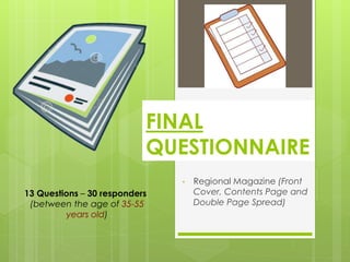
1. • Regional Magazine (Front
Cover, Contents Page and
Double Page Spread)
13 Questions – 30 responders
(between the age of 35-55
years old)
FINAL
QUESTIONNAIRE
2. 1) Are you a male or female?
Male
Female
• Highest Number of Results:
Female
• Least Number of Results: Male
3. Over half of my responders were female - which
was expected; even though my target audience
are both male and female 35 - 55 year olds,
females will most prominently buy a regional
magazine more than men (men prefer more
masculine magazines such as a sports magazine
etc.).
I wanted to receive an equal balance of
responses from both female and males to fill in my
three questionnaires – more accurate/varied
results and I get a clearer idea of what both
genders want from my potential product.
1) Are you a male or female?
4. 2) How old are you?
30 or under
30 - 40
40 - 50
50 - 60
60 +
• Highest Number of Results: 40 – 50
years old
• Least Number of Results: 30 or under
years old
5. 2) How old are you?
Most of my responders were between the
ages of 40 - 50 years old - with 50 - 60
years old closely behind.
There were hardly any 30 year olds (or
under), which was expected as I was
prominently attempting to reach people
who were within my primary audience (35
- 55 year olds) – to gain fairer/more
suitable results, and the responses from my
audience who were within the target age
bracket will be most beneficial to me.
6. 3)Do you live in an urban or rural
region?
Urban
Rural
• Highest Number of Results: Rural
• Least Number of Results: Urban
7. 3)Do you live in an urban or rural
region?
Over 50% of my responders live in a rural region,
more than those living in an urban area.
This is beneficial for me as I can get a clearer
idea of what my target audience, who live
rurally, want from my rural South Yorkshire
magazine (which focuses only on the rural
aspects of my chosen region) – only makes
sense to receive results from people who
already live in a rural community (my magazine
will hardly have any associations with an urban
region).
8. 4) How frequently do you log into
social media networks (e.g.
Facebook, Twitter or Google+)?
More than once a day
Once a day
Several times a week
Several times a month
Less than several times
a month
Don't use any social
media networks
• Highest
Number of
Results: More
than once a
day
• Least
Number of
Results: Less
than several
times a month
(and) Don’t
use any social
media
networks
9. 4) How frequently do you log into social
media networks (e.g. Facebook, Twitter
or Google+)?
Surprising, the majority of my target audience log into a social
media network more than once a day – however, social media
is getting increasingly popular and even adults are using
networks such as ‘Facebook’ (on their converged devices –
becoming digital natives themselves).
Most people would expect that the older generation hardly
use any social media apps, but according to my results, this is
not the case as the answers which got the least amount of
results were that they use social media networks ‘less than
several times a month’ and ‘don’t use any social media
networks’.
This question is helpful for finding out how much the older
generation link themselves with social media – to find out
whether or not there should be any associations of social
media on/within my magazine production.
10. 5) Choose a leisure activity that
you enjoy doing the most.
Walking/Hiking
Sports
Socialising
Shopping
Gardening
Cooking
• Highest Number of Results:
Walking/Hiking (and) Socialising
• Least Number of Results:
Gardening
11. 5) Choose a leisure activity that
you enjoy doing the most.
The highest equal amount if results were ‘Walking/Hiking’ and
‘Socialising’ being the most enjoyable leisure activity that my
target audience have chosen – therefore, I could incorporate
both topics into my production so I meet most of my target
audiences’ needs (wanting them to gain some entertainment &
diversion as well as personal identity and information &
surveillance; including social interaction as they might discuss a
page based on their favourite leisure activity to their older
friends) – prominently associated with female readers.
Gardening received the lowest amount of results - so there’s no
need to mention this particular topic a lot within my magazine
product.
I believe walking/hiking will be easy to fit into my magazine
production as I was planning for my rural South Yorkshire
magazine, primarily the front cover, to have some relations with
this activity anyway (e.g. portraying the countryside and the
outdoors).
12. 6) Do you prefer to read a regional
magazine that is based on…?
The Countryside
City Life
Wildlife
Fashion
Sports
History (of the
region)
• Highest Number of Results: The Countryside
• Least Number of Results: Sports
13. Over ¼ of my target audience chose that they prefer to read a regional magazine that
is based on the region’s history – with the countryside close behind.
The article (double page spread) within my potential magazine will most likely be on
the history of South Yorkshire - maybe not in general but specifically based on a single
event; e.g. I learnt a lot about the mining disaster in Silkstone from my ‘Topic Research’.
The importance of regional history could be read as a hegemonic process at work,
with the values of patriotism and regional pride prioritized in order to praise an old
world order – the irony of this is mining is related to a left wing struggle of the unions
against oppression, which is why it will be featured in my regional magazine in a
historical and ‘safe’ fashion; my magazine is partly celebrating the industry but only
does so from a perspective of placing the industry in the past where it cannot disturb
the distribution of power.
Since there were quite an amount of responses for the countryside, I would say that the
front cover will most likely portray a large main focal image of the region’s countryside -
to connote the rural nature of my magazine, and readers will immediately realise the
type of content my product would contain.
Additionally, since the other answers have received some decent amount of results
(even though they aren’t the highest on the list), I will still add a variety of content within
my production; such as wildlife, fashion and food & drink etc. – the more diversity of
information there is within my production, the more engaging it will be to my target
readers, who would then want to buy the magazine off from the self (I want my
magazine to highlight the variety of things there is to see/do in South Yorkshire).
6) Do you prefer to read a regional magazine that
is based on…?
14. 7) Which feature grabs your
attention the most on a regional
magazine front cover?
The Masthead
The Cover Lines
The Main Image
The Colour Scheme
The Style of Font
• Highest Number of Results: The Main
Image
• Least Number of Results: The Cover
Lines
15. Nearly half of my total responders answered that the main image is the
feature that grabs their attention the most on a regional magazine front
cover – including 2nd highest amount of results for the masthead.
This was expected as normally the largest conventions you would
notice first on the front cover of a regional magazine is the single large
main focal image and the masthead - the cover lines and secondary
images are in a smaller font/size, so they shouldn’t be as recognisable.
This shows that I should conventionally follow the features usually found
on the front cover of existing magazines, as I want my product to look
as realistic as possible – therefore, the main focal image will probably
be of the countryside of South Yorkshire (linked with Q.5 and Q.6), and
the masthead be in a large, sophisticated but simple style of font.
Additionally, the main image creates a simulacrum of the area, which
becomes more real than reality – this process is known as mediaisation
(postmodern theory).
I’ve got to make sure that these two main features would be the first
thing they notice on my regional magazine's front cover.
7) Which feature grabs your attention the
most on a regional magazine front cover?
16. 8) Which title do you think suits best
for my regional magazine (based
on South Yorkshire)?
South Yorkshire Living
South Yorkshire Life
Broad Yorkshire
Broad Yorkshire Living
(or Life)
South Yorkshire (Past &
Present)
• Highest Number of Results: South Yorkshire
Living
• Least Number of Results: Broad Yorkshire Living
(or Life) (and) South Yorkshire (Past & Present)
17. A very large majority of my responders answered that
my potential regional magazine should be titled ‘South
Yorkshire Living’ – with 2nd highest results for ‘South
Yorkshire Life’.
I think this clearly indicates what my magazine should
be called, as it has connotations of the rural nature of
South Yorkshire and has a simplistic but sophisticated
tone to it.
‘Archant’s existing magazines, such as ‘Yorkshire Life’ or
‘Derbyshire Life’, have helped me come up with the
name ‘South Yorkshire Living’ – states the region and
then just switched ‘Life’ to ‘Living’ (gaining ideas from
existing regional magazines has been very beneficial).
8) Which title do you think suits best
for my regional magazine (based
on South Yorkshire)?
18. 9) What should be the large main
focal image on my regional
magazine front cover? City/Town
Village
Countryside (over
hills/fields)
Wildlife
Human Activity
Castle
Lake/River/Moors
• Highest Number of Results: Countryside (over hills/fields)
• Least Number of Results: Human Activity
19. Most responders answered that the main focal image
on the front cover from my potential magazine should
be of the countryside – and village 2nd highest.
I had already planned for the main image to have
some associations with the countryside – maybe the
image should include part of a village and a
countryside lane (with green hills/trees etc.), as I want
the image to show off some variety to its target
audience (connoting the natural beauty of the region).
The least result was human activity, therefore, links with
human activities will probably most likely not be found
on the front cover.
9) What should be the large main
focal image on my regional
magazine front cover?
20. 10) Approximately, how many
smaller secondary images would
you expect to see on a regional
magazine front cover?
0
1
2
3
More than 3
• Highest Number of Results: 2
secondary images
• Least Number of Results: More than 3
21. Approximately, half of my responders answered that
there should be 2 smaller secondary images found on
the front cover of my regional magazine.
I already know that it’s conventional and common for a
regional magazine to portray one large main image,
and convey one or two smaller images on the front
cover (from my ‘Form Research’).
I was thinking that my regional magazine should have a
skyline, and within that I will edit two smaller images
(with some text next to each one) – I believe this will
create more space on the front cover; more room for
the cover lines and it’ll be clearer for the reader to
observe the main large image.
10) Approximately, how many smaller
secondary images would you expect to
see on a regional magazine front
cover?
22. 11) How many cover lines would
be ideal for a regional magazine
front cover?
2
3
4
5
More than 5
• Highest Number of Results: 5
cover lines
• Least Number of Results: 2 cover
lines (‘More than 5’ has none)
23. Conventionally, most existing regional magazines
have five or four cover lines edited on the front
cover – results show that target audience agree
that the front cover should have at least five (or
four) cover lines.
My older primary readers are hedgehog thinkers,
therefore, they’ll be engaged and interested with
the amount of content found within the magazine
- the more cover lines portrayed, the increase in
sophistication of the magazine (reader partly
wanting to receive information & surveillance).
11) How many cover lines would
be ideal for a regional magazine
front cover?
24. 12) Which layout do you prefer for
the contents page within a
regional magazine?
(a) COUNTRYSIDE
(b) Contents
(c) KENT LIFE
• Highest Number of Results: (b)
Contents
• Least Number of Results: (c) KENT LIFE
25. Contents page (b); the most popular due to it’s
structured/organised layout and the neutral colours
used.
I wouldn’t exactly copy the same layout/format as
contents (b), but I will aim to produce an equal
balance of text and images and will use suitable house
colours within my own potential magazine contents
page.
I know for definite that the contents page needs to be
kept tidy, structured and the language needs to be
formal/sophisticated – due to older age of target
audience.
12) Which layout do you prefer for
the contents page within a
regional magazine?
26. 13) What would you prefer the
double page spread, within a
regional magazine, to be about?
Shopping
An Upcoming Event
Historical Background
Wildlife
Other
• Highest Number of Results: Historical
Background
• Least Number of Results: Wildlife
(‘Other’ has none)
27. Nearly 50% of responders wanted the double page
spread to be about the region’s historical background.
The article within my potential magazine will most likely
be based on the mining disaster that took place in
Silkstone – if this is the case, I will type the article from
an educational perspective (as my primary readers are
A/B income bracket).
Most of the older generation like to read an article
based on the history of their region - remembering the
sad events that took place in different areas of South
Yorkshire, and receiving some information &
surveillance.
13) What would you prefer the
double page spread, within a
regional magazine, to be about?