The document outlines the results of a survey given to a target teenage audience about design choices for a new pop magazine. Key results include:
- The most popular title is "POPWORLD", and the color scheme is light blue, red and white.
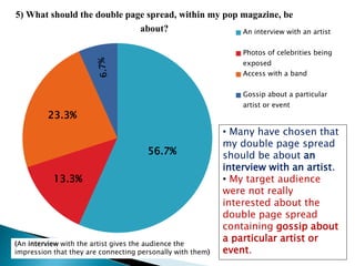
- The magazine will feature about 5 images and cover lines on the front cover.
- The main focal image will be a medium shot of a female artist, who will also be featured in the double page interview spread.
- The language in the magazine will be a mix of informal and formal, and will cost between £3-£3.50.