
Recommended
More Related Content
What's hot
What's hot (17)
Viewers also liked
Similar to Question 5
Similar to Question 5 (20)
Recently uploaded
Recently uploaded (20)
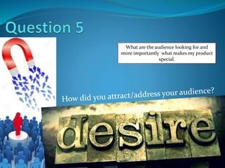
Question 5
- 1. What are the audience looking for and more importantly what makes my product special.
- 2. Colour Scheme Throughout My products research I had learnt how Colour coordination was vital in A products professional image, and promotion. I had found neighbour like brand karrang used quite dark menacing colours to get the attention of its younger target audience. I Saw how effective this was and I ultimately went for a main colour scheme of Black, Yellow, Red and White. I feel my age group need a product that stands out from the crowd of paperback covers on supermarket shelves and gives off a variety of emotions for a viewer in one go. The colours compliment each other as in boldness and solid colour state. They contrast hugely on the colour spectrum connoting a range of emotions and feeling as well as looking visually impressive for the less mature naked eye. I chose these colours because they are brighter and all more to younger audiences who have an eye for colourful work. I used Red for the text because I feel red connotes a energising positive yet anger at the same time. I think this colour suits the Music my product represents and fans can expect this emotion through mosh’ reading. I feel the colour scheme layout can be indentified by fans as a navigation system easy to use. For example headlines and contents are mainly in bold red and black, the yellow indicates area of interest. I noticed my audience are prepared to pay beyond prices of similar magazines like Kerrang for a product that showcases everything they need. I feel having a range of deep colours with high tone gives Mosh a professional stance over other magazines. I used more attention effective colours such as red for the important or lead articles of the product and areas of least interest remained black text. All images presented even frequently a boarder colour to give a 3D aspect to this magazine. Once again makes the product look more exciting, worth the buy and quality is good. Lead headlines drawn more attention, given high levels of tonal value over least important aspects which remain duller. Photograph boarders and outlines. Rugged approach and follow same colours, create synergy. Masthead of my product. BOLDEST context on my front cover, standout of the shelves.
- 3. Articles and Stories I was able to attract My audiences through my choice of Articles, information and stories that the product offers. I understand my fans what to feel they can interact with the people involved in Rock industry. Therefore many of my stories take on Famous bands and artists in Monthy interviews where the fans get to learn about there lifestyles and feel part of the music universe. Bands such as ‘Greenday’ , ‘fallout boy’ , ‘Biffy Clyro’ and Shed seven are renown favourites of this music genre and are as inspiring to its fans as interesting. Therefore interacting with there lifestyles in this magazine will make people desire this product and want to read its contents. I wanted Mosh to enter a subject area that hasn't been explored as much in other leading brands I the market. Despite using the old favourite technique of articles interviewing top bands I would like to immerse this product with the hard core side of music. Most of my readers will see the smaller venues behind closed doors, hidden away from public eyes, the real roots of early rock life. I look to open this youthful side of following music by providing a range of context that divides up into, Local venue Reviews, fans favourites, sound systems, Band formations, rookie life and background behind retro songs. I feel Younger audiences who have a passion for Rock music of this day and age can really connect with these stories because of its similarities to personal experiences. More importantly Mosh will explore a range of locations where gigs are held giving concert lovers the chance to visits locations they have not seen before. They will get a broad knowledge on what live music bands and venues around the country are like and learn to use mosh for educational purposes. Mosh takes pride in its connection with the younger generation and I feel that by incorporating a diverse selection of stories and news based around social media will only promote this magazine to my audience.
- 4. I have used social media as talking points, guidelines and a helpful tool in the magazine, explained in the contents area. My articles incorporate the media platform as the subject and the object of its stories. My audience feel at home with technology, often understanding the way it works more than older generations, use it daily and has became a part of daily life. Therefore fans will feel at home with news on this social media basis and want to involve themselves or read what mosh has to say on young peoples favourite aspect of technology. Incorporating social media allows the product to expand its universe to larger audiences and internet users. Social media can contribute to a range of alternative articles and fill out the pages in the magazine with stories related to the subject area. Having a full, exciting, and story packed magazine is always a great start in marketing any product to the general public, if it look quite empty and devoid of news people will not be interested. All the Contents titles use short, snappy and plain Headings on the contents page. This is so that audiences don't feel they are wasting time scanning the page as younger people often have a limited attention span. Alternatively The snappy headings use alliterations and other key English terms in engaging with the audience. Makes the Articles sound more adventurous I have used social media as talking points, guidelines and a helpful tool in the magazine, explained in the contents area, exciting and entertaining for its readers. The Headlines provided On the first page of my product are clear to read, bold and standout on the background image. This is important for first time readers or long time fans because The navigation of the product par the front cover is a vitally important section of the magazine. It gives an impression for audiences what the expect and sets the magazines example of news in this issue. I thought it was important for this product to Share The page numbers in the Contents column. For new fans they can navigate the page easier to a new product. The page numbers are bold red so creates a instant visual interpretation of a list.
- 5. Photography Was very important to the success of this product and important in getting the attention of my audiences and attracting wider fan base. The cover uses a young male with a clear rock lifestyle denoted by his dress codes, hairstyle and props. People interested in the music genre and clothing related to my magazines music choice will be visually interested and interested to view this cover. The model has a similar hair style to the one of famous artist Nathan day. Therefore being a well known rock celebrity people can make a connection with this magazine and they respect the style of this product. The clean cut gutter connoted professionalism and style that some people like to aspire to and understand this band member is possibly well known or has had a lot of success owning such a nice branded instrument. The colours in this photograph give my Front cover a good field of depth, readers can view this product and understand its been done to a good standard and allot of time and care has been taken to compete this. The colours are synergetic and run smoothly across the Front covers design linking to the choice of colour scheme across the issue. My product gives its audience a number of Characters in the pages that present themselves as band members and have articles featured about themselves in the magazine. Fans will enjoy seeing they characters for there knowledge of the people, style of clothing, emotions and even to feel attracted towards the members in print on the page. All these factors contribute to the emotional feelings of lust, excitement an interest for the general public. Therefore the audience want to buy this product. My double page spread included A Low angled long shot denoted Fibbers, a music venue in York. The article was a review and I believe that an image of the site is very important in people understanding and recognising venues that showcase there music genre. The image itself makes the building look quite imposing, it’s a striking set and idealistic for fans who Resemble rock music to dark, bold colours and heavy music. The product has a range of sites like pop world (to the right) on show and delves into the Rock universe through many things. Fans will enjoy being able to recognise locations of gigs, use there knowledge to hopefully go there own day and learn about the sites. Therefore they are attracted to the images and pictures shown in this product. Photography