Download as PDF, PPTX


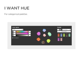


The document discusses the principles and guidelines for using color in data visualization, emphasizing the importance of color theory, perception, and appropriate color palettes for different types of data such as sequential or categorical. It advises against using the rainbow spectrum and highlights the need for distinct colors to avoid confusion, particularly for viewers with color deficiencies. Resources for selecting color palettes, along with practical examples, are also provided to enhance effective communication of data.