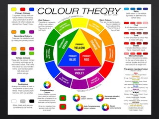
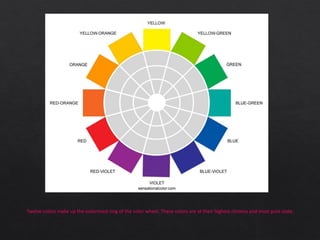
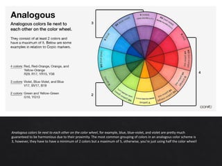
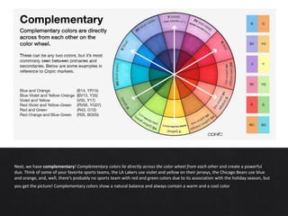
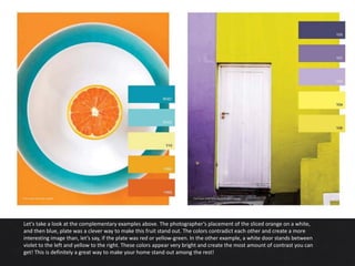
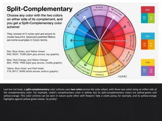
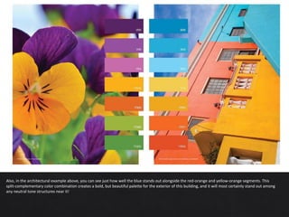
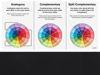
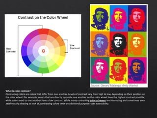
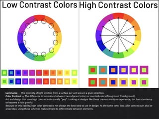
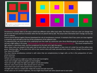
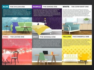
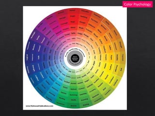
Colour in Interior Design
Color theory is both the science and art of using color. It explains how humans perceive color; and the visual
effects of how colors mix, match or contrast with each other. Color theory also involves the messages colors
communicate; and the methods used to replicate color.
In color theory, colors are organized on a color wheel and grouped into 3 categories: primary colors, secondary
colors and tertiary colors.
People decide whether or not they like a product in 90 seconds or less. 90% of that decision is based solely on color.
Merriam Webster Says the property possessed
by an object of producing different sensations
on the eye as a result of the way it reflects or
emits light.
Color or colour is the visual
perceptual property deriving from the spectrum
of light interacting with the photoreceptor
cells of the eyes. Color categories and physical
specifications of color are associated with
objects or materials based on their physical
properties such as light absorption, reflection,
or emission spectra.
What is a Color Wheel ?
A color wheel is a tool for organizing colors and
understanding color relationships. Think of it as
your cheat sheet for creating color harmony.
The arrangement of the colors on the wheel
gives you a variety of ways to combine hues to
create harmonious color combinations. By
using the color wheel in this way you can
generally select the colors or color families you
will use together.
Hue distinguishes one color from another and is
described using common color names such as
green, blue, red, yellow, etc. Value refers to the
lightness or darkness of a color. It defines a
color in terms of how close it is to white or
black. Chroma is the attribute that expresses
the purity of a color. Mixing a pure hue with
black, white, gray, or any other color reduces its
purity and lowers the strength of the original
hue.
Twelve colors make up the outermost ring of the color wheel. These colors are at their highest chroma and most pure state.
Tint
The lighter value of a color created when a hue is blended with white is called a tint. The hue may be mixed with
just a touch of white or with so much white that the hue is very faint but all are tints of the hue. On the color wheel
only one tint is shown for each hue. It is the color next to the hue and the tint is made to look like it is midway
between the hue and white.
Tone
A tone of a color is created when a hue is blended with gray; adding gray quiets or tones down a color. A hue mixed with any amount of
gray is considered a tone. On the color wheel only one tone, which is made to look like it is midway between the hue and middle gray is
included for each color.
Shade
A shade is a darker value of a color, made by adding black. Just as with the tints and tones, a hue may be mixed with just a touch of black
or with so much black that you are hardly able to detect the hue; all are considered a shade of the hue. On the color wheel only one
shade is shown for each hue. The inner most circle includes a shade of each hue, which is made to look like it is midway between the
hue and black.
Analogous colors lie next to each other on the color wheel, for example, blue, blue-violet, and violet are pretty much
guaranteed to be harmonious due to their proximity. The most common grouping of colors in an analogous color scheme is
3, however, they have to have a minimum of 2 colors but a maximum of 5, otherwise, you’re just using half the color wheel!
Let’s take a closer look at the sunset and dessert images above. The blue-violet sky at the top of the photograph flows
effortlessly into a periwinkle violet, then a light red-violet, then a vibrant red, etc. The sherbert image to the right shows a
transition from a dark plum violet to a saturated peony red-violet to a pale-rose red. Both of these images show a gradual
transition from one color to the next on the wheel, and for that reason, they’re both using an analogous color scheme
Next, we have complementary! Complementary colors lie directly across the color wheel from each other and create a powerful
duo. Think of some of your favorite sports teams, the LA Lakers use violet and yellow on their jerseys, the Chicago Bears use blue
and orange, and, well, there’s probably no sports team with red and green colors due to its association with the holiday season, but
you get the picture! Complementary colors show a natural balance and always contain a warm and a cool color.
Let's take a look at the complementary examples above. The photographer’s placement of the sliced orange on a white,
and then blue, plate was a clever way to make this fruit stand out. The colors contradict each other and create a more
interesting image than, let’s say, if the plate was red or yellow-green. In the other example, a white door stands between
violet to the left and yellow to the right. These colors appear very bright and create the most amount of contrast you can
get! This is definitely a great way to make your home stand out among the rest!
Last but not least, a split-complementary color scheme uses two colors across the color wheel, with those two colors lying on either side of
the complementary color. For example, violet’s complimentary color is yellow, but its split-complementary colors are yellow-green and
yellow-orange. This color scheme can be seen in nature quite often with flowers! Take a violet pansy, for example, and its yellow-orange
highlights against yellow-green leaves. So pretty!
Also, in the architectural example above, you can see just how well the blue stands out alongside the red-orange and yellow-orange segments. This
split-complementary color combination creates a bold, but beautiful palette for the exterior of this building, and it will most certainly stand out among
any neutral tone structures near it!
Black
Black isn't a primary, secondary, or tertiary color. In fact, black isn't on the color wheel because it isn't considered a color. It's all
colors. Or rather, the absorption of all colors. Black absorbs all light in the color spectrum.
According to color psychology, color-related emotion is highly dependent on your personal preference and past experiences with that
particular color. The color black is no different.
White
The color white has a number of meanings and associations, although these may vary depending on the individual and the culture in
which they live. Some of the main associations often connected to the color white include purity, innocence, cleanliness, blankness,
coldness, emptiness, simplicity, and minimalism.
Color Psychology
Red
In color psychology, red provokes the strongest emotions of any color. While cool colors like green and blue are generally considered
peaceful and calming, red is considered the warmest and most contradictory of the colors. In fact, this fiery hue has more opposing
emotional associations than any other color: Red is linked to passion and love as well as power and anger.
Blue
Blue is a color often found in nature such as the pale blue of a daytime sky or the rich dark blue of a deep pool of water. It is for this
reason perhaps that people often describe the color blue as calm and serene. Yet as a cool color, blue can sometimes seem icy,
distant, or even cold.
Green
For many people, the color green has strong associations with nature and brings to mind lush grass, trees, and forests. Green is often
described as a refreshing and tranquil color. Other common associations with the color green are money, luck, health, and envy. In
color psychology, colors made up of long wavelengths are considered "arousing or warm," whereas colors such as green that have
shorter wavelengths are "relaxing or cool.“ Our eyes must adjust to see colors with longer wavelengths, they don't need to adjust at
all to see cool colors.
Color Psychology
Yellow
"How wonderful yellow is. It stands for the sun." -Vincent Van Gogh
•Attention-grabbing: Since yellow is the most visible color, it is also the most attention-getting color. Yellow can be used in a small
amount to draw notice, such as on traffic signs or advertisements.
•Difficult to read: Yellow is also the most fatiguing to the eye due to the high amount of light that is reflected. Using yellow as a
background on paper or computer monitors can lead to eyestrain or vision loss in extreme cases.
•Energetic: Yellow can also increase metabolism.
•Frustrating: Yellow can also create feelings of frustration and anger. While it is considered a cheerful color, people are more likely to
lose their tempers in yellow rooms and babies tend to cry more in yellow rooms.
•Warm: Yellow is a bright color that is often described as cheery and warm.
Purple
The color purple is associated with a variety of meanings, including wisdom, creativity, royalty, power, ambition, and luxury. It can also
represent magic, extravagance, peace, pride, independence, and wealth. As with other colors, purple is the subject of color
psychology, which suggests that colors can have a powerful impact on moods and even behaviors.
The color purple became associated with wealth and royalty because, oftentimes, the rich were the only individuals who could afford
clothing and other household items that were dyed purple
Creativity, Emotionality, Enlightenment, Femininity, Imagination, Inspiration, Mystery, Rarity, Royalty, Spirituality
Brown
Like most colors, brown can have positive and negative associations and meanings. Some of the key characteristics associated with
brown in color psychology include:
A sense of strength and reliability. Brown is often seen as solid, much like the earth, and it's a color often associated with resilience,
dependability, security, and safety.
Feelings of loneliness, sadness, and isolation. In large quantities, it can seem vast, stark, and empty, like an enormous desert devoid of
life.
Feelings of warmth, comfort, and security. Brown is often described as natural, down-to-earth, and conventional, but brown can also
be sophisticated.
Negative emotions. Like other dark colors, is associated with more negative emotions.
Color Psychology
Orange
Orange can be a very strong and energetic color. Like yellow and red, it can be very attention-grabbing, which is perhaps why it
is often used in advertising.
Energetic, Attention-Getting, Happy, Spiritual, Autumnal
Pink
Pink is a light red hue and is typically associated with love and romance. It is often described as a feminine color, perhaps due to
associations people form during early childhood. "Girls' toys" are usually pink and purple, while "boys' toys" are often red, yellow,
green, or blue. People associate the color with qualities that are often thought of as feminine, such as softness, kindness, nurturing,
and compassion
Femininity, Healing, Innocence, Peace, Playfulness, Romance, Sweetness, Tranquility, Warmth
What is color contrast?
Contrasting colors are colors that differ from one another. Levels of contrast vary from high to low, depending on their position on
the color wheel. For example, colors that are directly opposite one another on the color wheel have the highest contrast possible,
while colors next to one another have a low contrast. While many contrasting color schemes are interesting and sometimes even
aesthetically pleasing to look at, contrasting colors serve an additional purpose: user accessibility.
Luminance — The intensity of light emitted from a surface per unit area in a given direction.
Color Contrast — The difference in luminance between two adjacent colors or overlaid colors (foreground / background).
Art and design that uses high contrast colors really “pop”. Looking at designs like these creates a unique experience, but has a tendency
to become a little painful.
Because of this liability, high color contrast is not always the best idea to use in design. At the same time, low color contrast can also be
a bad idea; using these schemes makes it hard to differentiate between elements.
The Rule of Simultaneous Contrast
Simultaneous contrast refers to the way in which two different colors affect each other. The theory is that one color can change how
we perceive the tone and hue of another when the two are placed side by side. The actual colors themselves don't change, but we see
them as altered.
French chemist Michel Eugène Chevreul developed the rule of simultaneous contrast. It maintains that if two colors are close together
in proximity, each will take on the hue of the complement of the adjacent color.
To understand this, we must look at the underlying hues that make up a particular color. Bruce MacEvoy gives an example using a dark
red and a light yellow in his essay, "Michel-Eugène Chevreul's 'Principles of Color Harmony and Contrast.'" The visual complement to
light yellow is a dark blue-violet, and the complement to the dark red is light blue-green.
When these colors are viewed in their pairs next to each other, the red will appear to have more of a violet hue and the yellow more
green. MacEvoy adds, "At the same time, dull or near neutral colors will make saturated colors more intense, though Chevreul was not
clear about this effect."
The most intense simultaneous contrast is with colors that are complementary to begin with, as this is the juxtaposition of color-
wheel extremes.
Rules of thumb:
•A dark color put next to a light one makes them both look brighter.
•Dark next to bright makes the bright one look brighter.
•Dark next to light makes the light seem lighter and the dark darker.
•Warmer colors look warmer when placed next to cool ones.
•Cool colors look cooler when placed next to warm ones.
•A bright color next to a muted color makes the muted one look more dull.
•If two colors are of a similar brightness, the less bright they'll both look when placed next to each other
Color Psychology

Color.pdf

  • 1.
  • 2.
    Color theory isboth the science and art of using color. It explains how humans perceive color; and the visual effects of how colors mix, match or contrast with each other. Color theory also involves the messages colors communicate; and the methods used to replicate color. In color theory, colors are organized on a color wheel and grouped into 3 categories: primary colors, secondary colors and tertiary colors.
  • 3.
    People decide whetheror not they like a product in 90 seconds or less. 90% of that decision is based solely on color.
  • 4.
    Merriam Webster Saysthe property possessed by an object of producing different sensations on the eye as a result of the way it reflects or emits light. Color or colour is the visual perceptual property deriving from the spectrum of light interacting with the photoreceptor cells of the eyes. Color categories and physical specifications of color are associated with objects or materials based on their physical properties such as light absorption, reflection, or emission spectra. What is a Color Wheel ? A color wheel is a tool for organizing colors and understanding color relationships. Think of it as your cheat sheet for creating color harmony. The arrangement of the colors on the wheel gives you a variety of ways to combine hues to create harmonious color combinations. By using the color wheel in this way you can generally select the colors or color families you will use together. Hue distinguishes one color from another and is described using common color names such as green, blue, red, yellow, etc. Value refers to the lightness or darkness of a color. It defines a color in terms of how close it is to white or black. Chroma is the attribute that expresses the purity of a color. Mixing a pure hue with black, white, gray, or any other color reduces its purity and lowers the strength of the original hue.
  • 6.
    Twelve colors makeup the outermost ring of the color wheel. These colors are at their highest chroma and most pure state.
  • 7.
    Tint The lighter valueof a color created when a hue is blended with white is called a tint. The hue may be mixed with just a touch of white or with so much white that the hue is very faint but all are tints of the hue. On the color wheel only one tint is shown for each hue. It is the color next to the hue and the tint is made to look like it is midway between the hue and white.
  • 8.
    Tone A tone ofa color is created when a hue is blended with gray; adding gray quiets or tones down a color. A hue mixed with any amount of gray is considered a tone. On the color wheel only one tone, which is made to look like it is midway between the hue and middle gray is included for each color.
  • 9.
    Shade A shade isa darker value of a color, made by adding black. Just as with the tints and tones, a hue may be mixed with just a touch of black or with so much black that you are hardly able to detect the hue; all are considered a shade of the hue. On the color wheel only one shade is shown for each hue. The inner most circle includes a shade of each hue, which is made to look like it is midway between the hue and black.
  • 11.
    Analogous colors lienext to each other on the color wheel, for example, blue, blue-violet, and violet are pretty much guaranteed to be harmonious due to their proximity. The most common grouping of colors in an analogous color scheme is 3, however, they have to have a minimum of 2 colors but a maximum of 5, otherwise, you’re just using half the color wheel!
  • 12.
    Let’s take acloser look at the sunset and dessert images above. The blue-violet sky at the top of the photograph flows effortlessly into a periwinkle violet, then a light red-violet, then a vibrant red, etc. The sherbert image to the right shows a transition from a dark plum violet to a saturated peony red-violet to a pale-rose red. Both of these images show a gradual transition from one color to the next on the wheel, and for that reason, they’re both using an analogous color scheme
  • 13.
    Next, we havecomplementary! Complementary colors lie directly across the color wheel from each other and create a powerful duo. Think of some of your favorite sports teams, the LA Lakers use violet and yellow on their jerseys, the Chicago Bears use blue and orange, and, well, there’s probably no sports team with red and green colors due to its association with the holiday season, but you get the picture! Complementary colors show a natural balance and always contain a warm and a cool color.
  • 14.
    Let's take alook at the complementary examples above. The photographer’s placement of the sliced orange on a white, and then blue, plate was a clever way to make this fruit stand out. The colors contradict each other and create a more interesting image than, let’s say, if the plate was red or yellow-green. In the other example, a white door stands between violet to the left and yellow to the right. These colors appear very bright and create the most amount of contrast you can get! This is definitely a great way to make your home stand out among the rest!
  • 15.
    Last but notleast, a split-complementary color scheme uses two colors across the color wheel, with those two colors lying on either side of the complementary color. For example, violet’s complimentary color is yellow, but its split-complementary colors are yellow-green and yellow-orange. This color scheme can be seen in nature quite often with flowers! Take a violet pansy, for example, and its yellow-orange highlights against yellow-green leaves. So pretty!
  • 16.
    Also, in thearchitectural example above, you can see just how well the blue stands out alongside the red-orange and yellow-orange segments. This split-complementary color combination creates a bold, but beautiful palette for the exterior of this building, and it will most certainly stand out among any neutral tone structures near it!
  • 18.
    Black Black isn't aprimary, secondary, or tertiary color. In fact, black isn't on the color wheel because it isn't considered a color. It's all colors. Or rather, the absorption of all colors. Black absorbs all light in the color spectrum. According to color psychology, color-related emotion is highly dependent on your personal preference and past experiences with that particular color. The color black is no different. White The color white has a number of meanings and associations, although these may vary depending on the individual and the culture in which they live. Some of the main associations often connected to the color white include purity, innocence, cleanliness, blankness, coldness, emptiness, simplicity, and minimalism. Color Psychology Red In color psychology, red provokes the strongest emotions of any color. While cool colors like green and blue are generally considered peaceful and calming, red is considered the warmest and most contradictory of the colors. In fact, this fiery hue has more opposing emotional associations than any other color: Red is linked to passion and love as well as power and anger. Blue Blue is a color often found in nature such as the pale blue of a daytime sky or the rich dark blue of a deep pool of water. It is for this reason perhaps that people often describe the color blue as calm and serene. Yet as a cool color, blue can sometimes seem icy, distant, or even cold. Green For many people, the color green has strong associations with nature and brings to mind lush grass, trees, and forests. Green is often described as a refreshing and tranquil color. Other common associations with the color green are money, luck, health, and envy. In color psychology, colors made up of long wavelengths are considered "arousing or warm," whereas colors such as green that have shorter wavelengths are "relaxing or cool.“ Our eyes must adjust to see colors with longer wavelengths, they don't need to adjust at all to see cool colors.
  • 19.
    Color Psychology Yellow "How wonderfulyellow is. It stands for the sun." -Vincent Van Gogh •Attention-grabbing: Since yellow is the most visible color, it is also the most attention-getting color. Yellow can be used in a small amount to draw notice, such as on traffic signs or advertisements. •Difficult to read: Yellow is also the most fatiguing to the eye due to the high amount of light that is reflected. Using yellow as a background on paper or computer monitors can lead to eyestrain or vision loss in extreme cases. •Energetic: Yellow can also increase metabolism. •Frustrating: Yellow can also create feelings of frustration and anger. While it is considered a cheerful color, people are more likely to lose their tempers in yellow rooms and babies tend to cry more in yellow rooms. •Warm: Yellow is a bright color that is often described as cheery and warm. Purple The color purple is associated with a variety of meanings, including wisdom, creativity, royalty, power, ambition, and luxury. It can also represent magic, extravagance, peace, pride, independence, and wealth. As with other colors, purple is the subject of color psychology, which suggests that colors can have a powerful impact on moods and even behaviors. The color purple became associated with wealth and royalty because, oftentimes, the rich were the only individuals who could afford clothing and other household items that were dyed purple Creativity, Emotionality, Enlightenment, Femininity, Imagination, Inspiration, Mystery, Rarity, Royalty, Spirituality Brown Like most colors, brown can have positive and negative associations and meanings. Some of the key characteristics associated with brown in color psychology include: A sense of strength and reliability. Brown is often seen as solid, much like the earth, and it's a color often associated with resilience, dependability, security, and safety. Feelings of loneliness, sadness, and isolation. In large quantities, it can seem vast, stark, and empty, like an enormous desert devoid of life. Feelings of warmth, comfort, and security. Brown is often described as natural, down-to-earth, and conventional, but brown can also be sophisticated. Negative emotions. Like other dark colors, is associated with more negative emotions.
  • 20.
    Color Psychology Orange Orange canbe a very strong and energetic color. Like yellow and red, it can be very attention-grabbing, which is perhaps why it is often used in advertising. Energetic, Attention-Getting, Happy, Spiritual, Autumnal Pink Pink is a light red hue and is typically associated with love and romance. It is often described as a feminine color, perhaps due to associations people form during early childhood. "Girls' toys" are usually pink and purple, while "boys' toys" are often red, yellow, green, or blue. People associate the color with qualities that are often thought of as feminine, such as softness, kindness, nurturing, and compassion Femininity, Healing, Innocence, Peace, Playfulness, Romance, Sweetness, Tranquility, Warmth
  • 21.
    What is colorcontrast? Contrasting colors are colors that differ from one another. Levels of contrast vary from high to low, depending on their position on the color wheel. For example, colors that are directly opposite one another on the color wheel have the highest contrast possible, while colors next to one another have a low contrast. While many contrasting color schemes are interesting and sometimes even aesthetically pleasing to look at, contrasting colors serve an additional purpose: user accessibility.
  • 22.
    Luminance — Theintensity of light emitted from a surface per unit area in a given direction. Color Contrast — The difference in luminance between two adjacent colors or overlaid colors (foreground / background). Art and design that uses high contrast colors really “pop”. Looking at designs like these creates a unique experience, but has a tendency to become a little painful. Because of this liability, high color contrast is not always the best idea to use in design. At the same time, low color contrast can also be a bad idea; using these schemes makes it hard to differentiate between elements.
  • 23.
    The Rule ofSimultaneous Contrast Simultaneous contrast refers to the way in which two different colors affect each other. The theory is that one color can change how we perceive the tone and hue of another when the two are placed side by side. The actual colors themselves don't change, but we see them as altered. French chemist Michel Eugène Chevreul developed the rule of simultaneous contrast. It maintains that if two colors are close together in proximity, each will take on the hue of the complement of the adjacent color. To understand this, we must look at the underlying hues that make up a particular color. Bruce MacEvoy gives an example using a dark red and a light yellow in his essay, "Michel-Eugène Chevreul's 'Principles of Color Harmony and Contrast.'" The visual complement to light yellow is a dark blue-violet, and the complement to the dark red is light blue-green. When these colors are viewed in their pairs next to each other, the red will appear to have more of a violet hue and the yellow more green. MacEvoy adds, "At the same time, dull or near neutral colors will make saturated colors more intense, though Chevreul was not clear about this effect." The most intense simultaneous contrast is with colors that are complementary to begin with, as this is the juxtaposition of color- wheel extremes. Rules of thumb: •A dark color put next to a light one makes them both look brighter. •Dark next to bright makes the bright one look brighter. •Dark next to light makes the light seem lighter and the dark darker. •Warmer colors look warmer when placed next to cool ones. •Cool colors look cooler when placed next to warm ones. •A bright color next to a muted color makes the muted one look more dull. •If two colors are of a similar brightness, the less bright they'll both look when placed next to each other
  • 25.